Oakland, California
Jack London Square
Markets
Services
Design Awards
- 2021 Creative Communication Award, Winner
Client
- CIM Group
INSPIRED BY THE CITY & ITS CREATIVE CULTURE
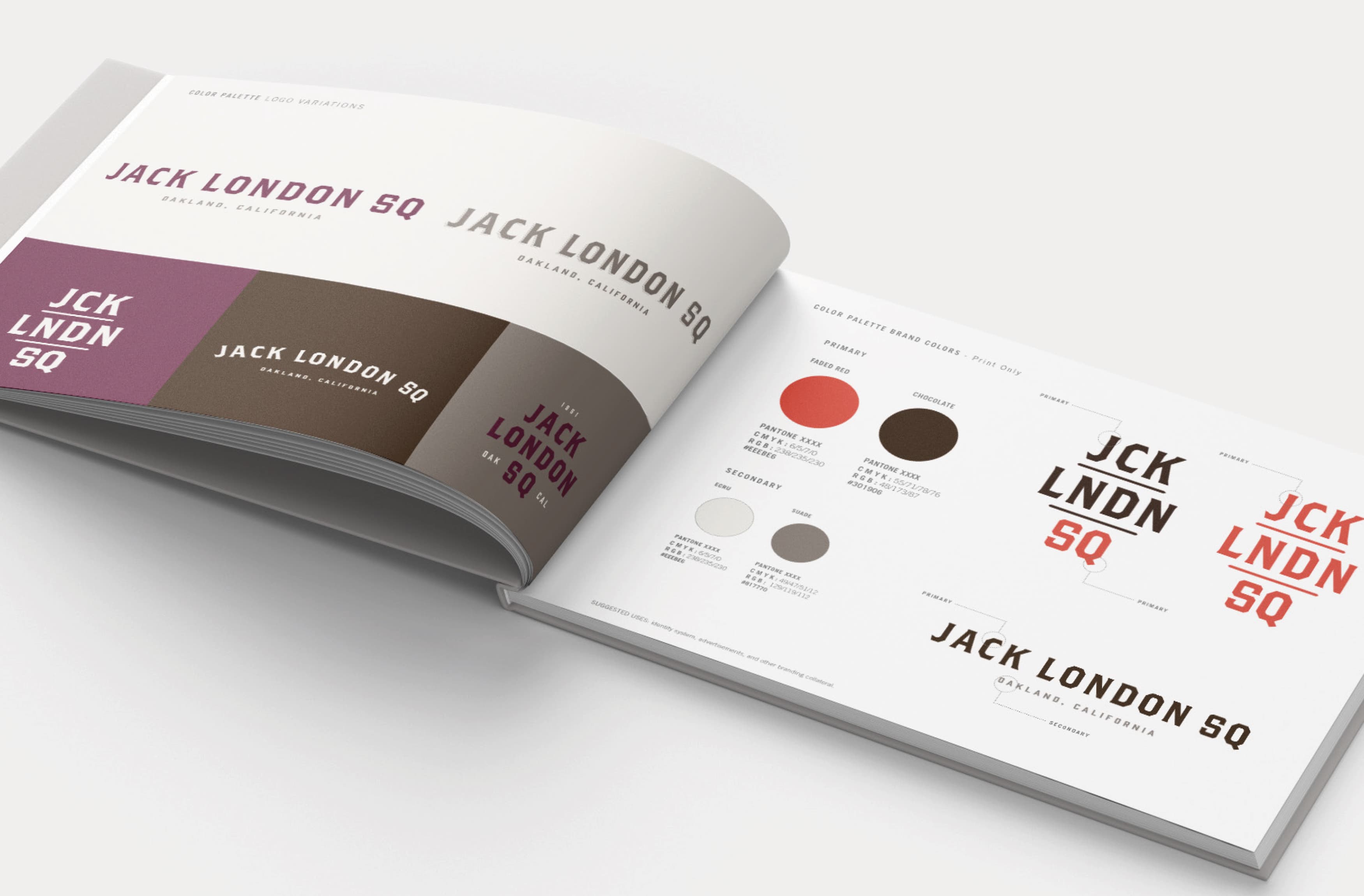
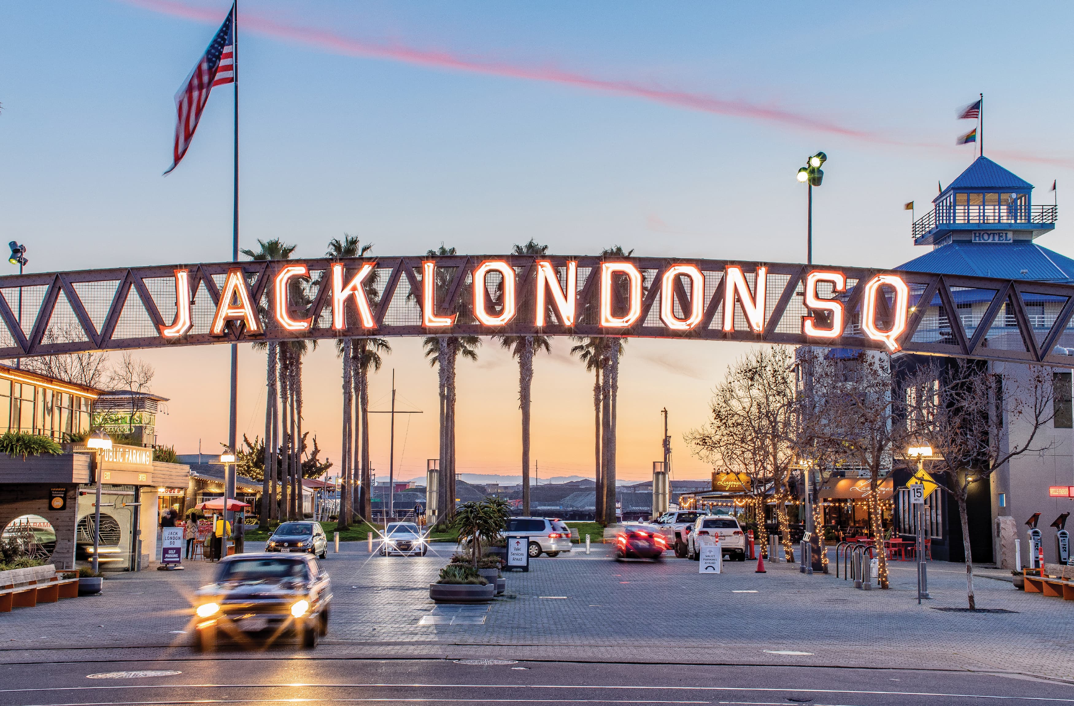
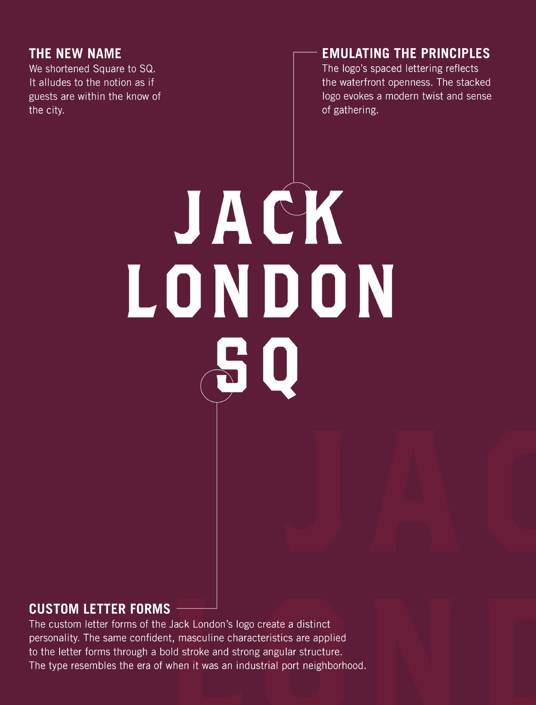
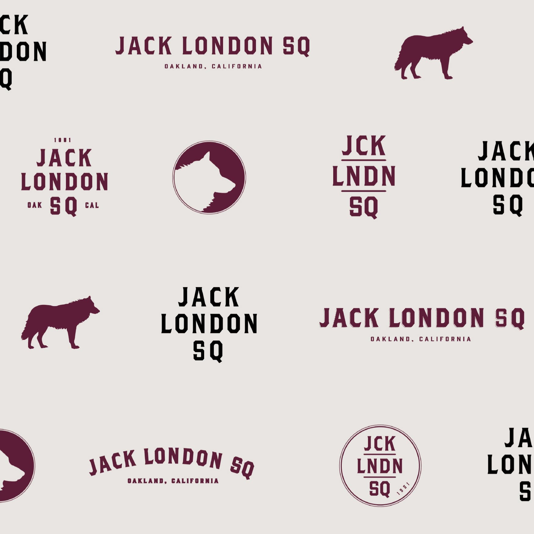
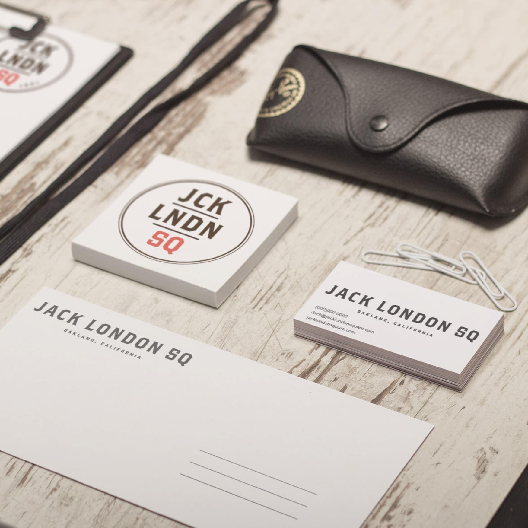
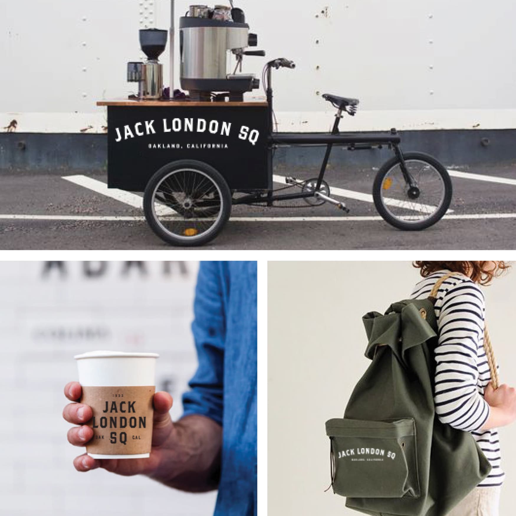
In our quest to give Jack London Square a new face to its name. RSM Design acknowledged that it already had a strong brand equity as a historic working waterfront. RSM Design focused on creating a place for locals to connect to the water with expanded residential offerings, existing retail commercial base; and activating the links to commercial areas. The new brand’s identity and guidelines reflect the brand’s principles. The established brand guidelines and kit expresses the positioning and personality, which exhibit characteristics of the people and historical notions of the location – timeless, bold, rugged, proper, adventurous, dashing and handsome qualities. The branding narrative brought together the heritage of Jack London, the famed American writer who was raised in Oakland, and the local vibe that is the heart of Oakland. The narrative was then extended to the environmental graphic design system inspired by an industrial waterfront vocabulary.
BUCK THE WOLF
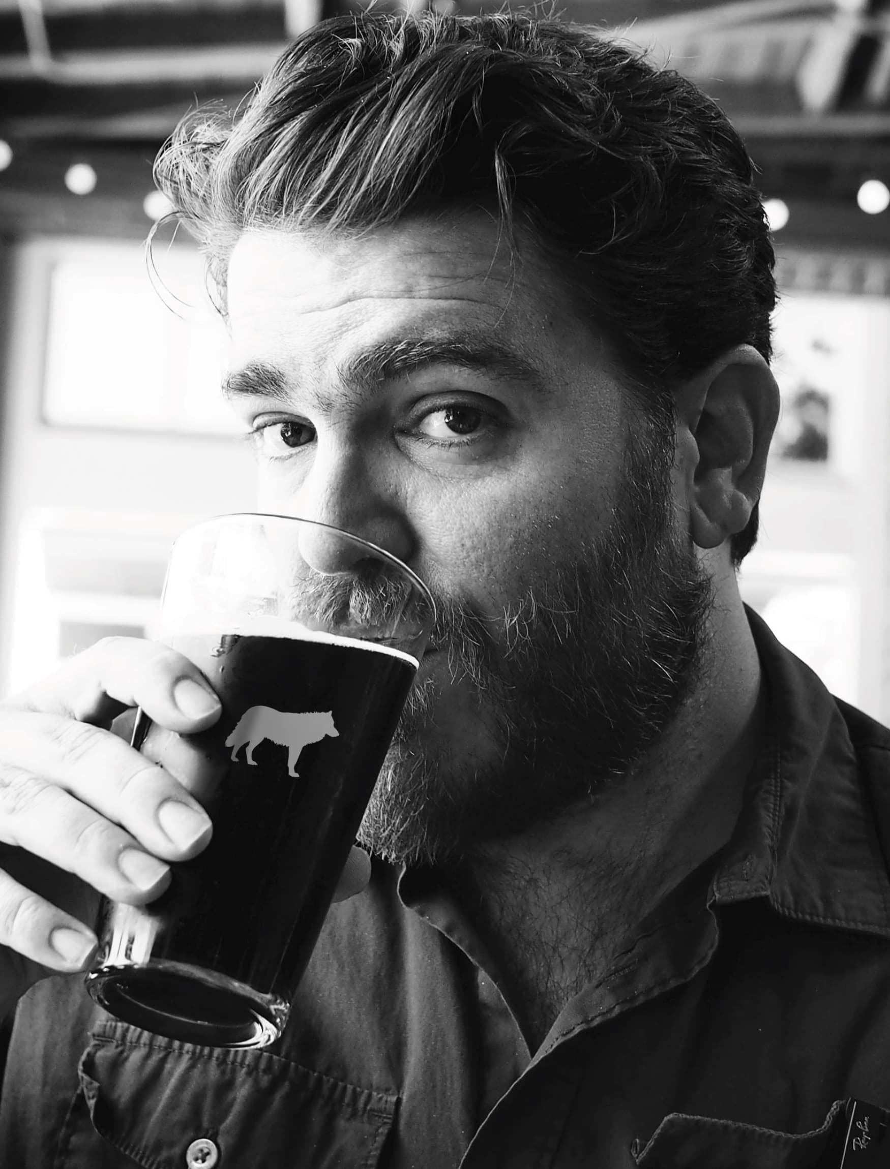
Our team developed Buck the Wolf, as a mark to distinguish Jack London Square from the primary typography logos. The wolf alludes to Jack London’s most well-known work, The Call of the Wild and its protagonist, Buck. This silhouette is the most understated of all the brand element.
A DISTINCT LOCATION WITHIN JACK LONDON SQUARE
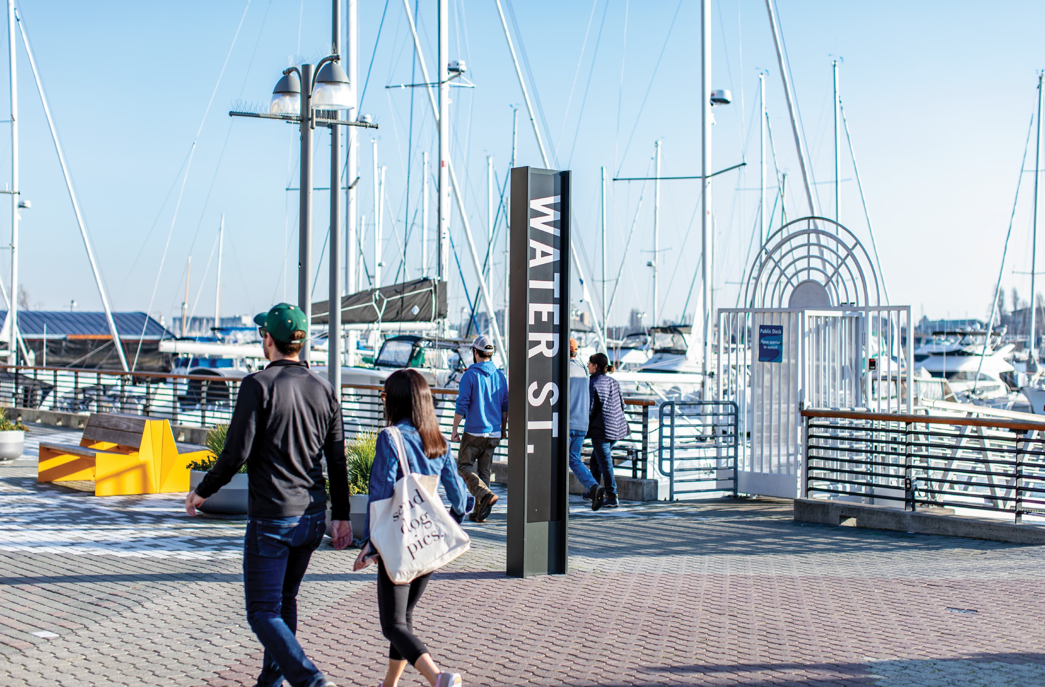
Water Street was the historic main waterfront road. Our team aligned this historic street with the new development, and the existing usage of commercial and office building; and created a brand that would represent this new destination that would foster a linkage between two residential towers and a promenade for guests to shop and eat. It was important to distinguish this promenade from Jack London Square. So RSM Design conceived a modern brand with similar principles as timeless, bold, and eclectic.
ENHANCING THE VISITOR EXPERIENCE
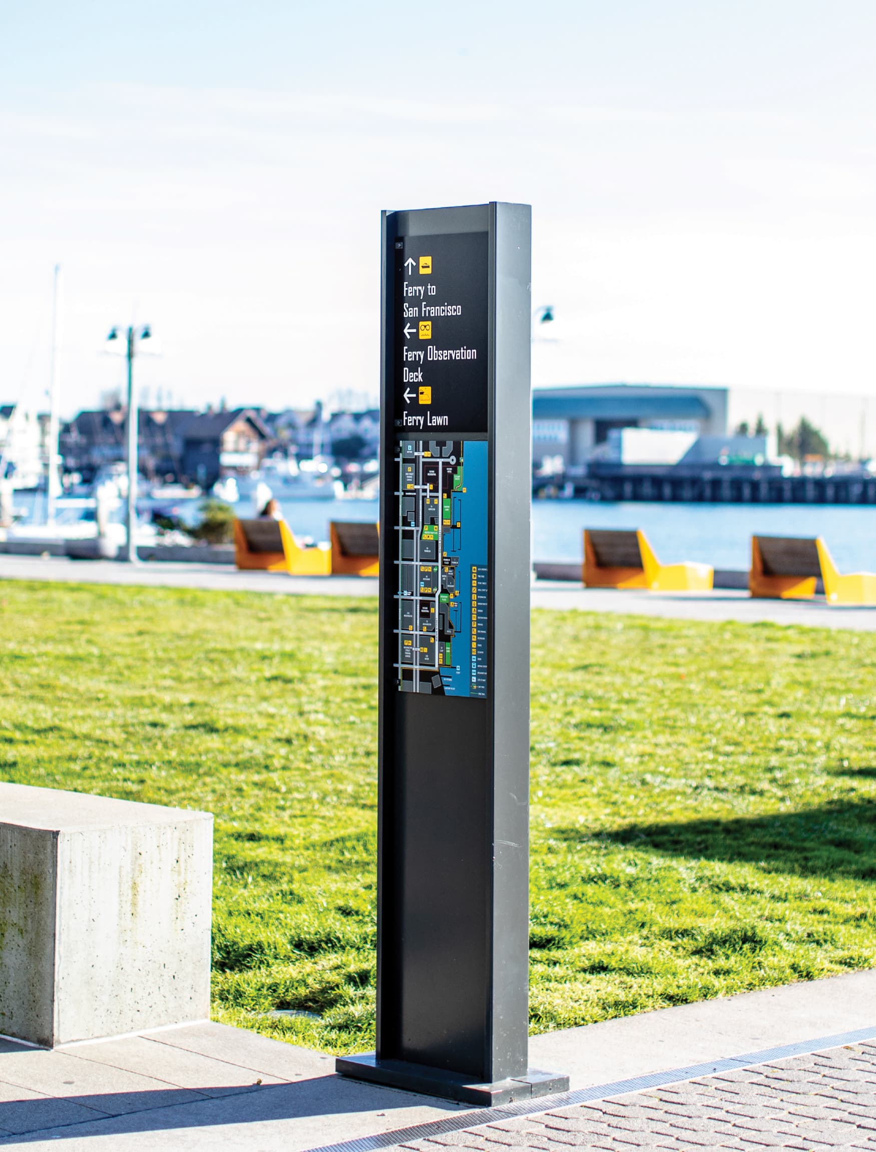
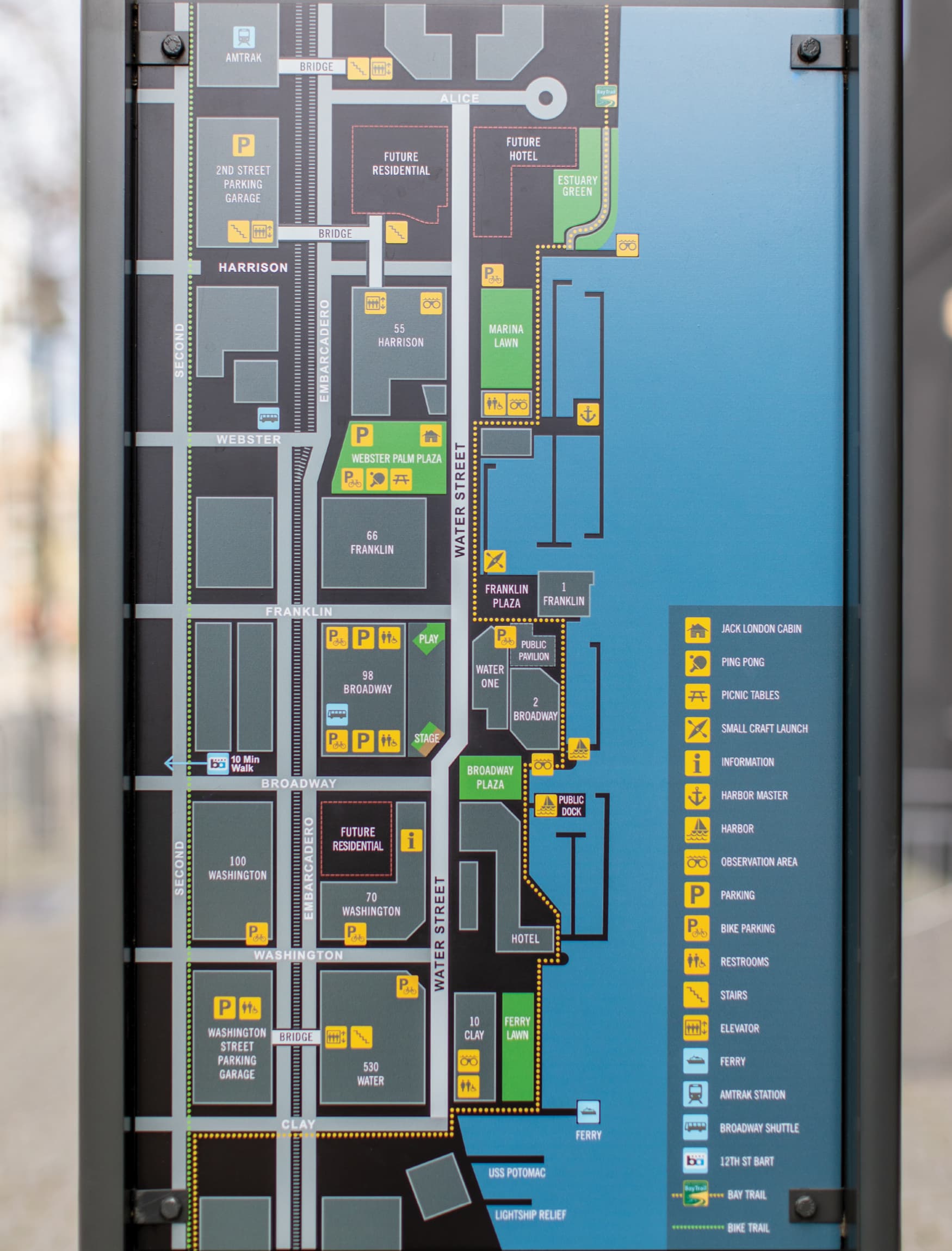
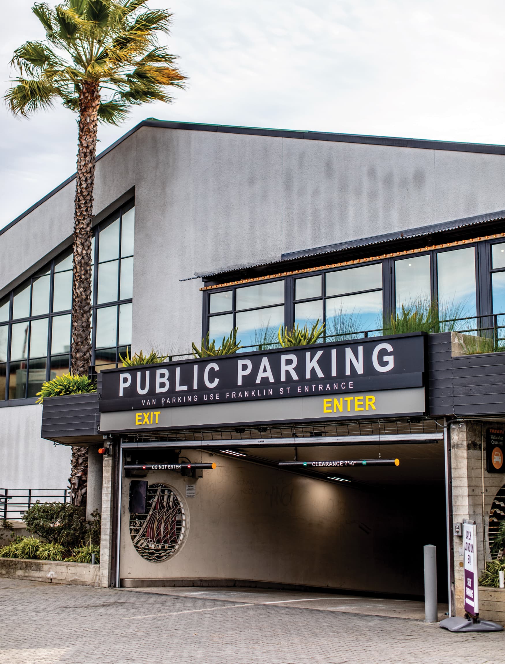
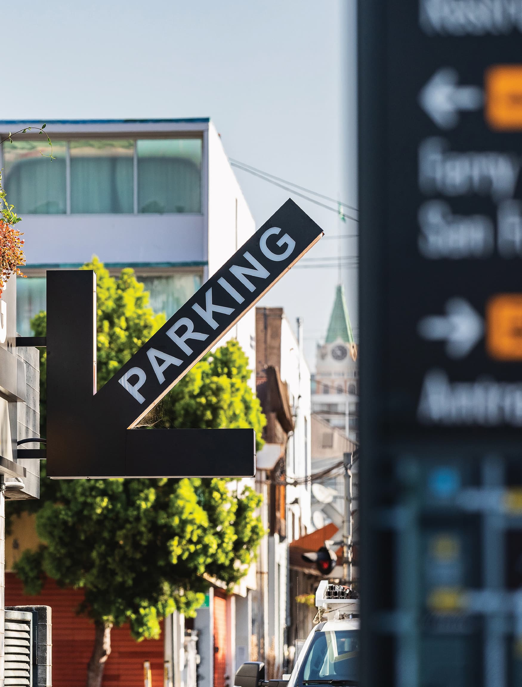
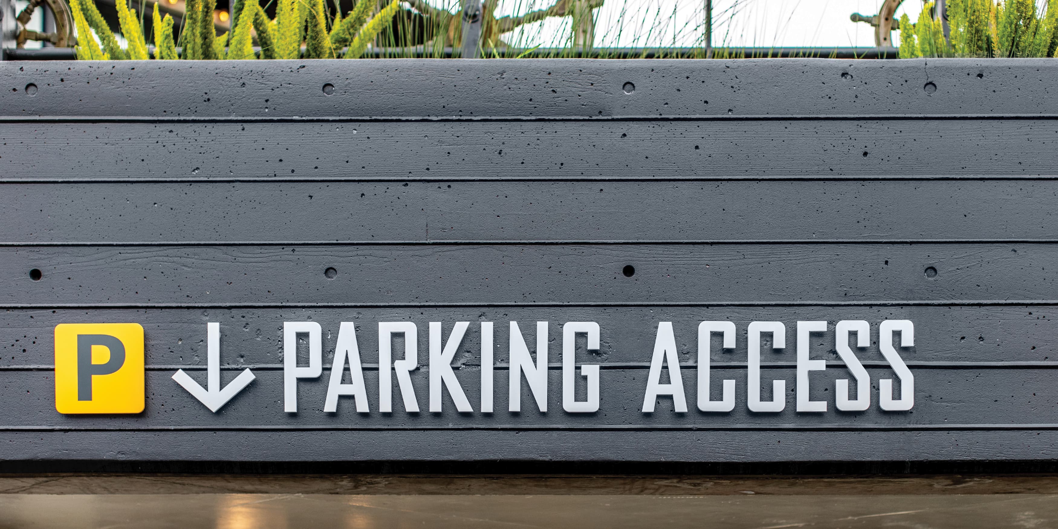
A system of signage and wayfinding guides visitors and clearly defines boundaries and destinations within the district. RSM Design also worked on streetscape concepts to revive the waterfront area. This cohesive vision, branding, and signage share the rich history of the district and attract more visitors, enhancing both the visitor experience and the district’s identity.
Creo Industrial Arts