September 29, 2021
Innovation in Architectural Graphics Today
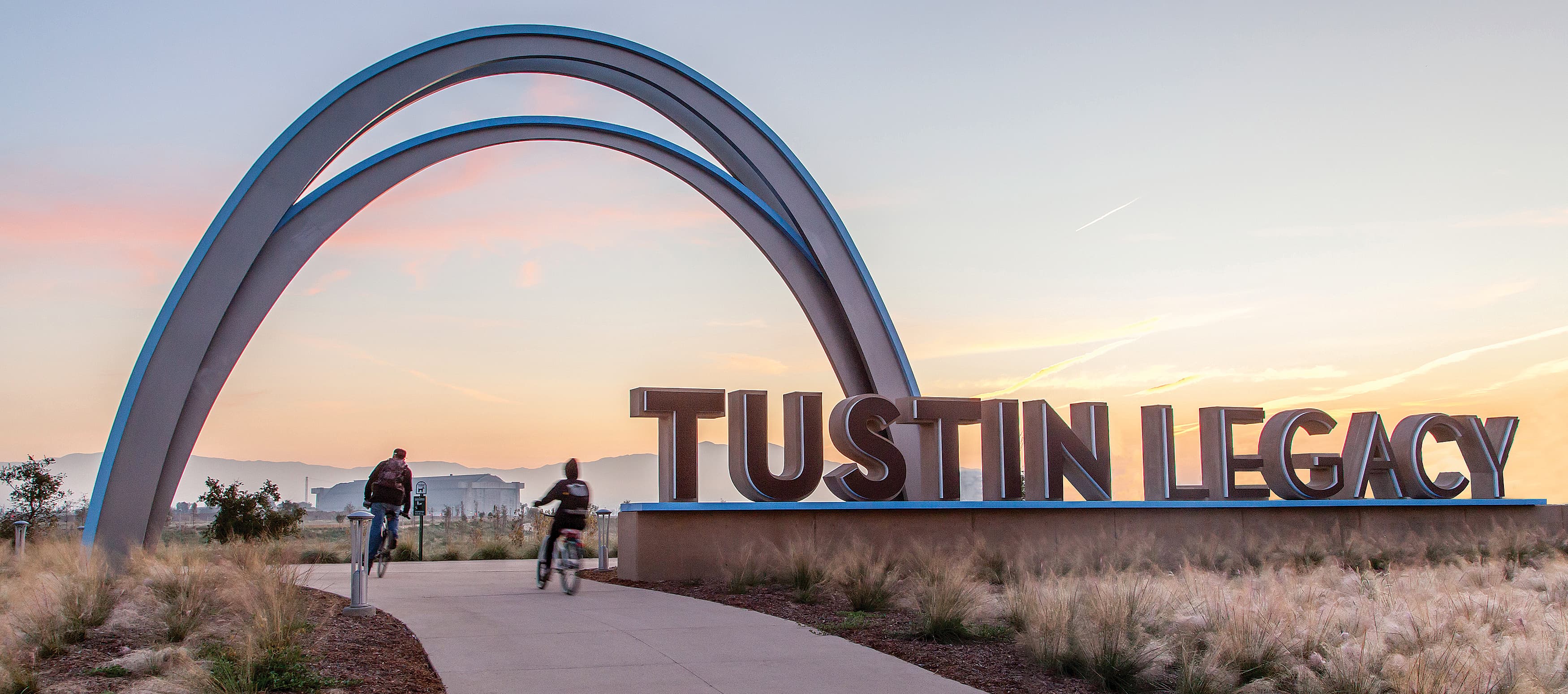
September 29, 2021

Architecture can be seen as both a canvas and an opportunity for storytelling. The synergistic relationship and importance of graphic design in architecture gives a building and its users the chance to connect with the context of a community by weaving in a unique graphic language. Architectural graphics and their interdependence with two- and three-dimensional designs express meaning and purpose in an immersive and engaging way.
RSM Design’s current series of articles, as well as our new book (Graphic Connections in Architecture), focus on the relationship of architecture and graphics, and how our team works at the intersection that weaves both together. Our focus is consistently on the relationship of architectural graphics to community, culture, history, and emotion.
In our last article, we talked about the origins of architectural graphics throughout history, beginning with a survey of graphics interventions from antiquity. In this article, we look at what is happening today with environmental graphics, retail experience design, and the importance of placemaking design.
Check out On the Origins of Architectural Graphics ›
Today, many graphic installations into architecture focus on context, culture, and emotion. People want to see architecture as a reflection of their community and it is often times through this layering of graphics where these feelings manifest. Here we will examine some of the ways communities around the world are using graphics in architecture to express their unique personalities.
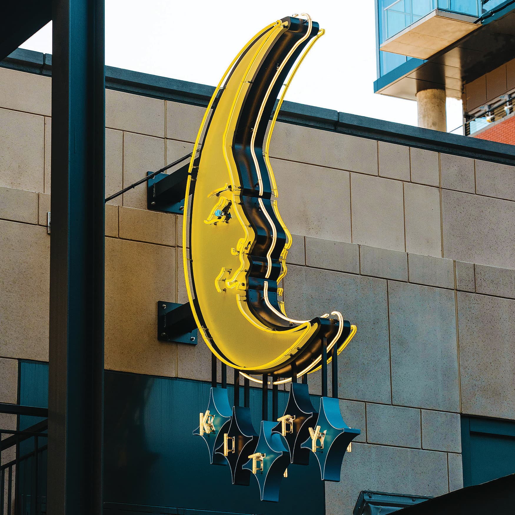
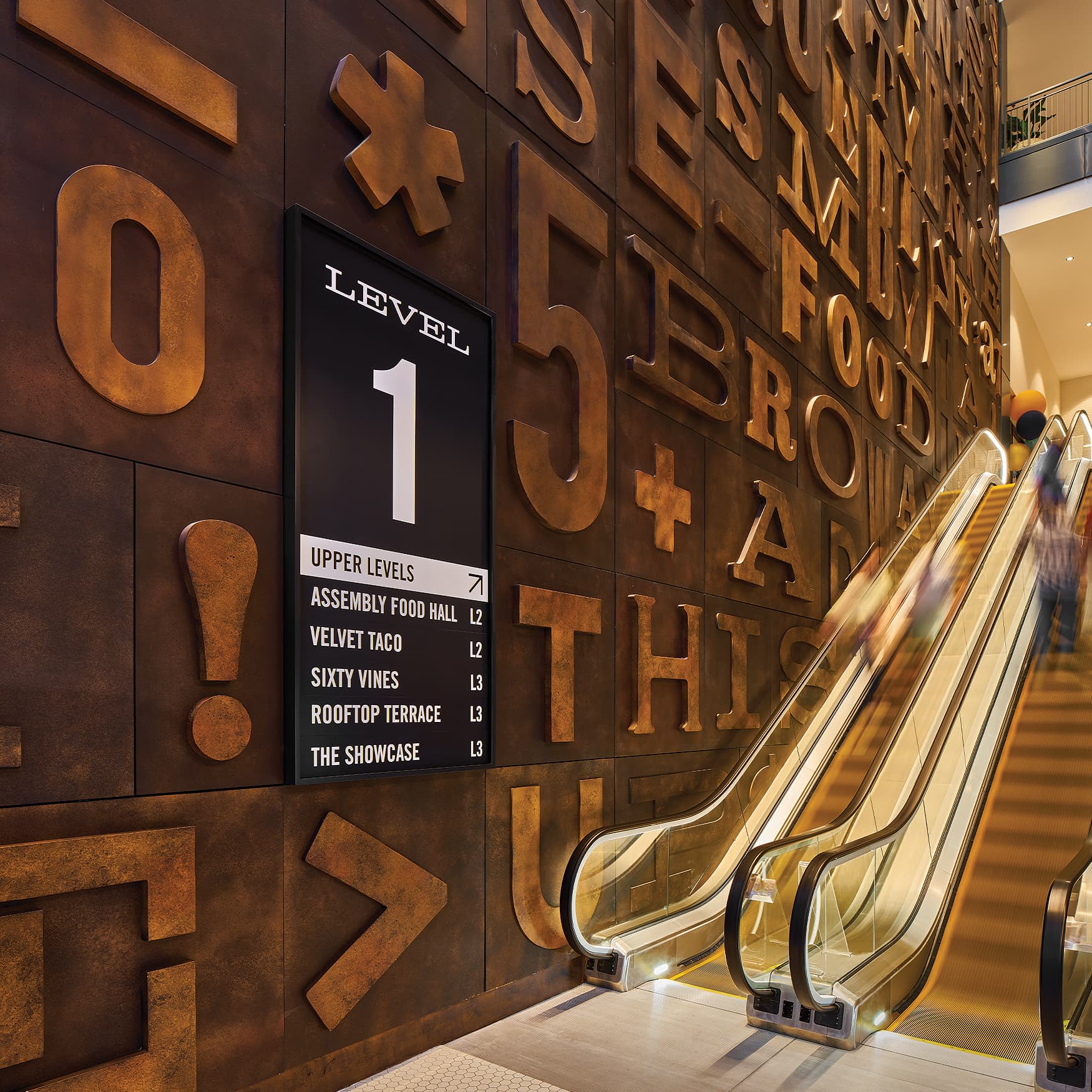
In the very heart of Nashville, across from the renowned Ryman Auditorium, is Fifth + Broadway... the epitome of a true mixed-use development and microcosm of the city. Rooted in heritage, influenced by culture, and designed for the people, Fifth + Broadway both preserves what makes Nashville great and looks towards its future. Boldness is a key word to describe this community and the graphic layer seen there. Dynamic neon signage and other original installations speak to the seamless relationship of graphics to architecture.
Fifth + Broadway uses landmarking elements that help people get where they need to go, but they’re strategically layered into the architecture to tell a story and represent the community.
The wayfinding and signage are all in the context of the culture. The graphics originated with music posters, offset printing, and block printing—all the origins were derived from a sense of place, history, and community. These bold signage graphics guide visitors, tell stories, and serve in functionality.
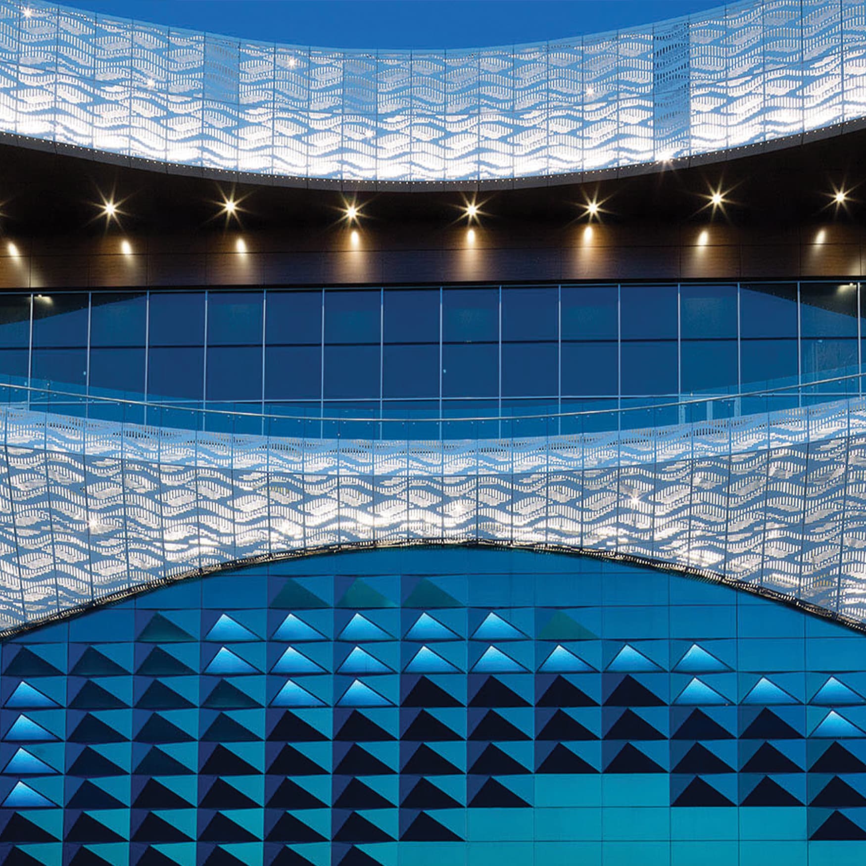
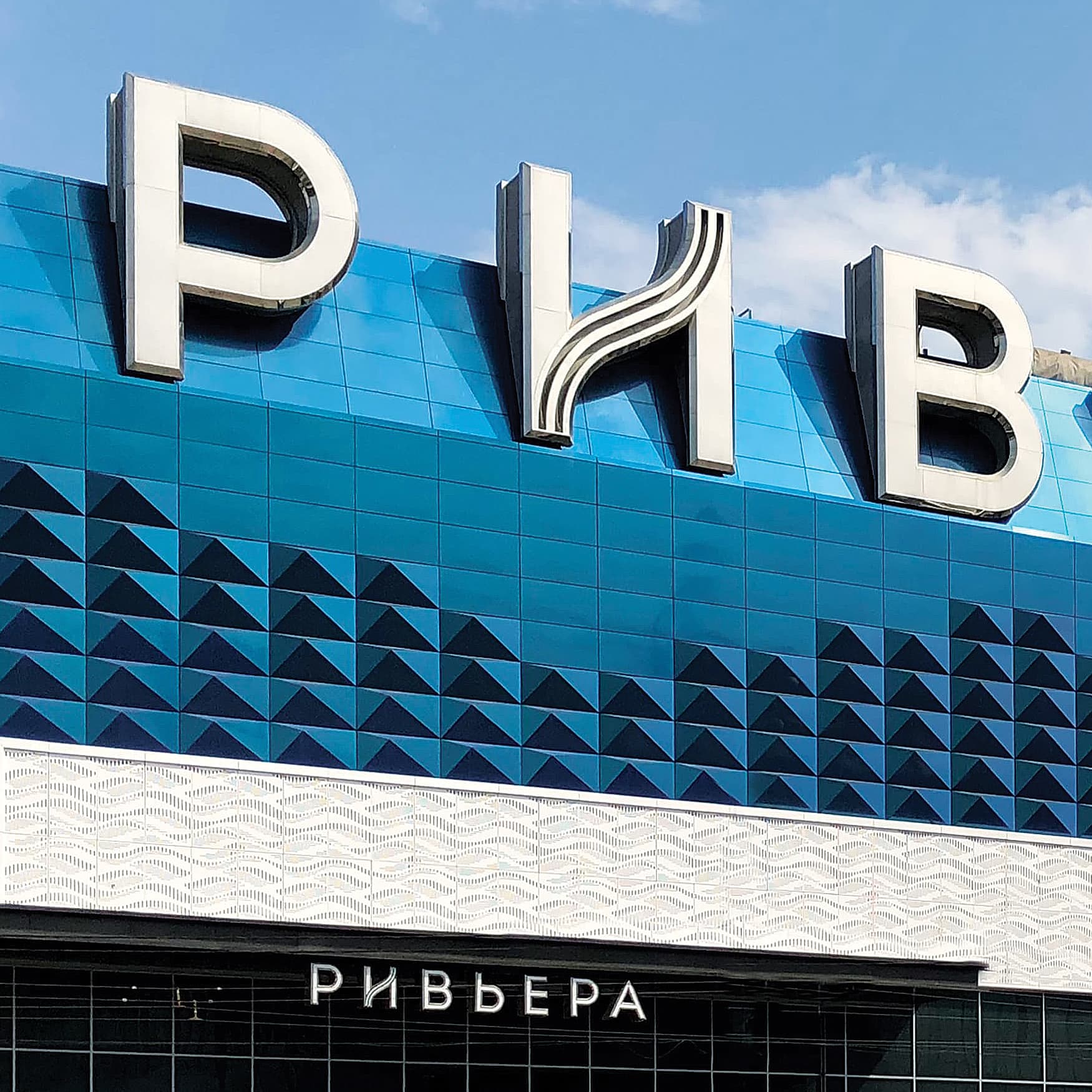
The Moscow Riviera is a two-million square foot mixed-use development that has become a high value destination within central Moscow. Working with the interior and exterior signage graphics, the RSM Design team echoed the bold elegance of the people, nature, and surrounding area.
This development is an ideal example of how architectural graphics as pattern becomes an integral part of the architectural expression. In our first article in this series, we revealed how pattern is not just ornamentation, but is a traditional technique of experiential design. At Moscow Riviera, you’ll notice the same elements being used in the architectural graphics to create a similar synergy, but it’s completely modern and a reflection of this progressive community and location.
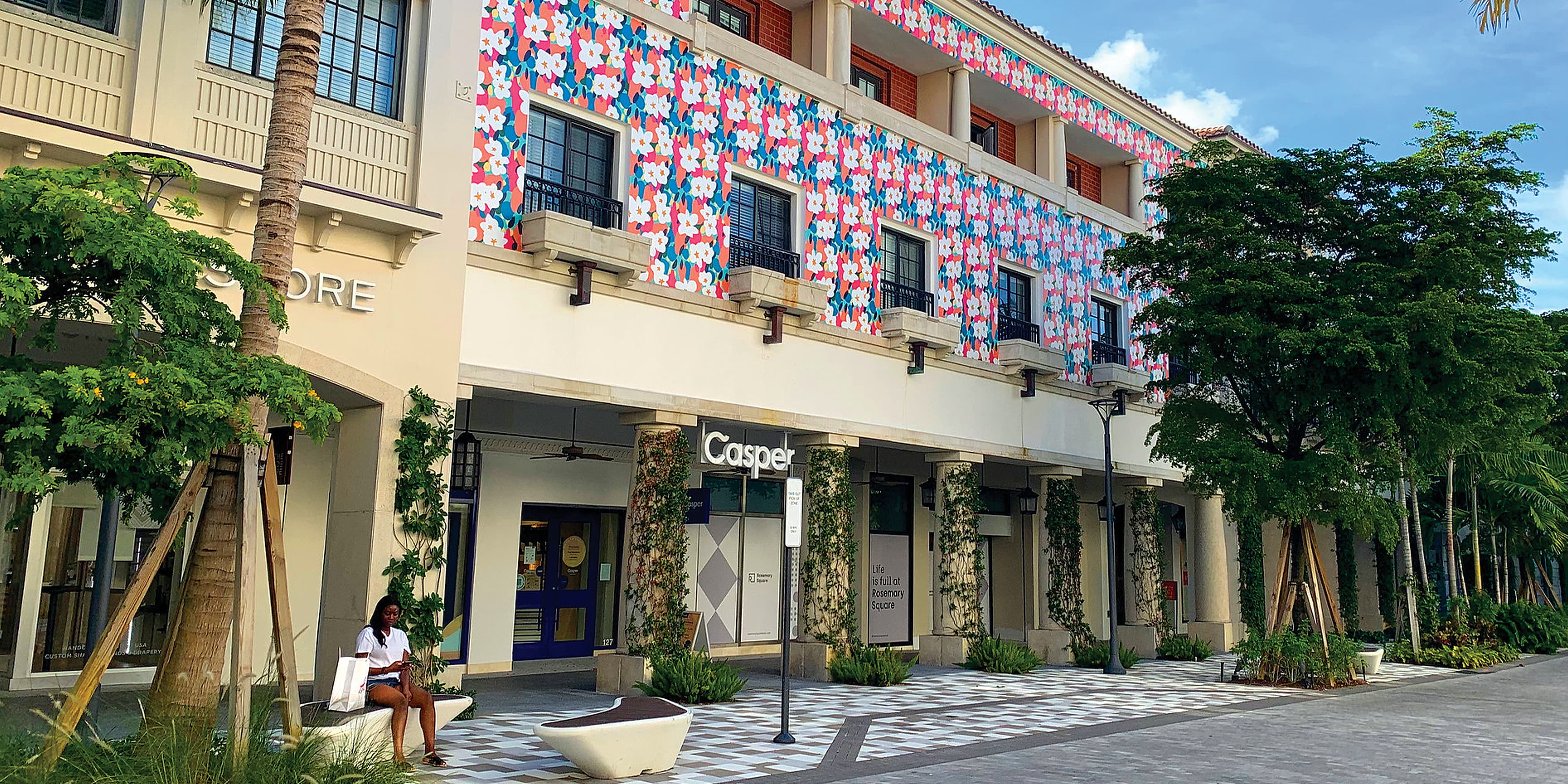
When you look at Rosemary Square in West Palm Beach, Florida, you’ll see a diverse area of experiential retail and culinary offerings. You will also notice the robust arts and cultural programs, making this a truly exceptional new district to live, work, and visit in south Florida.
Through the use of architectural façade graphics, the buildings were enhanced to be more engaging and reflective of the vibrant local arts culture. What adds to the soul of this place are the layered patterns and cultural references that provide contextual vibrancy to the guest experience. These economically produced and impactful façade patterns and mural installations transformed the district into a new dynamic environment.
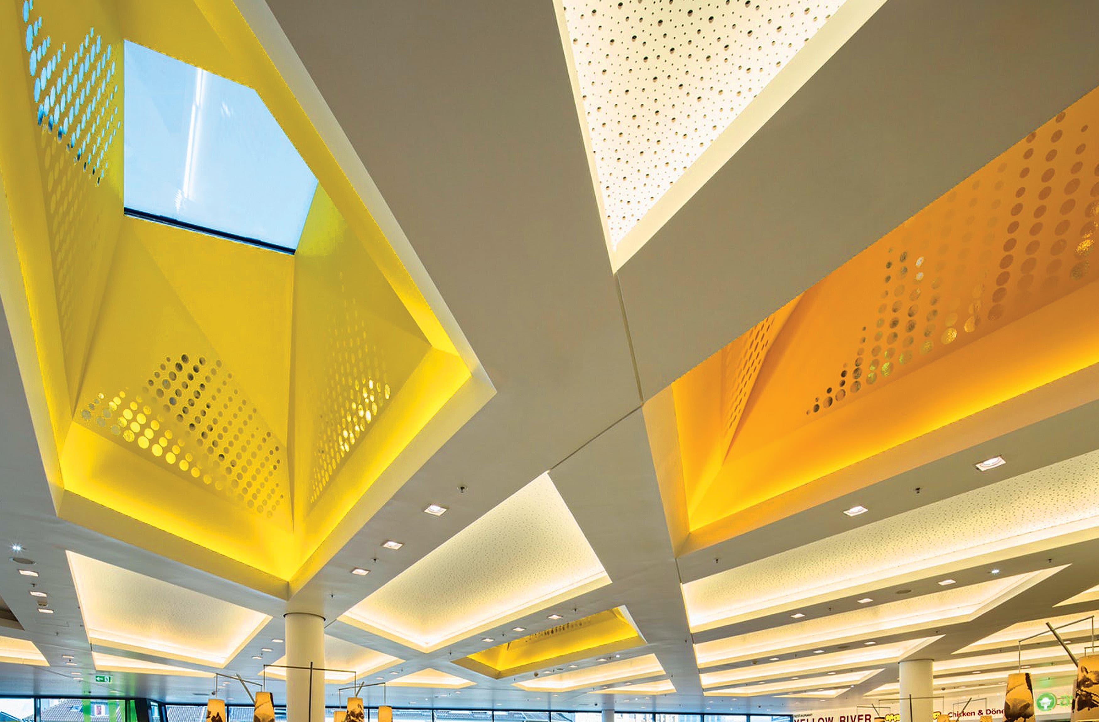
The city of Solingen, Germany, is known for its knife and cutlery production—it’s even called the City of Blades.
The Hofgarten Center celebrates Solingen’s knife and cutlery production, among other unique elements that reflect the region by inspiring the origins of the graphic language. The graphics also weave comfortably with the modern architecture, utilizing themes of nature, industry, and fashion, to blur the lines between what is architecture and what is graphic enhancement. The relationship between the graphics and architectural patterns makes the façade, for example, feel bold and impactful. Additionally, throughout the building, visitors encounter playful surprises that make walls look like they disappear, skylights with interesting dynamic and ever-changing light features, and bold unexpected patterning in the parking areas.
From the front door to the parking lot, Hofgarten Center uses architectural graphics as wayfinding tools to turn a building into a surprisingly strong representation of the community.
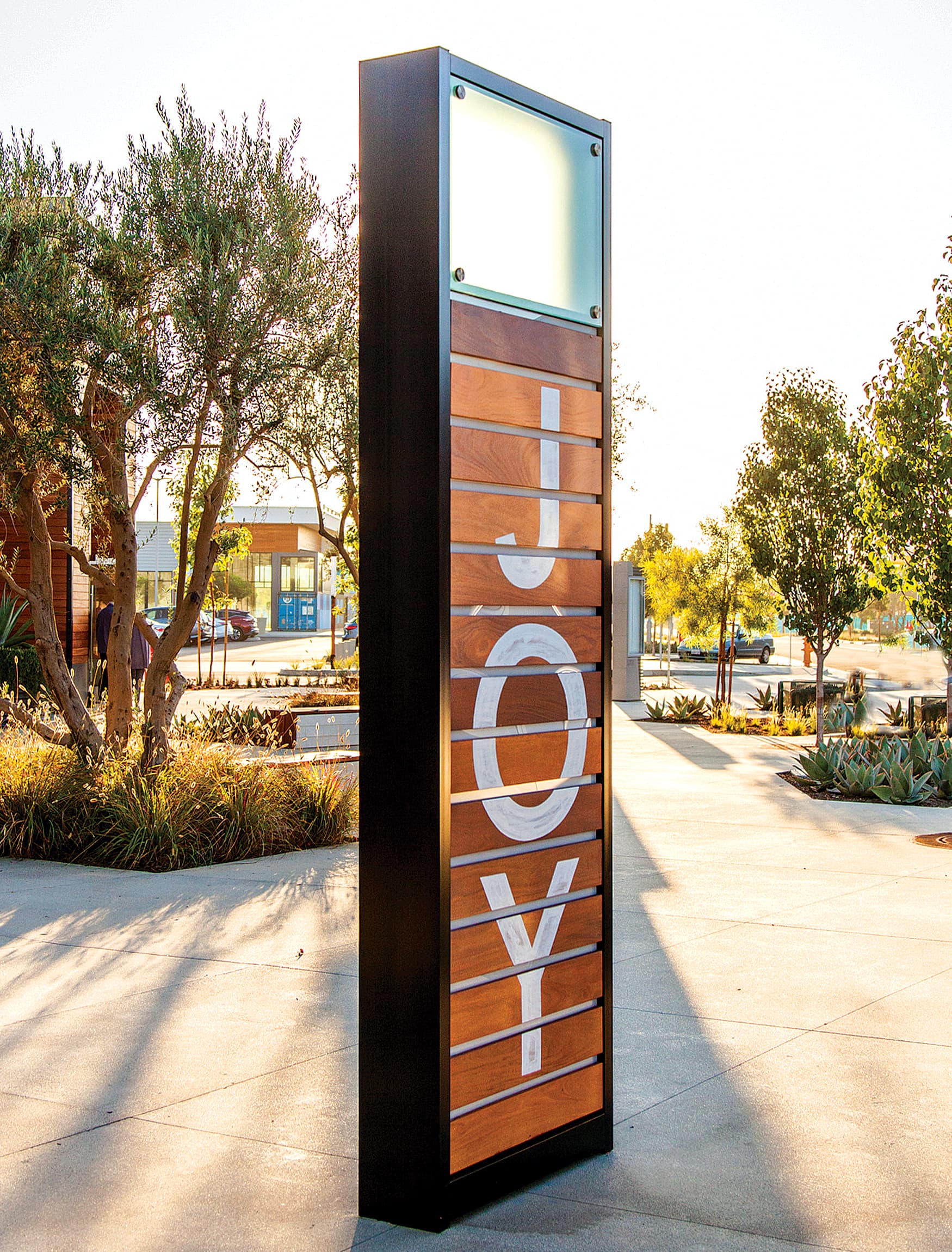
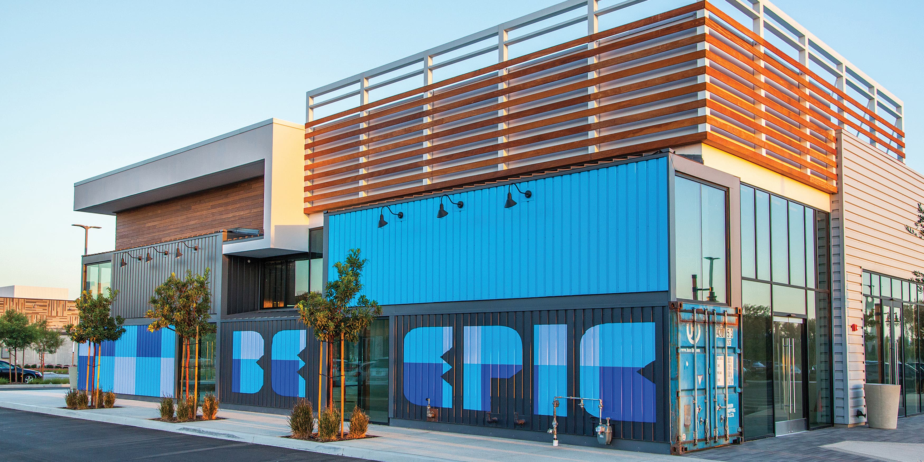
Long Beach Exchange is all about the engaging the guest with specialty graphics.
The custom graphics help to create many different expressions of the site’s origins and culture. It complements the architecture in a positive way, making a statement about the community: It’s okay to be original and stand out here. Inspired by the local culture and laid back vibes of the community, the architectural graphics have turned into Insta-worthy moments of surprise and whimsy.
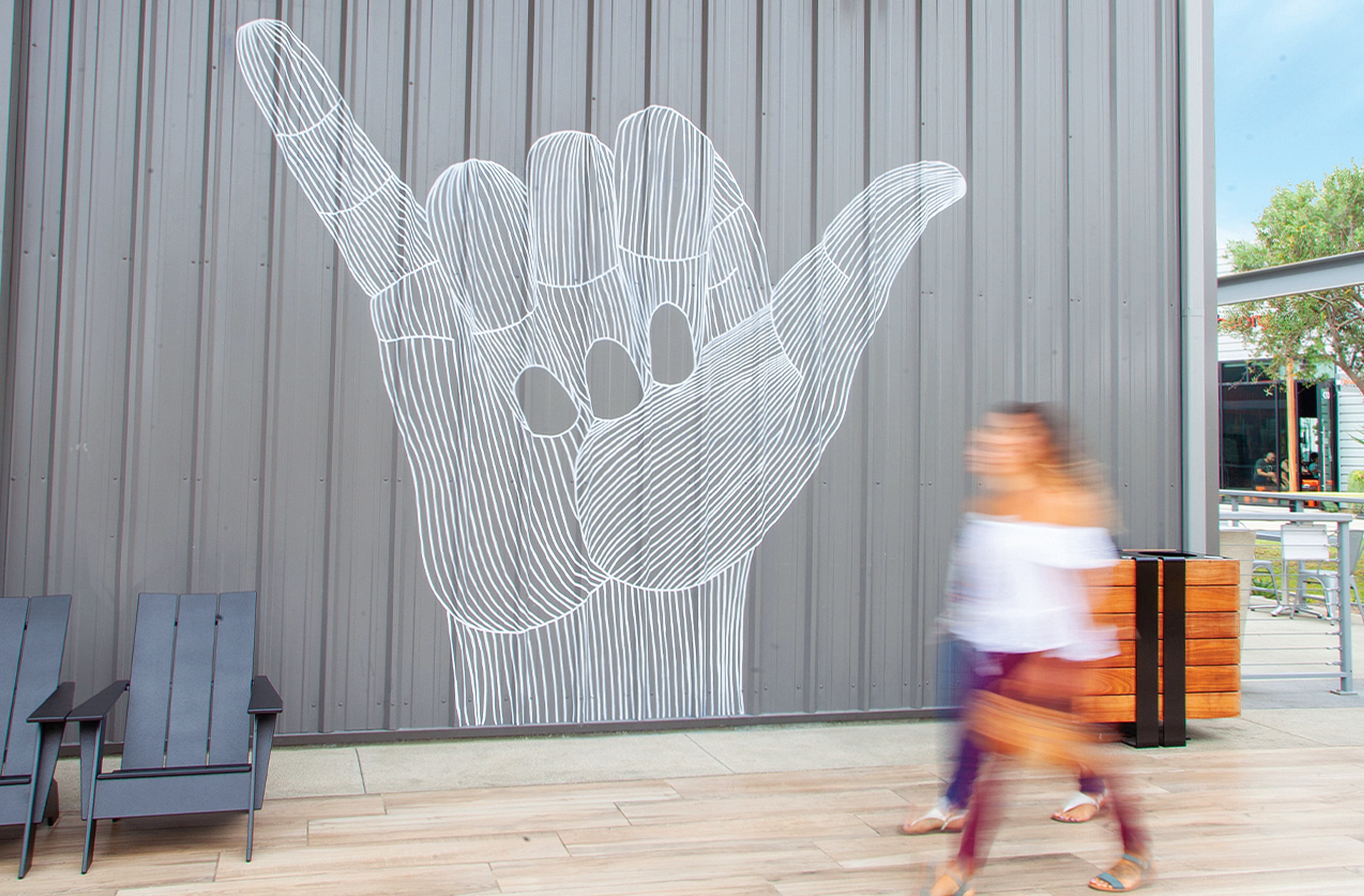
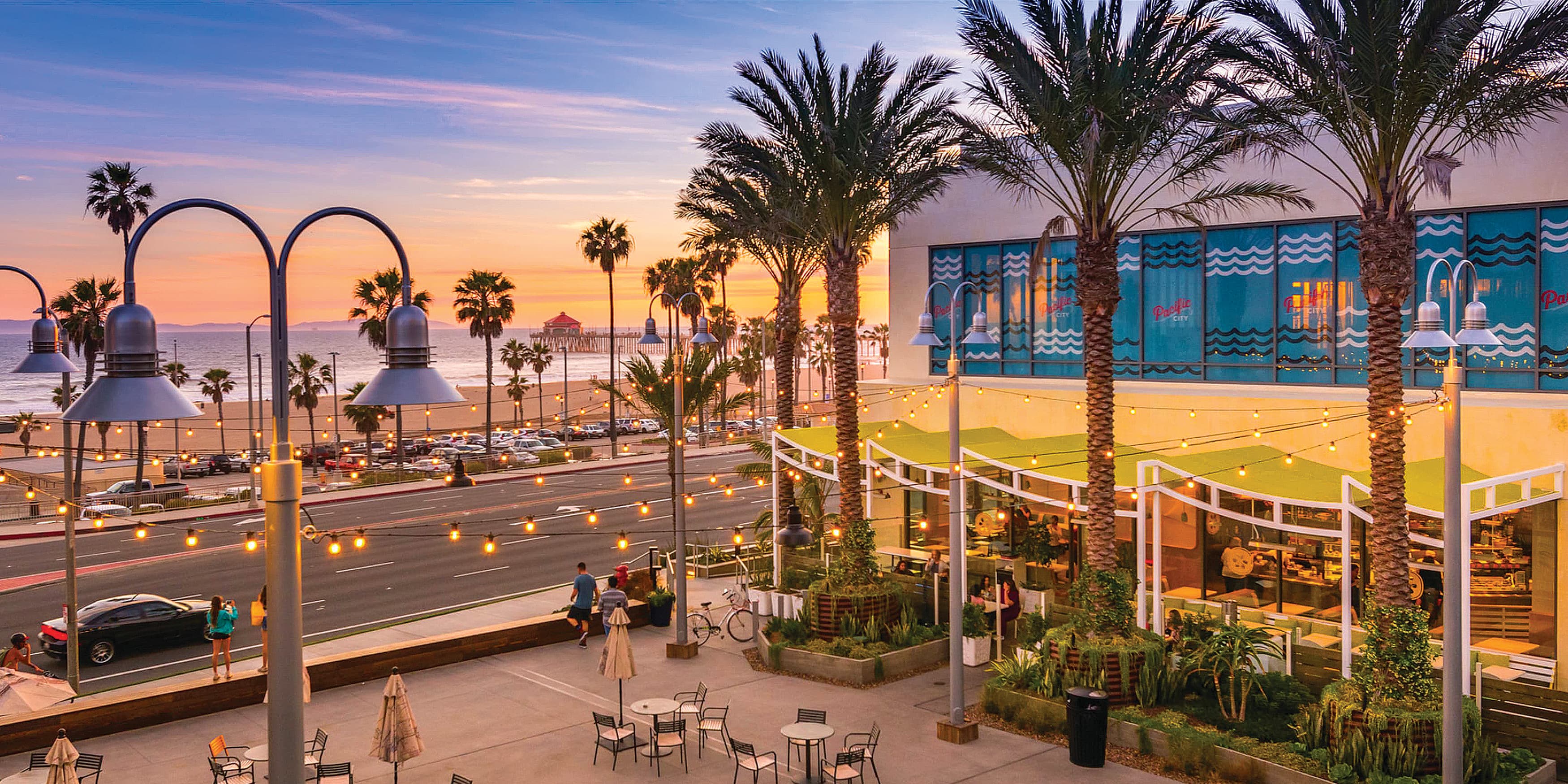
Did you know that Pacific City was the original name of what is now Huntington Beach, CA? That’s what makes it such a perfect name for this city’s shopping and dining epicenter. And the Pacific City narrative is inspired by and overtly reflects the culture of the community—Surf City, USA.
When the project was being built, the property installed temporary barricade graphics to give visitors something engaging to look at while the stores prepared to open. These murals reflected the local surf culture and history, and they quickly became popular with the community. However, when the stores were ready to open, the murals came down. And the community questioned what had happened. Visitors had identified with the artwork so strongly that they asked the developer to bring them back. Shortly after, the murals became permanent installations.
What was intended to be a temporary expression of Huntington Beach’s culture was embraced and permanently adopted by the community. The murals used graphics in architecture to communicate the area’s history and spirit. What seemed like a temporary fix turned out to be something completely beloved.
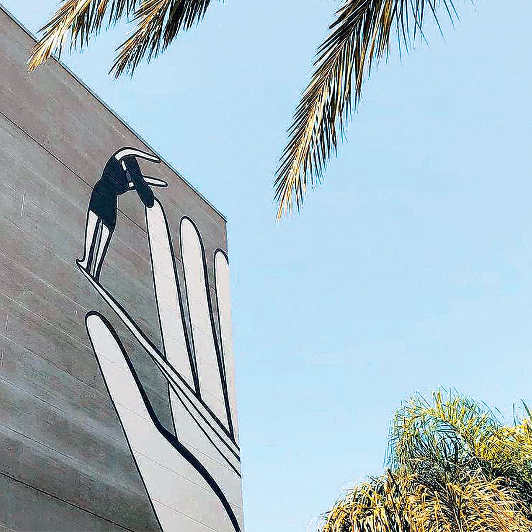
Given how today’s graphics in architecture and wayfinding design trend toward community-focused context, culture, and emotion, what does that tell us about where things are going? Can we accurately predict the future of architectural graphics and wayfinding?
No, but it sure is fun to speculate.
It all comes down to the individual. Many people seem to be attached to their smartphones—it’s how they navigate. Will “traditional” forms of wayfinding be as critical in the future with our reliance on the digital expansion?
Digital components in signage are not new…they have been around for quite some time, so that’s not what we’re talking about. It’s more about how wayfinding and graphics will become greater user focused. We will be exploring how wayfinding will become more intuitive and less reliant on traditional signage methods, instead turning to virtual engagement of the space.
We’re seeing how signage technology is shifting. For example, we're using technology that produces LED glass or digital nodes to transform any surface...into a sign, an image, a pattern, another façade. We're seeing digital graphic façades that generate their own power or other sustainable initiatives, becoming more multi-functional and more inherent with the architectural expression.
Will all of this outdo traditional models of wayfinding? Most likely not. Instead, it will enhance them. As buildings become digitally smarter, they will inherently evolve to do more, but we will always use the graphic layer of buildings to convey culture, community, and context.
Right now, culturally, it feels like we’re in a similar spot when compared to the country after the 1918 flu pandemic, which ushered in the roaring 20s. With the anticipation of a reopening and return to normalcy, people are looking for comfort and confidence, while also craving new experiences. How will this change the impact of environmental graphics and experience design?
It starts by blending smart technology with wayfinding in a way that helps people feel comfortable about getting back and learning how to experience travel, dining out, and being with the community again. We’ll get back to digging into the future of graphics in architecture in the third installment of this series. For more information, check out our companion book, Graphic Connections in Architecture, to this article series.
Graphic Connections in Architecture by RSM Design ›