May 11, 2021
On the Origins of Architectural Graphics
May 11, 2021
But when exactly was it that we started using words, symbols, and patterns to create an environment? The short answer: from the start.
Graphics have always been an inherent part of architecture, making the language of patterns, words, signage, and narratives as much of a part of the community as the buildings themselves. Almost every documented culture used words, symbols, or patterns in their environments—and we’re still doing it today, taking old techniques to new levels.
Taking a look back, as we create environments for the future, is fascinating and inspiring, which is why we are publishing a series of articles that take an in-depth look at the relationship of graphics and architecture. First, we’re starting with the origins, exploring how typography, patterns, and culture have helped create the architectural identity of buildings for centuries.
For centuries, architecture and graphic design have coexisted in the built environment, although each discipline has its own unique language. If you combine and meld them, they create a whole new vocabulary that can give a building its unique identity.
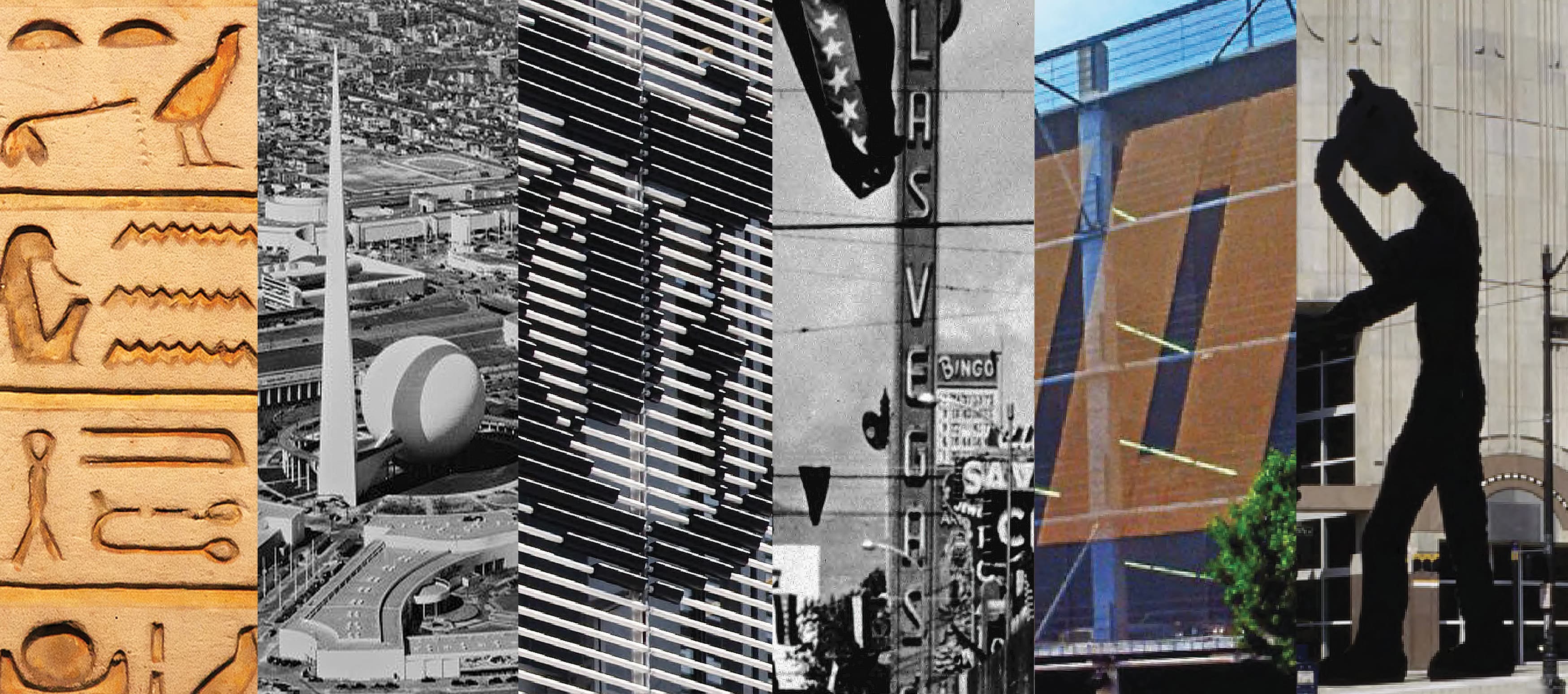
Let’s go all the way back to hieroglyphics in ancient Egypt. Hieroglyphics used graphic, syllabic, and alphabetic elements to create characters and tell stories. However, these did not just act as storytelling—they also gave structures cultural identities that are still being studied today.
While the centuries, uses, and structures have changed, we’re still seeing the same relationship between graphics and architecture. Classical inscriptions, figurative murals, and ornamental surfaces have all evolved over time to reflect the social and cultural climate of each changing era, becoming part of our visual heritage.
Over the decades, these depictions evolved to reflect the social and cultural climate of each changing era, becoming part of our visual heritage. You can take a walk through any city and see graphic elements in architecture almost everywhere. Think of a city hall, or maybe your town’s library. While your city hall may not have the intricate carvings like the ones seen on the Arch of Titus in Rome, it may have similar carved inscriptions letting you know that it is a city hall.
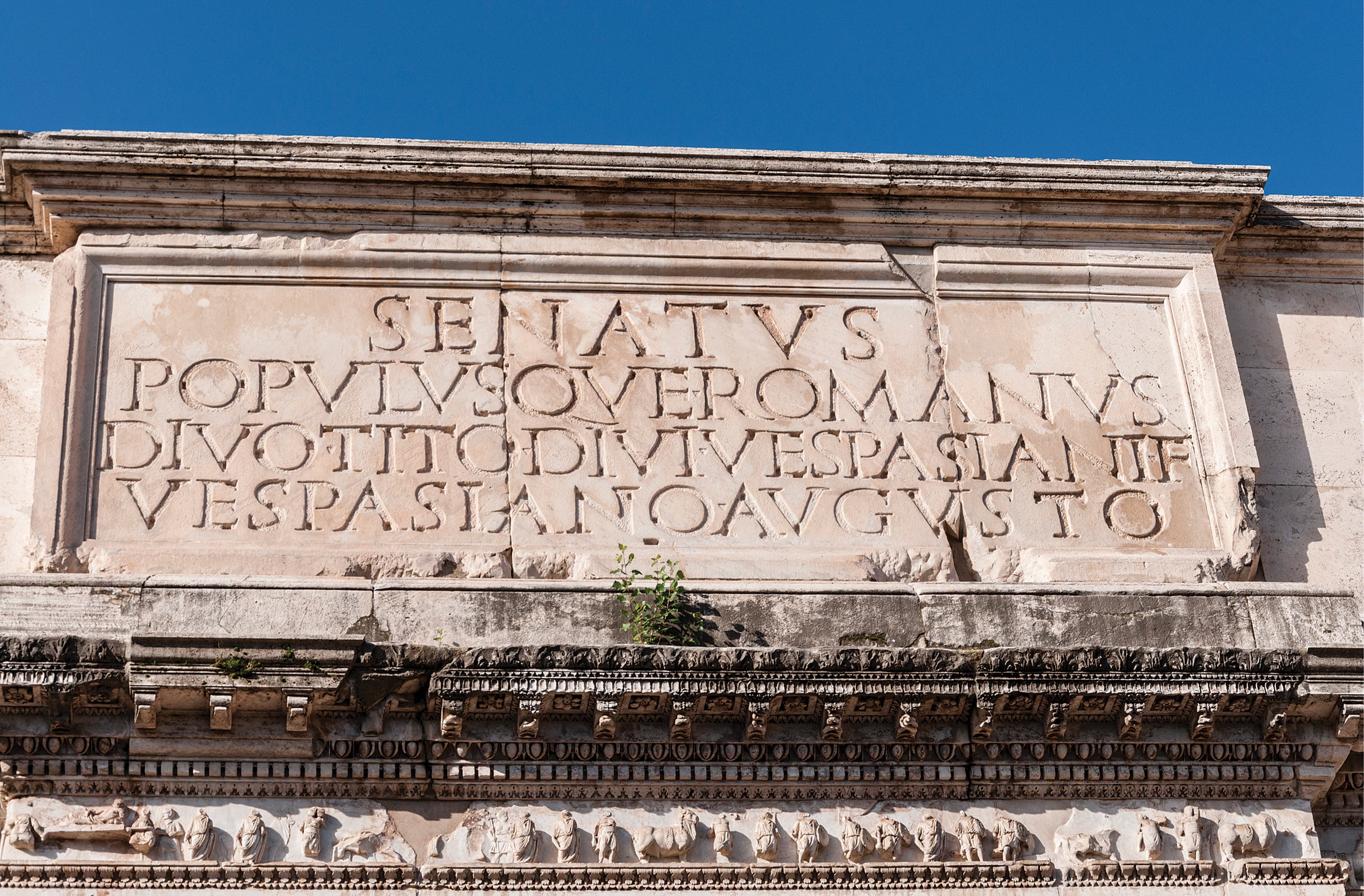
The Arch of Titus itself is an example of graphics evolving to reflect changing times. It was restored in 1821, and the restorations included new carvings to reflect the current religious landscape, which were made in travertine limestone to differentiate between the old and the new.
Through all of the world’s political, religious, and industrial revolutions, the use of architectural graphics hasn’t just continued—it has flourished and grown into a critical component of how society engages with architecture. Today, we are still using graphics in architecture to convey language and meaning through both two- and three-dimensional design. Architectural graphics woven into the environment solidify narratives, culture, and history, and build a sense of community.
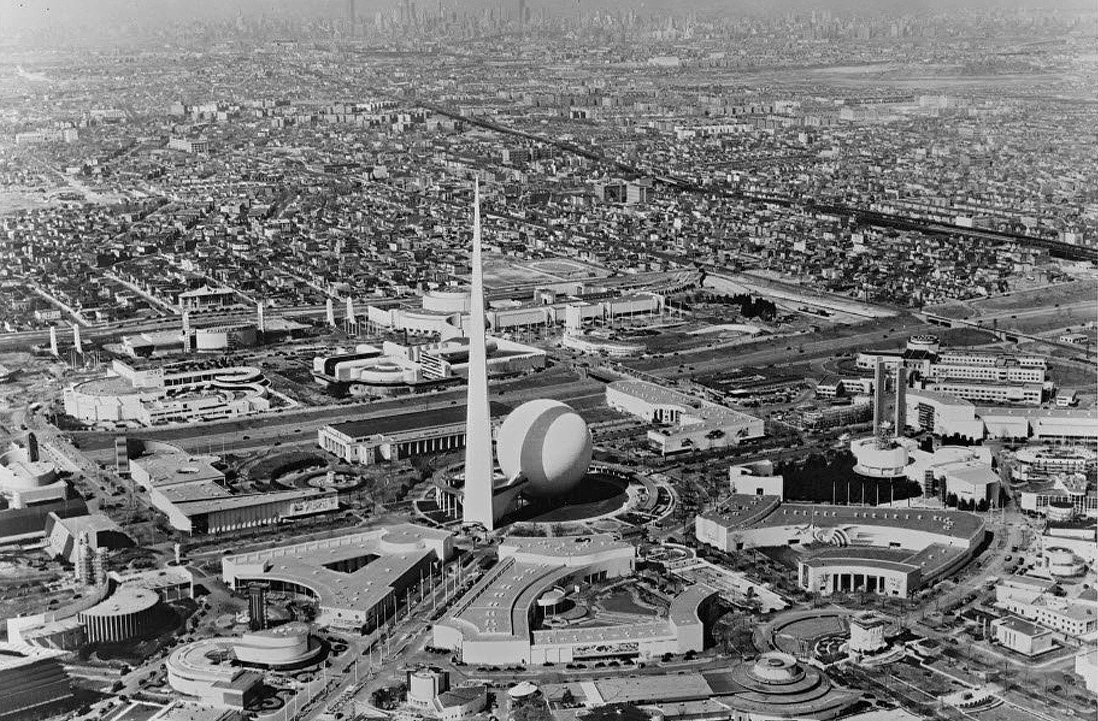
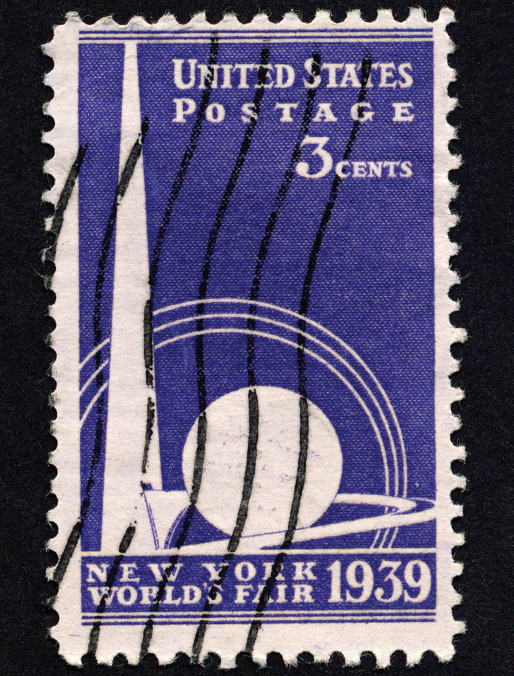
The combination of graphics and architecture is what most inspired environmental graphic design pioneer Deborah Sussman. Sussman vividly recalls her memory of the 1939 New York World’s Fair installation:
“The famous ‘Trylon and Perisphere’ of the 1939 New York World’s Fair became another lasting icon for me. In this case, it was the form and its whiteness, its newness, its bigness, and its simplicity that lives in memory. It wasn’t architecture; it wasn’t really sculpture, and certainly not graphic design. So what was it? It did not fit into a category neatly. Could it have been ‘environmental graphic design’?”
– Deborah Sussman
Sussman helped to define what structures did not fit into a category, but still made a powerful impression. Now, the famous Trylon and Perisphere lives on in memory as the origin of modern environmental graphic design.
The graphic design of typography, imagery, symbology, and art can tell cultural and visual stories, and oftentimes echo an architectural and cultural message.
The human desire to “dedicate” places is clearly the reason graphics were integrated into the built environment. Inscriptions, figurative murals, and ornamental surfaces have long been a part of architecture. These elements and concepts transformed over time, reflecting the social, political, and cultural climate of each period and becoming part of our rich visual and cultural heritage.
The typography we see today, along with layered two-dimensional patterns, have been used to define a structure’s identity for centuries.
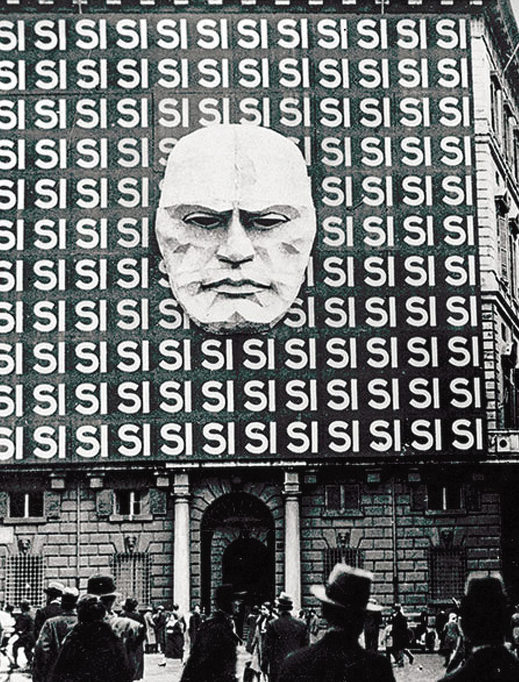
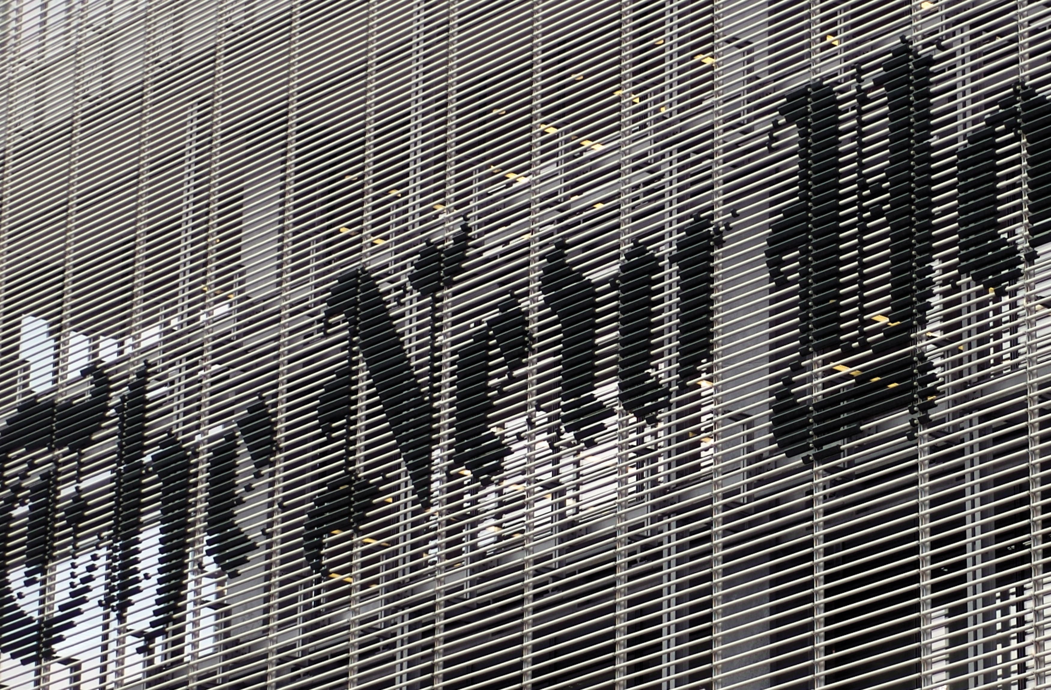
Typography is a particularly powerful tool. Compare The New York Times building in New York, the Arch of Titus in Rome, and Mussolini’s Palazzo Braschi in Rome. While the three structures bear little resemblance to each other culturally, politically, or geographically, they all use typography to tell their identity story.
The Arch of Titus is a religious honorific arch, whereas Palazzo Braschi was once the headquarters for Italy’s fascist party. Then you have The New York Times building, which tells you not only that it’s a prominent publication, but also that it is part of the very fabric of New York City.
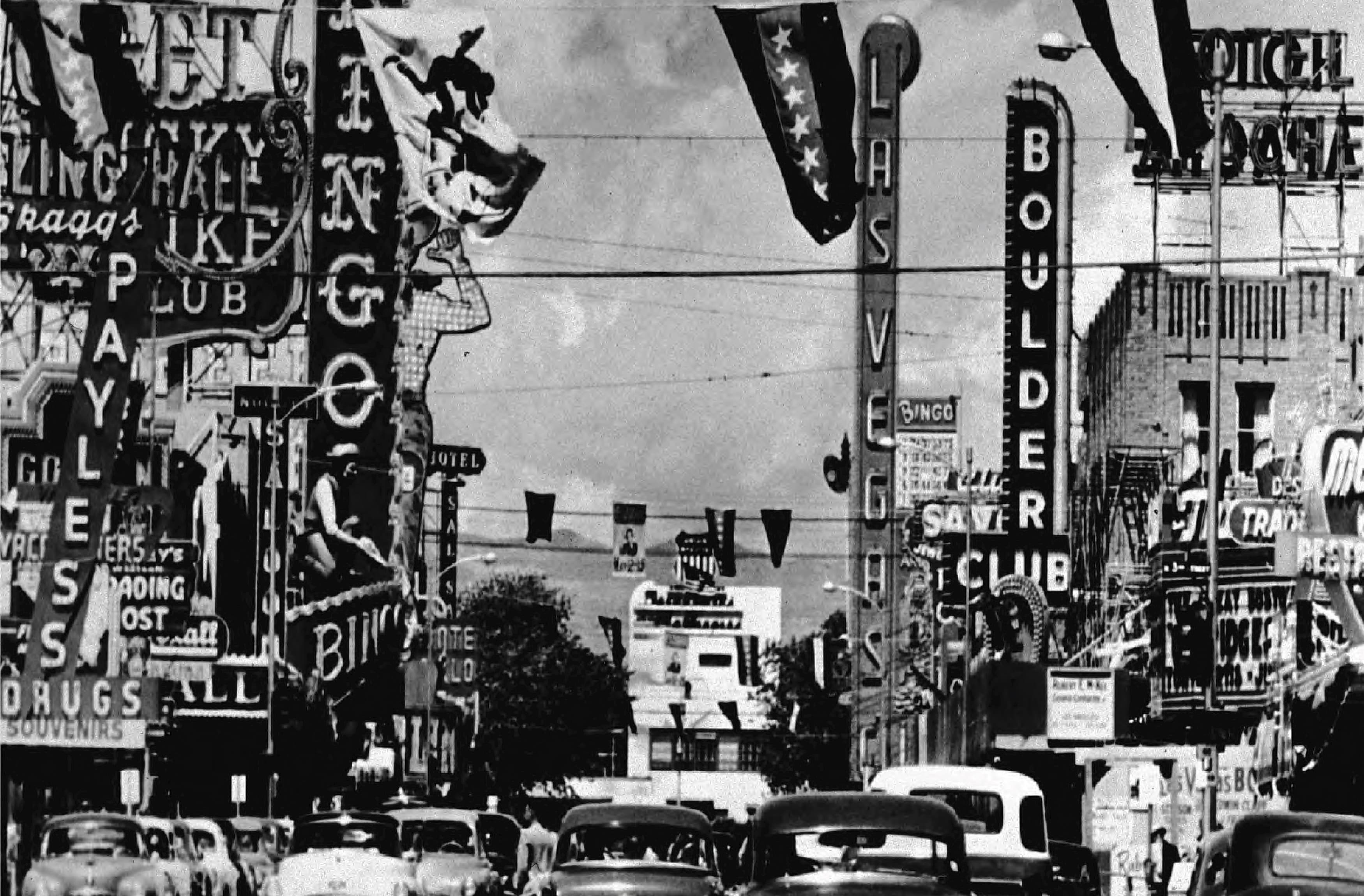
Las Vegas in the 1940s is a great example of how wayfinding and signage are design elements that can turn buildings into landmarks. Sure, the bright lights and typography gave you information and told you where to go—but they also helped to give Las Vegas its cultural identity.
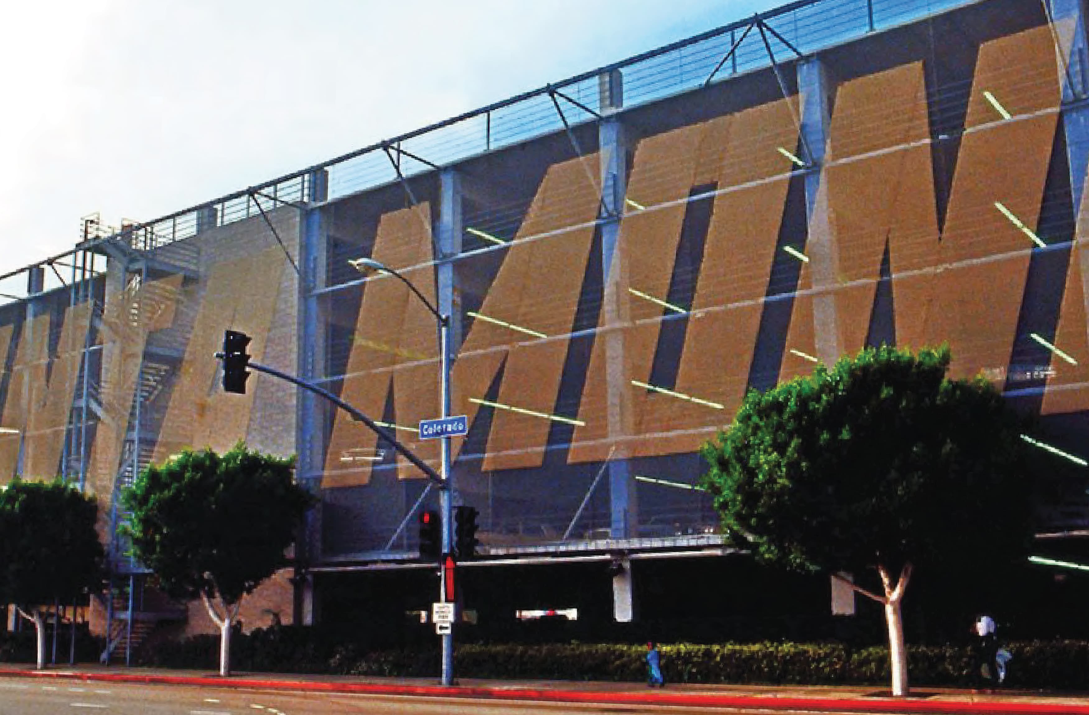
Architects of the 1980s embraced using typography to solidify architecture brand identity. Take Frank Gehry’s Santa Monica Place in Los Angeles, for example. He used gigantic typography layered with chainlink to turn something that could have been ordinary into an iconic image that has been woven into the pop culture history of Los Angeles.
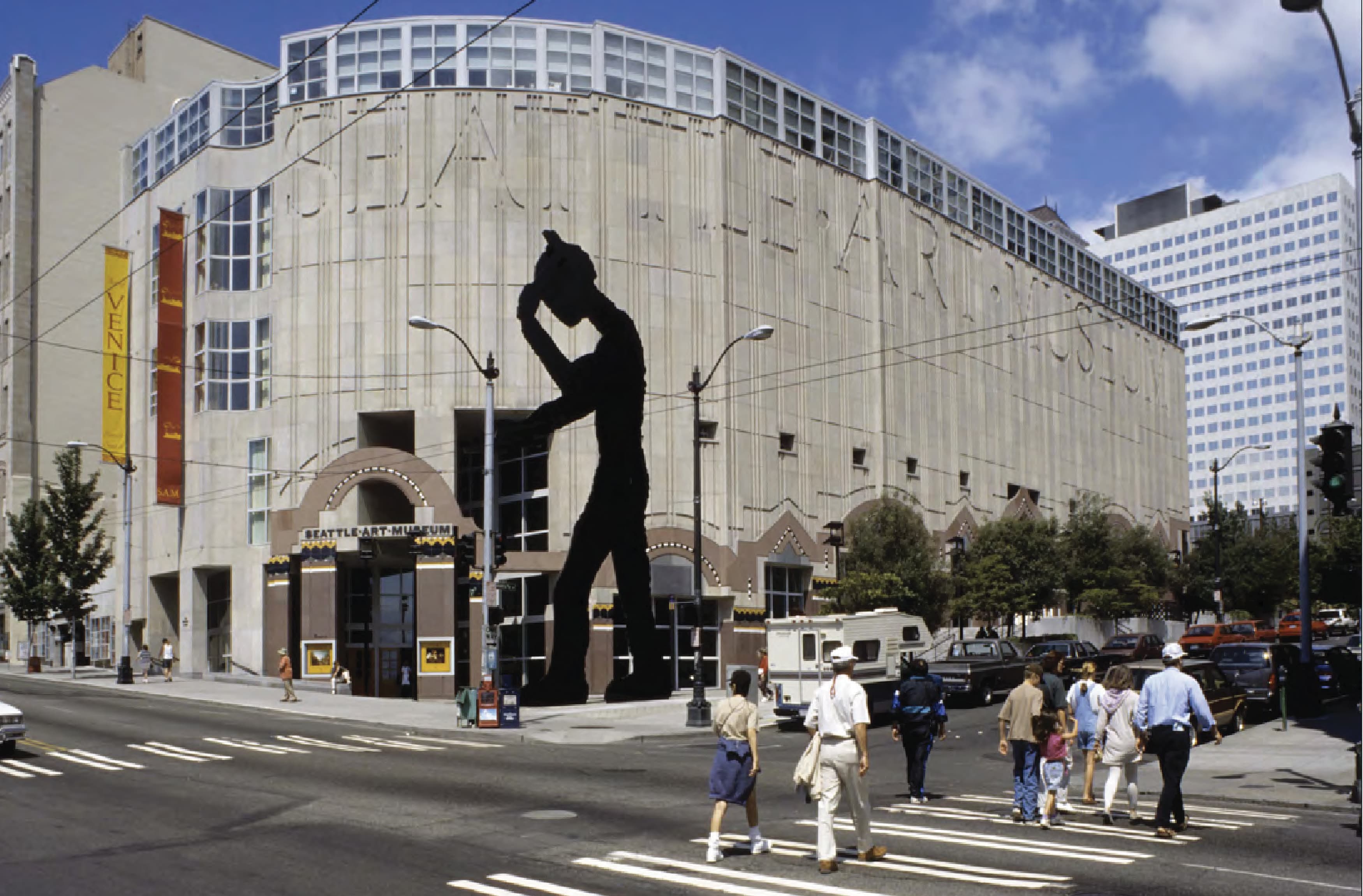
Go a little farther up north to Washington, and you can see another excellent example of typography in architecture. The Seattle Art Museum, designed by Robert Venturi and Denise Scott Brown, uses typography in a way that seems so simple, but has such an impact. That “simple” typography has made the museum truly stand out in a city full of iconic buildings.
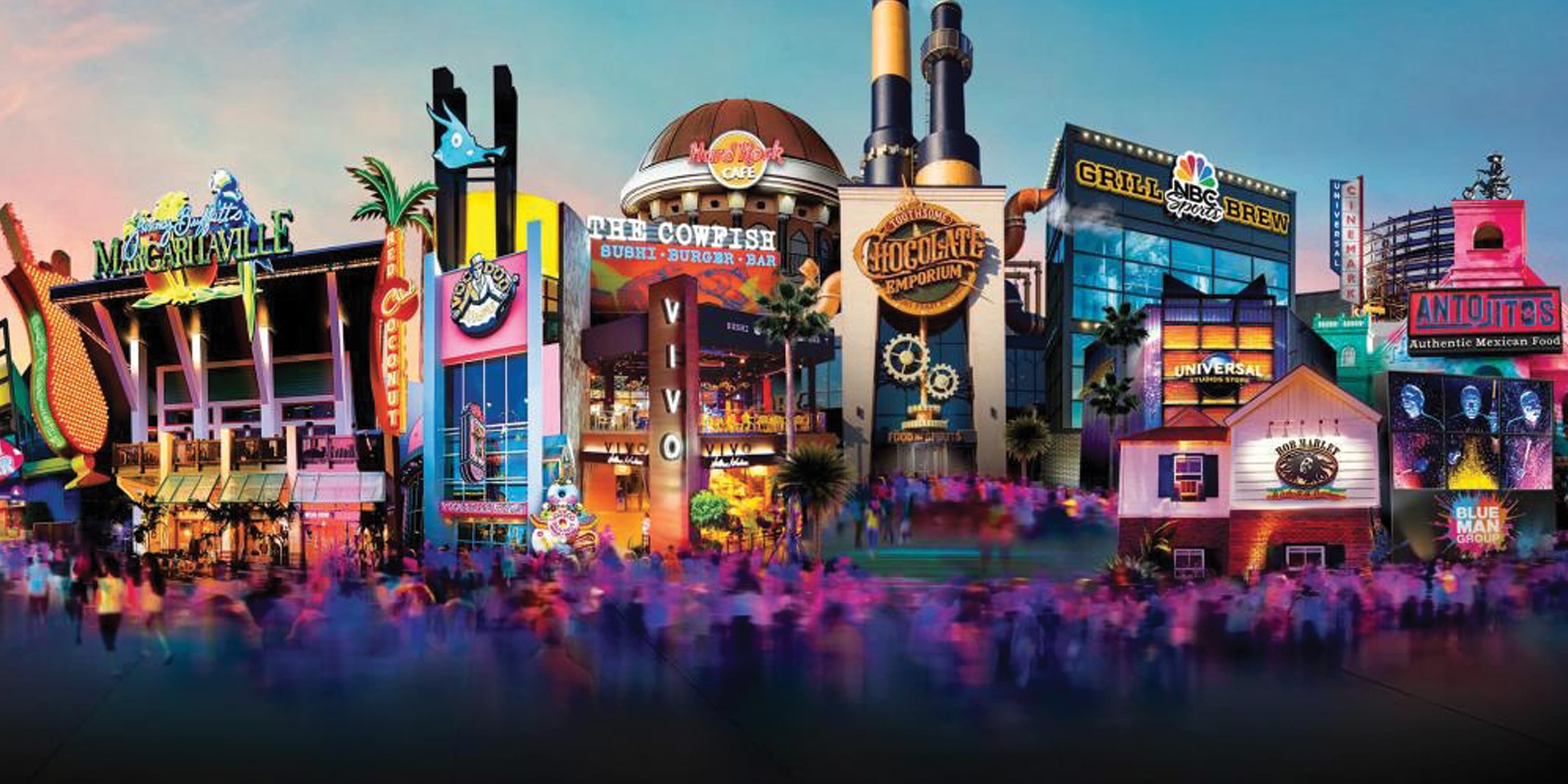
If you jump to the 1990s, Jon Jerde’s design for Universal CityWalk in Los Angeles also shows how signage isn’t just a simple addition to the architecture, or something that gets in the way of it—it is a crucial part of the design.
The engaging aspect about examples of architectural graphics is that they’re everywhere, in almost every city or town. Even now, we’re seeing some of the most exciting examples of architectural graphics yet—which is what we’ll talk about in our next blog post.
Graphic Connections in Architecture Book ›
And remember—don’t miss the next blog post in this series. Next time, we will be discussing architectural graphics in contemporary environments, and you know we’ll have a lot to say.
Many aspects of the built environment—including urban streetscapes, office buildings, museums, airports, public parks, mixed-use developments, and entertainment centers—have been transformed by the integration of graphic design and architecture.
Although the discipline of architectural graphics was only recognized relatively recently, it has long been known not only for its functional improvements, but also for its integral relationship to changes in architecture, cultural movements, and art. This combination of the disciplines can shape our overall perception and memory of place and ultimately enrich our experiences with the built environment.
The conversations surrounding graphics in architecture are important. Graphic typography and texture can enhance architectural design in so many ways, and even turn a building into an iconic destination.
RSM Design's new book, Graphic Connections in Architecture, takes a deeper look at the synergistic relationship between engaging graphics and today's architecture, starting with the origins and going all the way to the future.