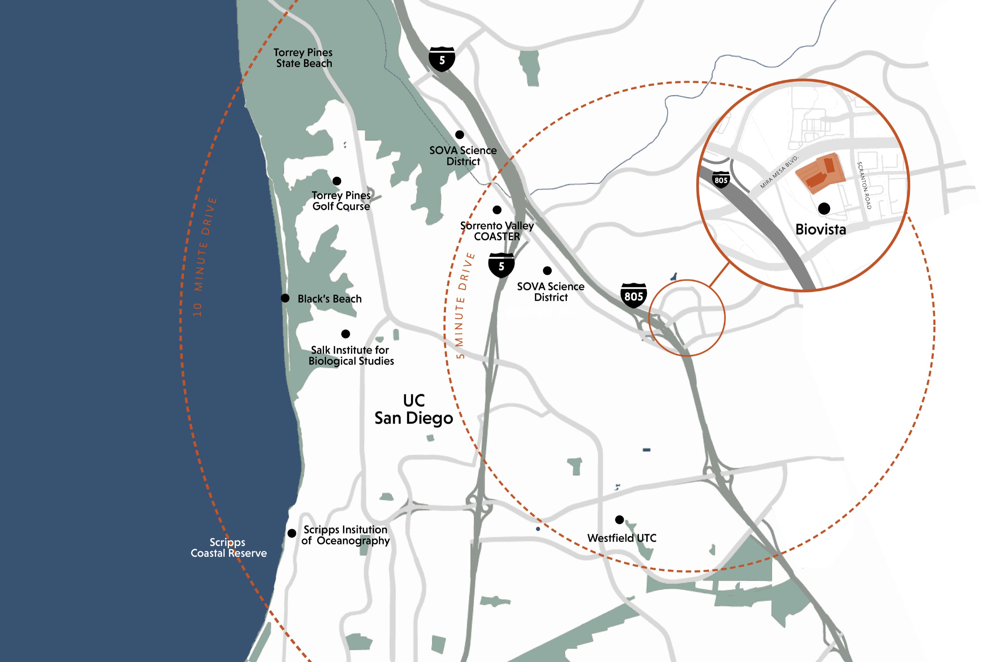
San Diego, California
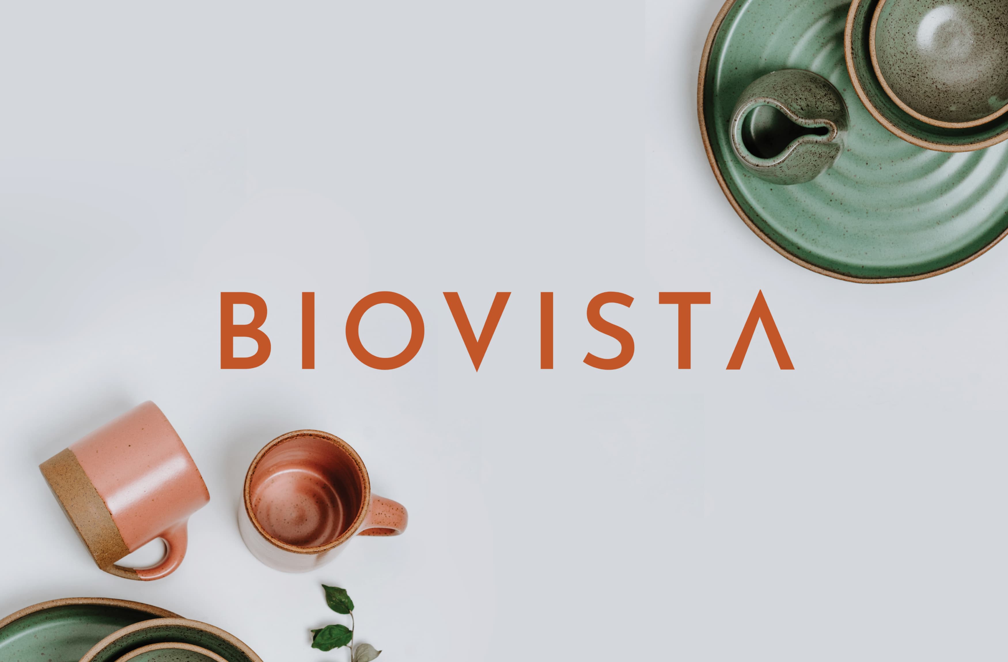
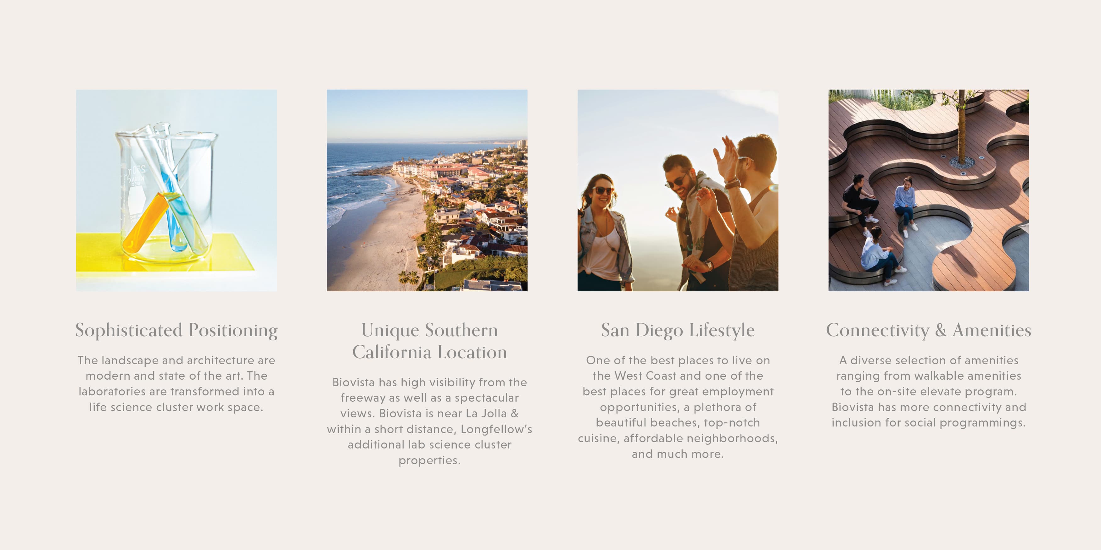
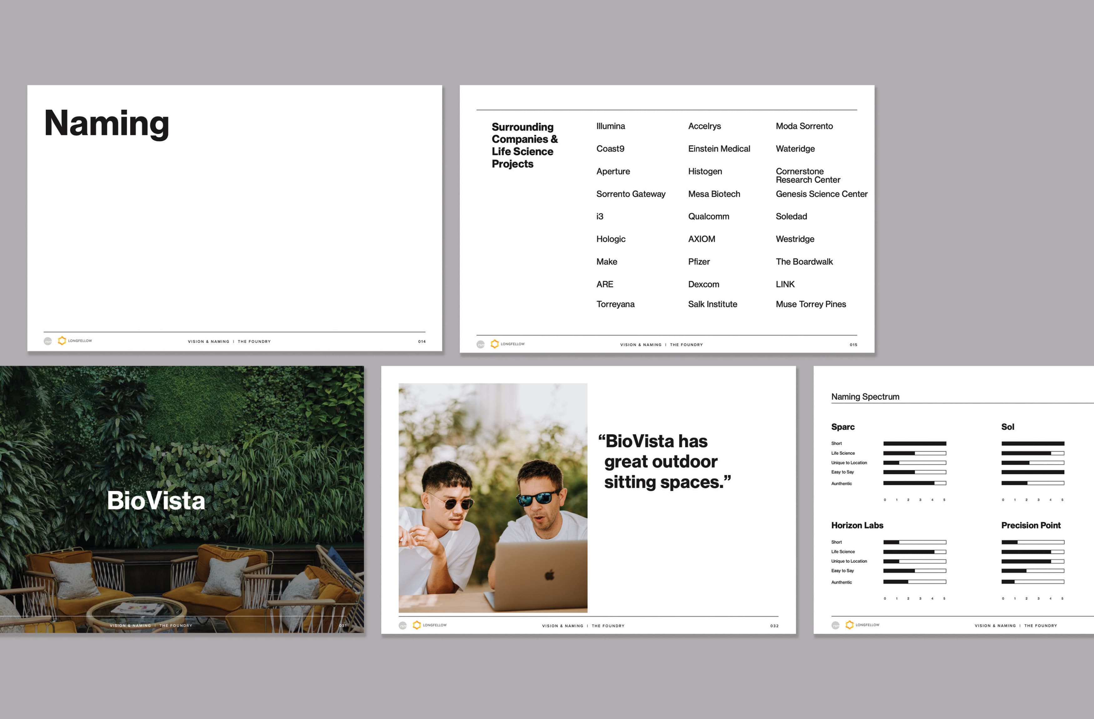
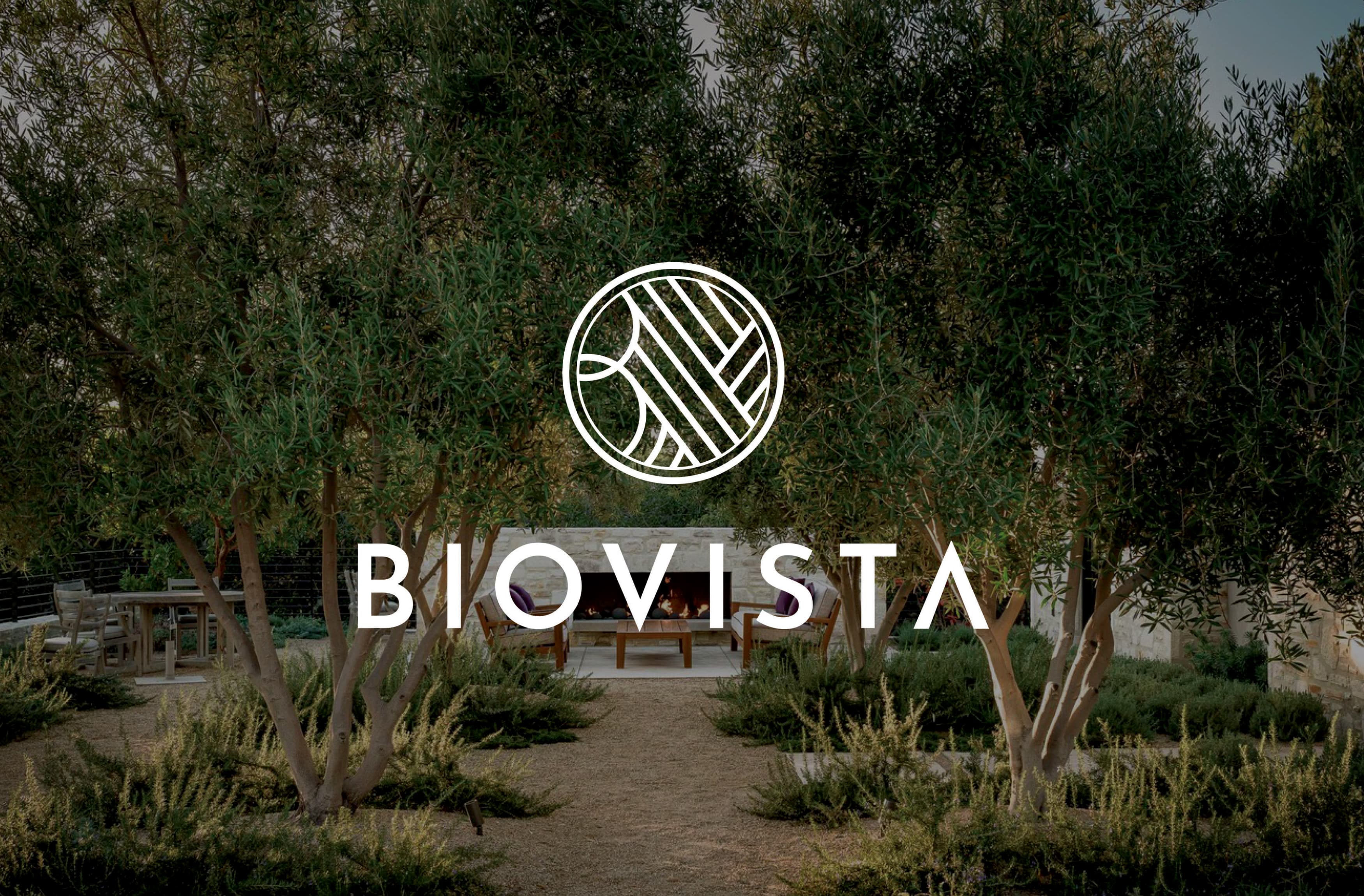
Biovista
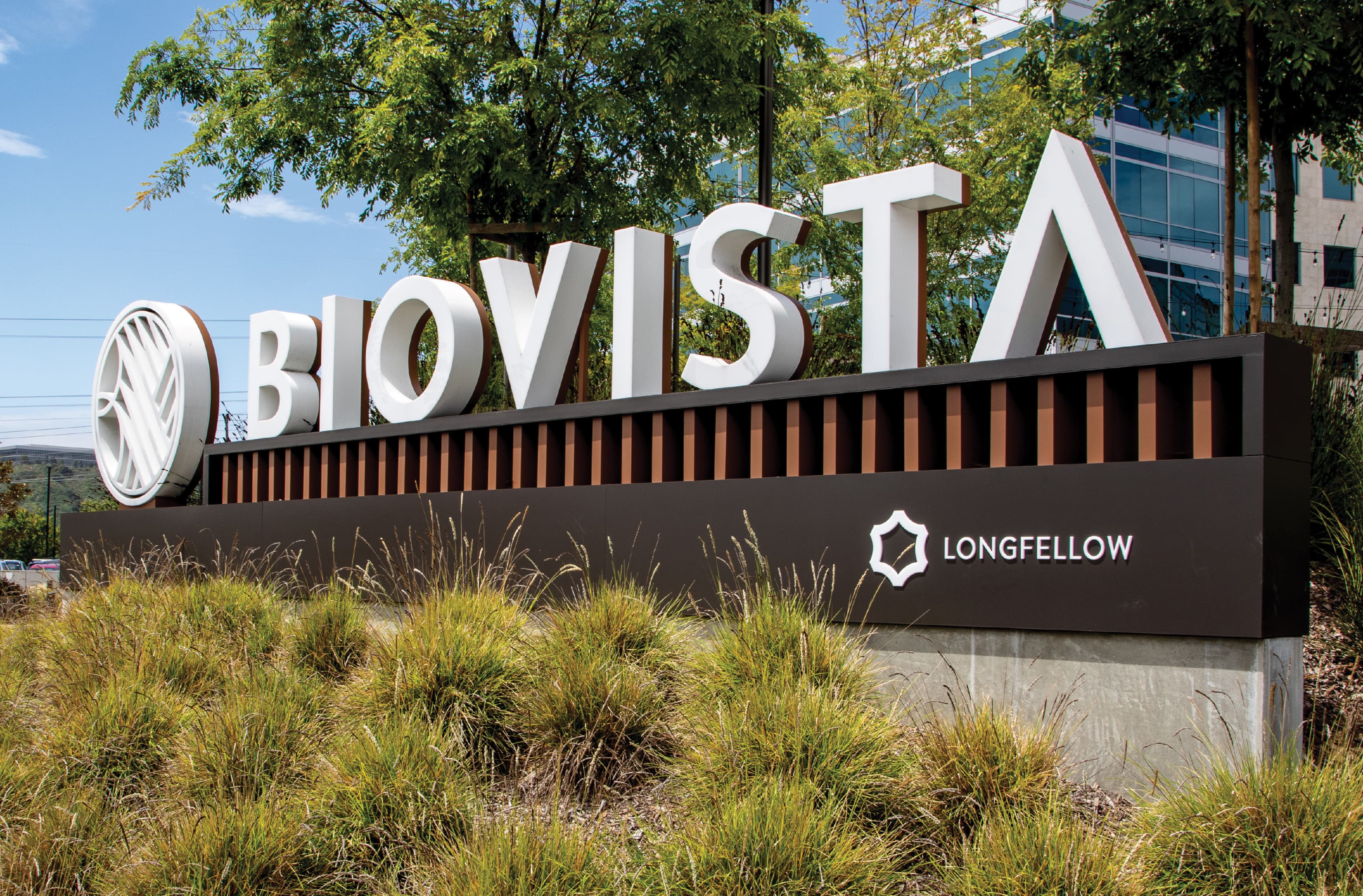
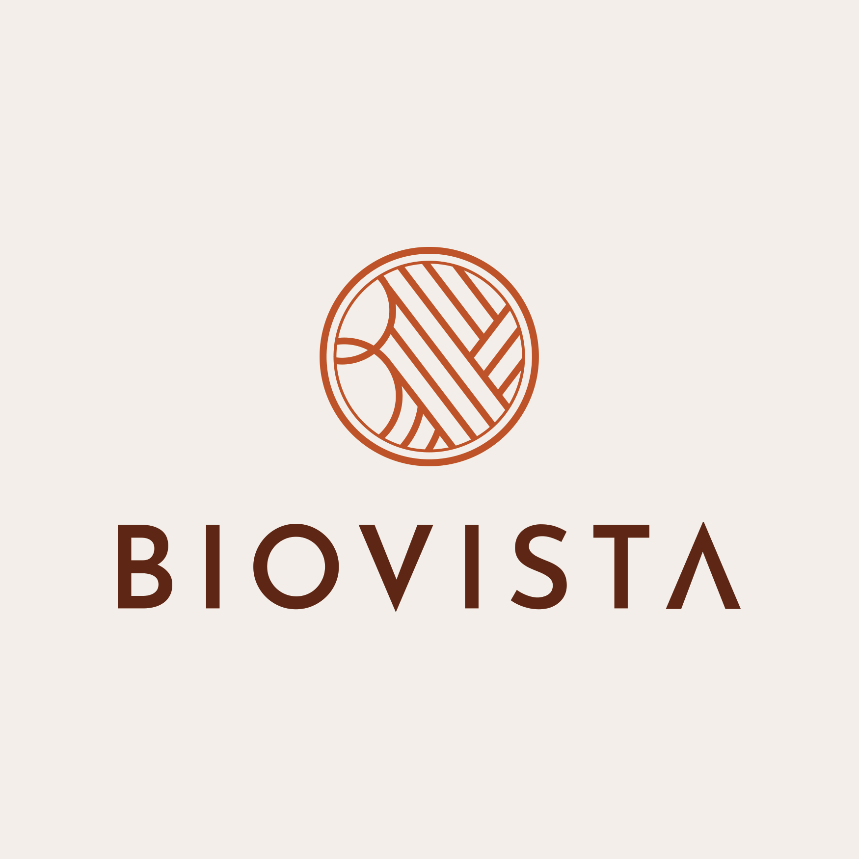
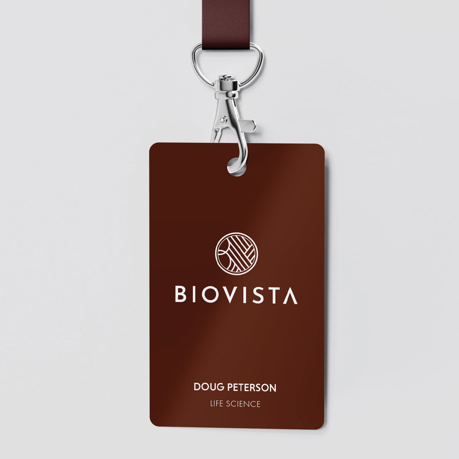
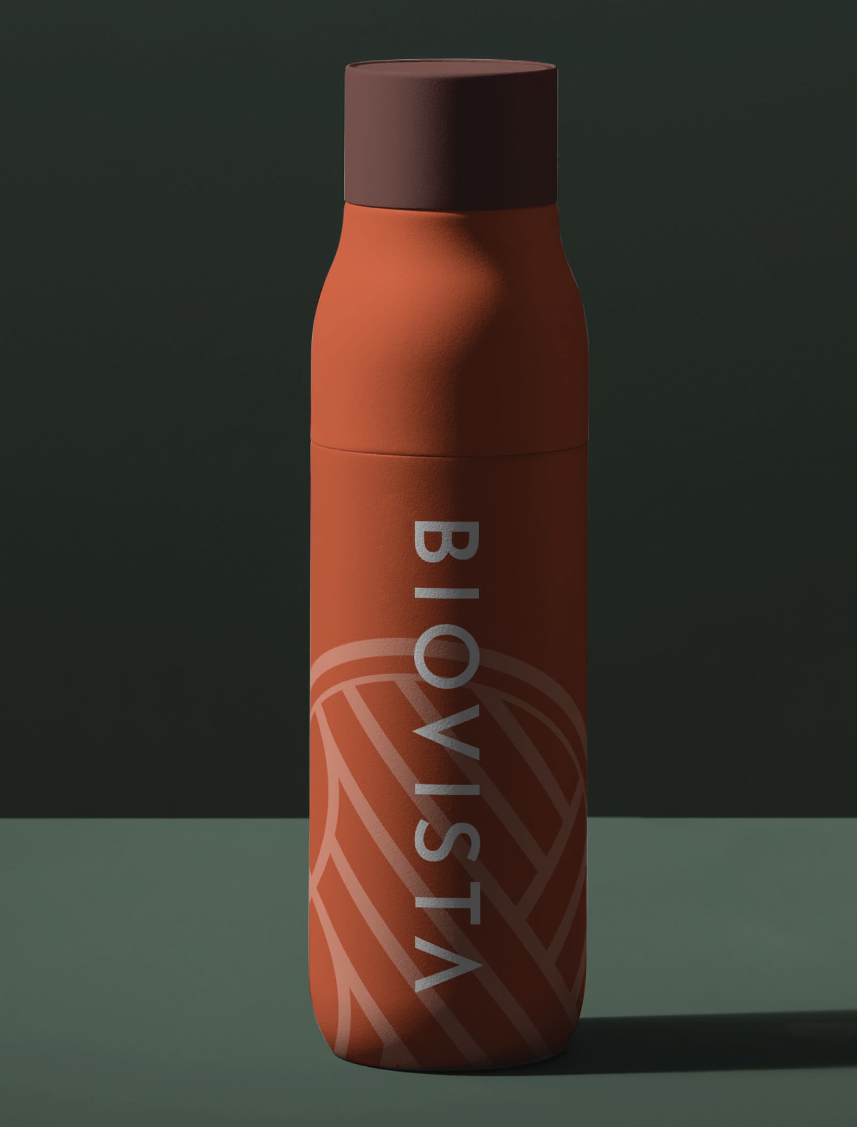
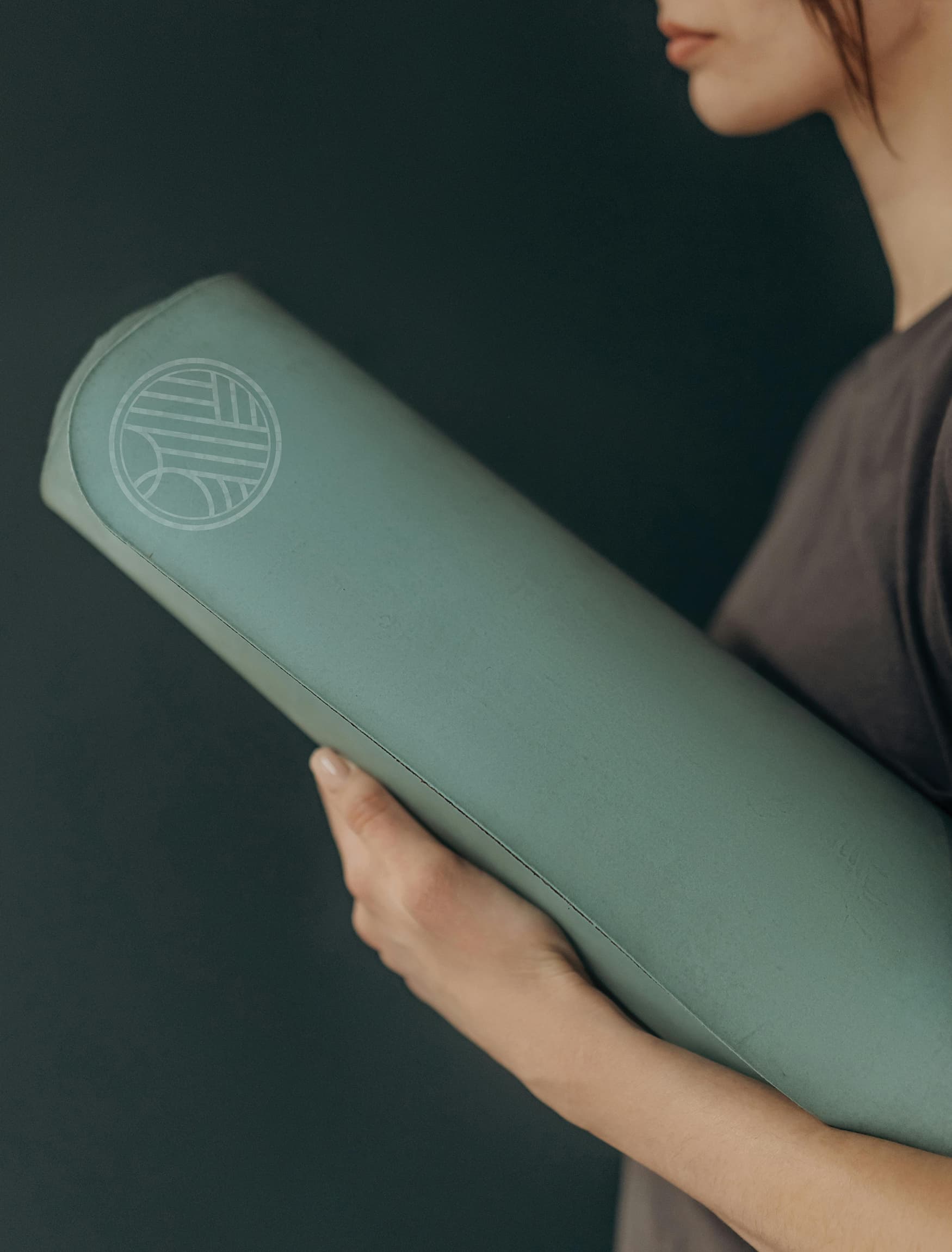
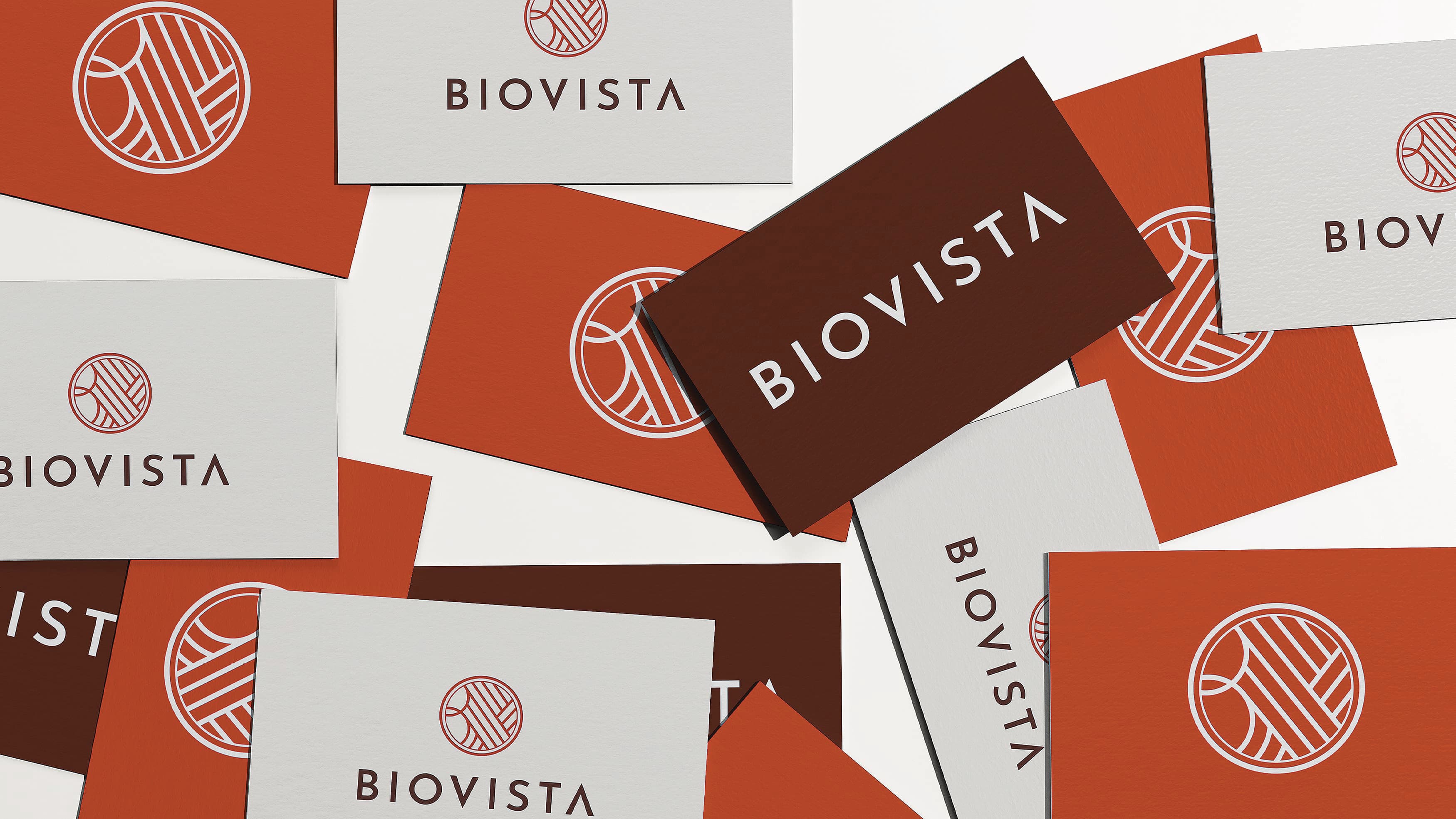
Longfellow Real Estate Partners acquired a two-building project in San Diego, California specifically designed for labs, workspaces, and high-end amenities. RSM Design was invited to craft the name, brand, and logo for the new life science campus as well as implement the brand character from vision and strategy, naming, logo design, and signage. Through exploration and stakeholder meetings, RSM Design worked to create a unique design family that would differentiate the lab workspace from its competitors, as well as standout in the science and technology community. The design team also worked to create a leasing brochure to communicate the outstanding amenities, location, and the essence of why Biovista is a top life-science facility within the San Diego market. In addition, RSM Design created wayfinding signage and placemaking for Biovista.
Markets
Services
- Brand Development
- Environmental Graphic Design
- Naming
- Vision & Strategy
Design Awards
- 2023 GDUSA Health and Wellness Winner, Signs + Environmental Graphics
Client
- Longfellow Real Estate Partners, LLC