October 21, 2022
Cody Clark + ArtCenter College of Design’s Hoffmitz Milken Center for Typography Speaker Series
October 21, 2022
Watch the lecture on YouTube ›
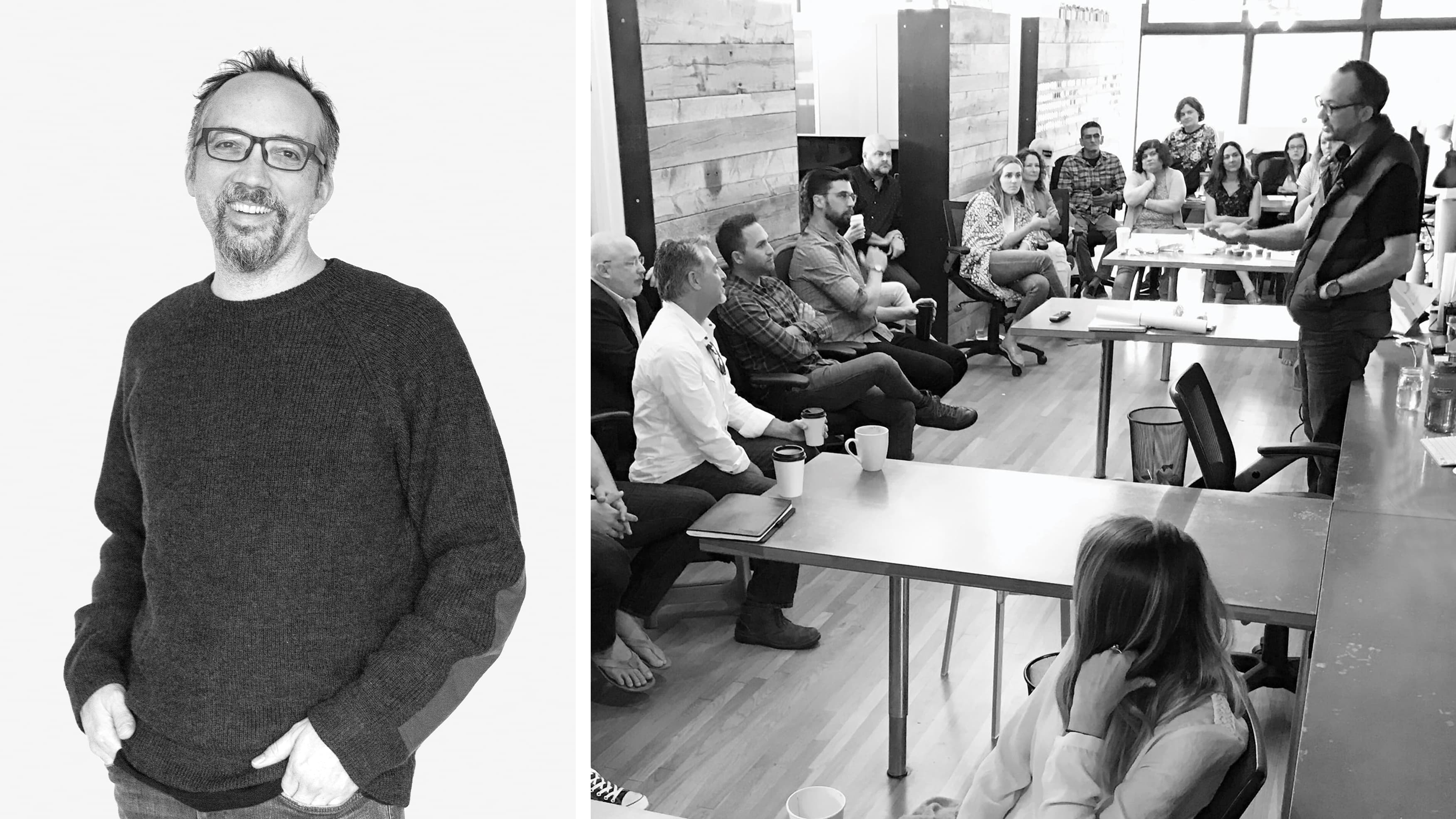
Cody Clark, Principal and Director of our Los Angeles office, participated in ArtCenter College of Design’s HMCT, Hoffmitz Milken Center for Typography Speaker Series. Cody is a graduate of ArtCenter College of Design as well as former instructor in Graphic Design and Environmental Design for over 15 years. He has built an award-winning career through creative and contemporary storytelling within architectural and public space environments. Cody believes in building projects around a client-informed process which is led by asking great questions, resulting in meaningful and economically successful projects.
Cody discusses his specialization in transmedia, wayfinding and environmental interventions, and his experience challenging spatial storytelling conventions as an educator and designer.
We all experience a lot of transactional environments in daily life, they tend to be service oriented or poorly designed. They are meaningful in their functionality but what we’re after as a design studio is creating something that’s transformational, how do we create spaces that help people connect and have meaningful experiences. We want to add to their lives, create pride, ownership, and longevity. Our goal at RSM is to design experiences that enrich every part of daily life. People’s experiences are always at the core of what we do, we create connections, activations, and relevancy. We always work within the bounds of who we’re designing for, the context and the conditions. We are writing the recipe for designing to a specific narrative of a project. A recipe that creates impactful and transformational experiences for the range of people that are going to visit each project. There are many contexts that designers are faced with on a daily basis, I am going to talk about five of the core contexts and show projects for each of these.
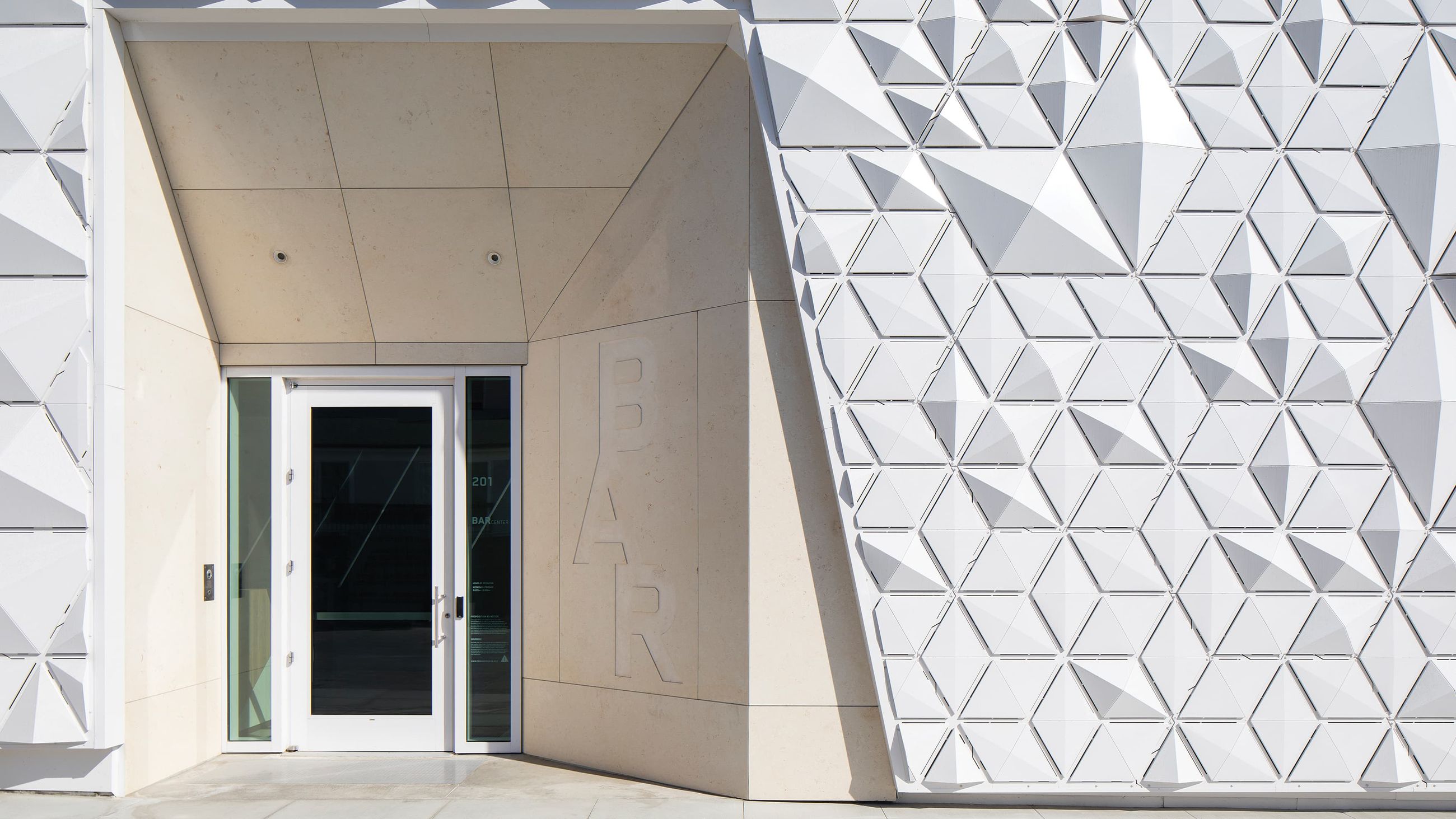
The BAR Center at the beach in Venice, California was an existing center from the 1960s that was built for the Jewish community of Los Angeles. The Jewish Federation of Los Angeles is part of a nationwide Foundation whose goal is to share knowledge about Jewish heritage and serves a lot of different functions for the community. We worked to create graphics and a typographic language that can celebrate the culture of the Federation. While communicating the brand of the building it also wanted to be slightly ambiguous, an abstract interpretation. The Star of David was separated into an abstracted graphic form where it becomes deconstructed. We used it as a graphic patterning device that became a veil around the building. This is not a building where you want to have a screaming loud identity so we looked at taking advantage of light. A Jerusalem stone was imported for the project so routing out the monogram with only the natural environment for illumination is the contextual feel this project needed.
The BAR Center at the Beach Project Page ›
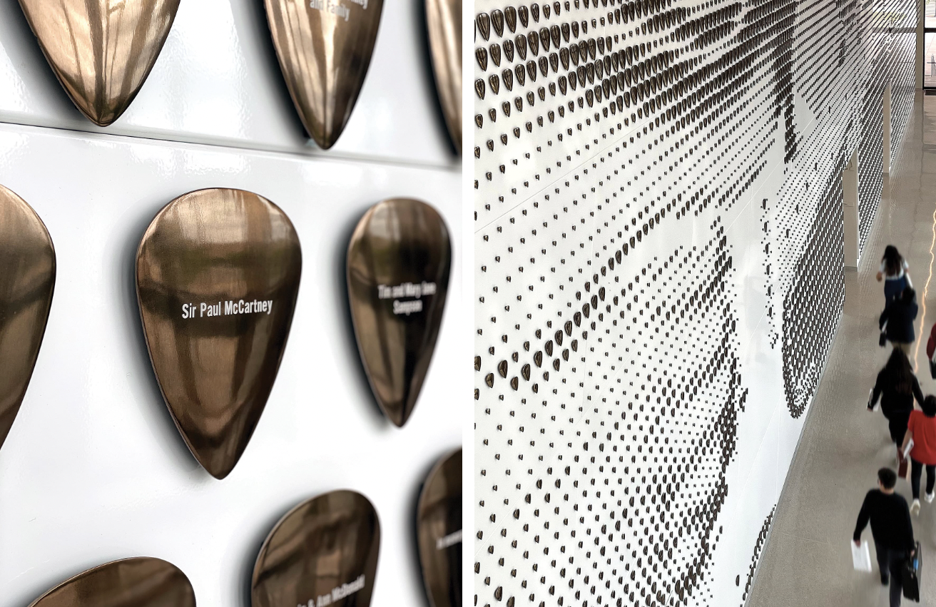
Buddy Holly Hall of Performing Arts and Sciences is in West Texas. We started by building the right typography for the traditional signage of the project but a big effort was creating these amazing experiences within the project. Donor installations are a great storytelling device and in this case we worked closely with the architect. We ended up filling the atrium space with volumetric guitar picks at different scales for different gifting amounts. When you step back this donor wall becomes an image of Buddy Holly on guitar. There’s a symbiotic relationship between the graphic narrative and the architecture, the two are designed together.
The Buddy Holly Hall Project Page ›
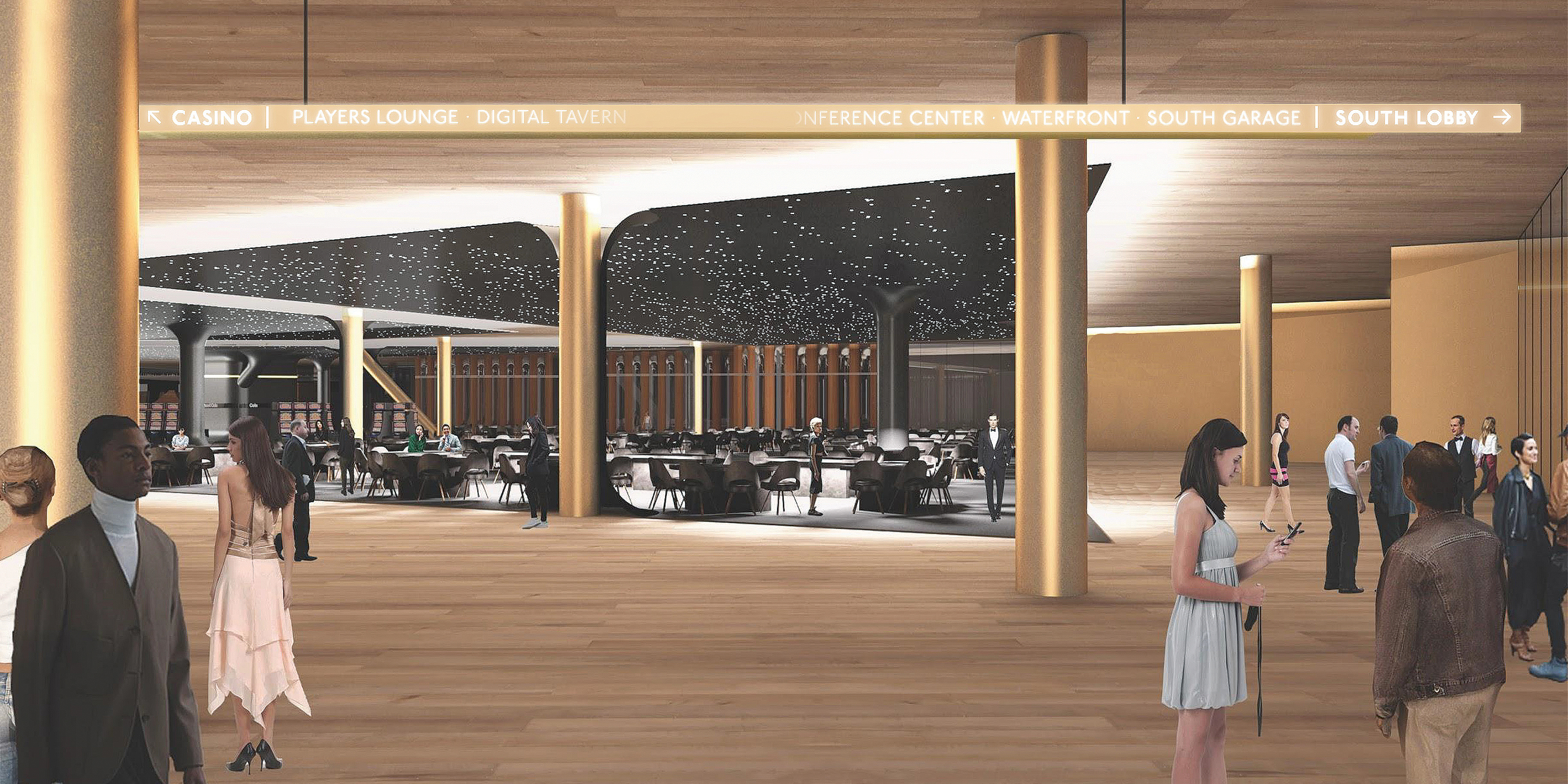
The Drew Las Vegas was going to be a 6 million square foot building with a hotel, casino, retail, restaurants, among other things. Our approach collectively between consultants was to look at it very differently from a storytelling point of view. There has to be a functionality to it that helps the guest experience but you also want to pair that with discovery and surprise. You want to create something that’s memorable. We built on the idea of ground, horizon, sky and how everybody’s association with a space is in one of these three categories. How do we leverage each one of those moments paired with the information, art or media that needs to happen at that particular location. We had the freedom to control how information is woven through the environment, it doesn’t have to be static, it can be digital, it can be ever-changing. Information would disappear and then reappear as it was needed. We wanted things to be surprising and artful so information disappears when there’s no one around and it transforms into art. Then the minute someone is in proximity it turns to the necessary wayfinding information. We were able to rethink how people engaged with typography in really interesting ways.
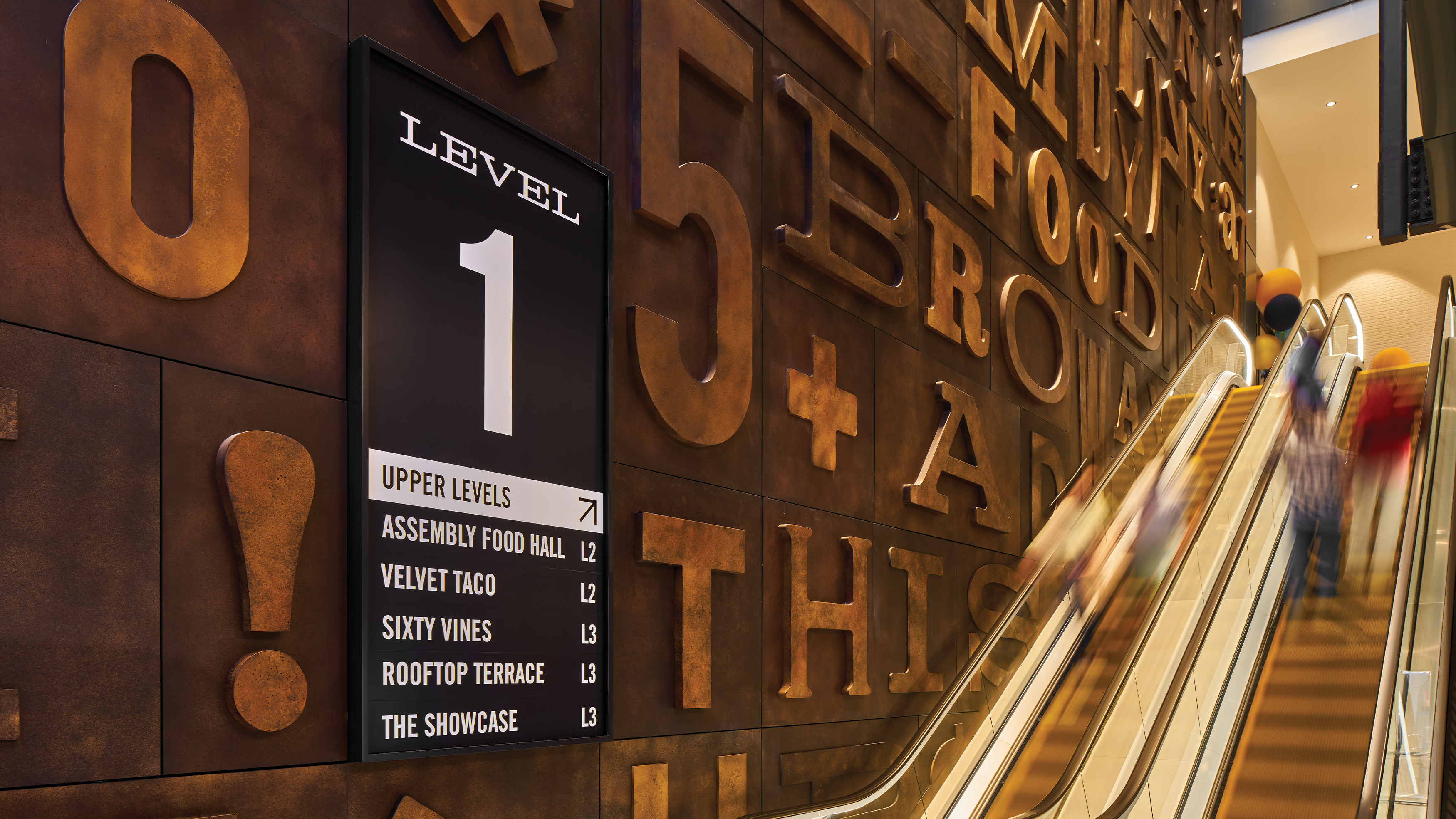
Fifth and Broadway is in downtown Nashville on the north side of Broadway, across from the Ryman Auditorium and Bridgestone Arena. We wanted to celebrate the old honky tonks, saloons, and music venues that line Broadway. We do a lot of research to extract a vocabulary of typography, color palettes, and materials that don’t feel foreign to the context. This is clearly a new place, but it’s a place that honors its past.
Fifth & Broadway Project Page ›
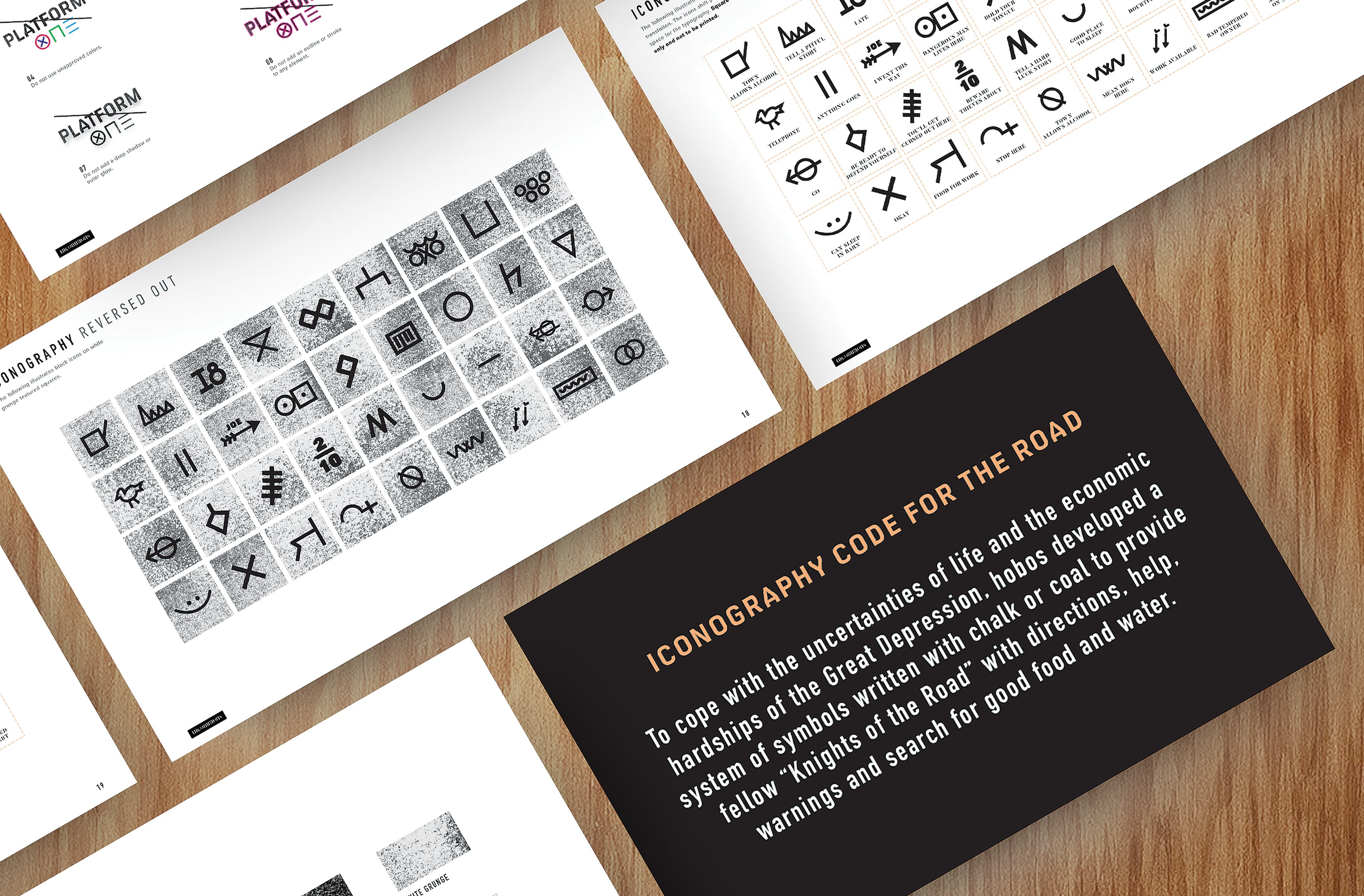
Platform One is a food Hall that’s part of a larger project on the outskirts of Las Vegas. We did a deep dive on research locally and developed this brand inspired by hobo symbols. There’s a long-standing iconography study of hobo symbols in American culture, we leveraged that to create something more cryptic and uniquely this place. The symbology creates ambiguity, which creates a question, which prompts a story. In this case the applications celebrate individualism, the client even sold t-shirts where everybody could create their own combination of symbols. The brand ultimately changes for each person, they get to apply their personal interpretation of the place. As a transmedia designer we’re assessing how to tell a similar story across multiple platforms. You have to build this diversity of brand and typography that lives in a lot of different contexts within multiple experiences.
Platform One Project Page ›
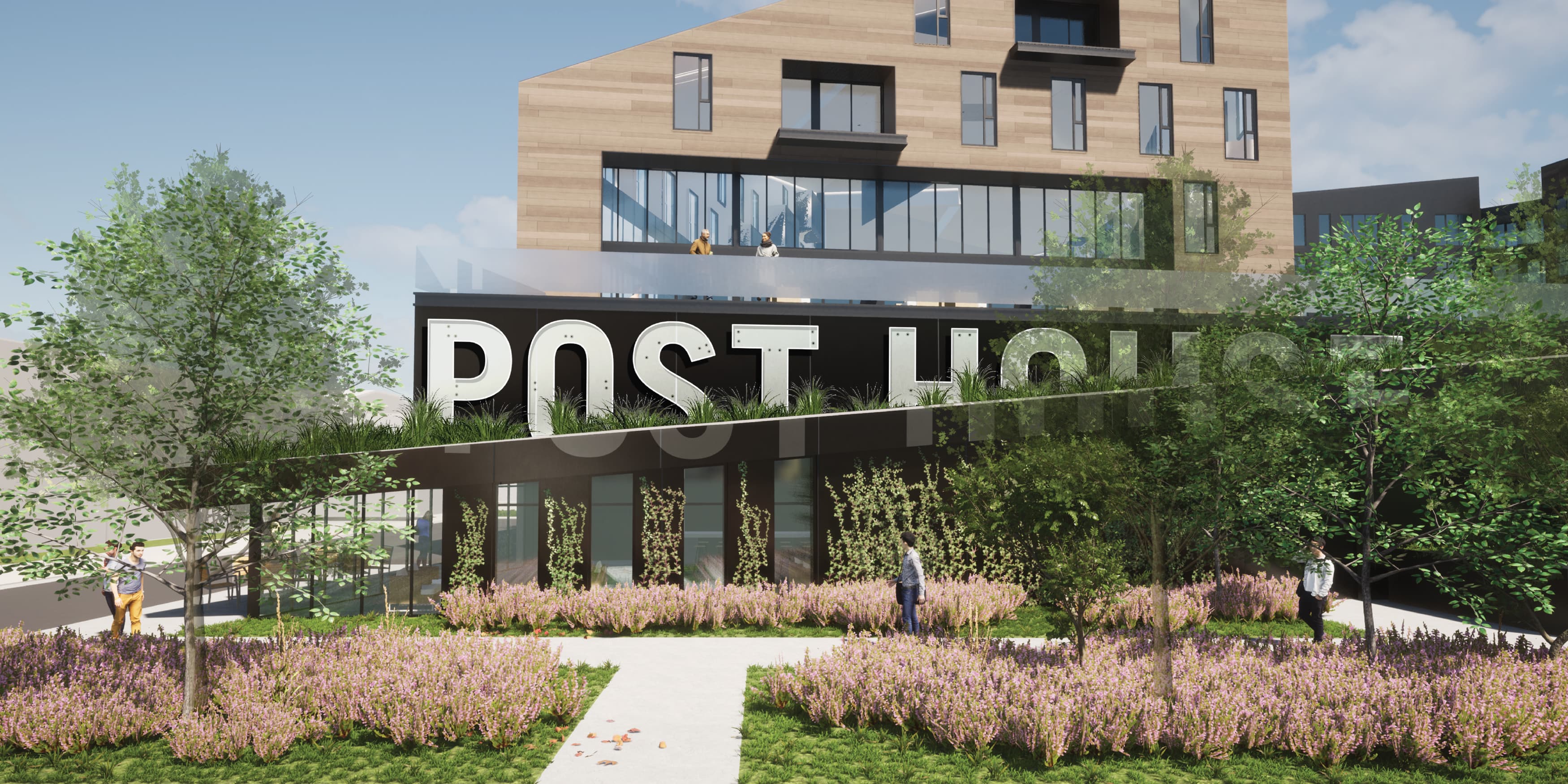
Density is a really important context because it sets the tone and recipe for the right visual voice for a given market. Post District is an adaptive reuse project in downtown Salt Lake City. The main building on site was the old newspaper printing facility for the Salt Lake City News. Uncertainty was really important, we wanted to design spaces that felt eclectic. We talked a lot about texture and applying that to different areas of the space. We deconstructed the brand typographically so it would never be seen the same way twice. It was stamped into surfaces and architecture as texture within the environment. It allowed us the freedom to use the brand in vague ways that enhance the experience holistically while maintaining the feel.
Post District Project Page ›