Playa Vista, California
Runway Playa Vista
Markets
Services
Client
- DJM Capital Partners Inc.
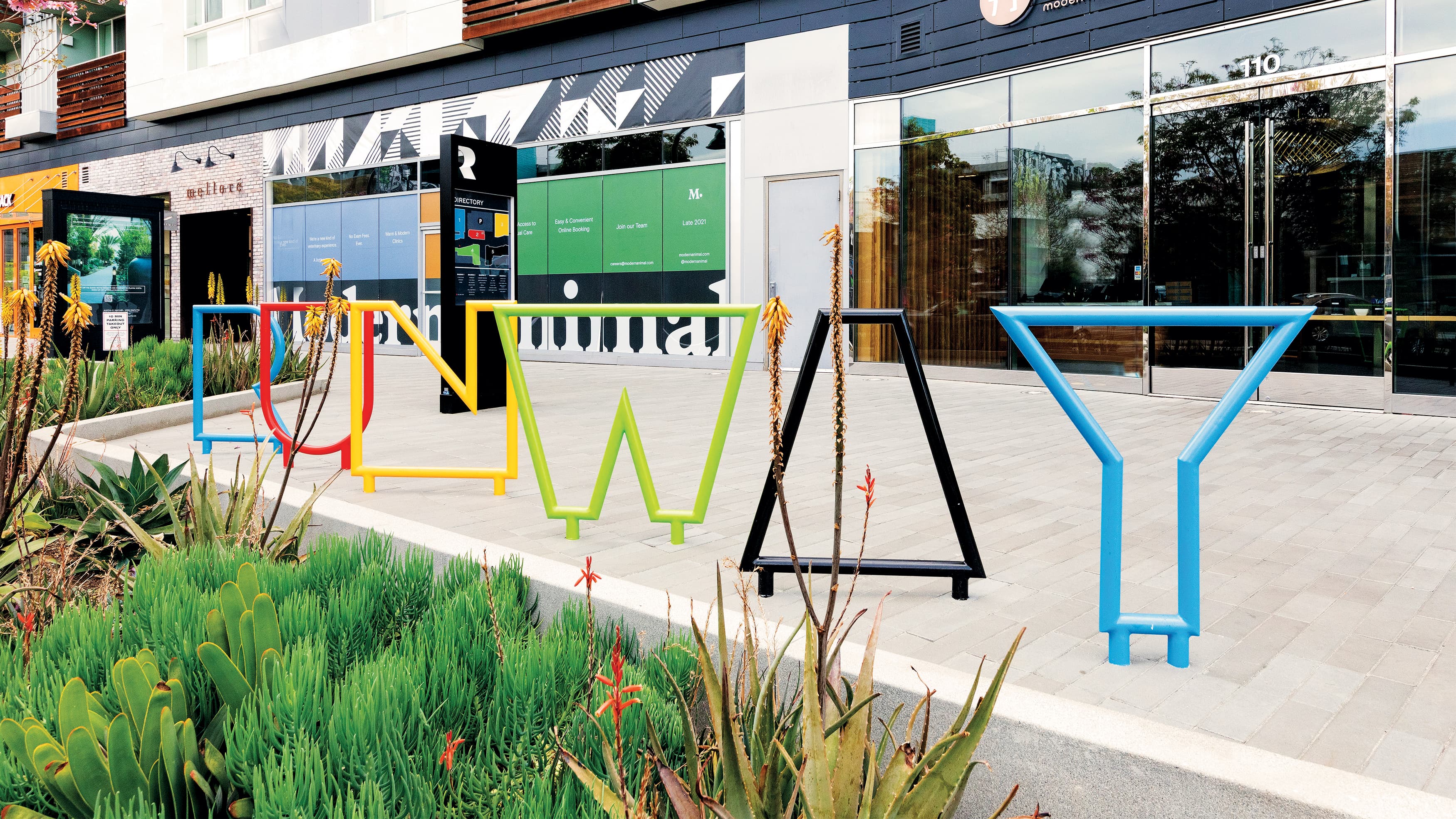
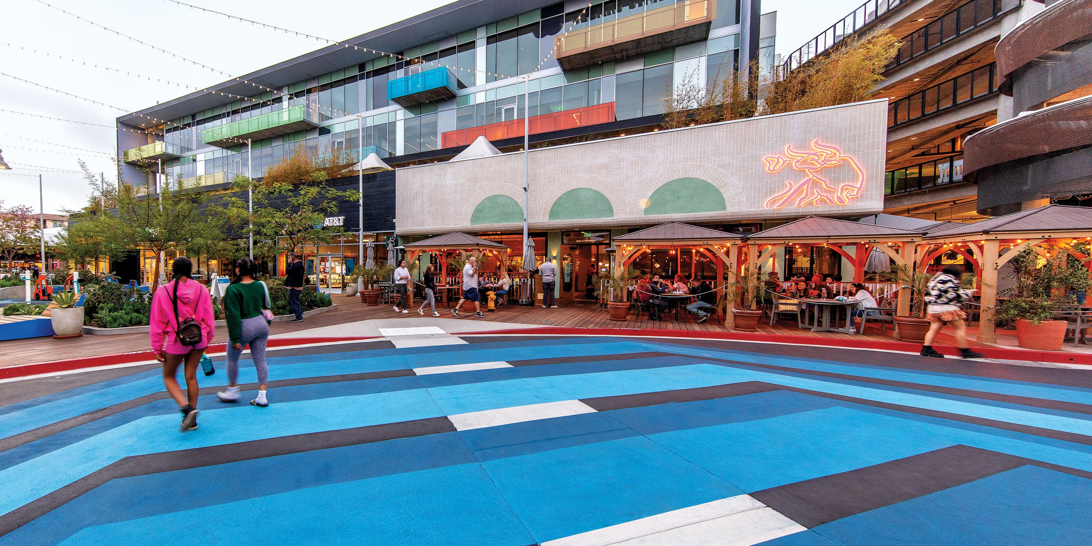
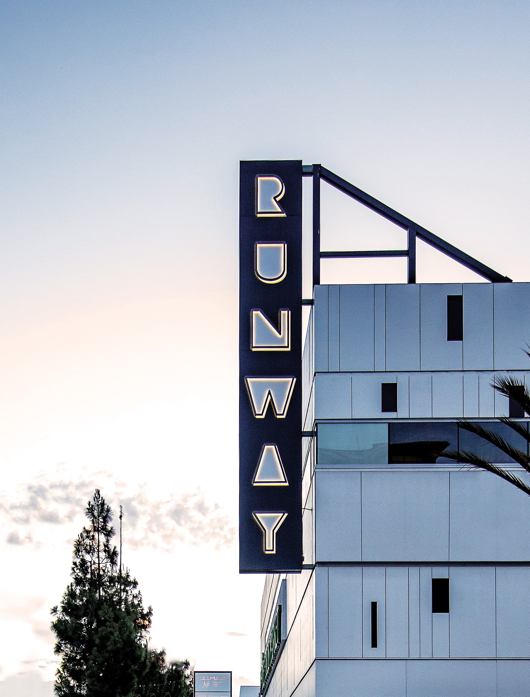
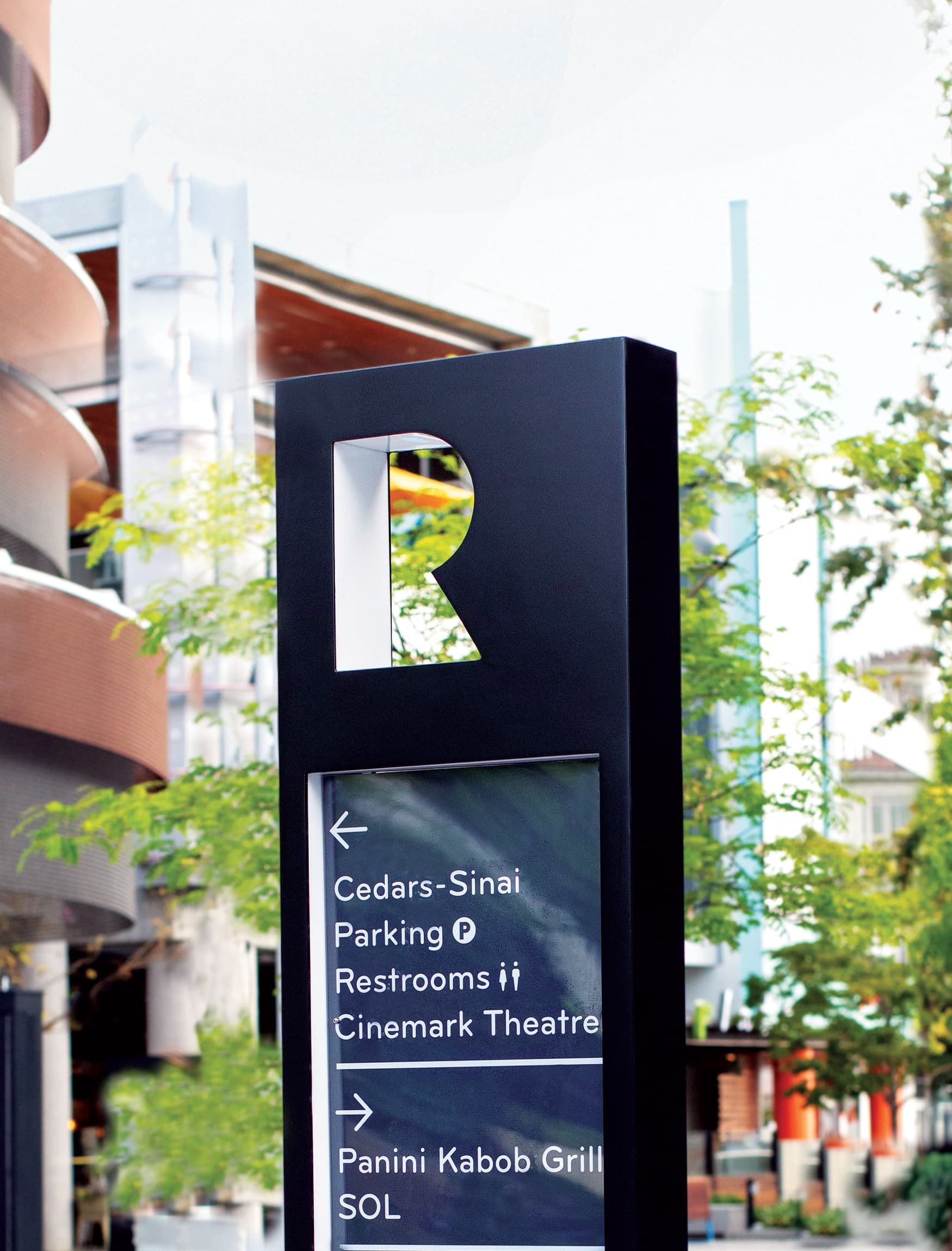
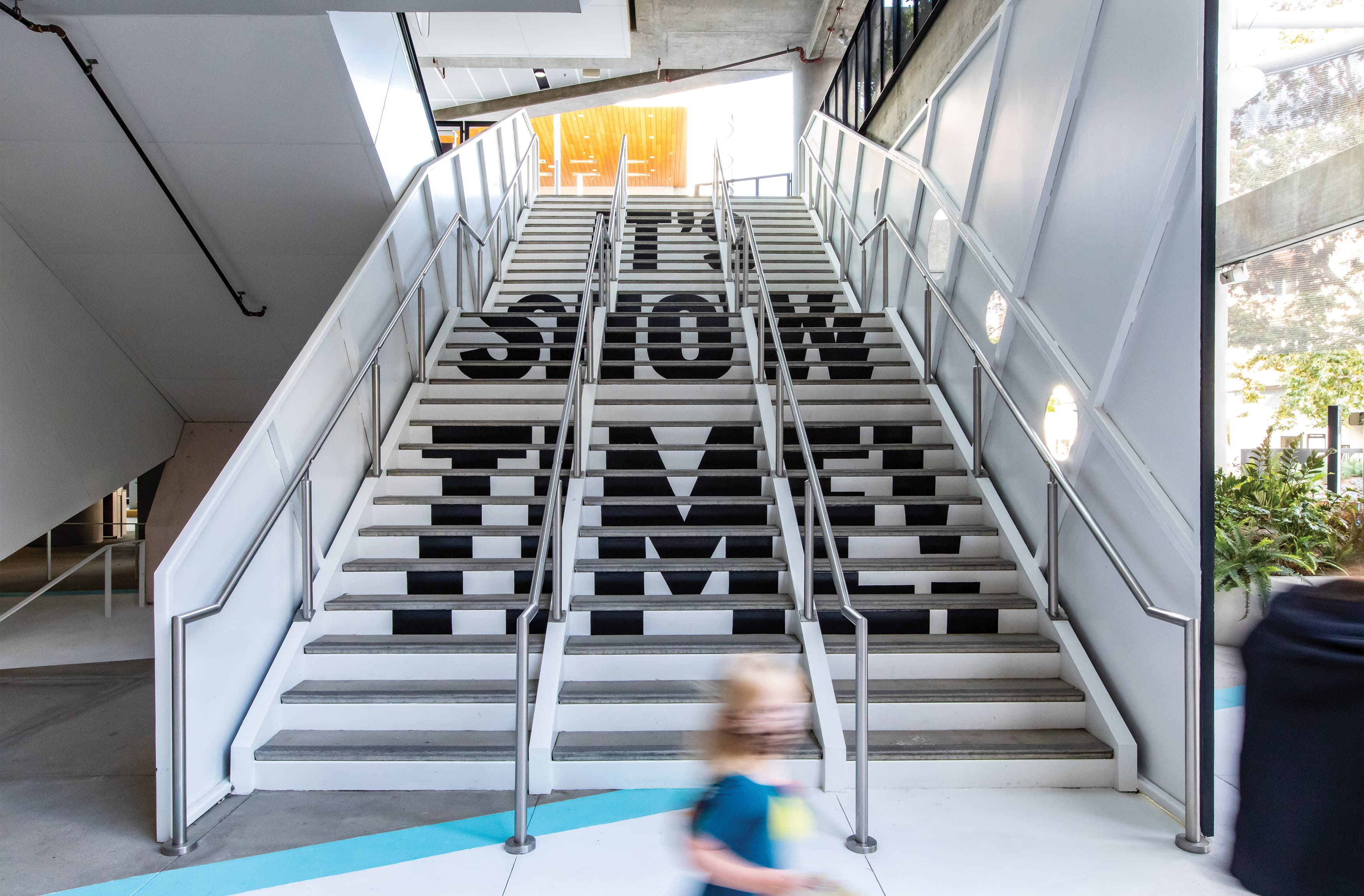
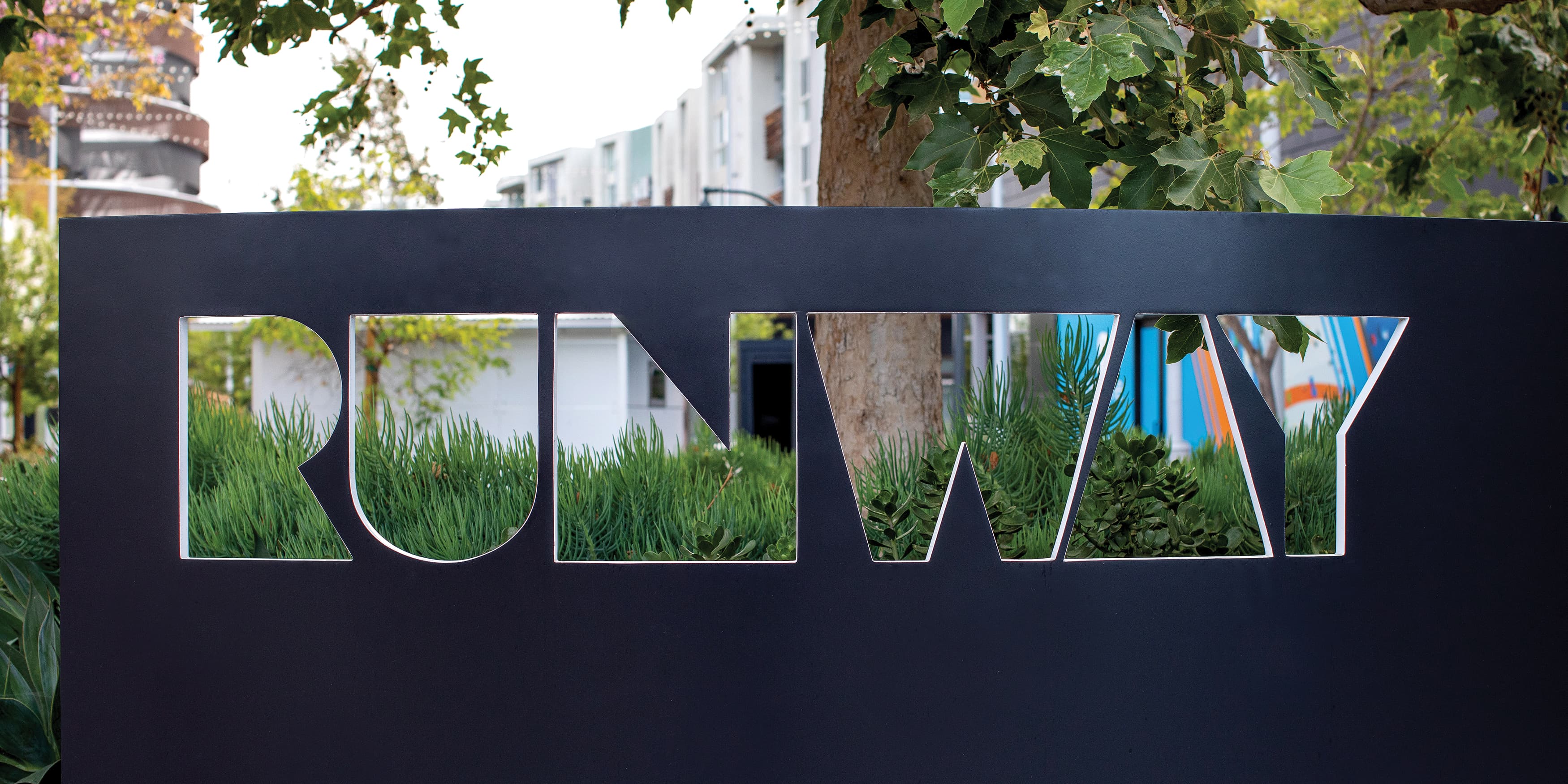
FREE MARKET is an ever-evolving collective that develops and markets curated products, services, and experiences by combining strategy with artistic understanding. FREE MARKET’s special programming division leverages vital relationships with stakeholders, building owners, and the real estate community to cultivate and activate key retail and mixed-use development projects. The development team at Runway brought in FREE MARKET to enhance it’s tenant collection and attract guests. RSM Design collaborated on the environmental graphics around the space to seamlessly integrate wayfinding signage into the artistic environment.
See other environmental graphic design projects. ›
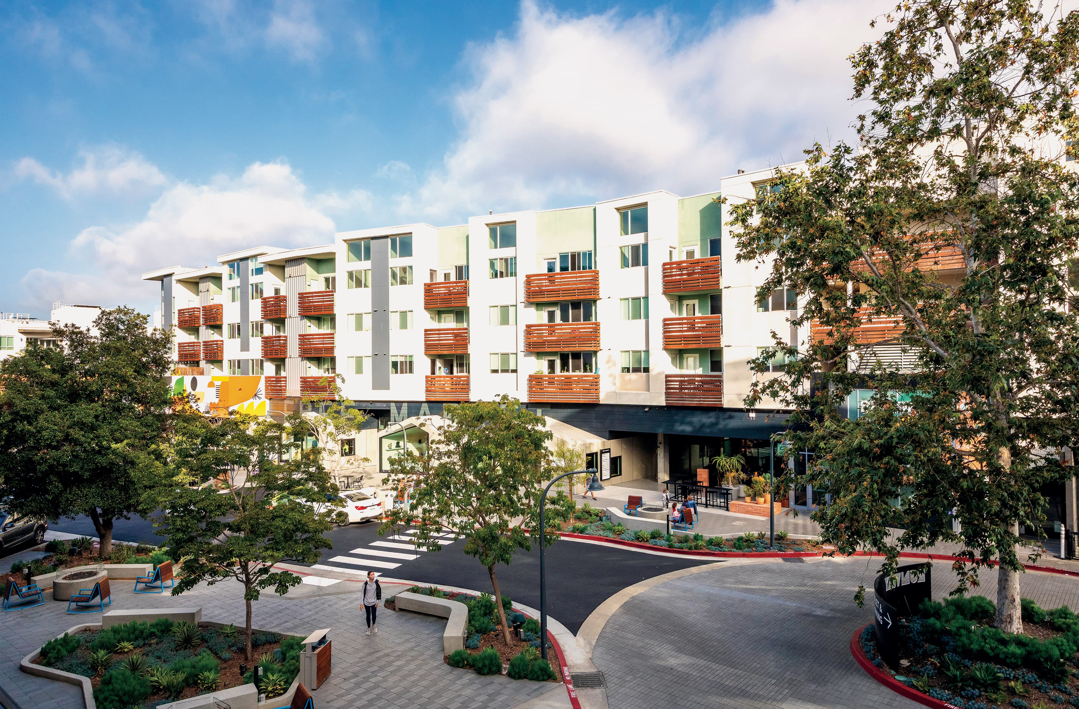
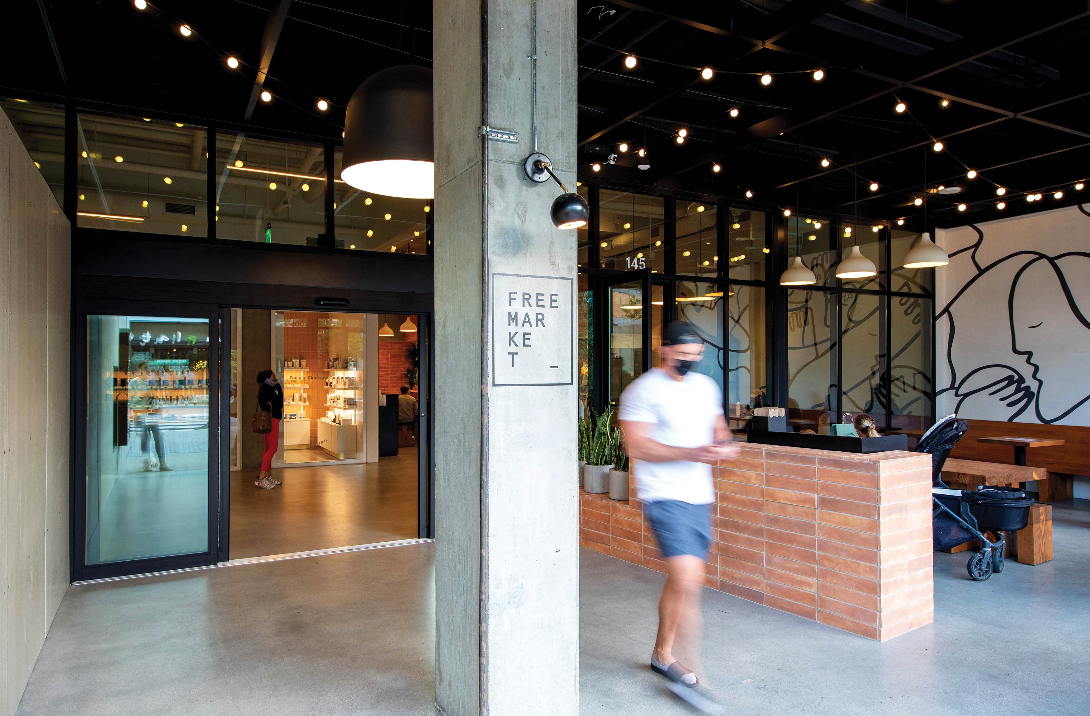
A space for creatives, entrepreneurs, foodies, entertainment enthusiasts, and adventure seekers.
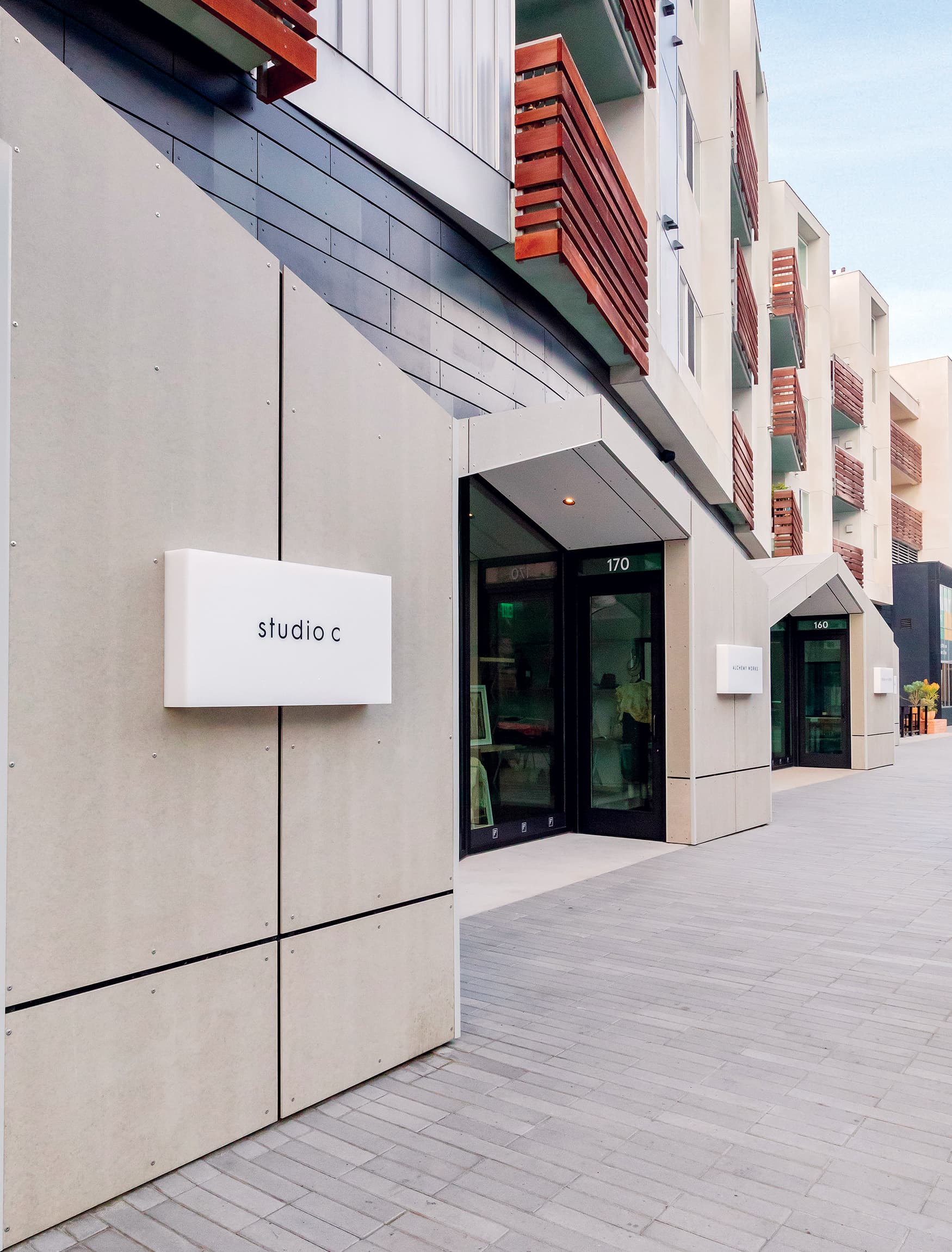
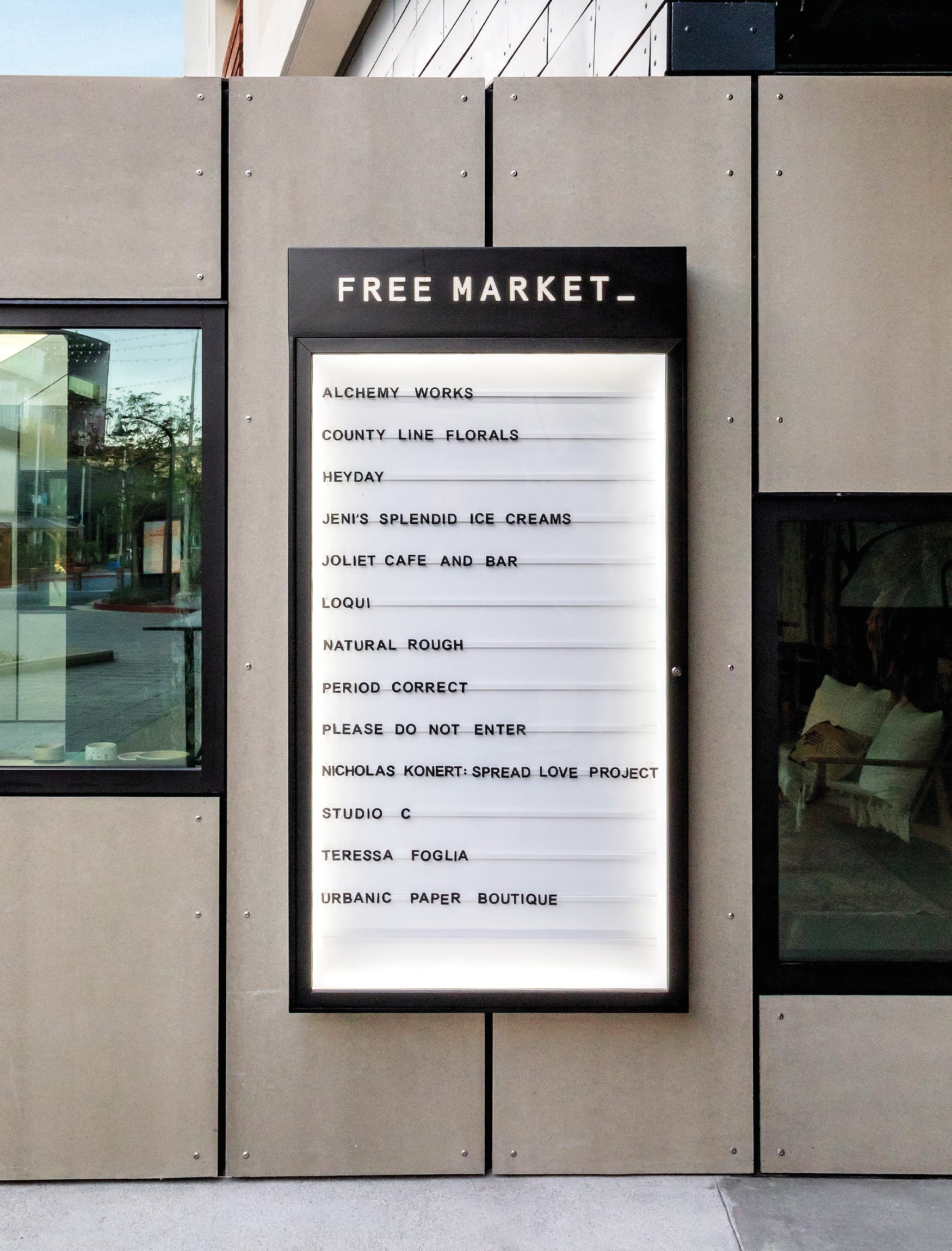
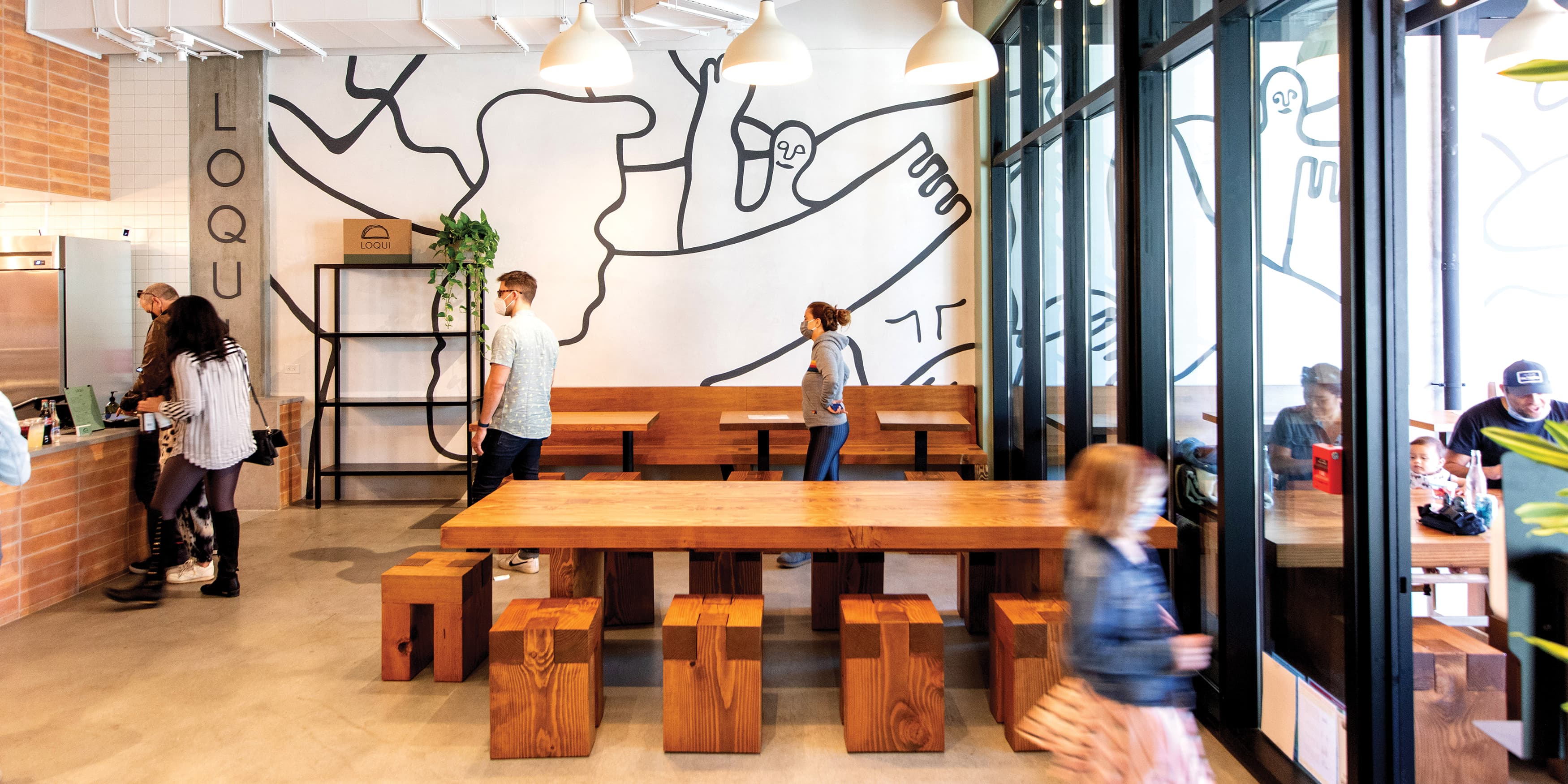
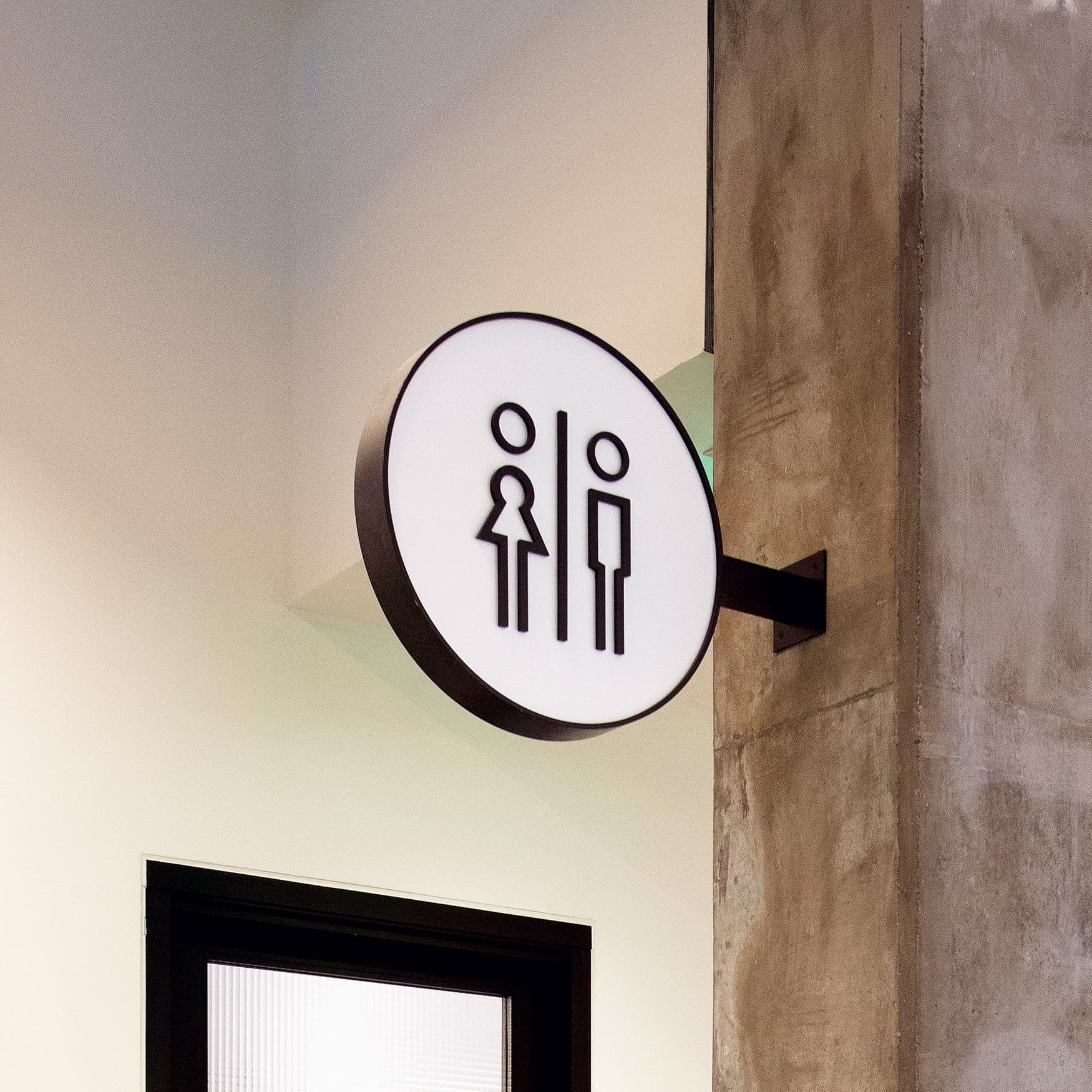
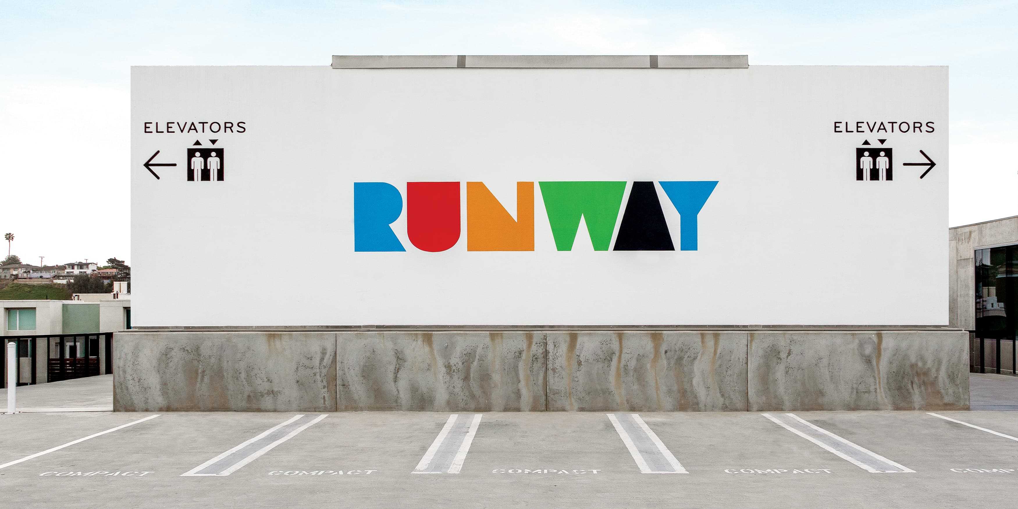
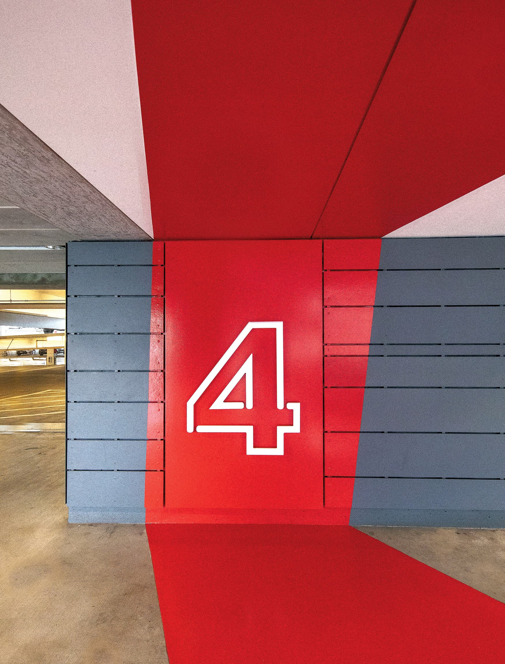
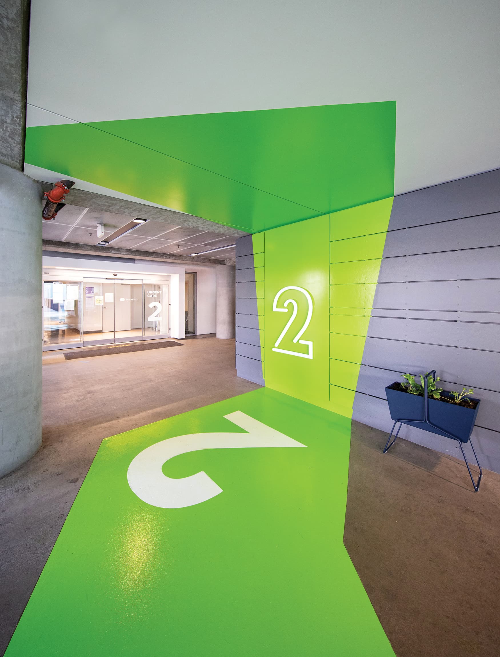
The design team worked to create a space that is as memorable and enjoyable as it is easy to navigate. Spanning over 200,000 SF of retail space, the site needed a wayfinding system that makes guests feel confident. In the large on-site parking structure, the design team implemented bold, pops of color that differentiate between floor levels. By adding these environmental graphics to the parking garage, as well as to the entire project, guests can create identifiable links to certain destinations.
Brightview Design Group, TSA Archtitects, Design Bitches