San Antonio, Texas
North Rim
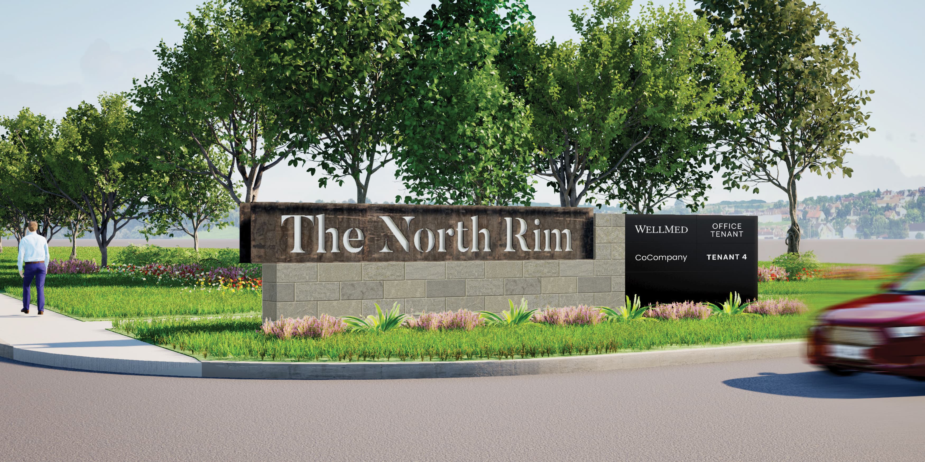
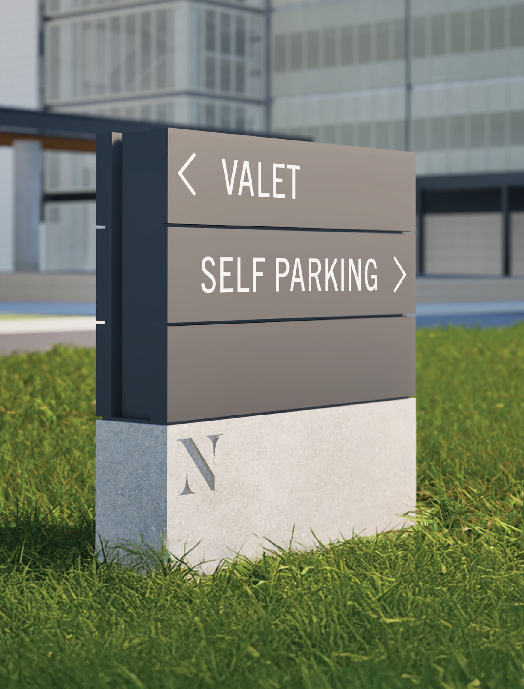
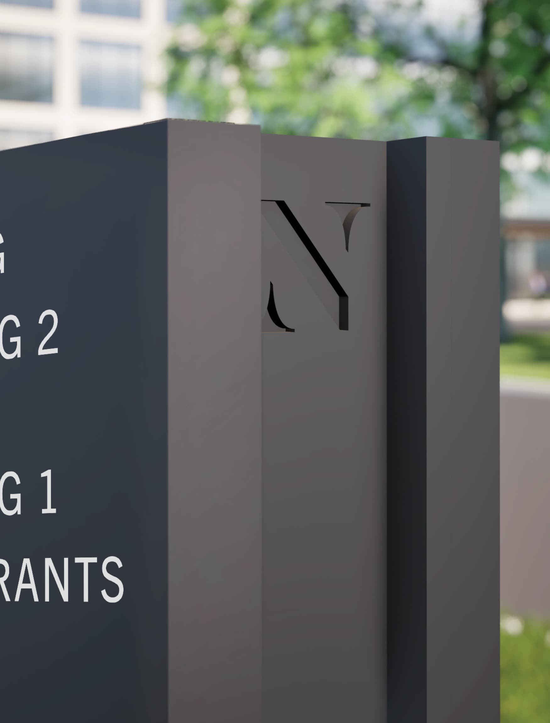
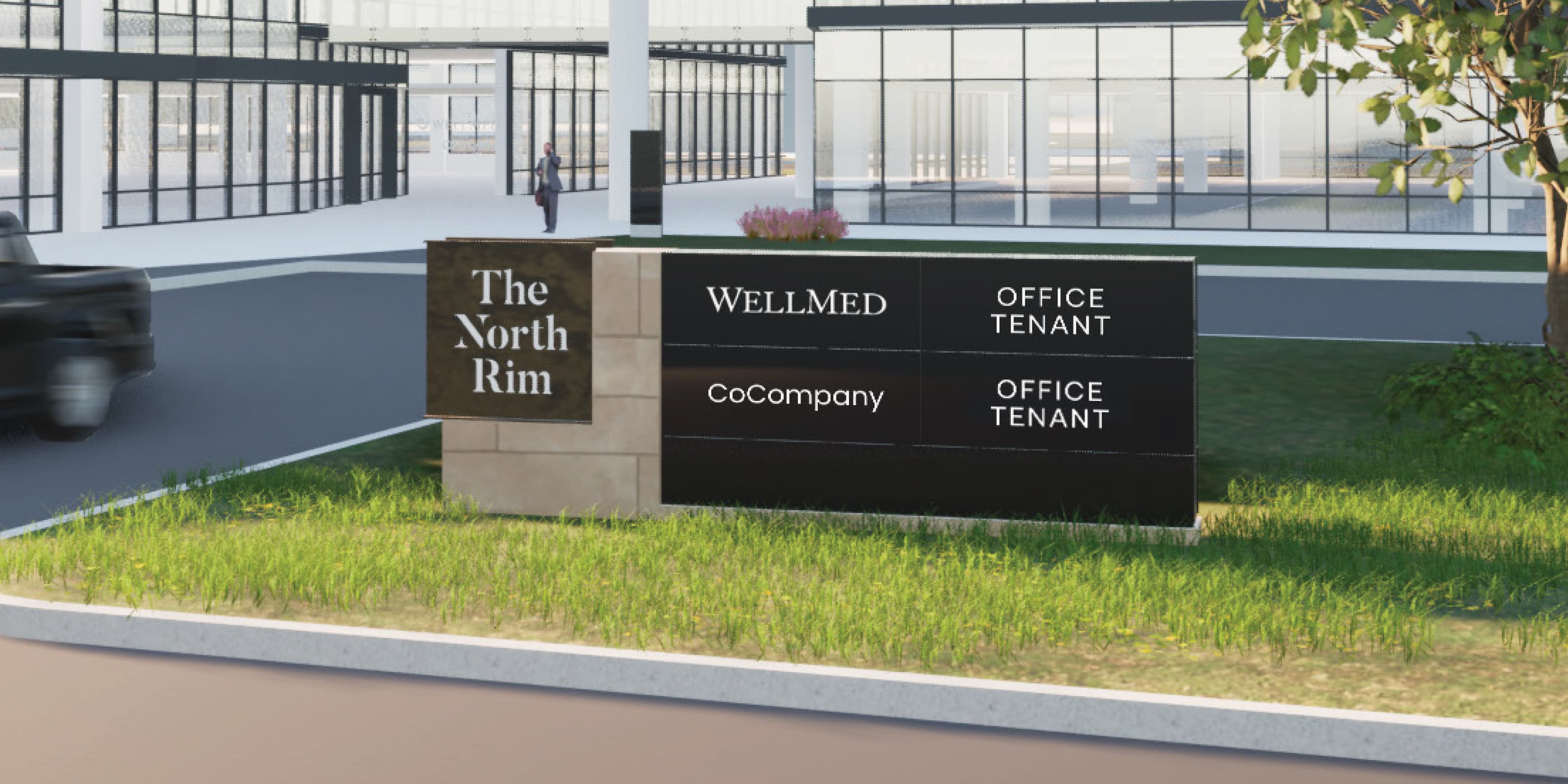
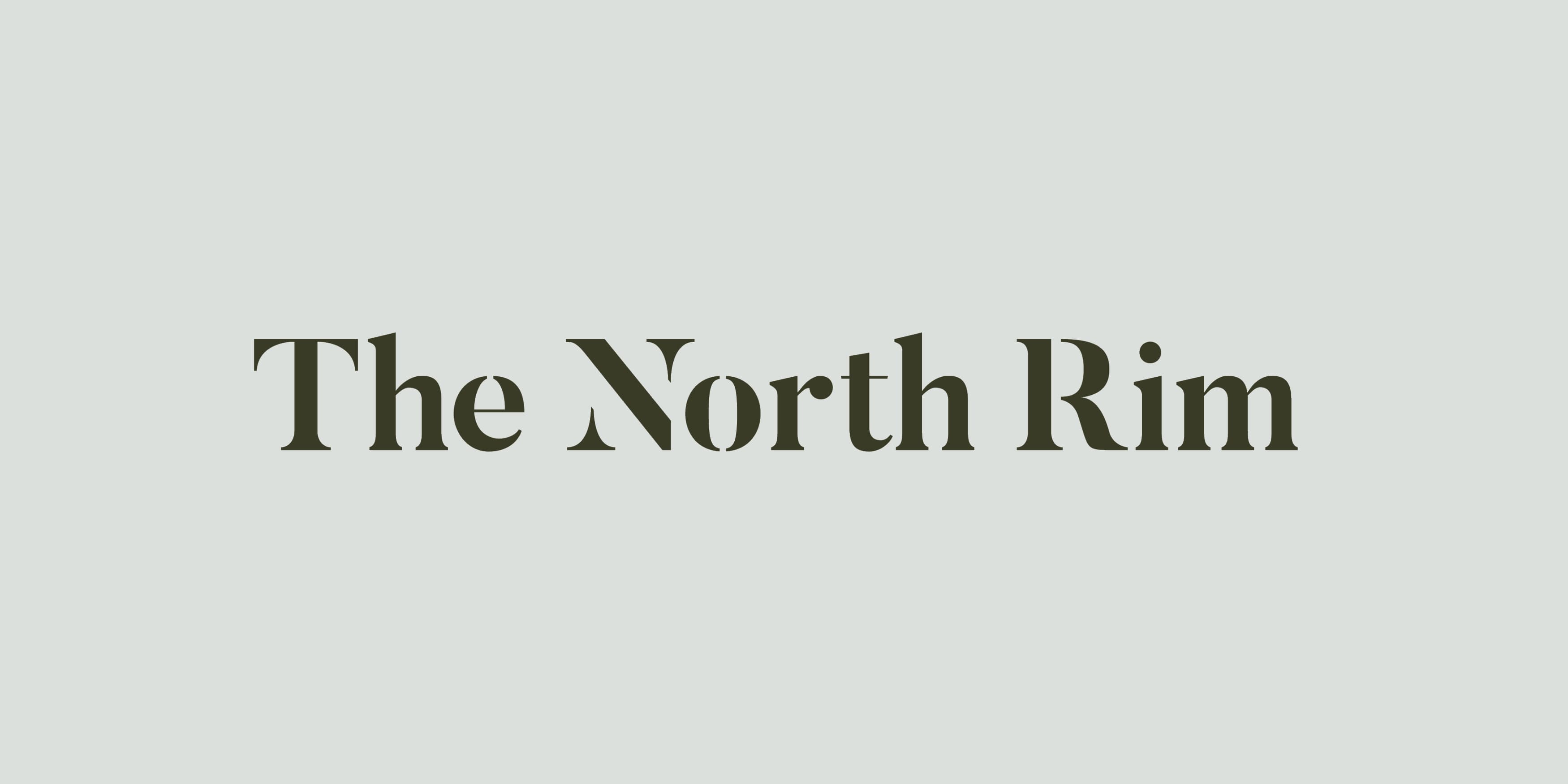
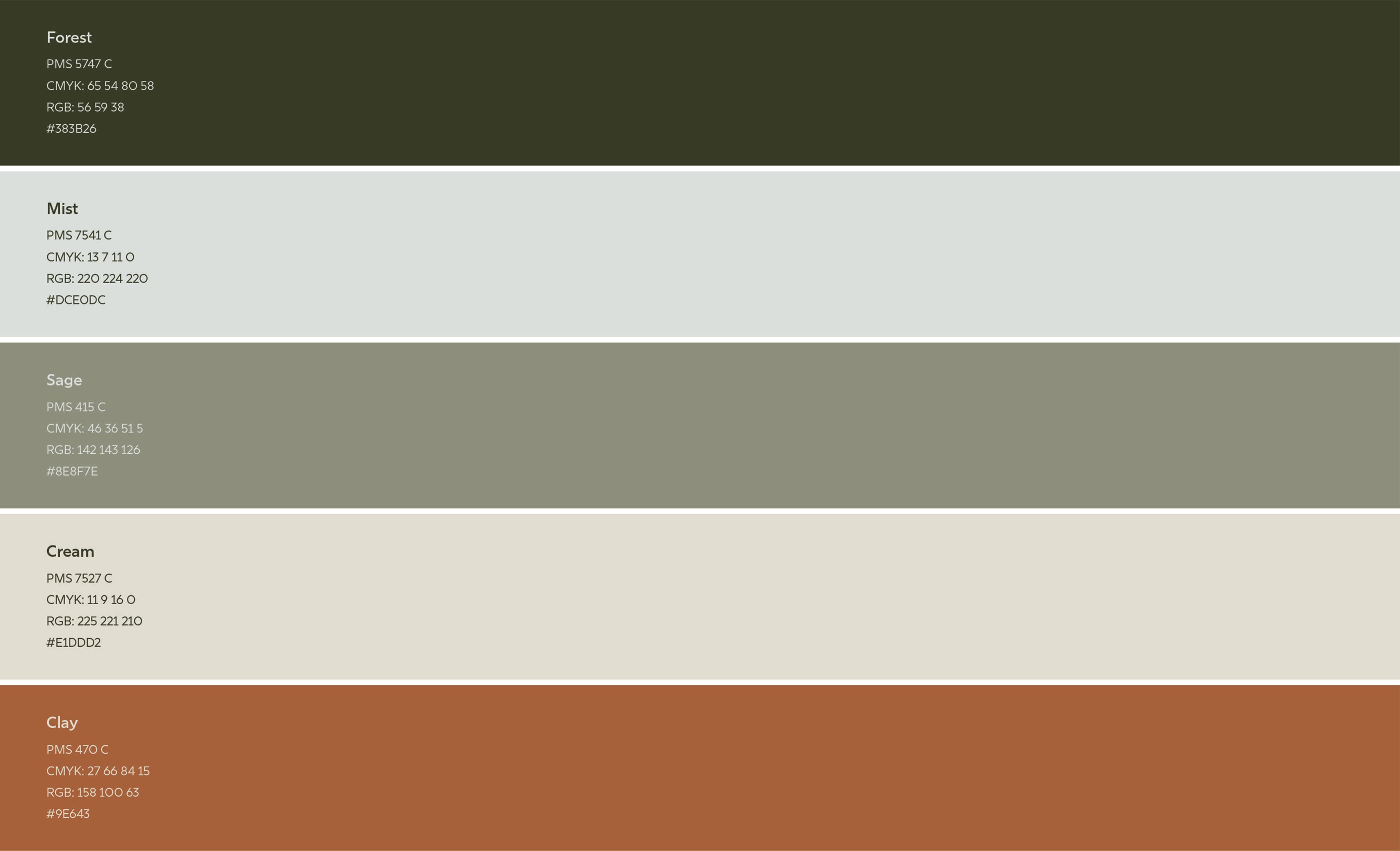
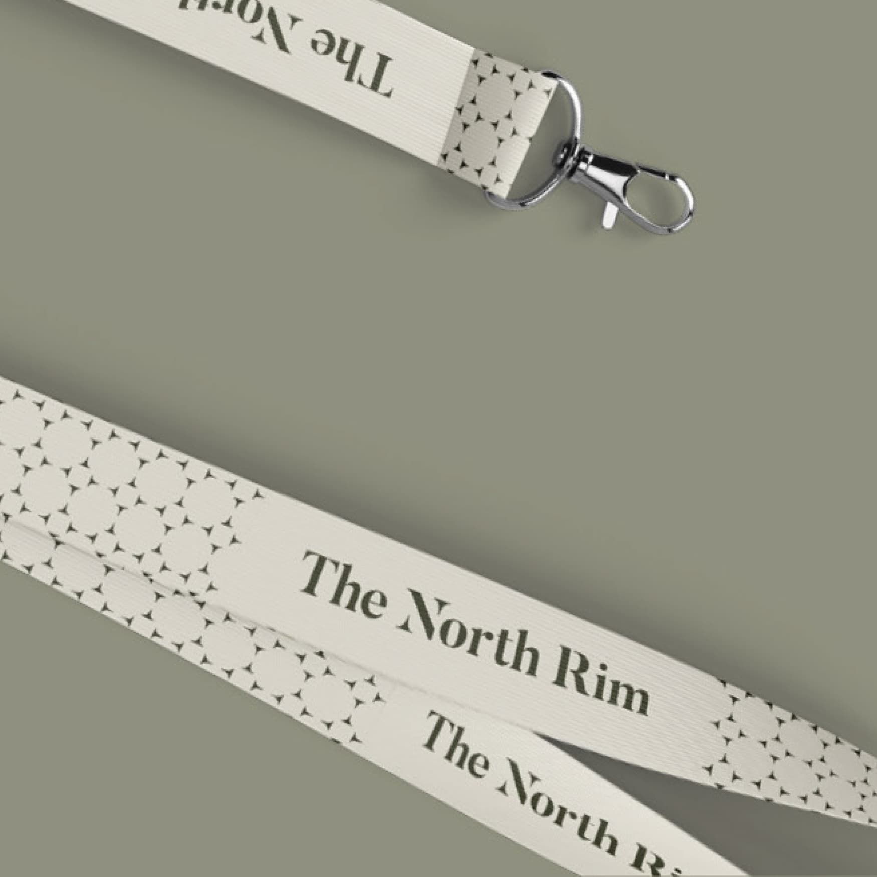
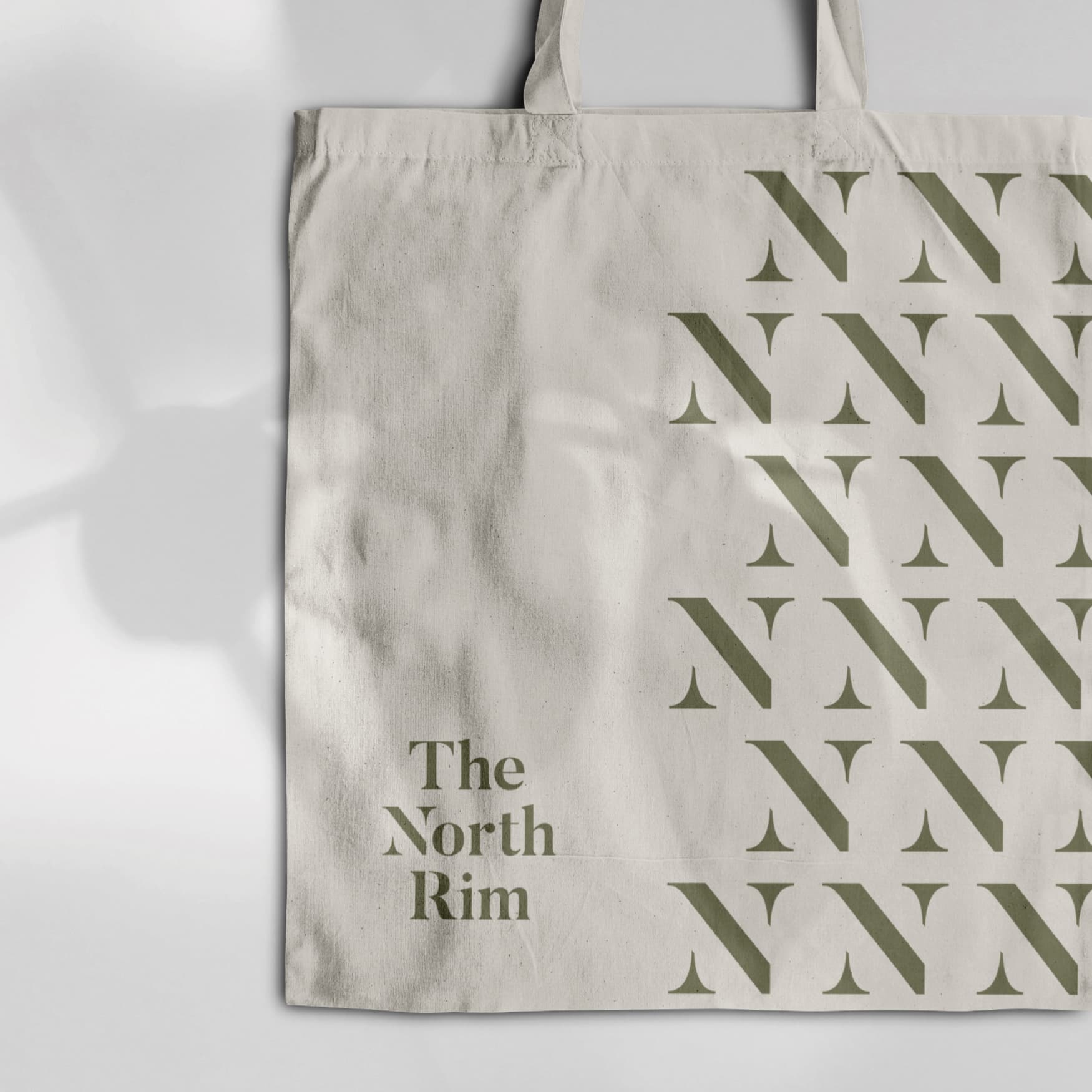
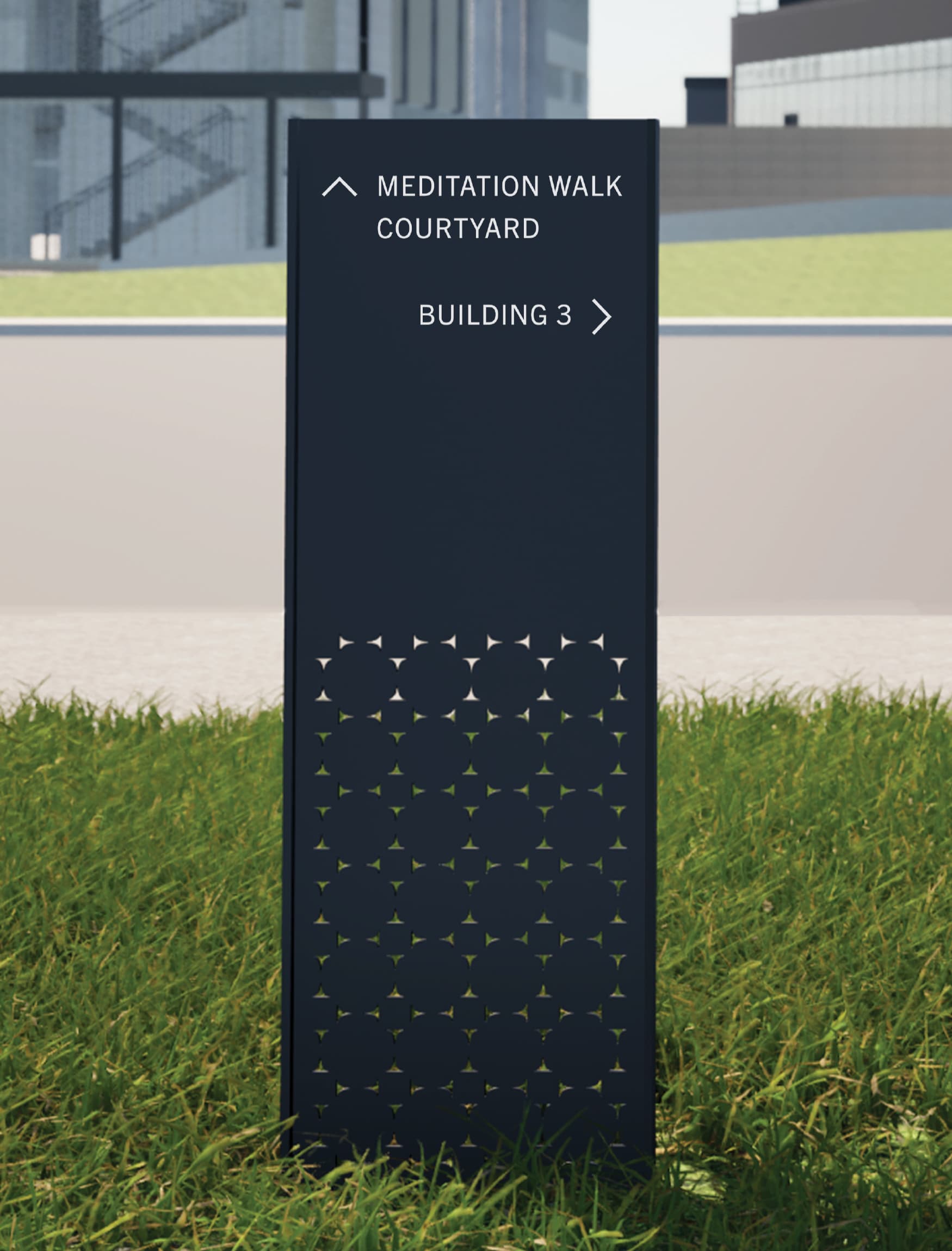
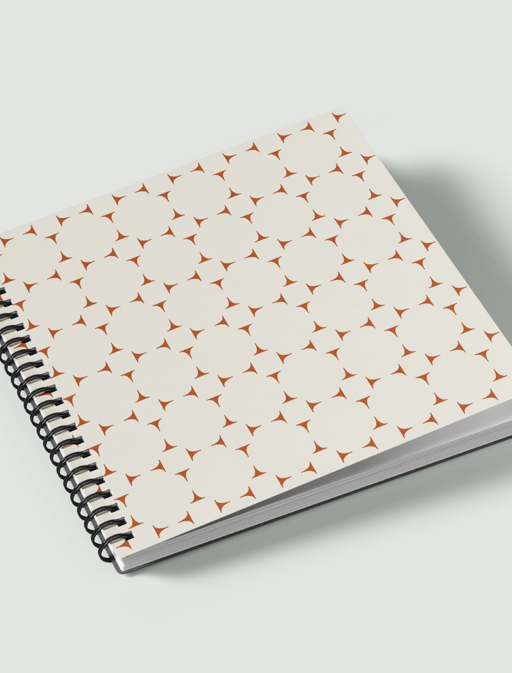
The North Rim is San Antonio’s newest Corporate Campus that is positioned between The Rim, a popular retail destination, and the Leon Creek Greenway. This prime location offers convenient connections to both city and nature, fostering a serene office environment. The site uses collaborative indoor-outdoor spaces to further enhance this harmony, promoting a thriving work culture. RSM Design crafted a timeless brand identity for the campus that emphasizes connectivity and wellness. By designing the signage and branding concurrently, the wayfinding system was deeply integrated with the brand, ensuring cohesion. These elements harmonize with the natural architecture and eco-conscious landscaping through the use of warm stone materials and sun-inspired patterns.
Markets
Services
Design Awards
- 2025, American Graphic Design Awards, Branding + Identity Programs
Client
- Fasken Ltd