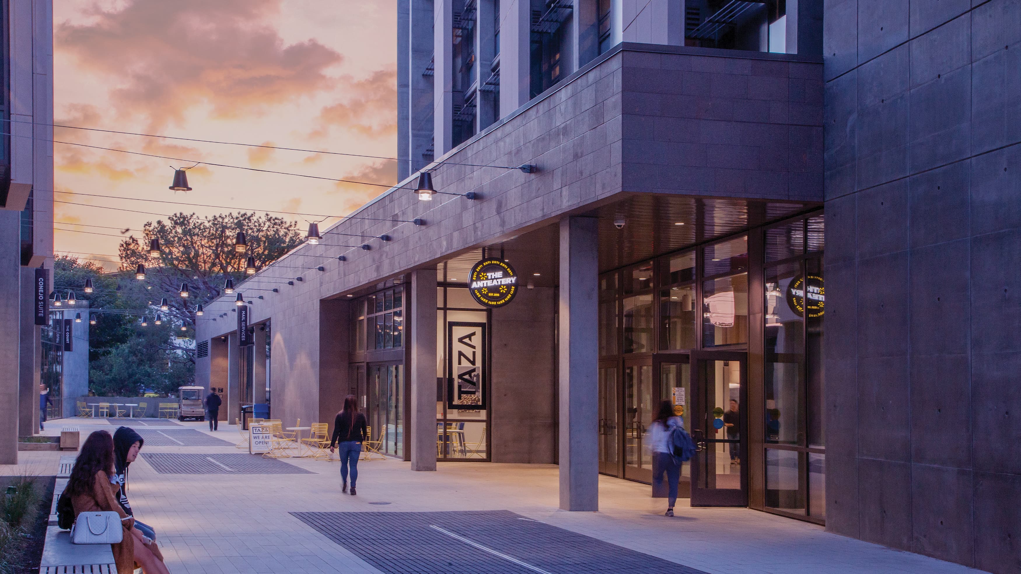
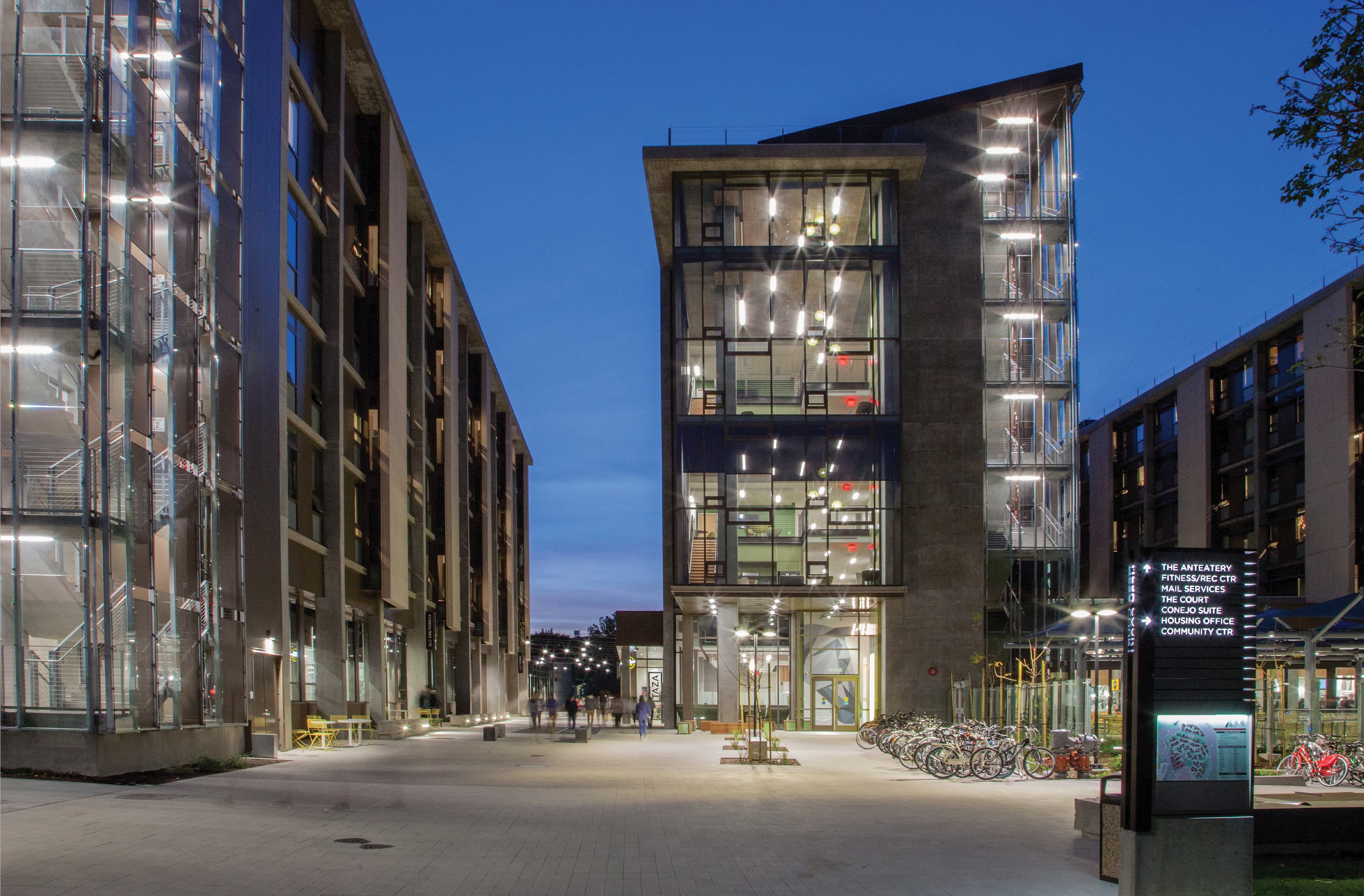
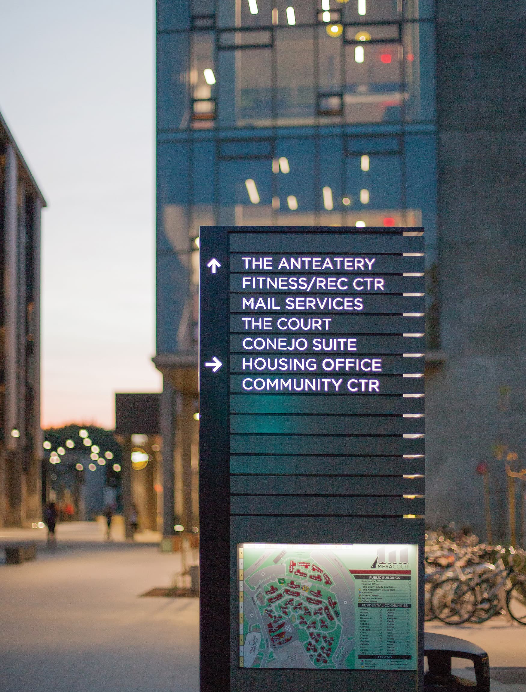
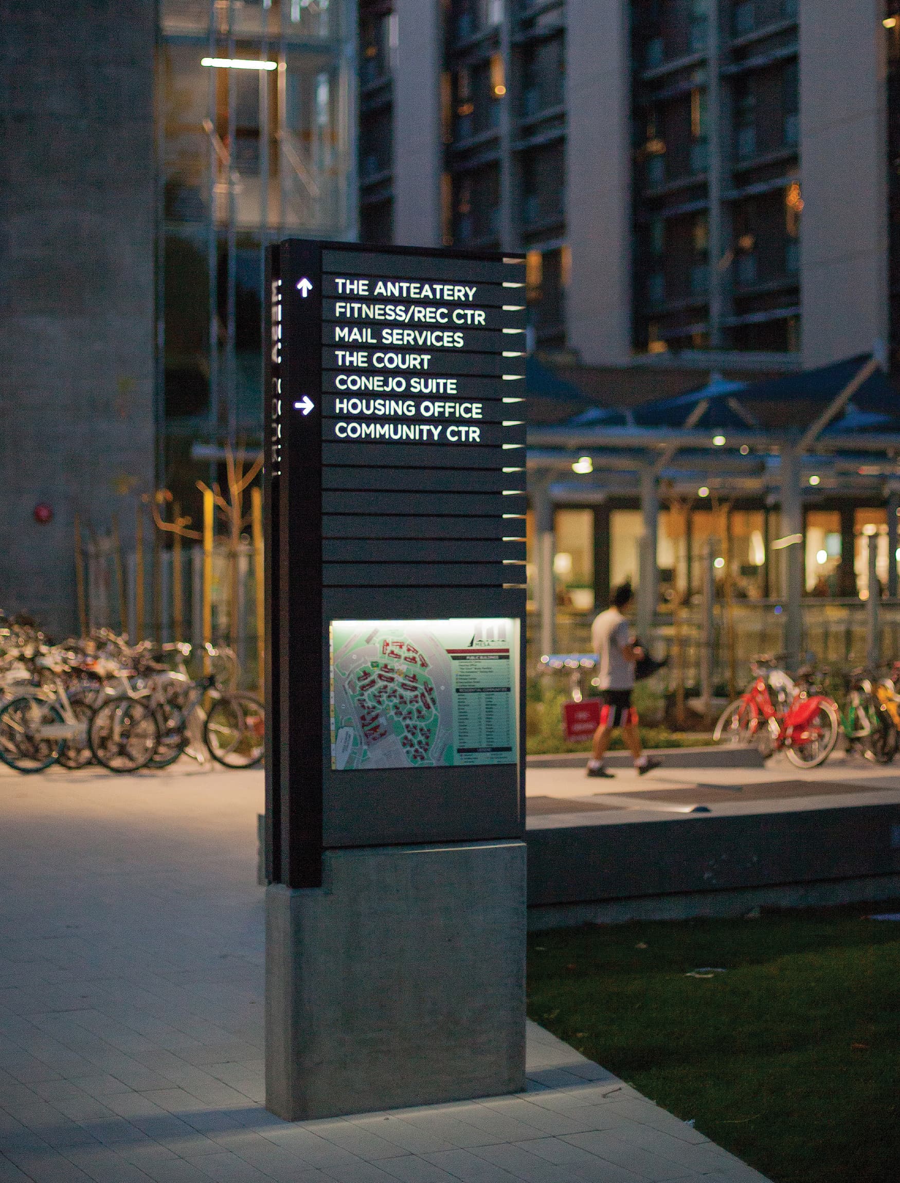
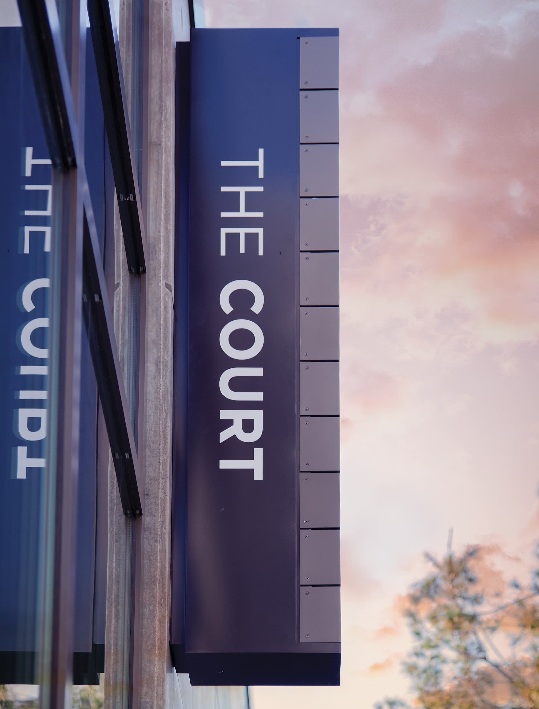
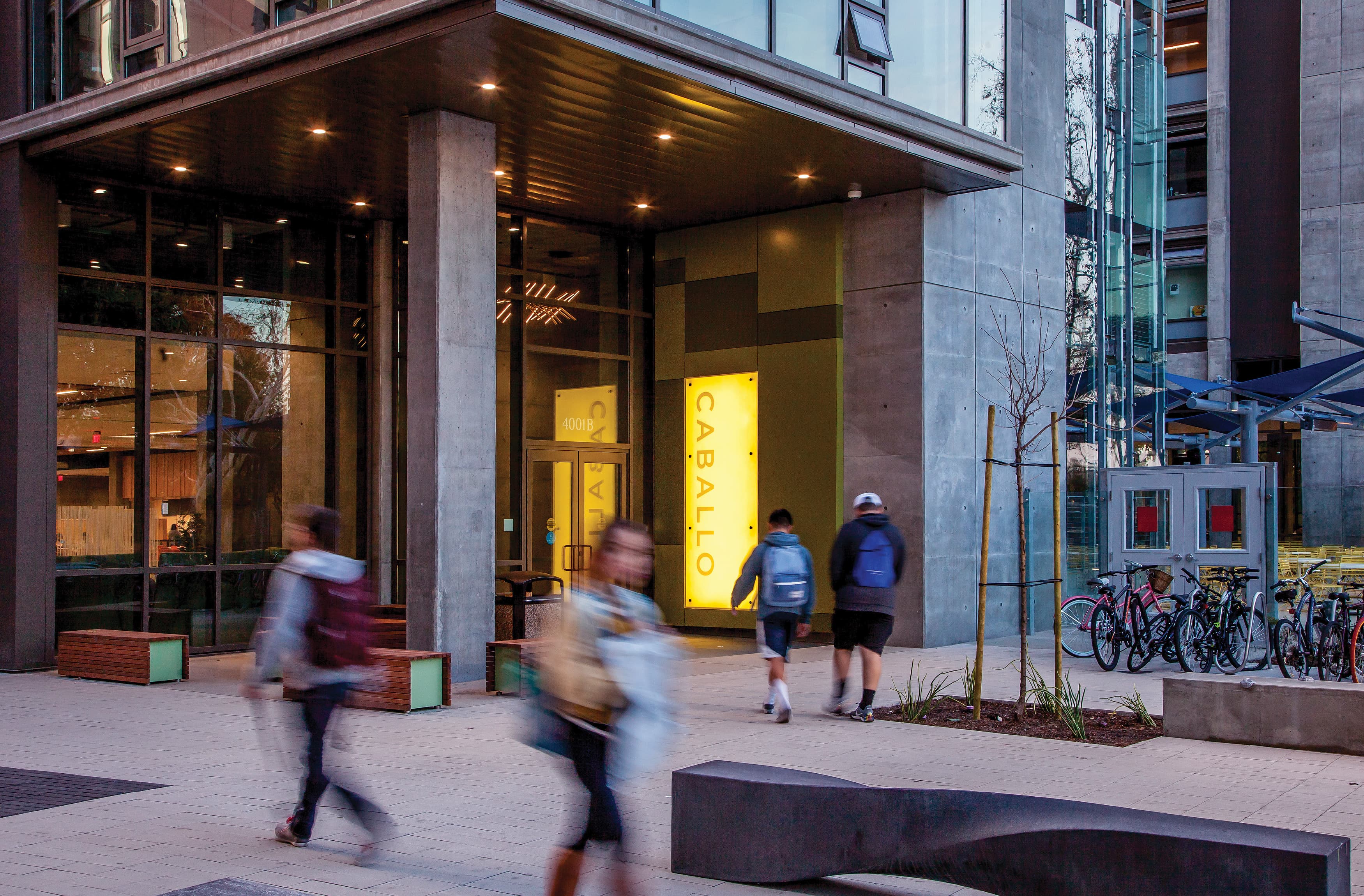
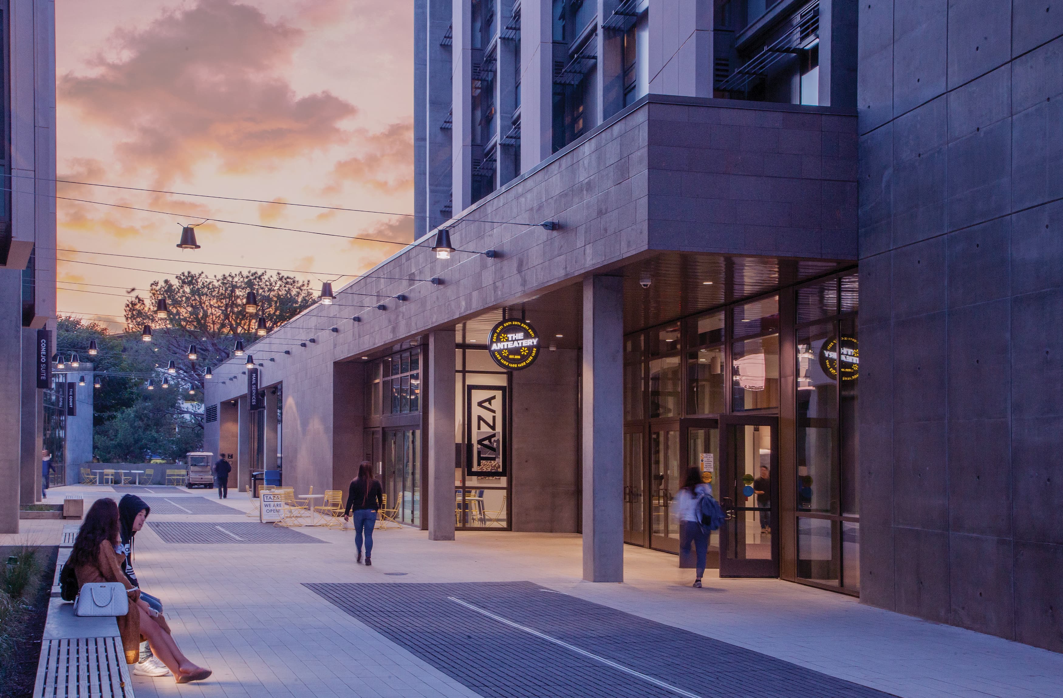
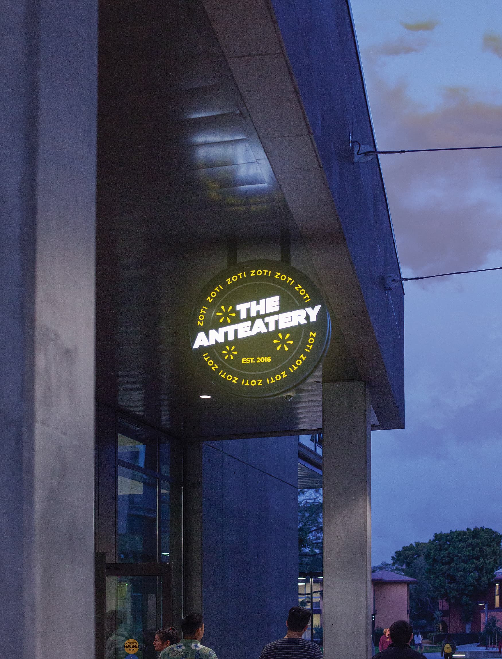
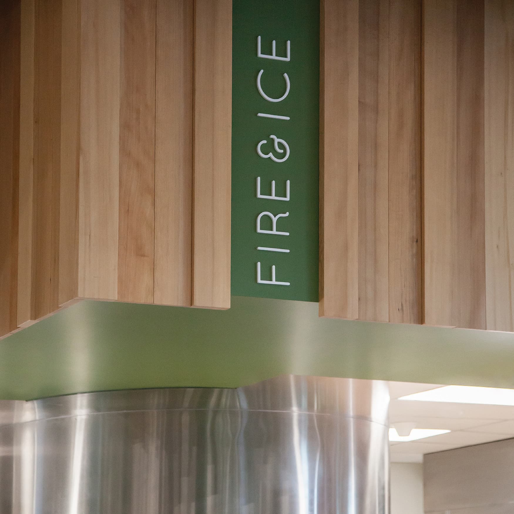
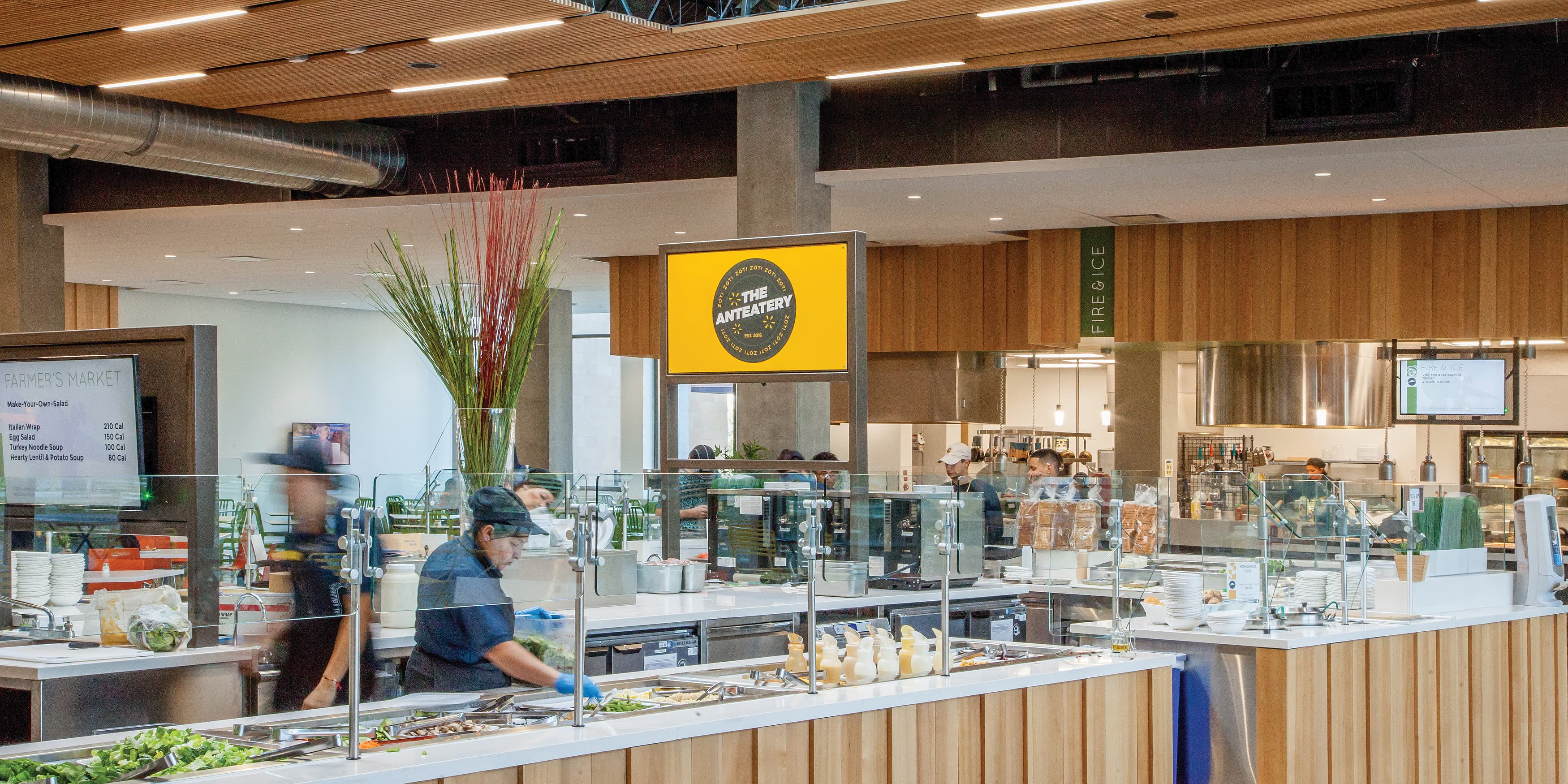
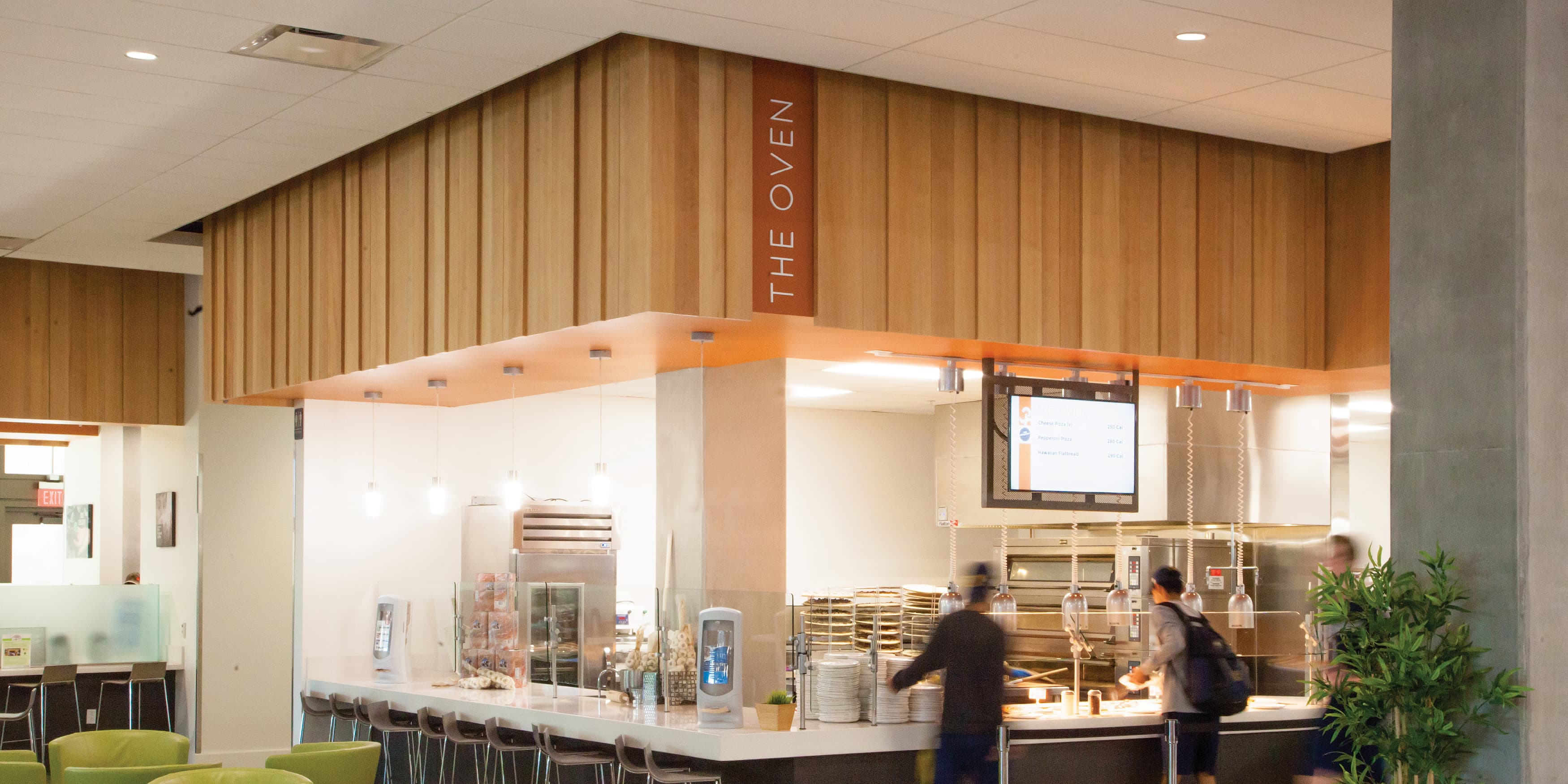
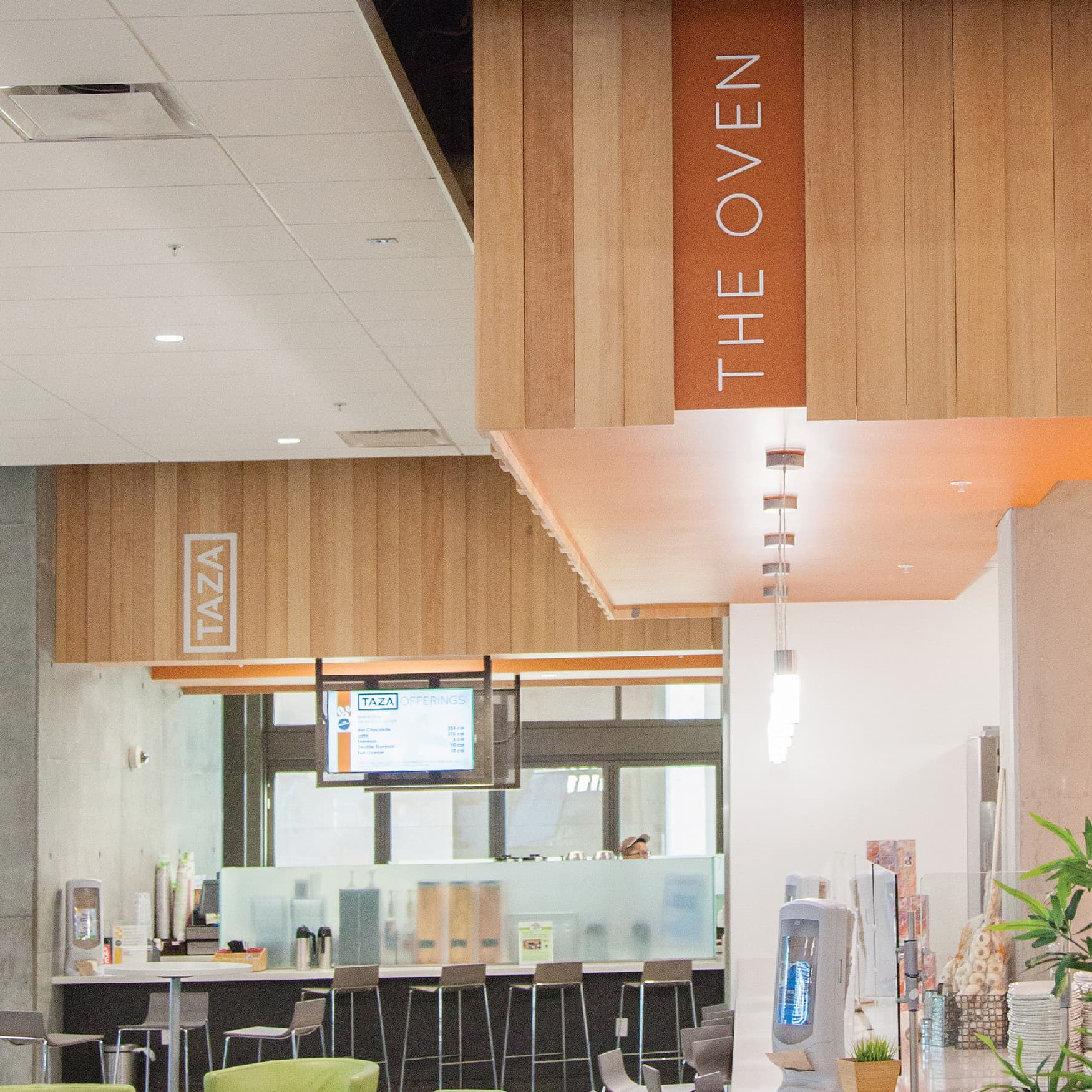
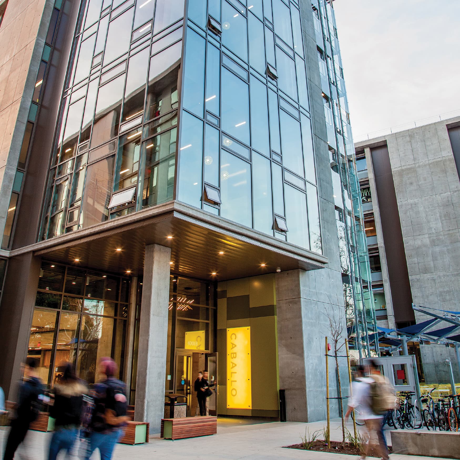
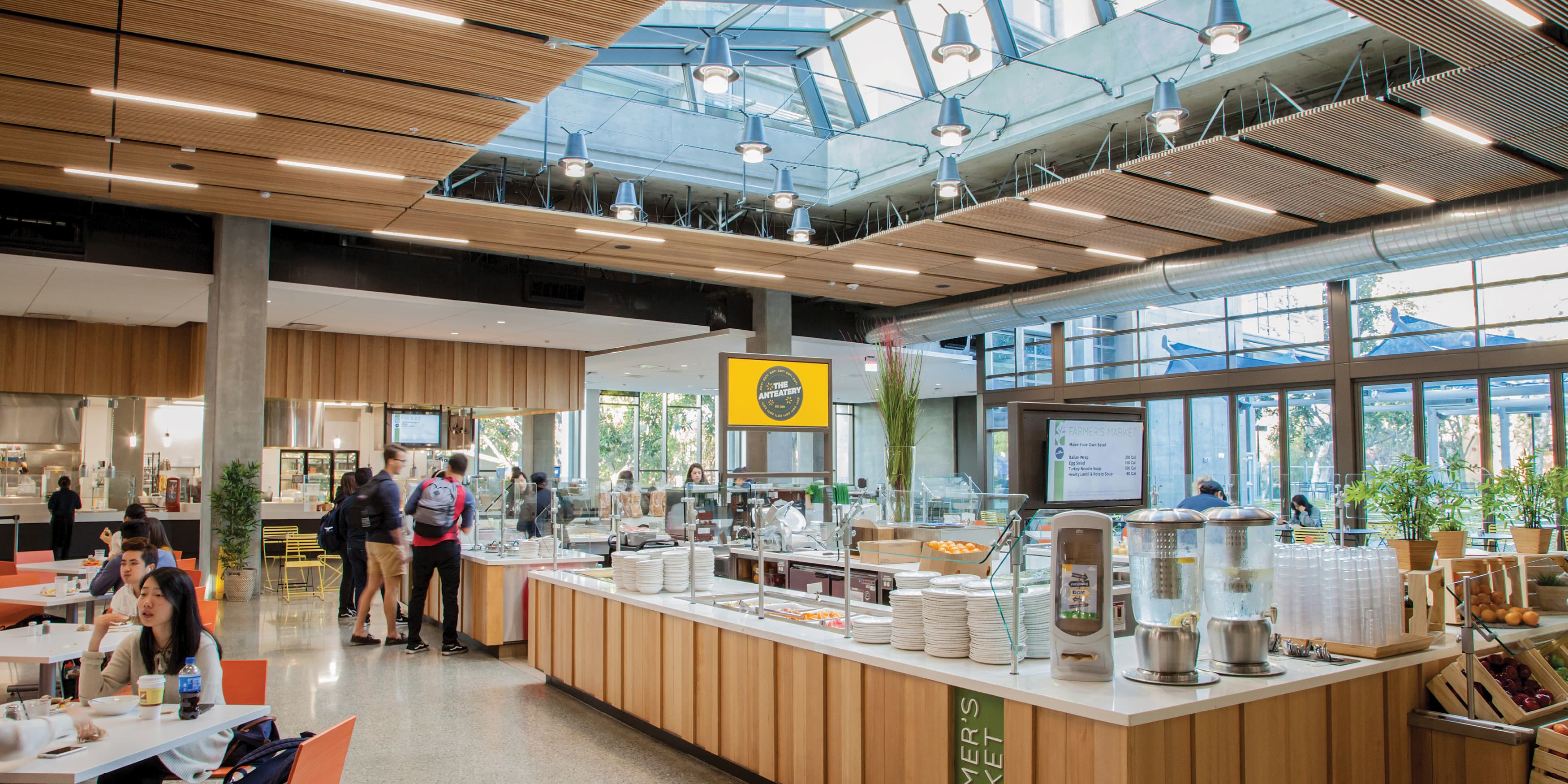
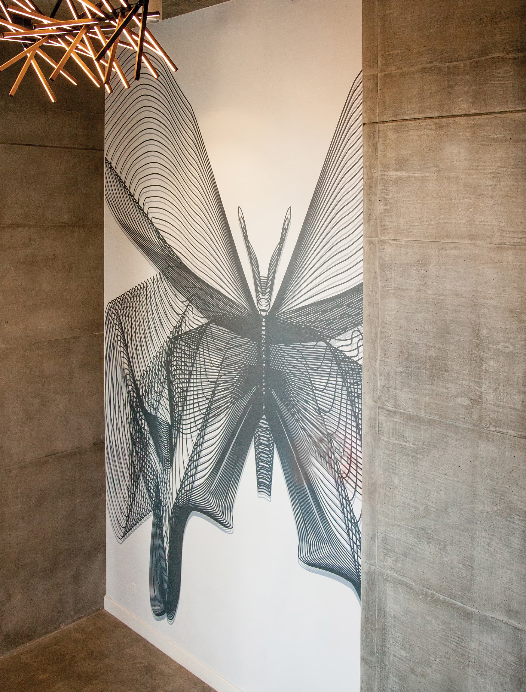
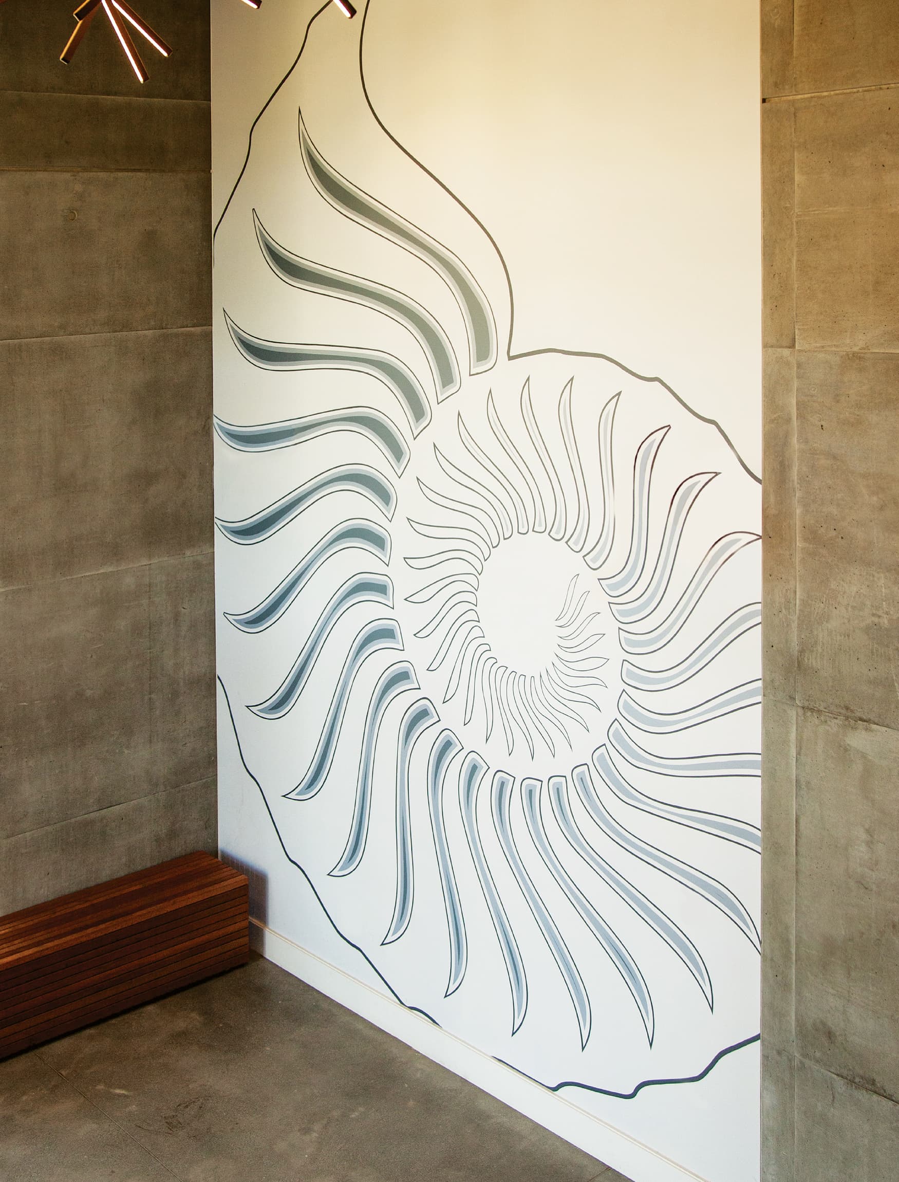
In the University market, the current competition focuses just as much on amenity offering and student life as it does on academics, and the challenge for RSM Design was to provide creative design solutions that meet the rising expectations of today’s students. RSM Design developed a family of signage using three main design elements: a deep, espresso brown cabinet structure, metal slats that echo the architecture from Mithun, and a concrete base. Carrying these motifs throughout, RSM Design was able to create an innovative design solution that met the client’s modest budget. Additionally, the team produced a series of mural graphics in a placemaking design package at the entrance of each hall and the Anteatery, which added to the character and value of the spaces
