THE CHALLENGE: A COMPLEX HISTORY
In the early days the site was home to a thriving African American community, a neighborhood previously known as the Gas Plant District. But in the beginning of the 1980’s residents and business owners were notified to leave, and the entire community was bulldozed and destroyed in order to make room for the development of a large stadium. Since 2016 The City of St. Petersburg has been working on plans to redevelop the area once again after the sports team announced their departure– this time with a different goal in mind: honor the place’s past and restore a once destroyed community.
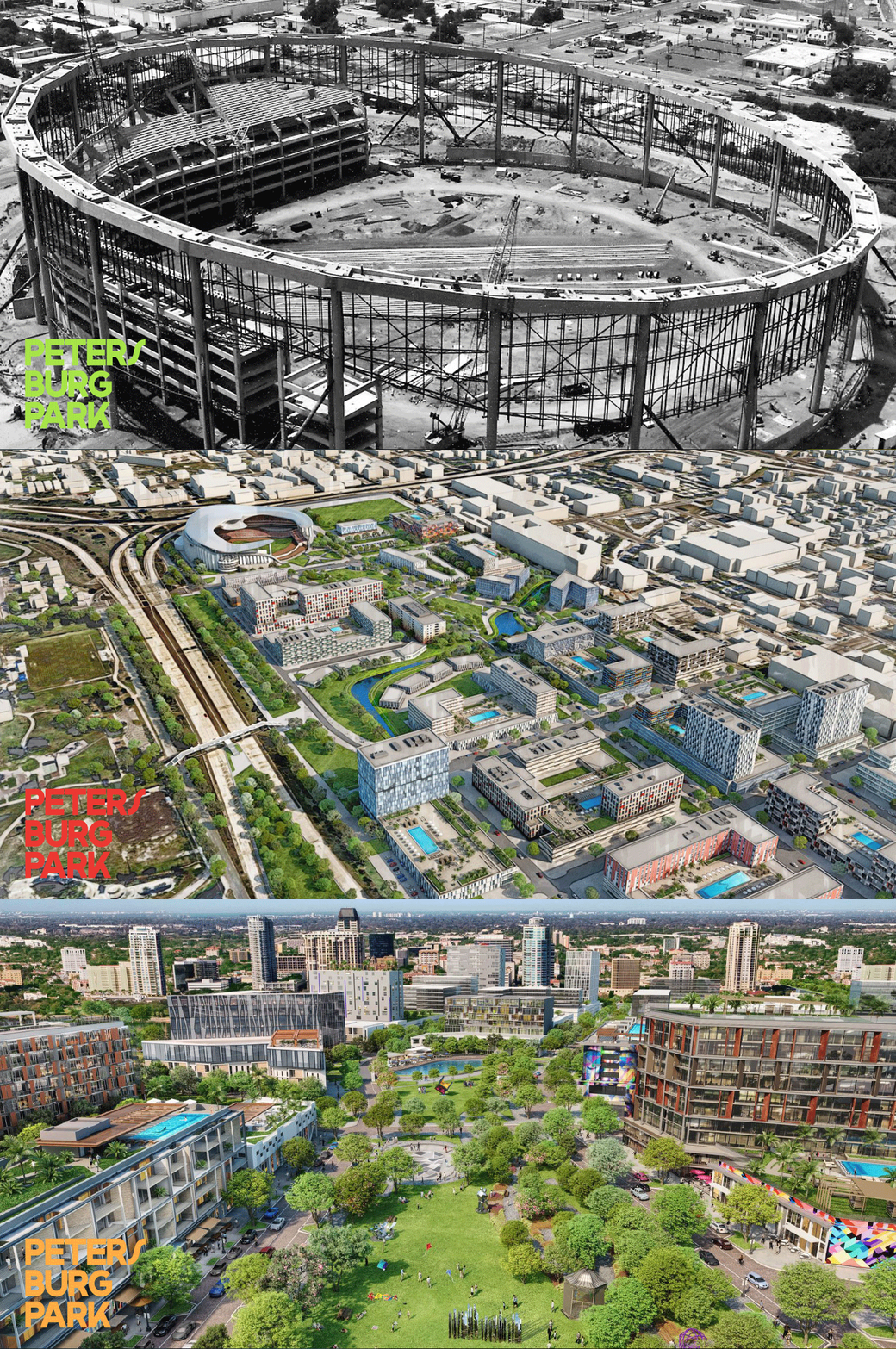
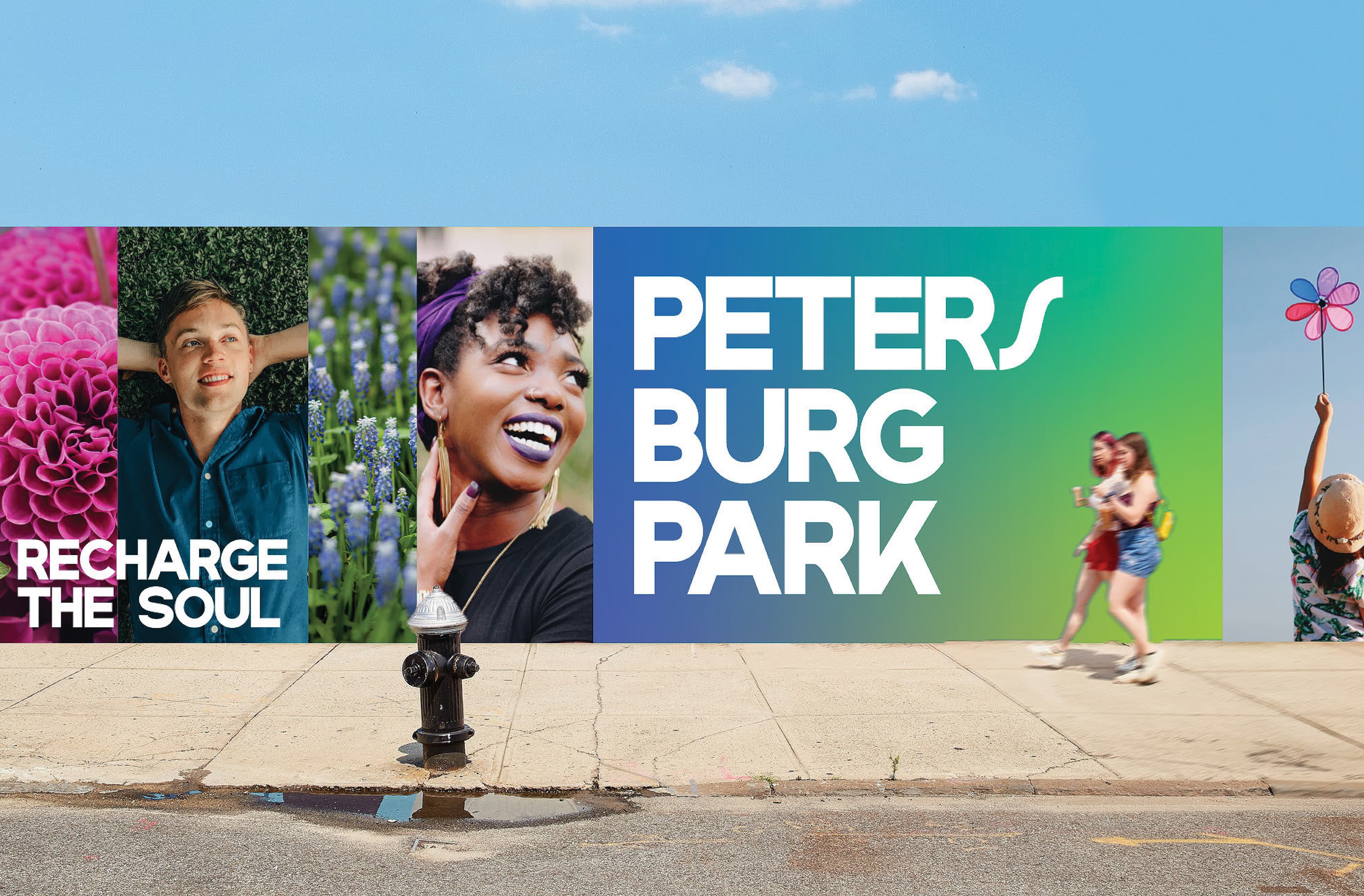
A city park that embraces the surrounding community on a human scale and becomes an oasis to recharge the soul by celebrating nature, the arts, healthy living and learning.
THE DESIGN PROCESS: EXPLORING THE BRAND VALUES
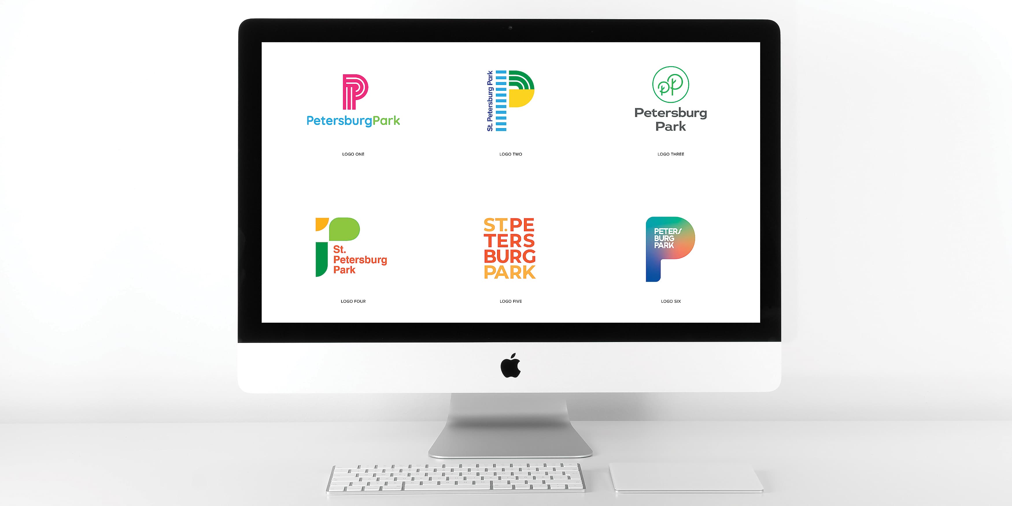
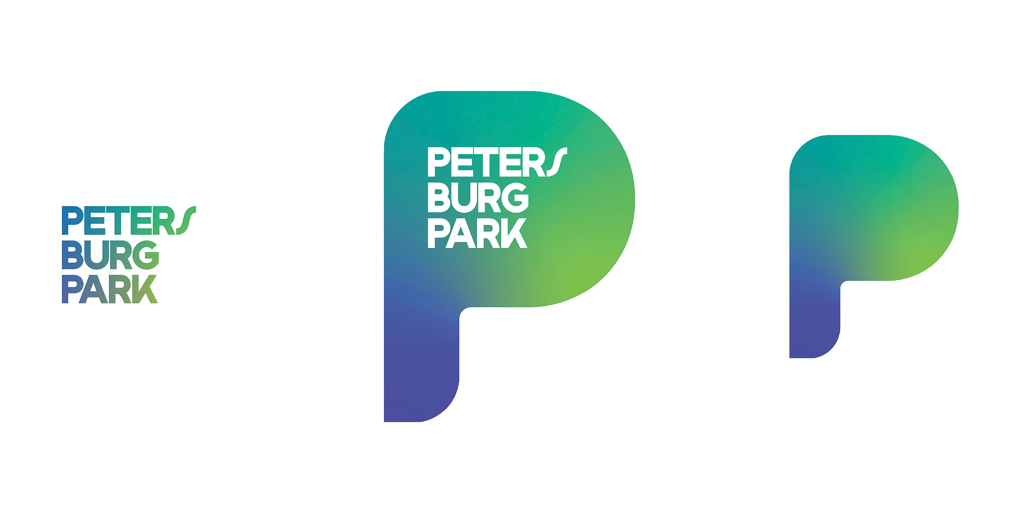
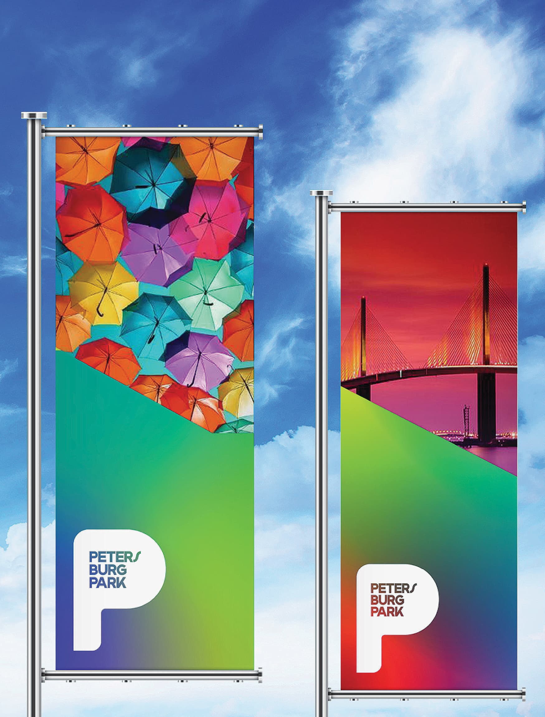
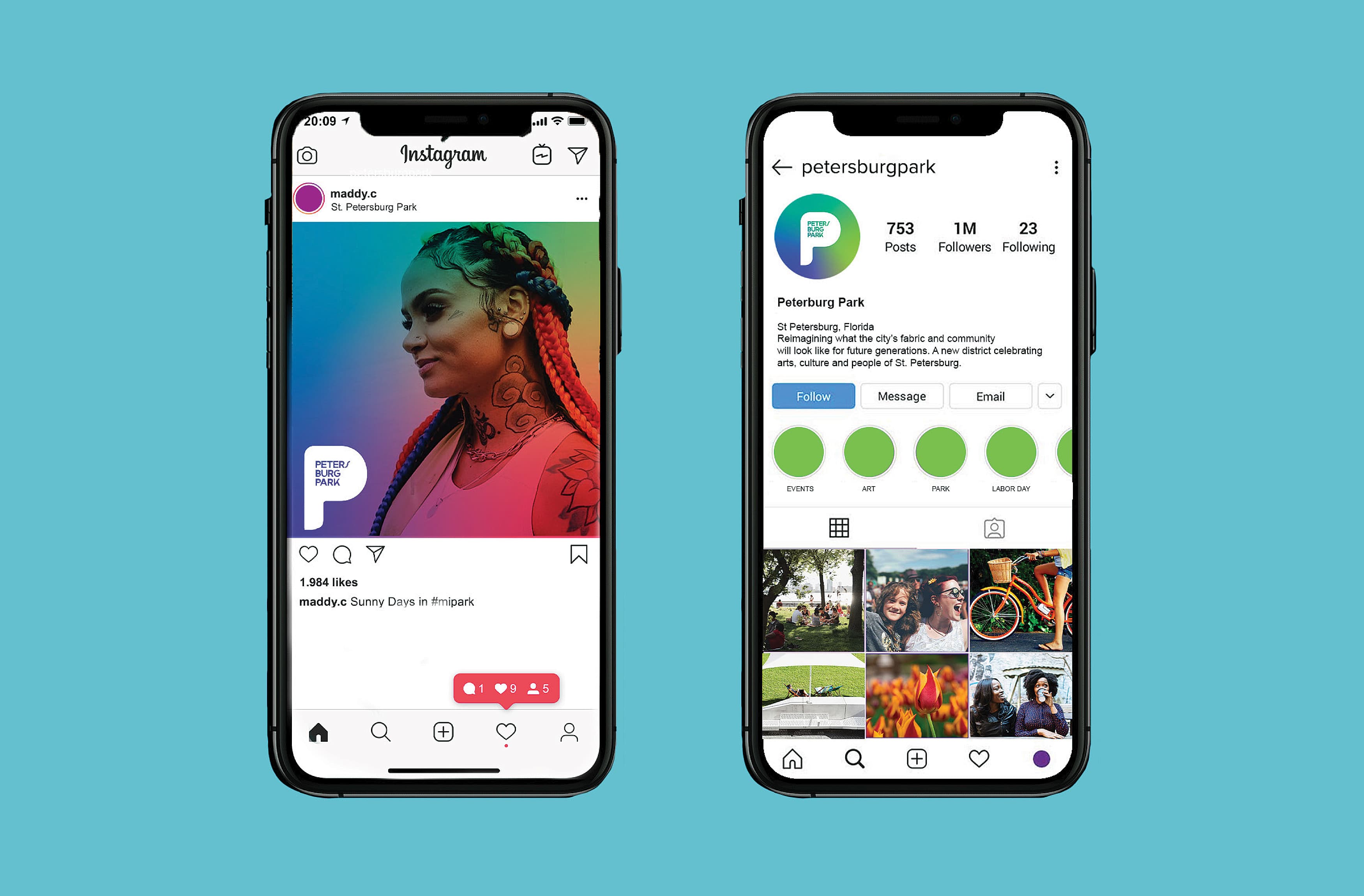
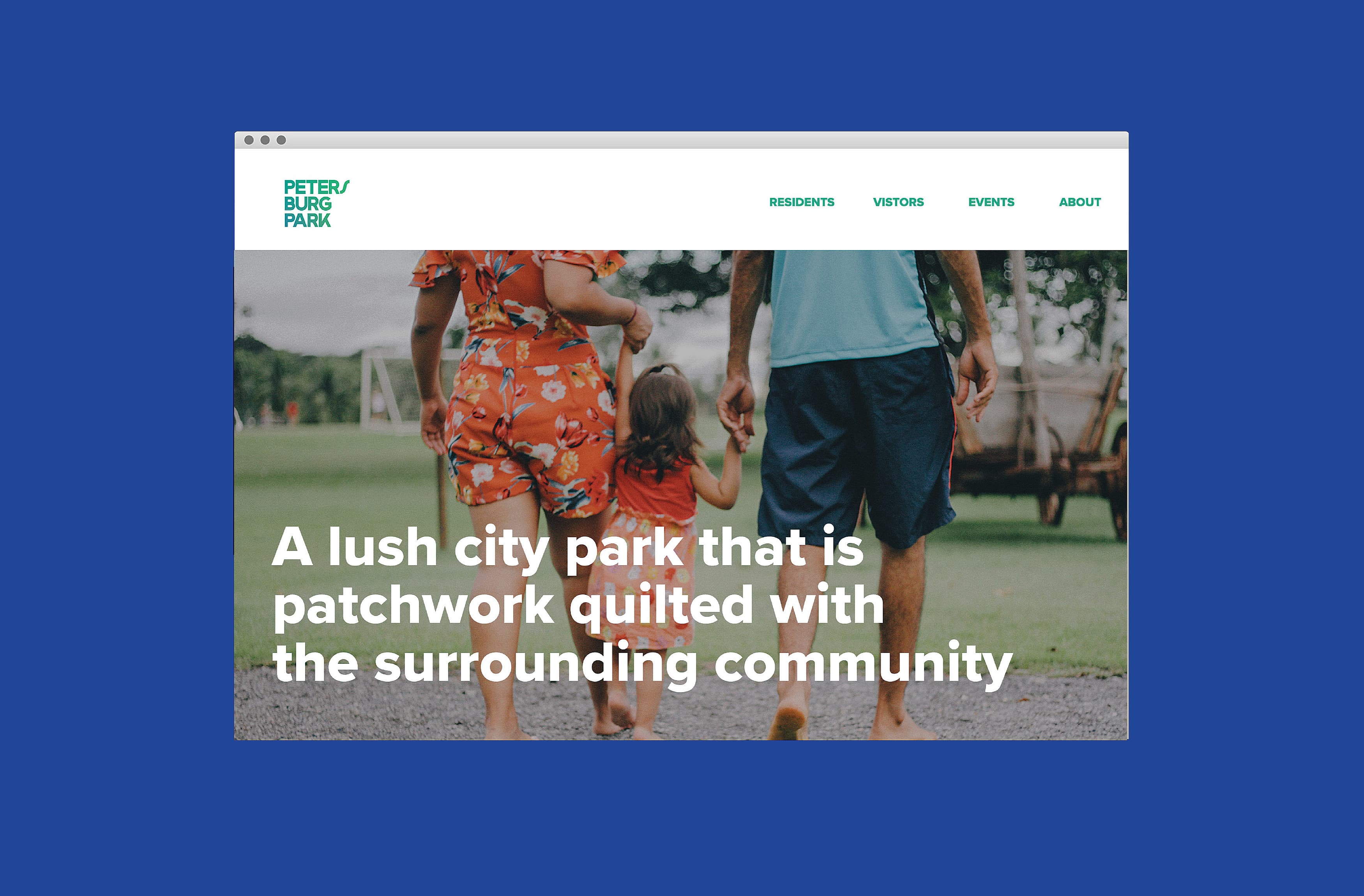
The branding and visioning process began with a series of community workshops, led by Unicorp, to ultimately gain critical insight from the public. Through key conversations it was decided that Petersburg Park would reflect the community’s desire for a park to simply be a place to gather with friends and family for a picnic. The brand kit of parts, such as name, color palette and logo, would become critical elements to how the park would be seen to the public. Embracing topics of diversity, community, friendliness, and forward-thinking ideas, the team developed each component in detail.
See other RSM Design Park and Outdoor Spaces projects ›
