San Antonio, Texas

Pearl Brewery

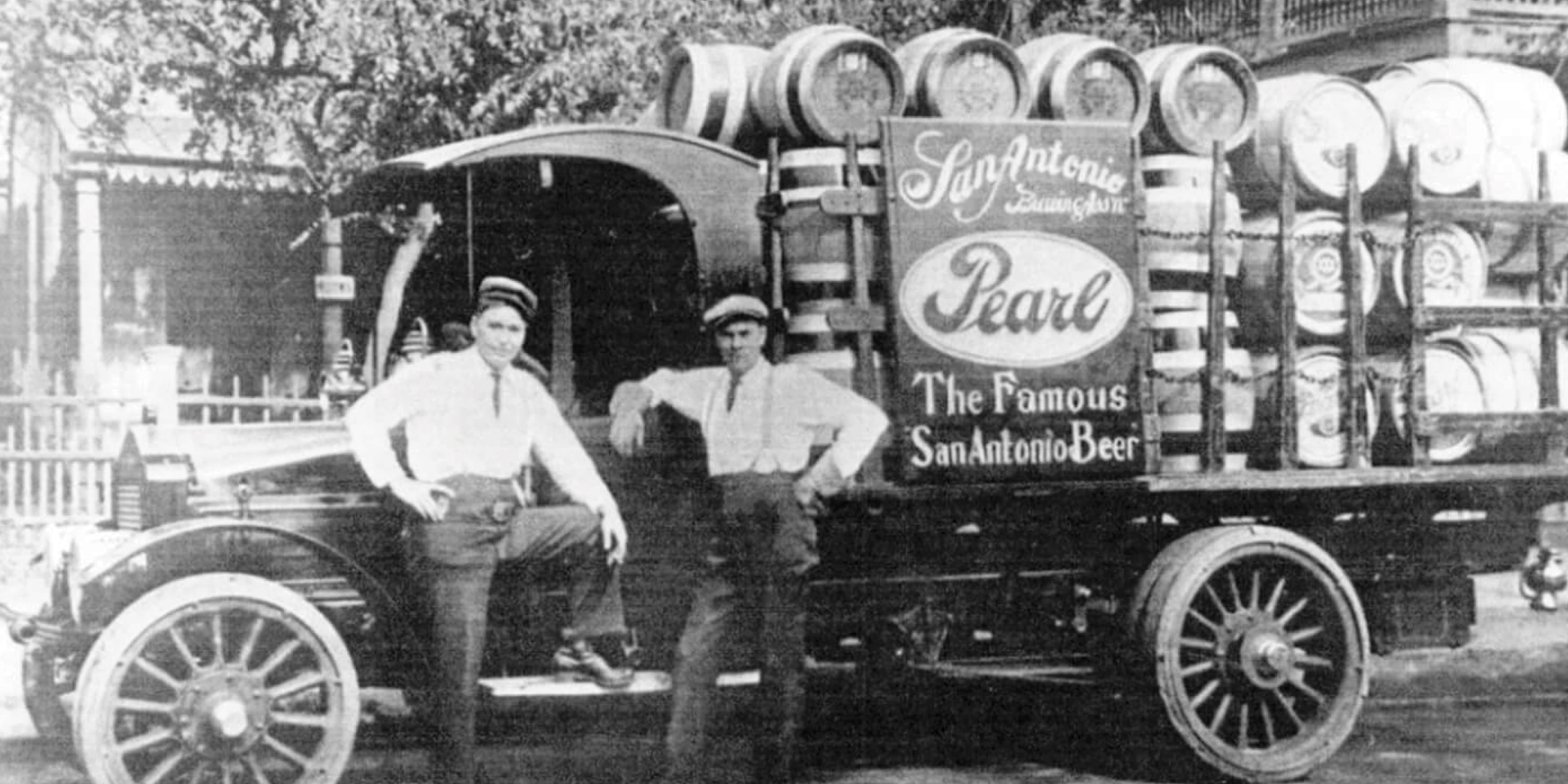
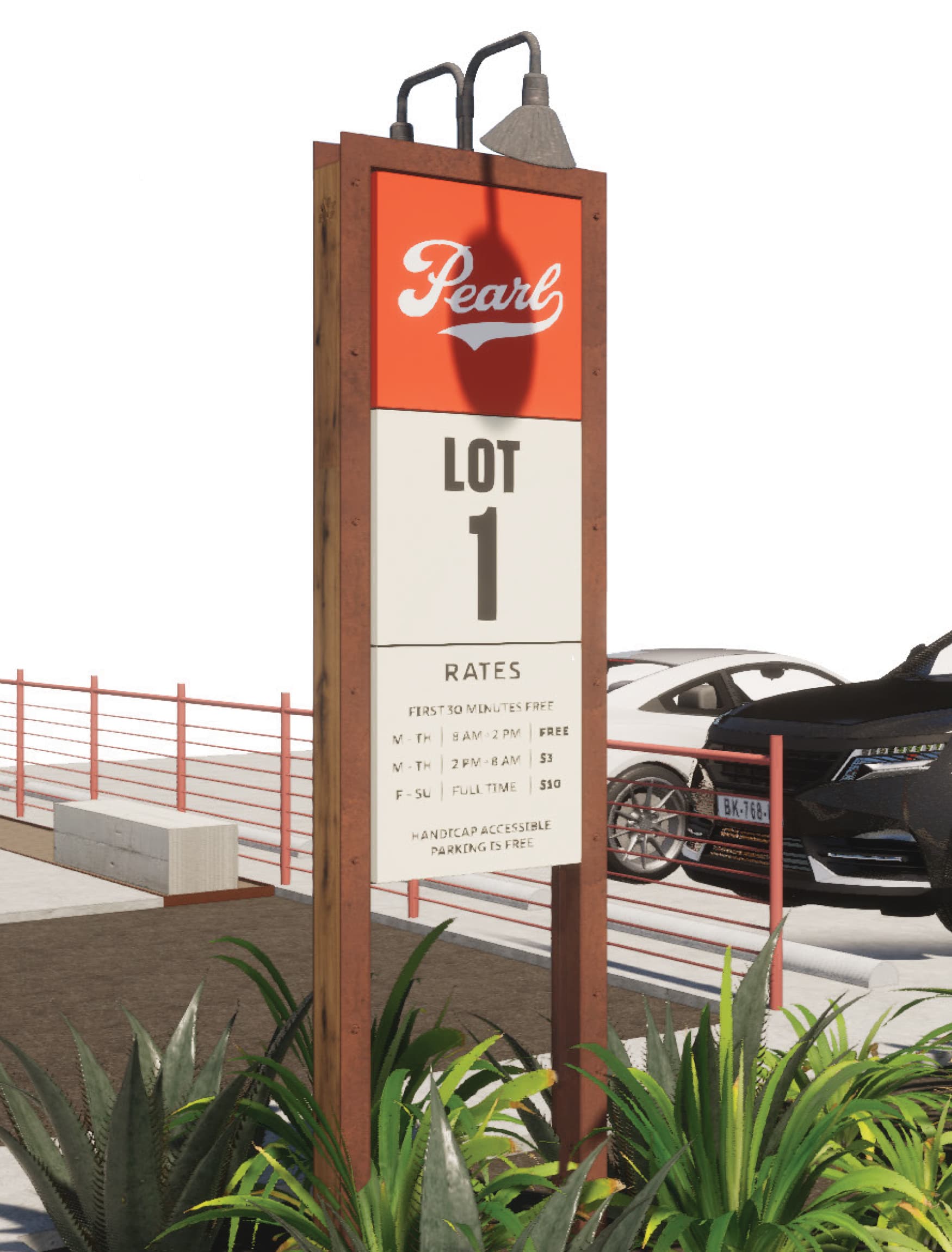
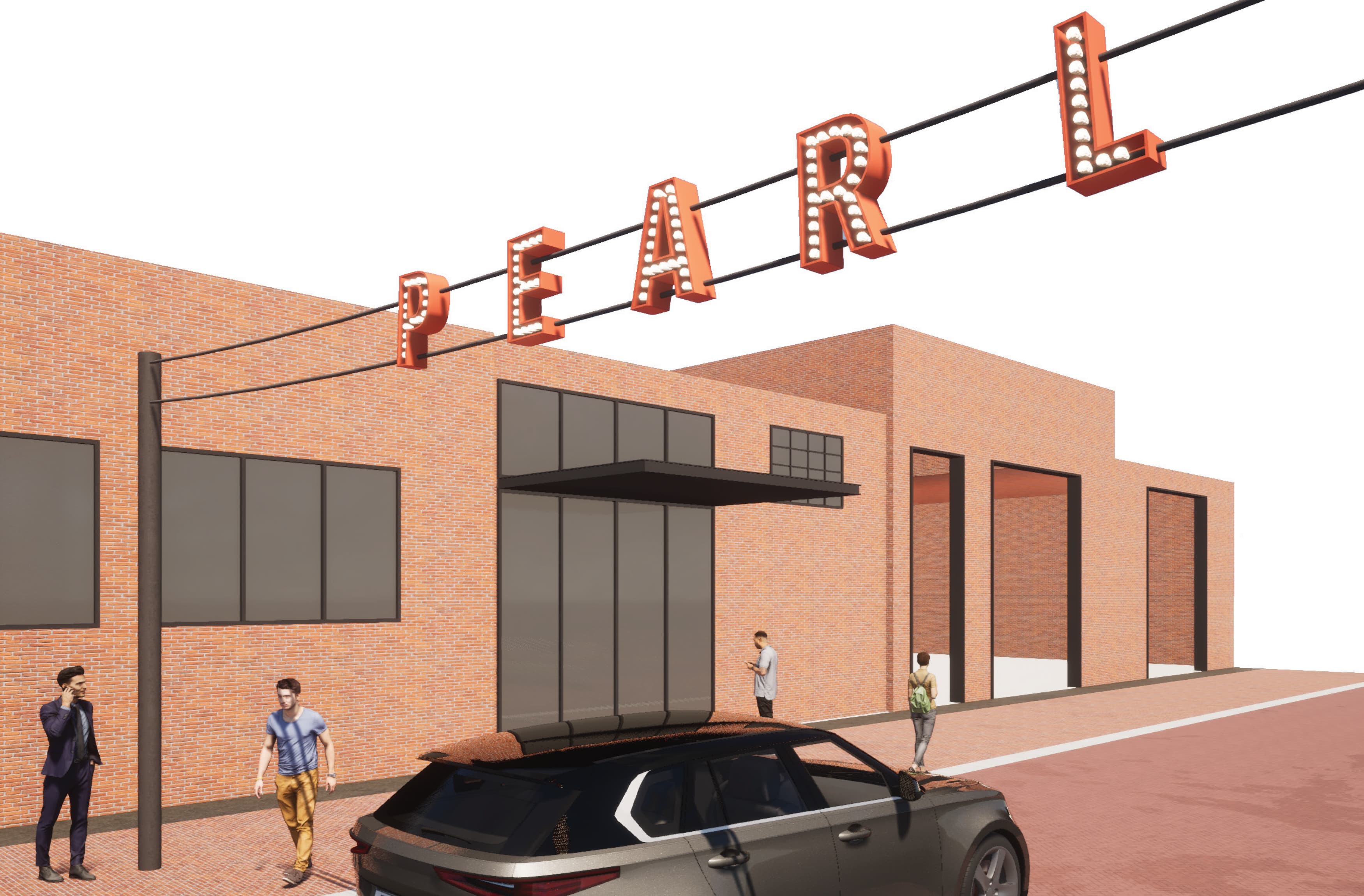
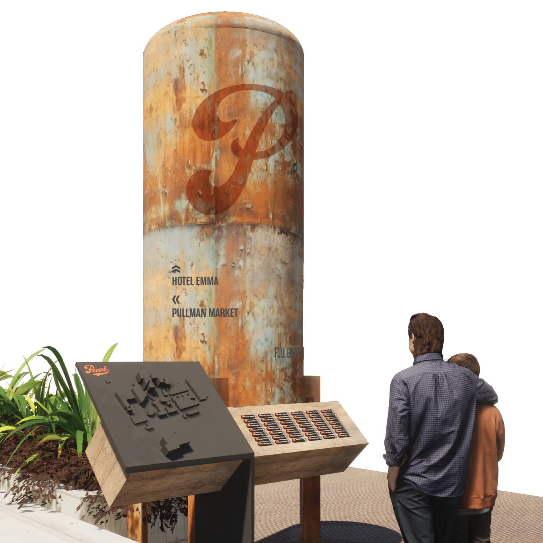
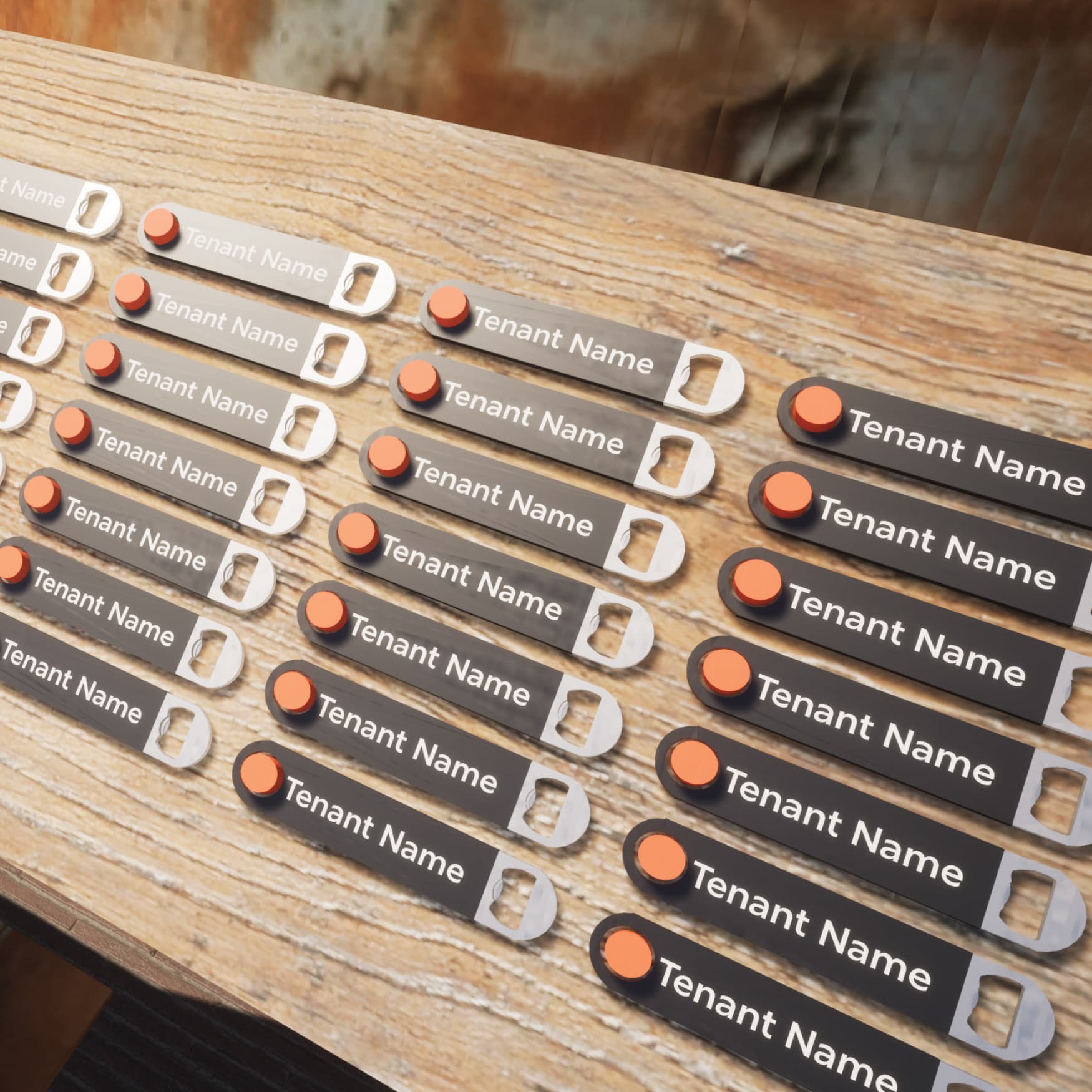
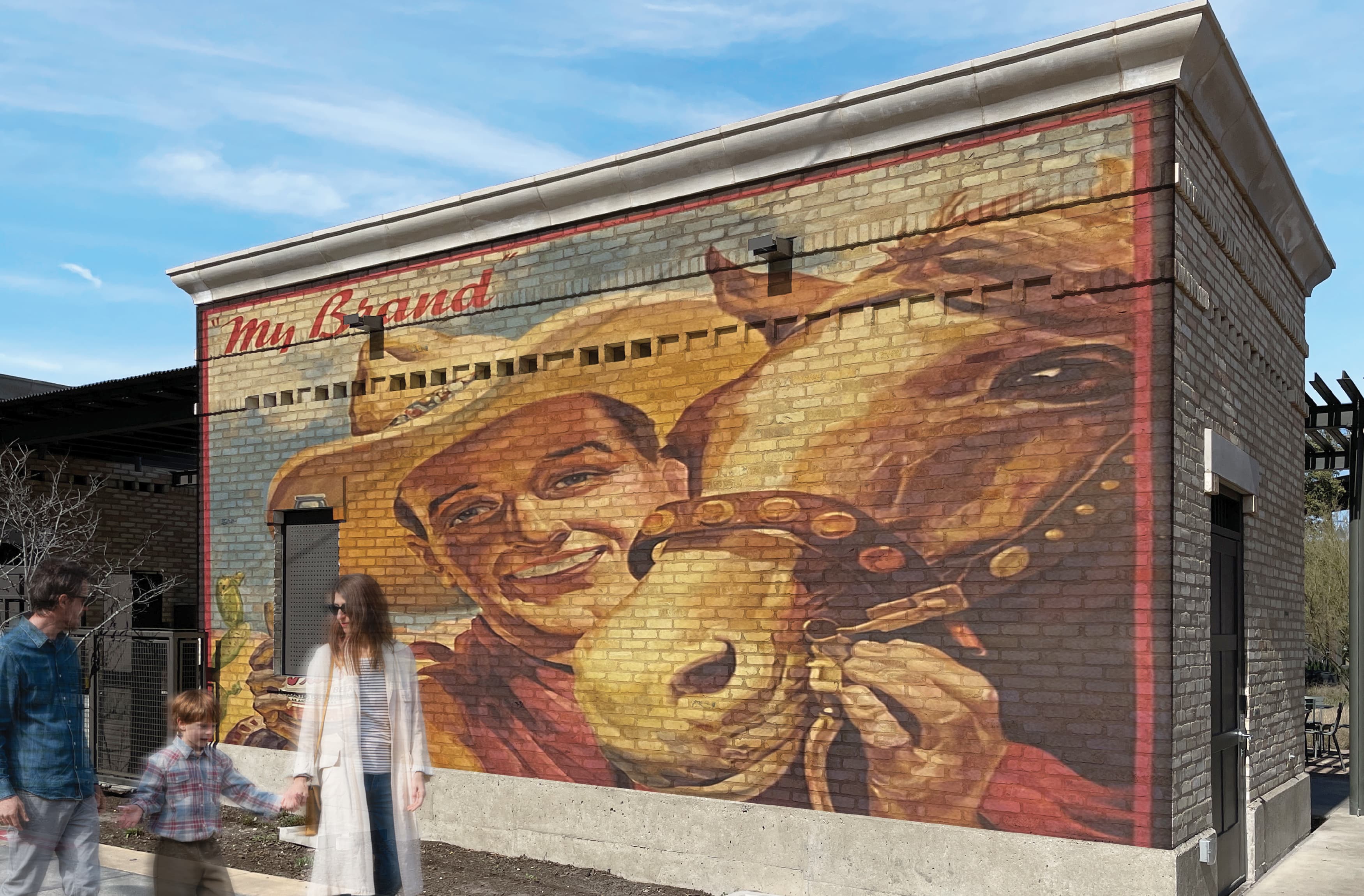
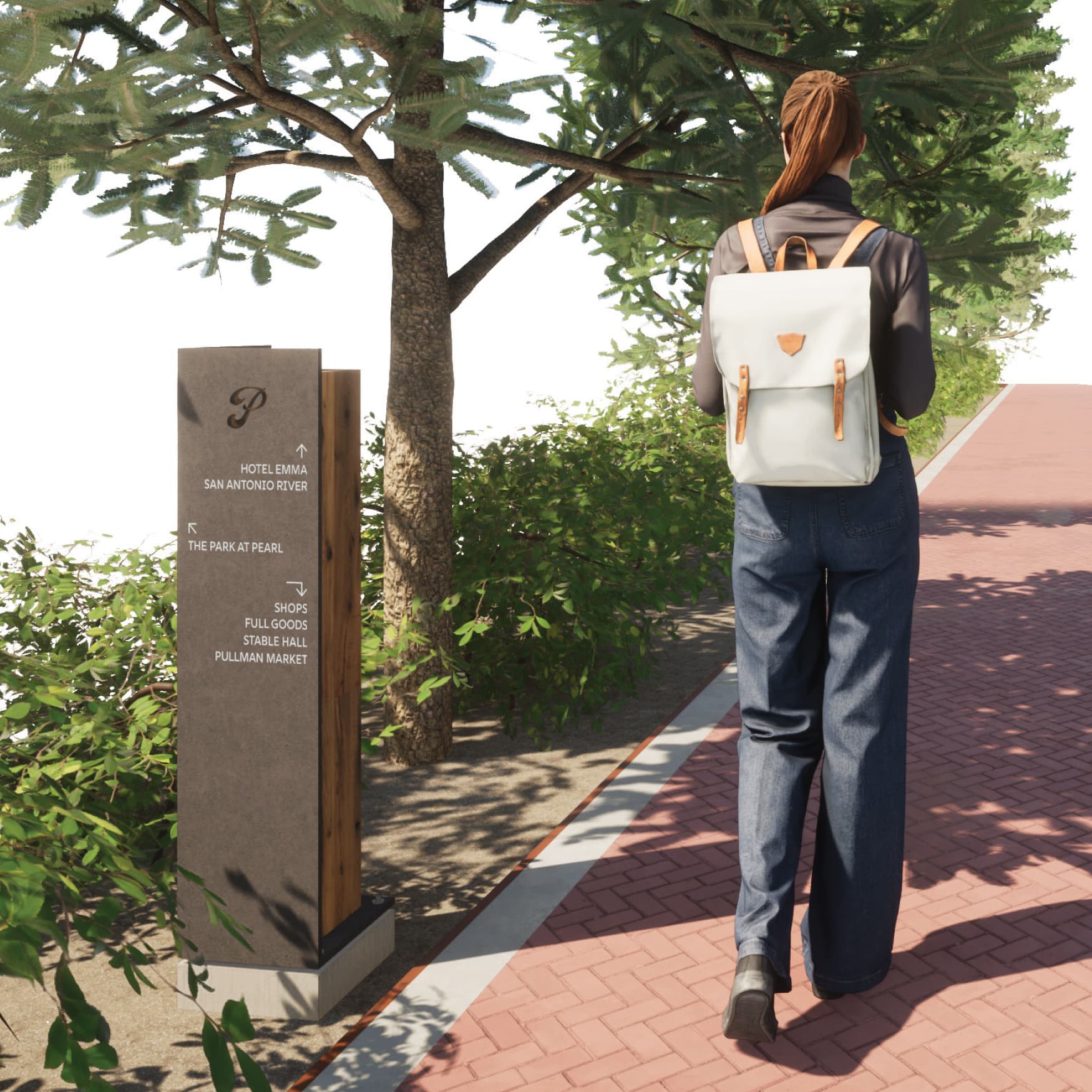
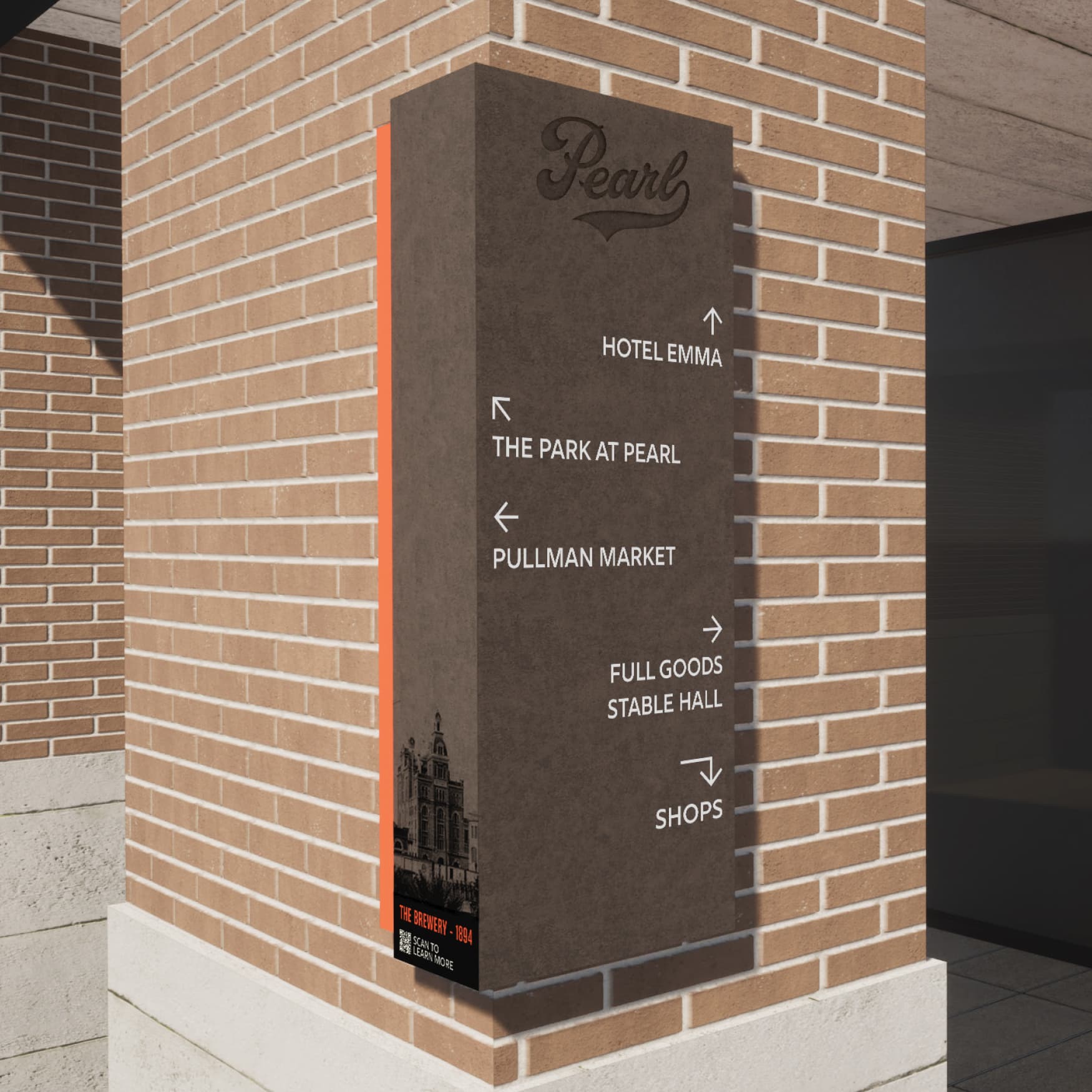
RSM Design partnered with Pearl Brewery in San Antonio, Texas, to reimagine the site’s existing environmental graphic design and wayfinding strategy. Pearl is a beloved mixed-use destination anchored by an 1800s historic brewhouse, once the largest brewery in Texas, brewing the esteemed Texas lager, Pearl. The connection to the brewery’s legacy imbues the site with a sense of history and authenticity, making it a treasured cultural destination. Drawing inspiration from Pearl’s historic artifacts and distinct architectural language, RSM Design created a visual language that was both familiar and fresh. The signage incorporated unique materials, thoughtful placements, and creative forms, maintaining a strong connection to the site’s heritage while enhancing the user experience with moments of playful discovery. The result was a wayfinding system that not only guided visitors but also became an essential part of Pearl’s storytelling, inviting exploration and curiosity.

Adding to the charm of the historic Pearl

BREWERY RELICS REPURPOSED INTO WAYFINDING

As part of the research process for our wayfinding work at the Pearl in San Antonio, the RSM Design team had the unique opportunity to visit Pearl’s library and archives—a treasure trove of historical materials documenting the area’s industrial past. Among shelves of old photographs, maps, and objects, we discovered antique screw jacks and vintage railroad spikes, once used in the original brewery and rail infrastructure. These authentic artifacts served as a meaningful source of inspiration, and we’re incorporating similar materials into our wayfinding elements to add texture, depth, and a strong sense of authenticity—anchoring the design in the Pearl’s deep-rooted history of craftsmanship and ingenuity.

PAST & PRESENT BREWERY ICONS FOR NAVIGATION

Working closely with Pearl, RSM Design developped a wayfinding system that strikes a balance between honoring the site’s rich industrial past and introducing a fresh, forward-thinking design approach. Drawing from the existing brand and iconic logo, our team thoughtfully expanded the visual language into a comprehensive system that lives seamlessly within the built environment. Through careful integration of typography, materials, and form, we translated the Pearl’s established identity into tactile elements that guide and inform visitors while complementing the character of the historic site. The result is a wayfinding experience that feels both rooted and renewed—respecting the legacy while supporting the evolving energy of the destination.

Collaborators:

Overland Partners

Next Project

Loading next project…