Social Media story for Cucamonga Station in Rancho Cucamonga, California.

Rancho Cucamonga, California

Cucamonga Station

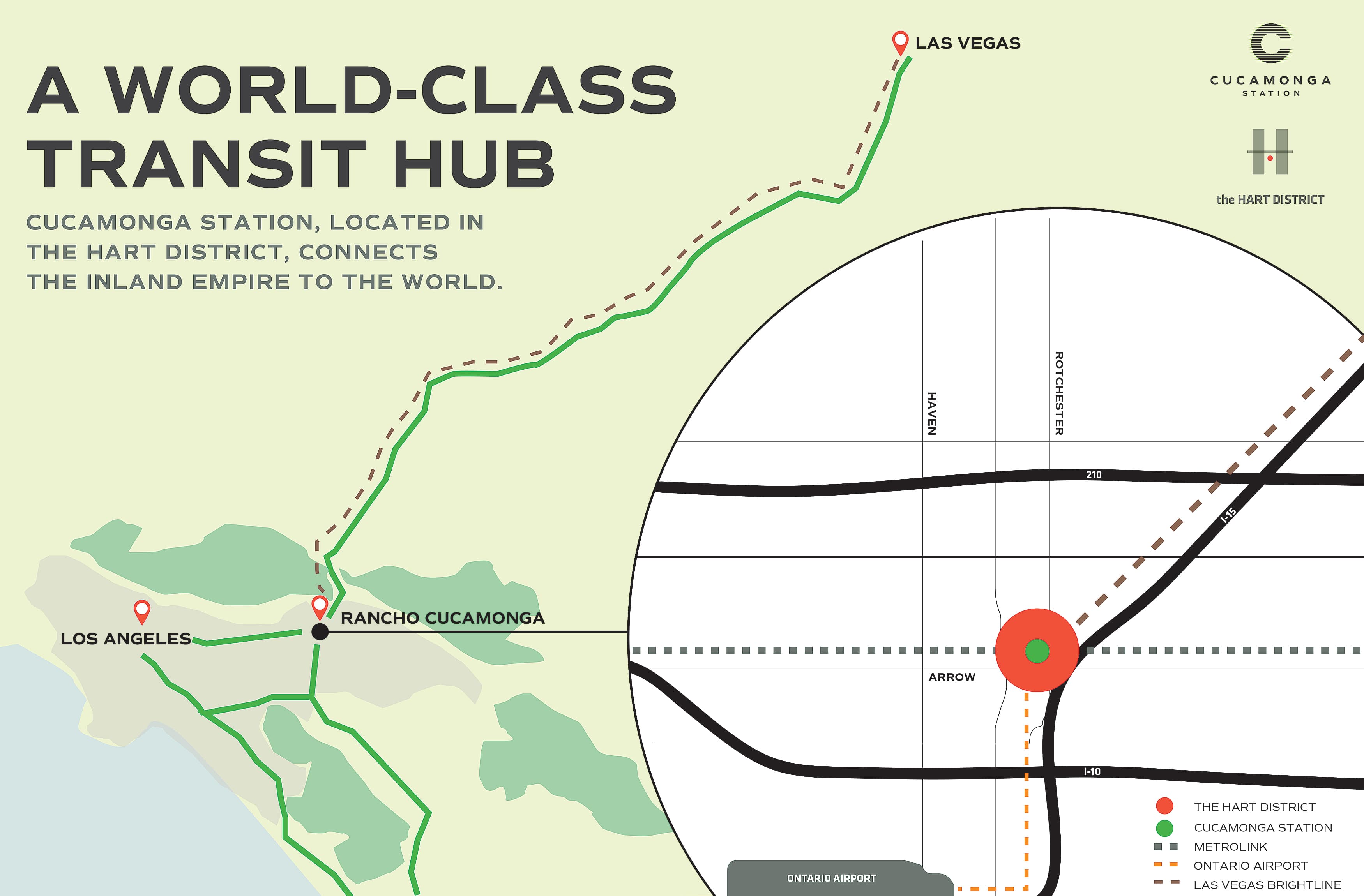
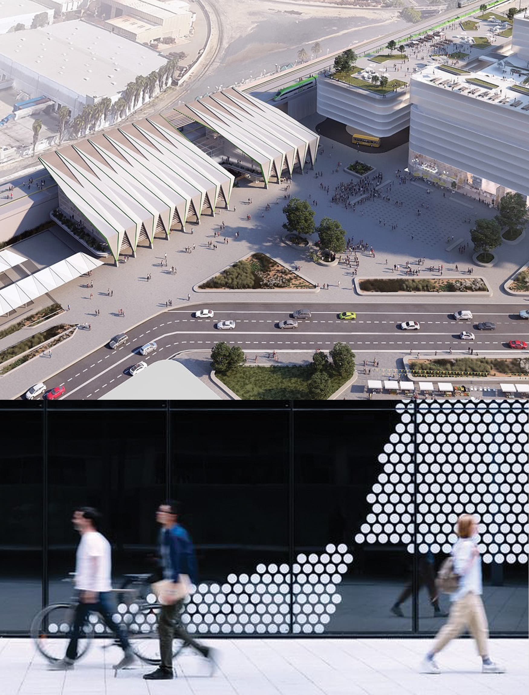
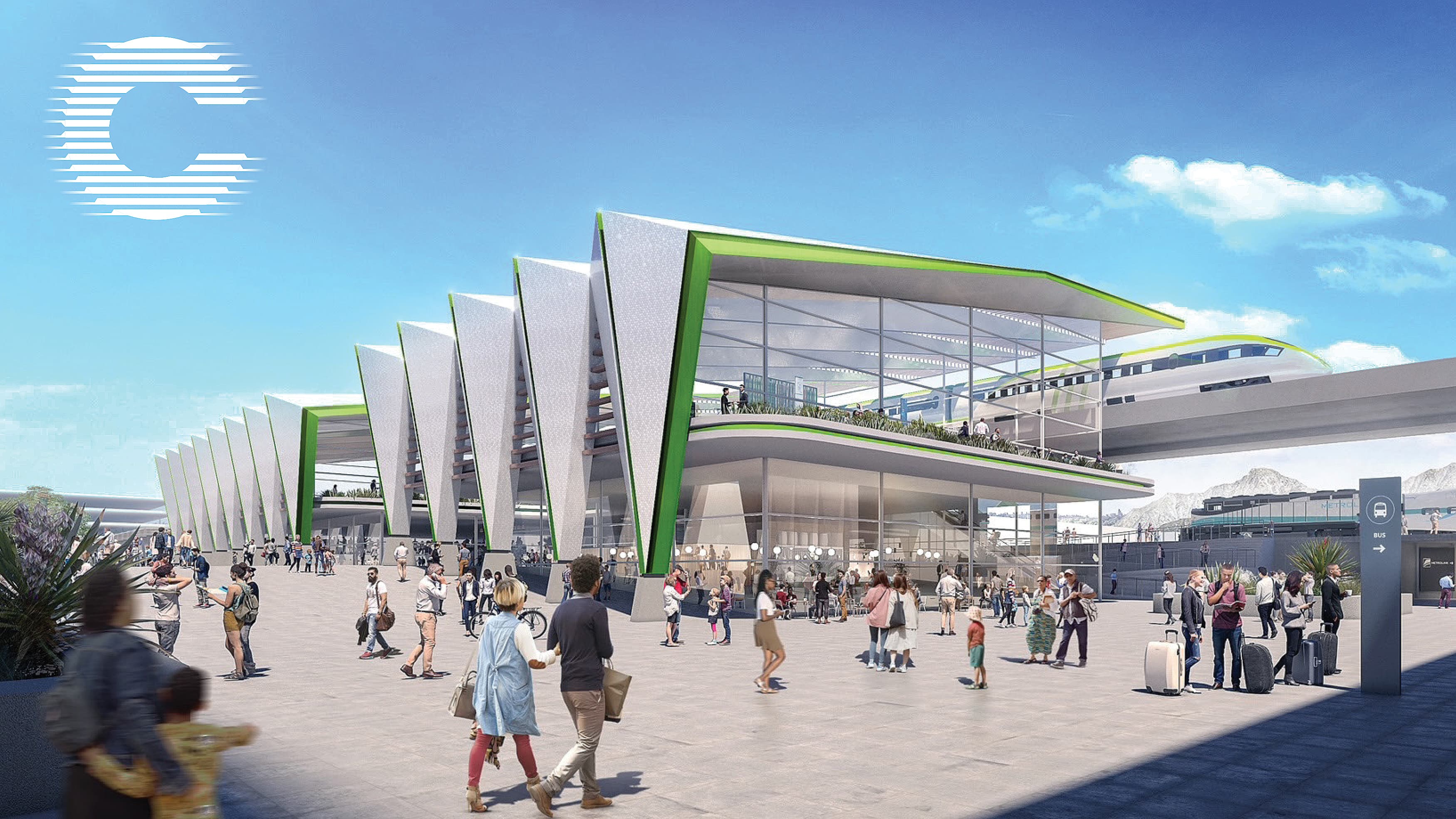
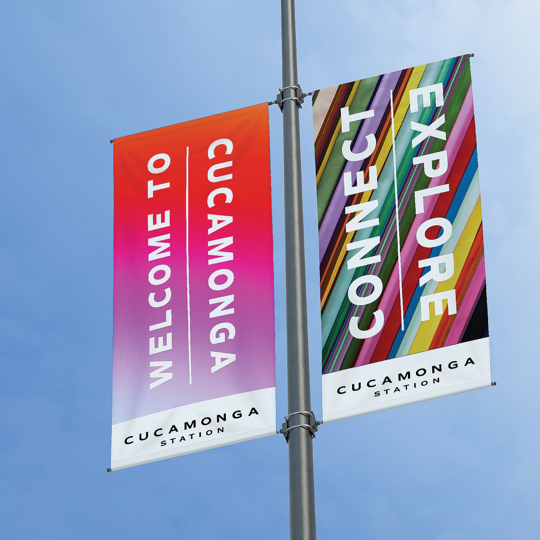
The city of Rancho Cucamonga is championing a first of its kind transit center in the Inland Empire. The space is soon to become a major connection point for those traveling through the area. As well, the destination hopes to spur economic growth for Southern California. Partnering with Ontario Loop, The Boring Company, Metrolink, Brightline and Omnitrans, Cucamonga Station will be the new nexus of transportation in San Bernardino County as well as a gateway to Las Vegas. RSM Design collaborated with the City of Rancho Cucamonga to design a logo and identity system to distinguish this new destination– focusing on connection and movement.

Markets

Client

  • City of Rancho Cucamonga

A TRANSIT CONNECTION POINT FOR SOUTHERN CALIFORNIA

With a number of transit routes for various modes of transportation in the area, Cucamonga Station desires to be a connection point. Already existing in the area, the Ontario Airport Loop creates convenient access from Ontario to Los Angeles County to San Bernardino County. As well, the Boring Company will build a four-mile tunnel, subterranean transit system that will shuttle thousands of passengers per day between to the Rancho Cucamonga station. Brightline will also extend their high speed rail line from Victorville to Cucamonga Station. The goal of linking multiple transit centers is to create access for residents who depend on transit for everyday life. The ultimate mission is to provide an opportunity for residents to travel to and from work– ultimately boosting the economy and well-being of the area.

As a new multi-modal hub, Cucamonga Station connects the region to the world; offering new opportunities for the community to commute, travel, and explore new food and shopping destinations.

DESIGNING THE BRAND IDENTITY

RSM Design partnered with the City of Rancho Cucamonga to create a logo and brand for the transit station. Inspired by the impactful and memorable form of a sans-serif letter “C”, the logo embraces simplicity and contemporary design. The design team understood that the brand needed to reinforce innovation and connectivity while also embodying a sense of playfulness. The design incorporates motion through the use of gradients to symbolize the forward-thinking and fast moving destination.

BRAND EXPRESSION

Cucamonga Station stands as a destination for the community. Therefore, the brand should express a sense of energy and connectivity. The design team chose a color palette that is expressive and diverse, as well as pays strong attention to ideas of culture and motion. Patterns are also at play within the brand. These illustrative elements add fluidity and a sense of movement that reflect the hustle and bustle of a transportation center.

DESIGNING A LOGO THAT IS VERSATILE

With a large number of people visiting the transportation center every day, there was a need to incorporate diversity into the brand. The space will become a destination for a variety of people from different cultures, perspectives, and economic backgrounds. The design team worked to create a logo mark that embodies a variety of experiences, rather than being static to one group or one experience. The interchangeable logo mark is flexible while always being relevant and consistent. Additionally, this allows the brand to be translated across a variety of surfaces, including marketing collateral and brand partnerships.

Collaborators:

The Boring Company, Metrolink, Brightline, and Omnitrans

Next Project

Loading next project…