November 29, 2018
Campus Placemaking: Anchoring Students with Clarity, Specificity, and Purpose
November 29, 2018
RSM Design believes that every project is unique, but certain core needs weave through all projects. We have recently explored how the signage and placemaking needs on university and college campuses are a microcosm of this broader context and that a few key ideas about the role of signage builds stronger brands and positive student experiences.
As our team approaches the wayfinding and signage needs within the world of higher education, we start by identifying what connections are most important to the design problem at hand. Prospective students want clarity, while returning students, faculty, and staff value an integrated approach in tune with the campus culture. This might seem like a balancing act, but by remaining true to the core brand both goals can be met simultaneously. With placemaking on campus, as with many other wayfinding challenges, the key is to give students the right information at the right time.
When visitors step onto the campus for the first time, they are building important early impressions of that branded experience. Signs are the metaphorical front door of the campus— naming the place, and linking the mental image to the physical reality of the space. Based on the clarity and quality of that message, expectations are met and new expectations are created.

RSM Design’s work in campus signage master plans and student unions best illustrate this approach. Signs should amplify the existing brand, architecture and values of the campus. For example, when RSM Design first arrived on the Santa Ana College campus to begin a new wayfinding program there was no signage on the campus exterior. The subsequent design of the sign program became an expression of community and campus pride— an invitation to the campus that spoke to the city at large. The design brought the voice of the campus out in a visible way, reaching out to the neighborhood, while respecting the Spanish revival style of the campus architecture. The addition of high contrast letters and brightly colored mosaics act as an invitation to the community with a clear sense of the brand and roots of the campus.
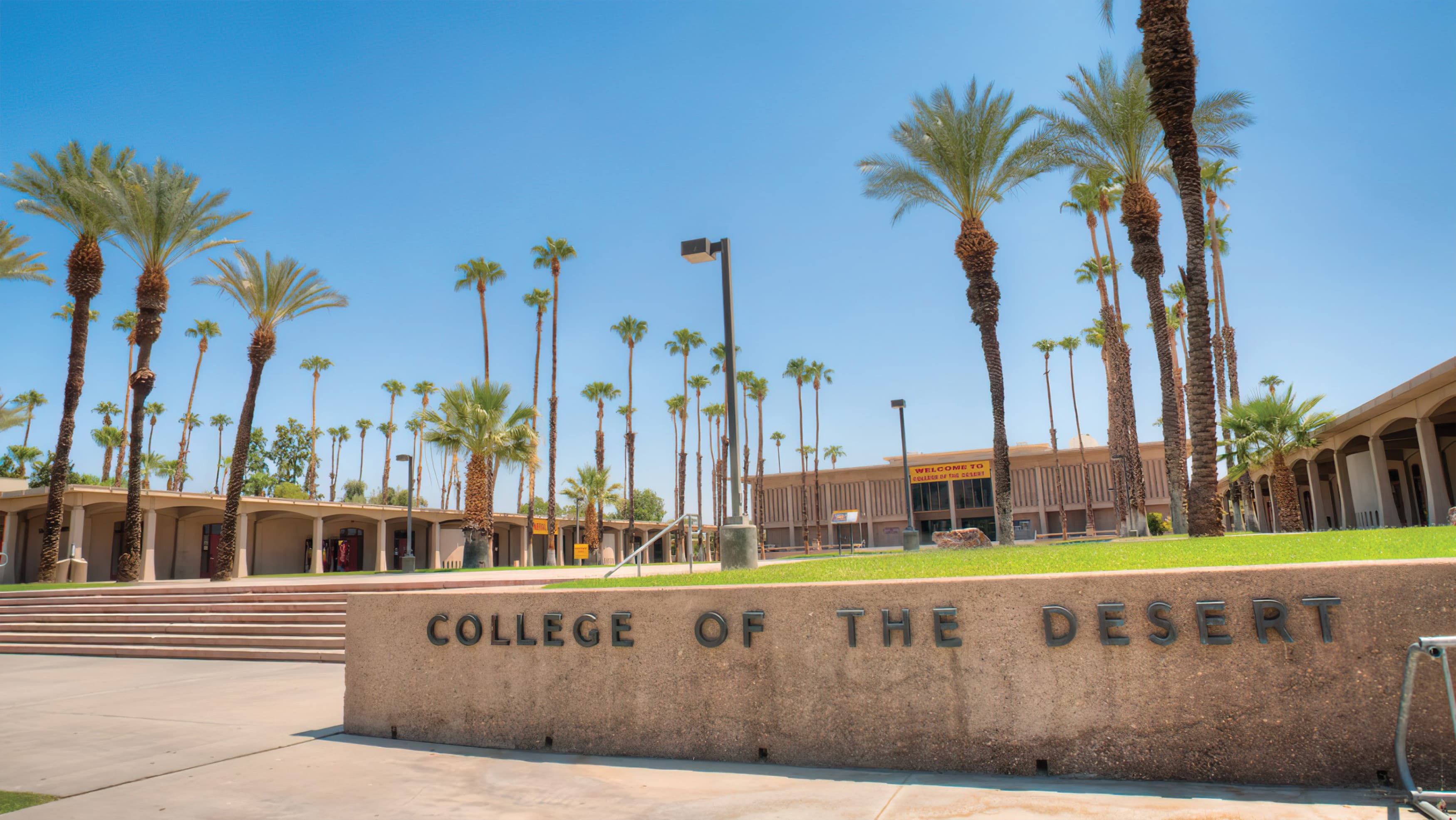
Another example, the College of the Desert’s sign program started with the modernist roots of the campus, complementing a diverse set of applications through its simplicity. RSM Design created a cohesive approach, to visually connect a campus built over time. Sign materials were selected to withstand the harsh desert climate and the consistent font and size standards allow for flexibility as the campus grows.
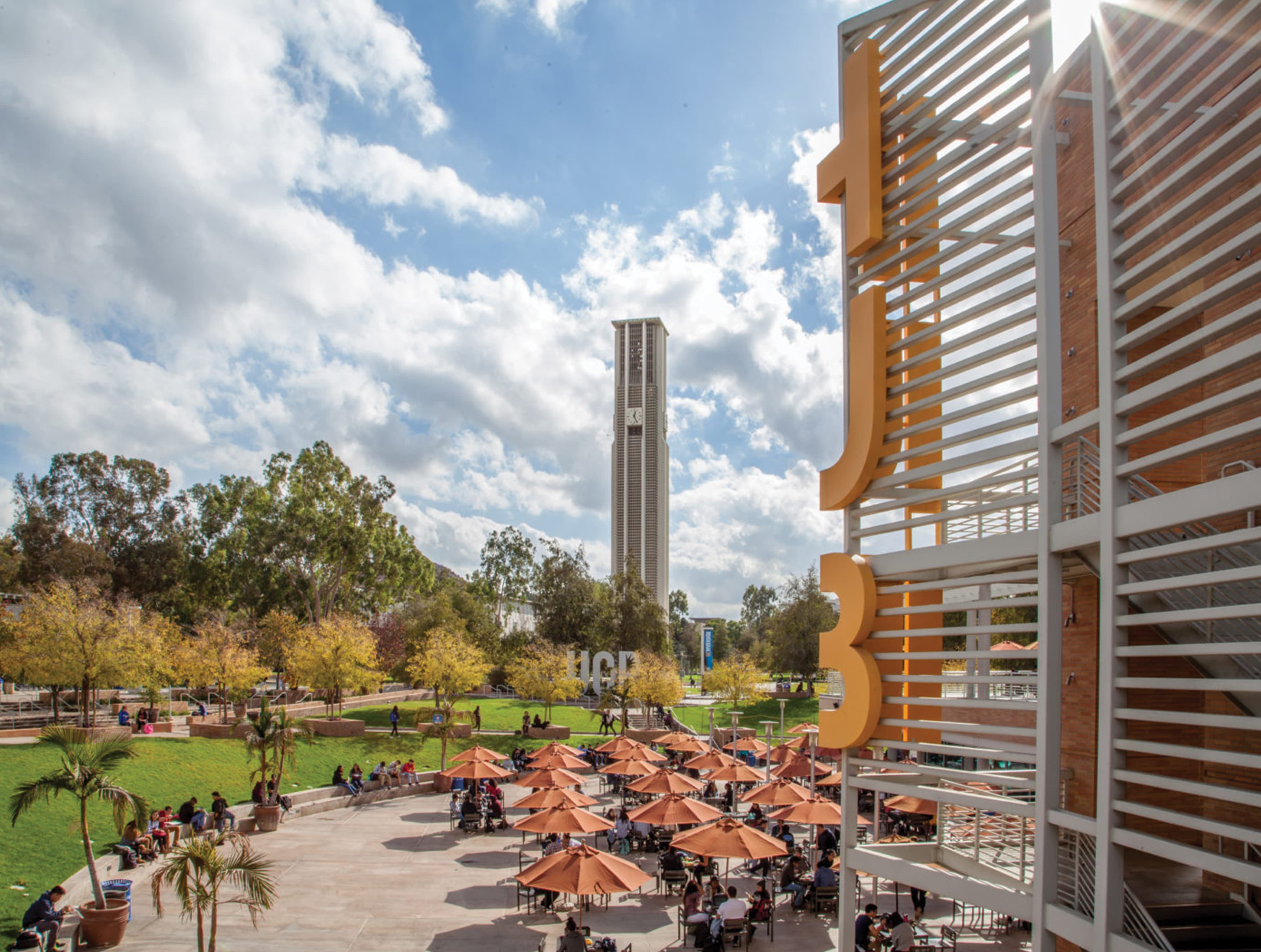
The social and emotional connections to campuses run deep and are built over time. For the students, faculty, and staff, there is a sense of pride and community that defines higher education as a special place. RSM Design’s work on the University of California Riverside campus and its Highlander Union Building shows the power of signage to symbolize community. One of the first evolutions we suggested was an acronym for the union building (HUB) and a large iconic statement of the UCR identity. The new HUB letters wrap the architectural tower, optimizing sight lines and expressing the vibrant nature of the building within the overall campus.

Across the plaza are the eight foot tall UCR identity letters. These heroic letters have become an important icon on the campus, with countless photos taken every year by student clubs, teams, graduates, and their families. This installation has become a place to express campus pride, making that intangible emotional connection tangible. At graduation, the letters are so popular that the campus sets up a rope to contain the lines of students waiting to have their photos taken. These photos and the sharing of them has become an important part of the UCR student experience.

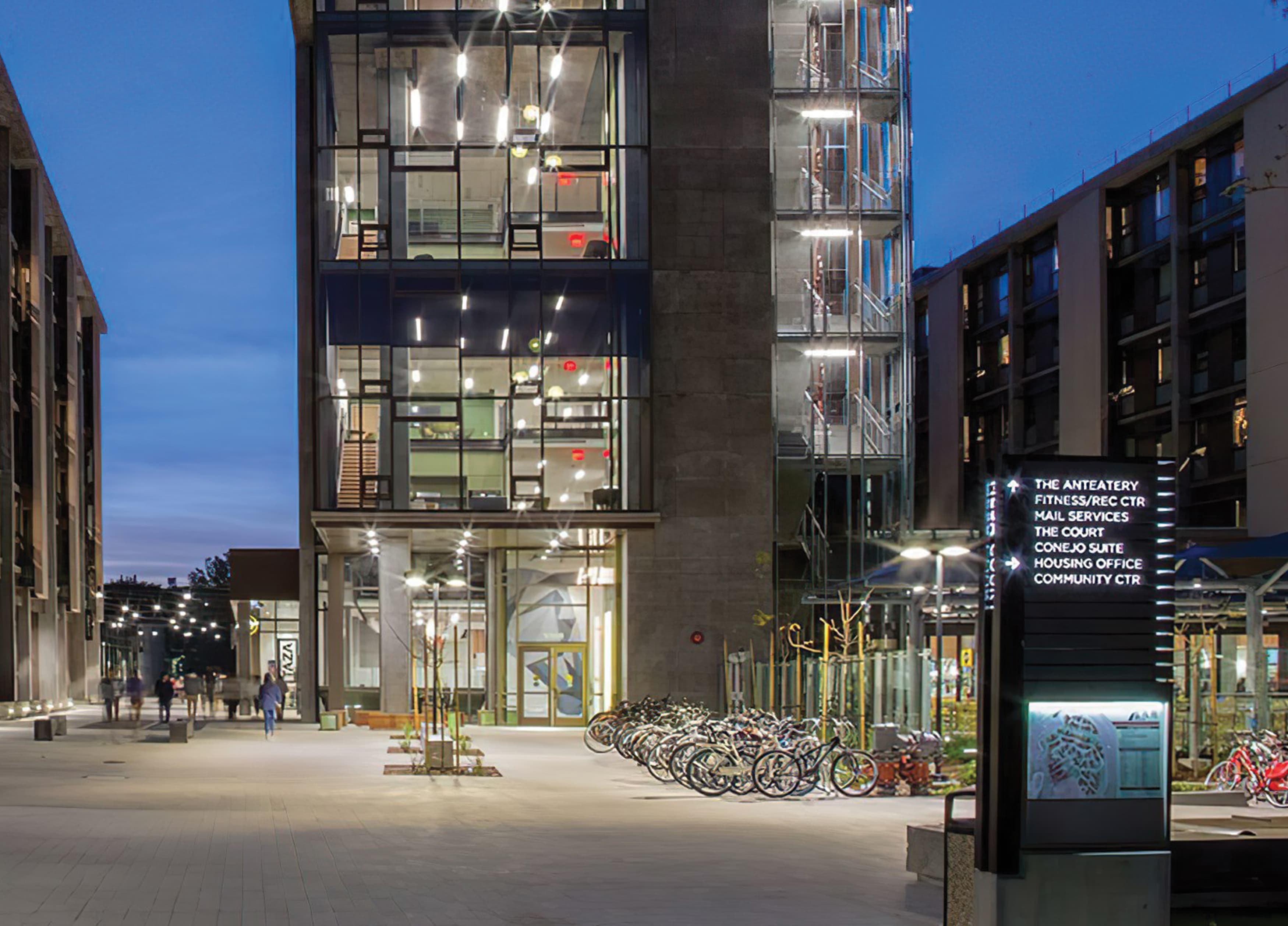
At the opposite end of this spectrum another project, the Mesa Court Towers at the University of California Irvine – an on-campus undergraduate residential district with housing, dining, student services, mail, and lounge spaces. Working closely with Mithun Architects, RSM Design carefully wove signage into the development, matching architectural finishes and a softer sensibility in line with the crafted nature of the building. Wayfinding elements link students to important locations and amenities, as well as the campus at large without dominating the spaces. Large-scale super graphics illustrate the building names on colors derived from the architectural palette.
Looking at these two very different solutions shows RSM Design’s principle of layering and balance. Each set of graphics is tailored to the problem at hand and thoughtful enough to withstand the test of time.
An additional topic to address with campus wayfinding are solutions that bridge the gap with the surrounding community. At the University of the Pacific’s Dugoni School of Dentistry, the challenge was to create an inviting interior space for a diverse international and local community for their dental work. The client originally wanted orange to reflect the campus branded colors, but the dental school recognized the need for a calming, cool color palette. To find common ground, the orange was used on the exterior identity signs to connect to the university brand, while on the interior more cool colors are used as graphic accents.

Dental work can be a stressful time for many patients, especially when navigating across language and cultural barriers. RSM Design worked closely with the campus to use a light and open approach to signage with a hint of color. The color makes the space inviting and non-threatening wherever possible. Crisp type and clean lines communicate the world class cutting edge nature of the institution and the precise work done there by students. International icons replace type, creating directionals to communicate more universally to the users. The campus is a serious location doing important work, but must also reach a hand out to the community invite first time users.

The solution to all of these RSM Design graphics projects centers around the premise of remaining true to the campus while working to provide necessary information. Much like the college experience itself, the secret is all about knowing who you are and expressing that unique personality to the world.