January 01, 2013
Evolving the RSM Brand...
January 01, 2013
To kick off RSM Design’s 16th year, the studio decided it was time to refresh our brand. Through a series of collaborative brainstorms, interactive work sessions and early morning pow wows, the team worked together to redefine the vision of RSM Design. Our new mission statement reflects both the diversity and unity of the team, and our new logo takes it one step further.
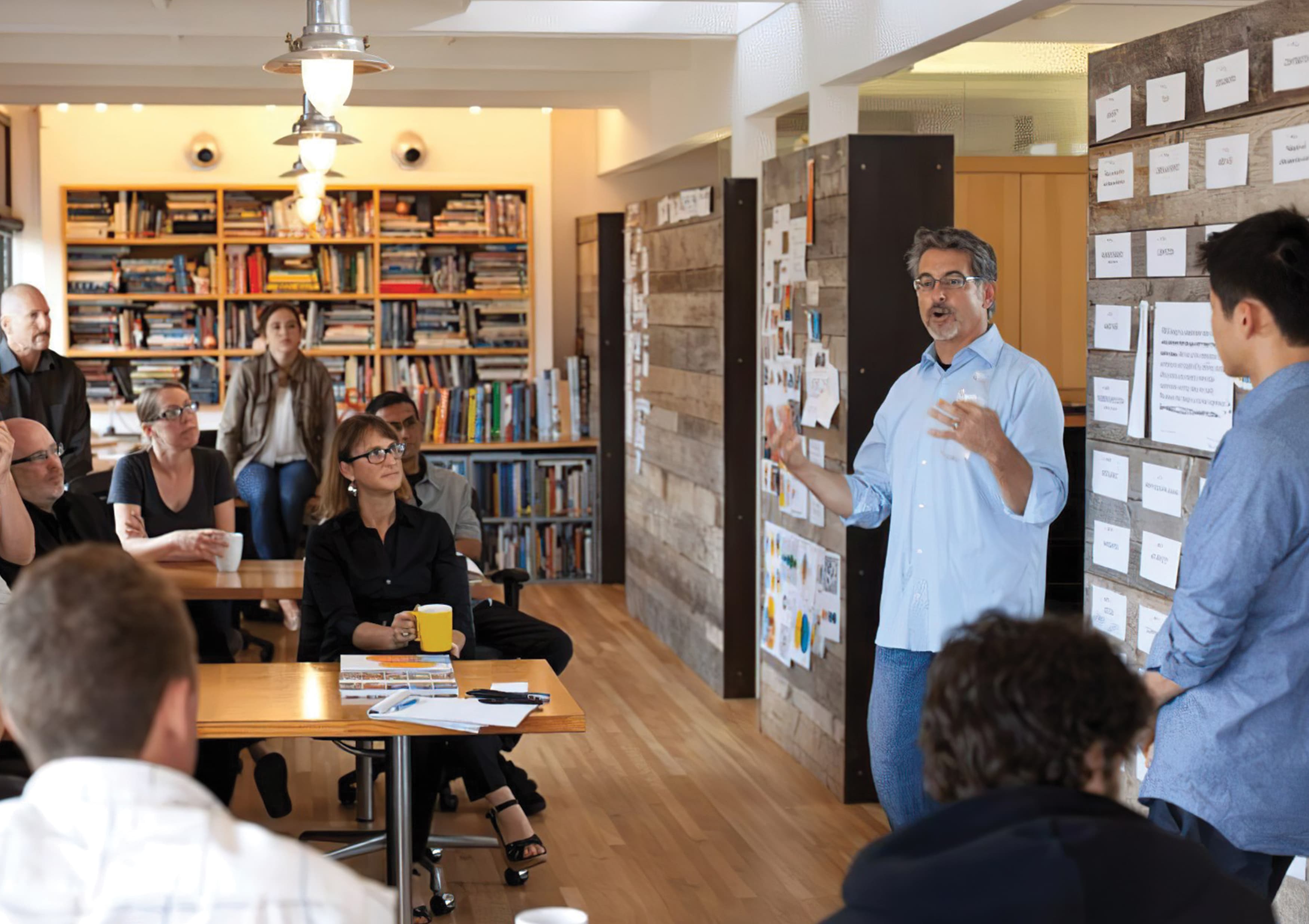
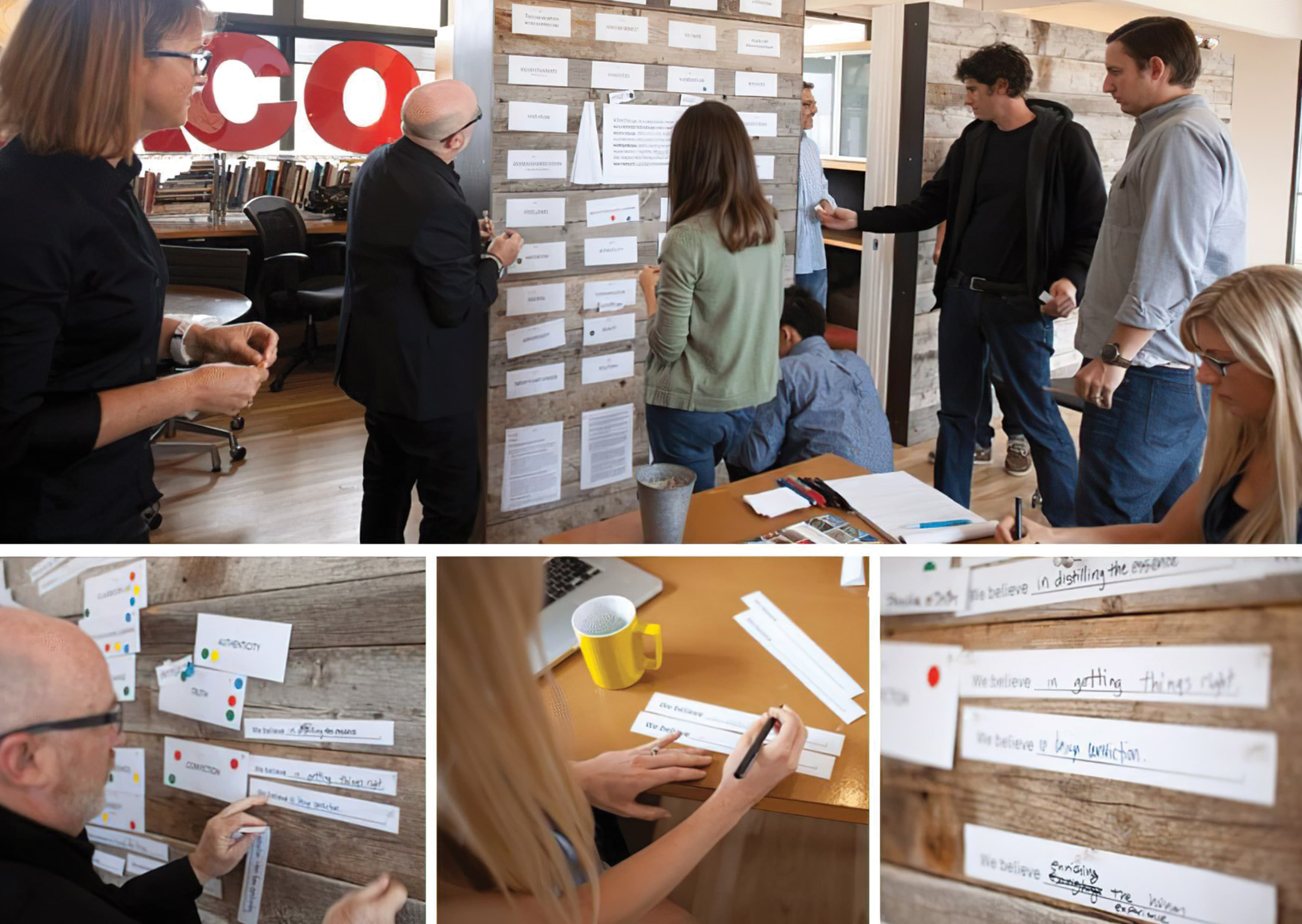
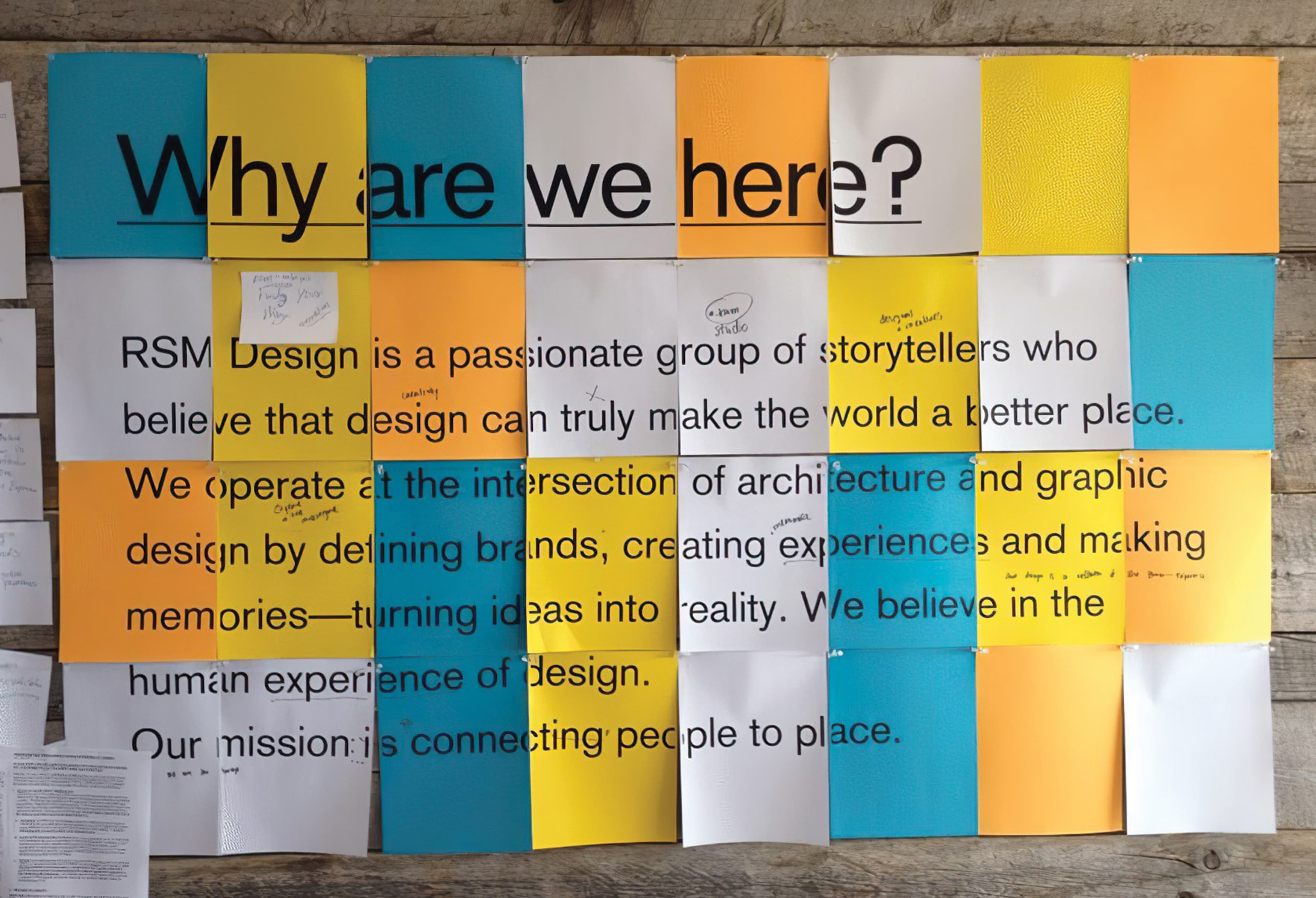
We approached the rebranding of our own logo as we would every project, starting with the “Why.” After reading Simon Sinek’s Start with Why as an office, we decided to reevaluate our mission and core beliefs to figure out Why exactly we were all here. In order to do this, we started with a brainstorm, asking all team members to participate in filling in the blank “we believe…” as well as voting for key principles that individuals felt strongly represented RSM as a design firm and as a brand. Through this collaborative and sometime messy process, we discovered key words and core principles that we could all get behind, as individuals and collectively as a firm. You can find out more about our “Why” here.
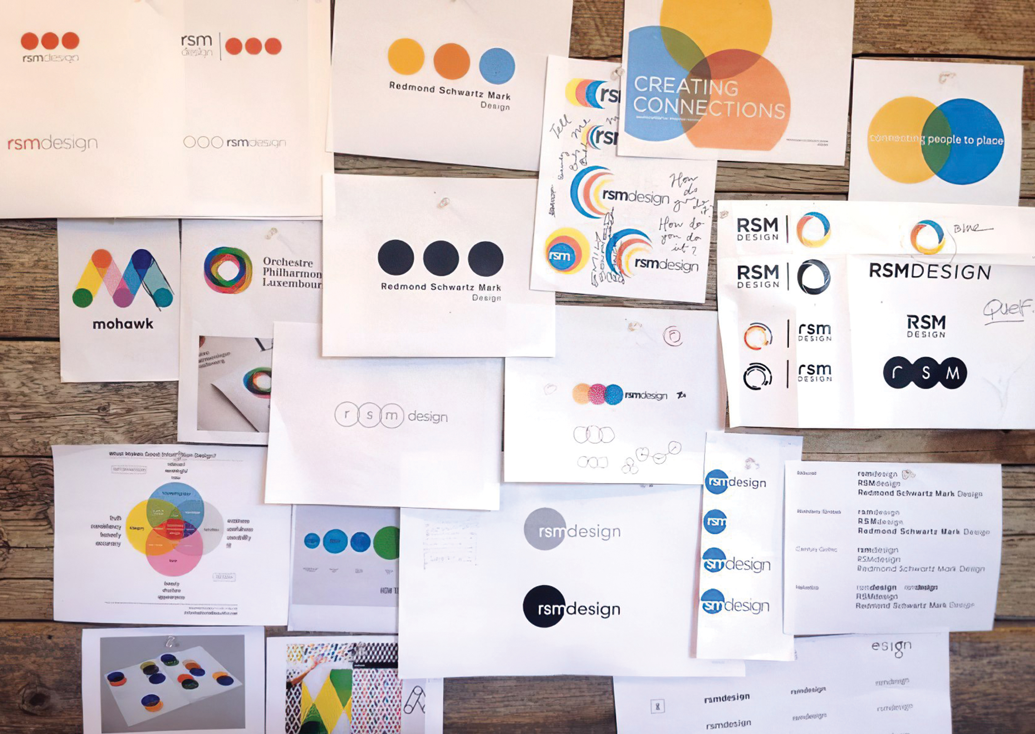
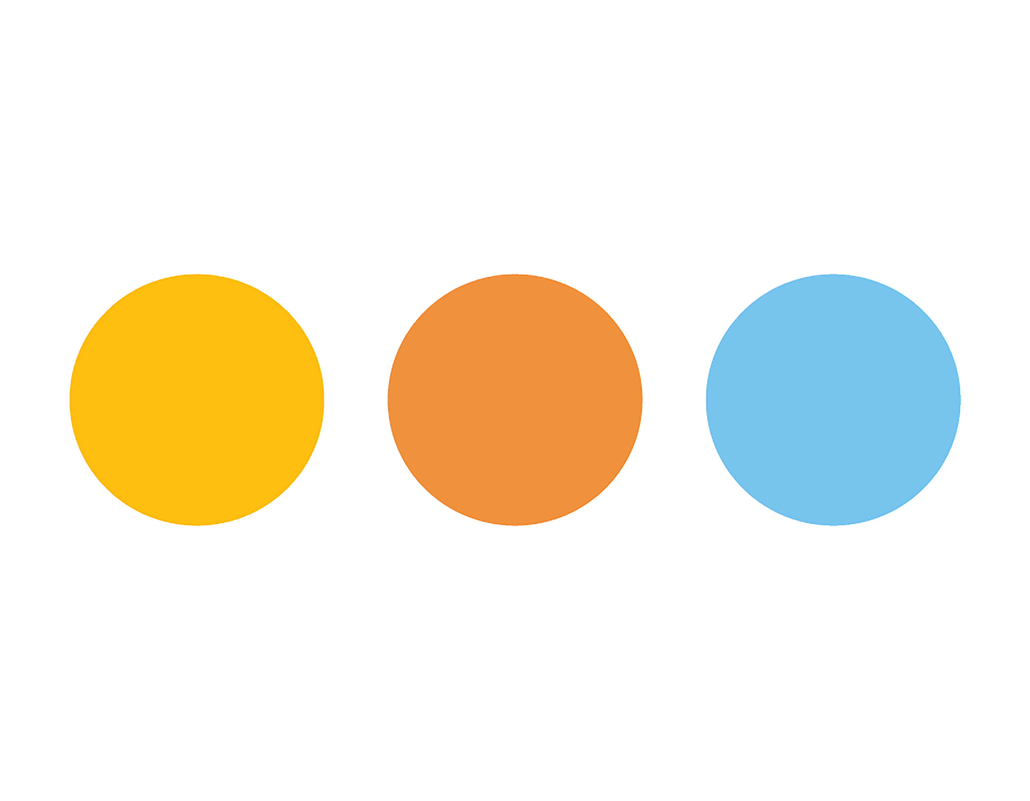
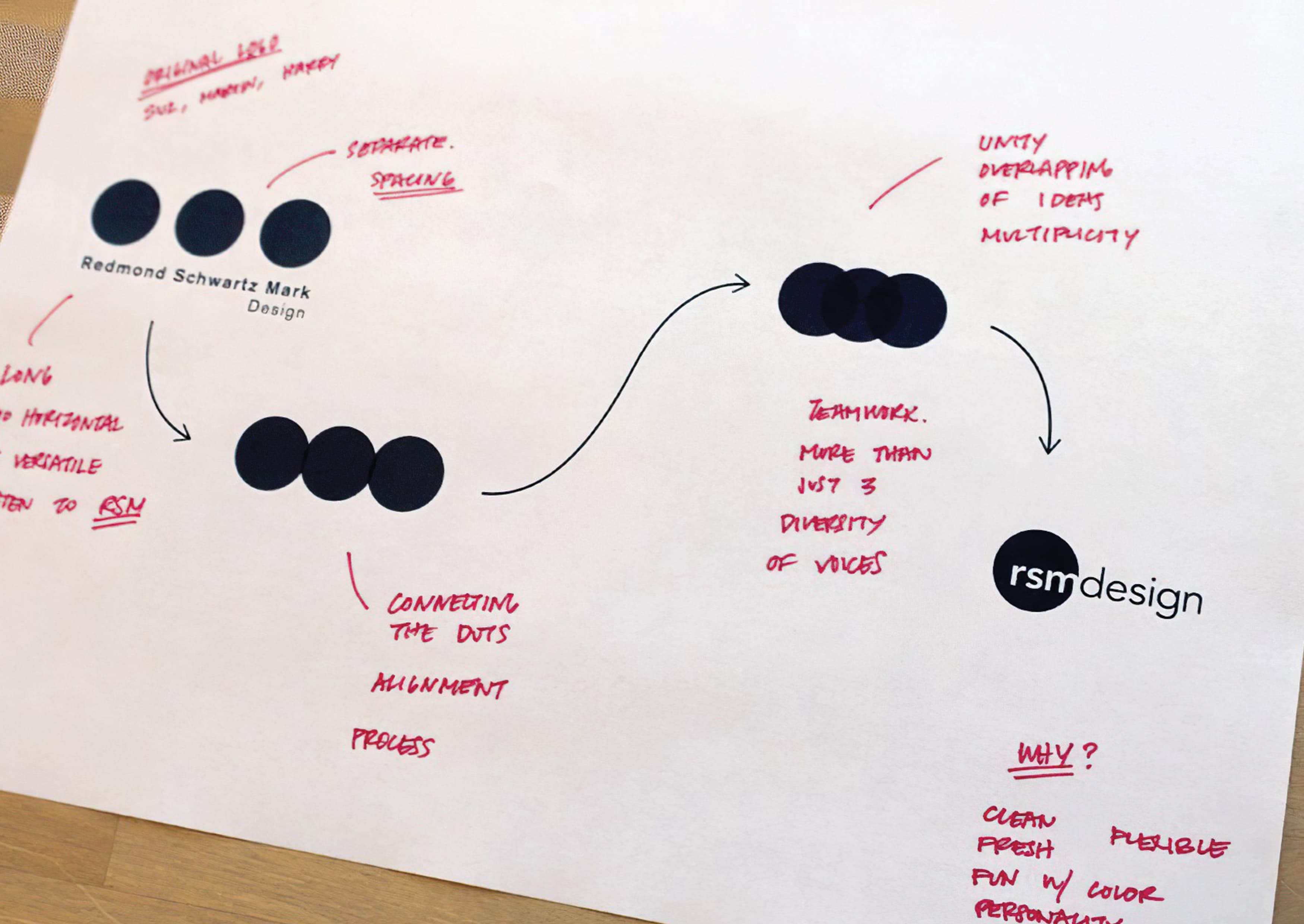
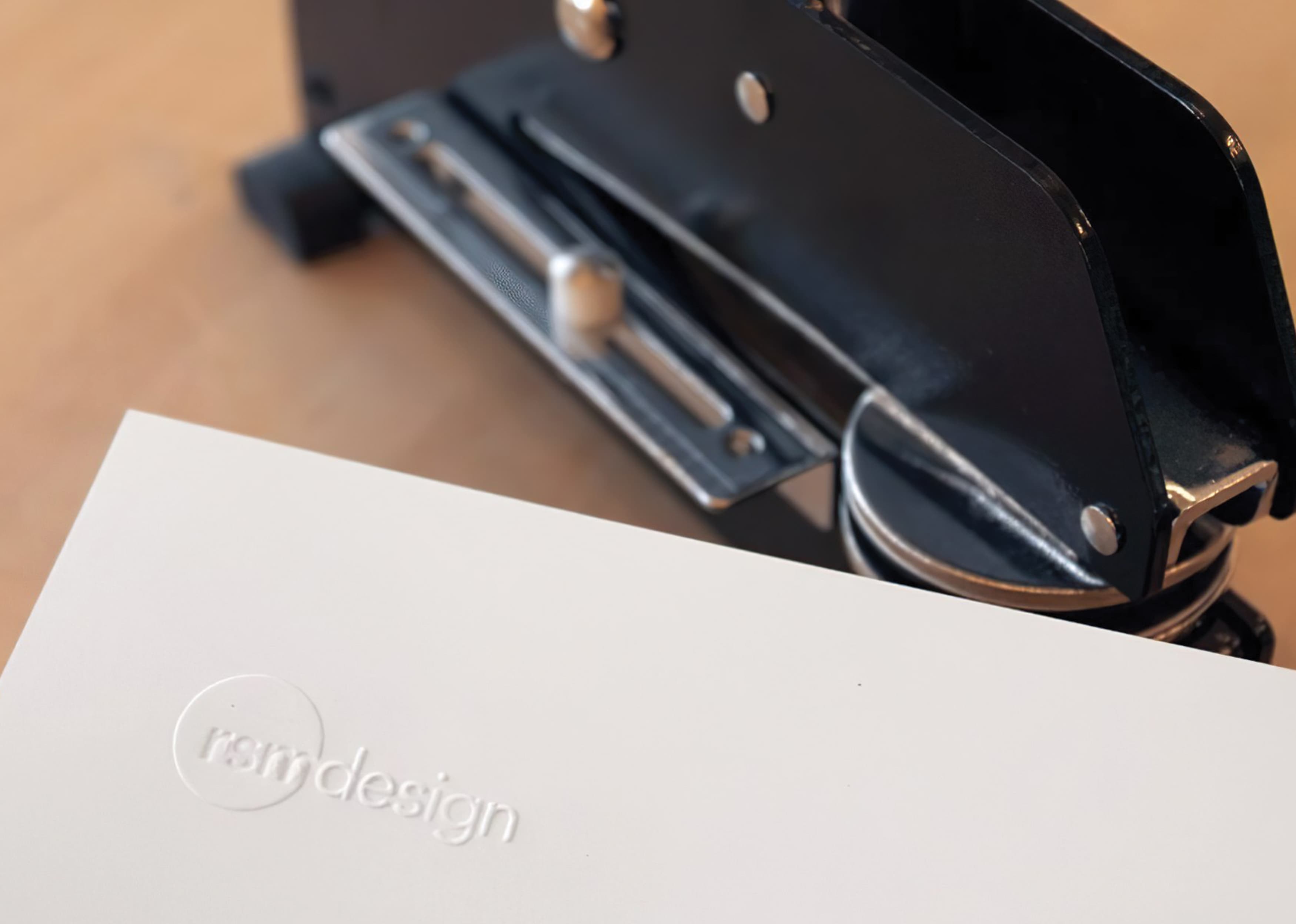
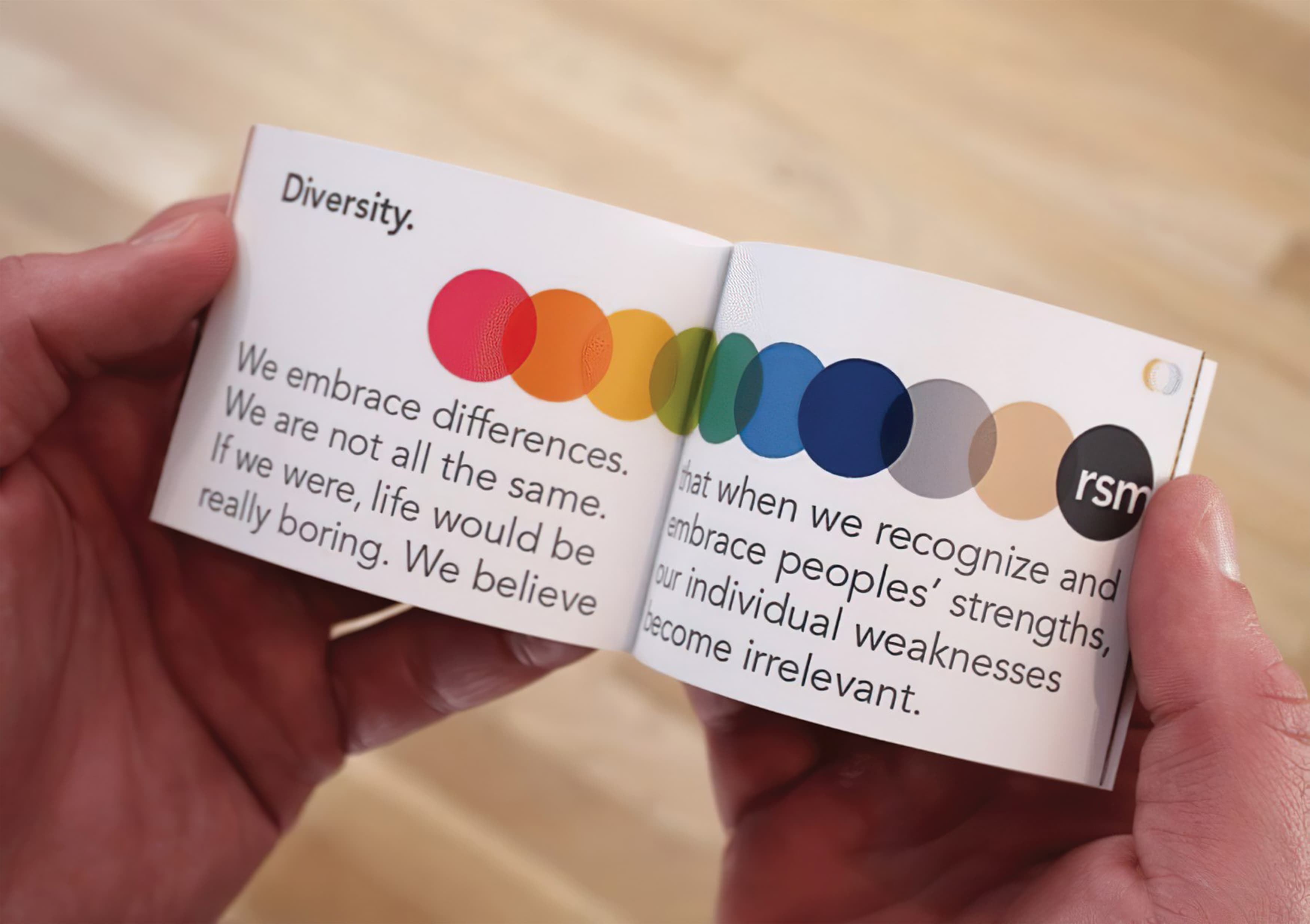
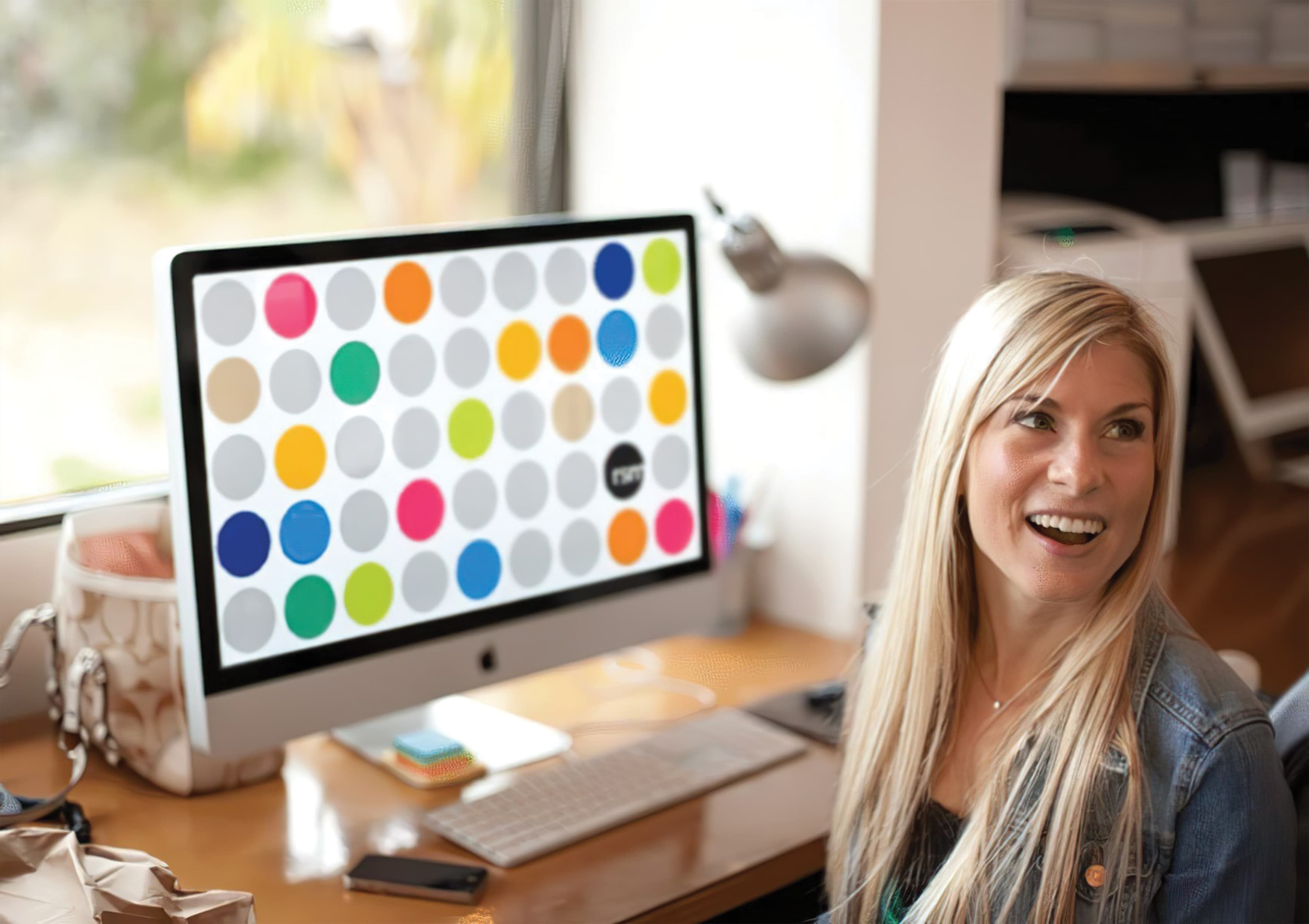
After clarifying our new and refined mission, the next step was to create a graphic representation of our purpose and beliefs. Let’s just say it’s a lot easier said than done. Starting with our original logo, we began to experiment and try new things. The whole office participated in generating ideas, and the final result is truly a product of multiple authors, not just one designer. The new logo reflects the unification of the team under a single mission: connecting people to place. The merging of the dots represents a single vision as well as collaboration and teamwork, which are integral to the way we work. It also represents alignment among the leadership and team members. The transforming colors of the logo reflects the diversity of our ideas and team members, as well as reflecting the fact that we like to have fun in our office.
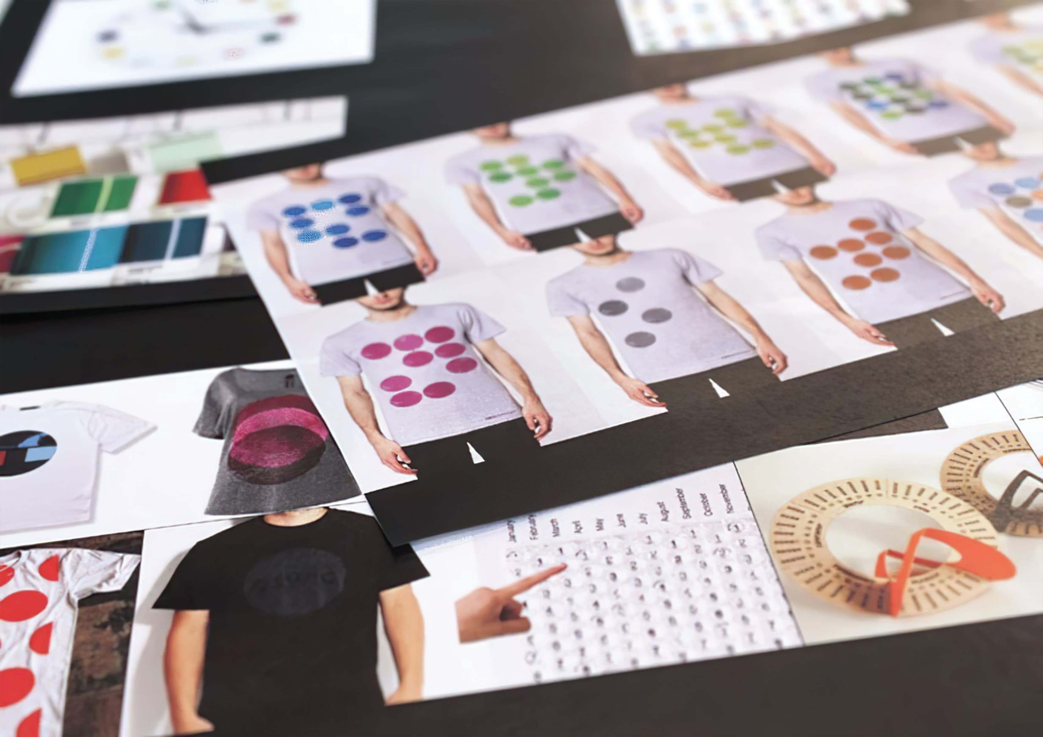
Overall, the process was not an easy one, but oftentimes designing for yourself can be the hardest thing to do! This was truly a team effort and every member of the team had a role in shaping the RSM brand. We’re passionate about the clarity we have achieved through our work sessions and have grown stronger as a team in the process. We believe that our new brand reflects the creativity, problem-solving and fun that is RSM Design. Give us a shout!