August 17, 2018
The Placemaking Power of Ten
August 17, 2018

We’ve all been places we love and want to return to again and again. These spaces are exciting and engaging and they elicit a positive emotional reaction. At RSM Design, we have made our name designing the places that people love. Our work is deeply rooted in the user experience and we deem a project “successful” when people choose to spend time in the places we have a hand in creating.
The philosophy behind creating these experiences centers around placemaking. Placemaking refers to a collaborative process between us and the communities we serve with the end goal of creating a space that is authentic, engaging, and creative.
Places thrive when people have a range of reasons to visit, and we refer to this as the Power of 10. Every place should have at least 10 features that draw people in– whether it’s a cozy place to sit, a fun spot to meet friends, or an interesting attraction to observe. From small scale to large scale, these considerations make the difference between a spot that people simply pass through and a location that becomes an integral part of the community. These ten ideas branch out of just environmental graphics and include all disciplines that go into making outstanding public spaces, from landscape and architecture to developers and city planners.
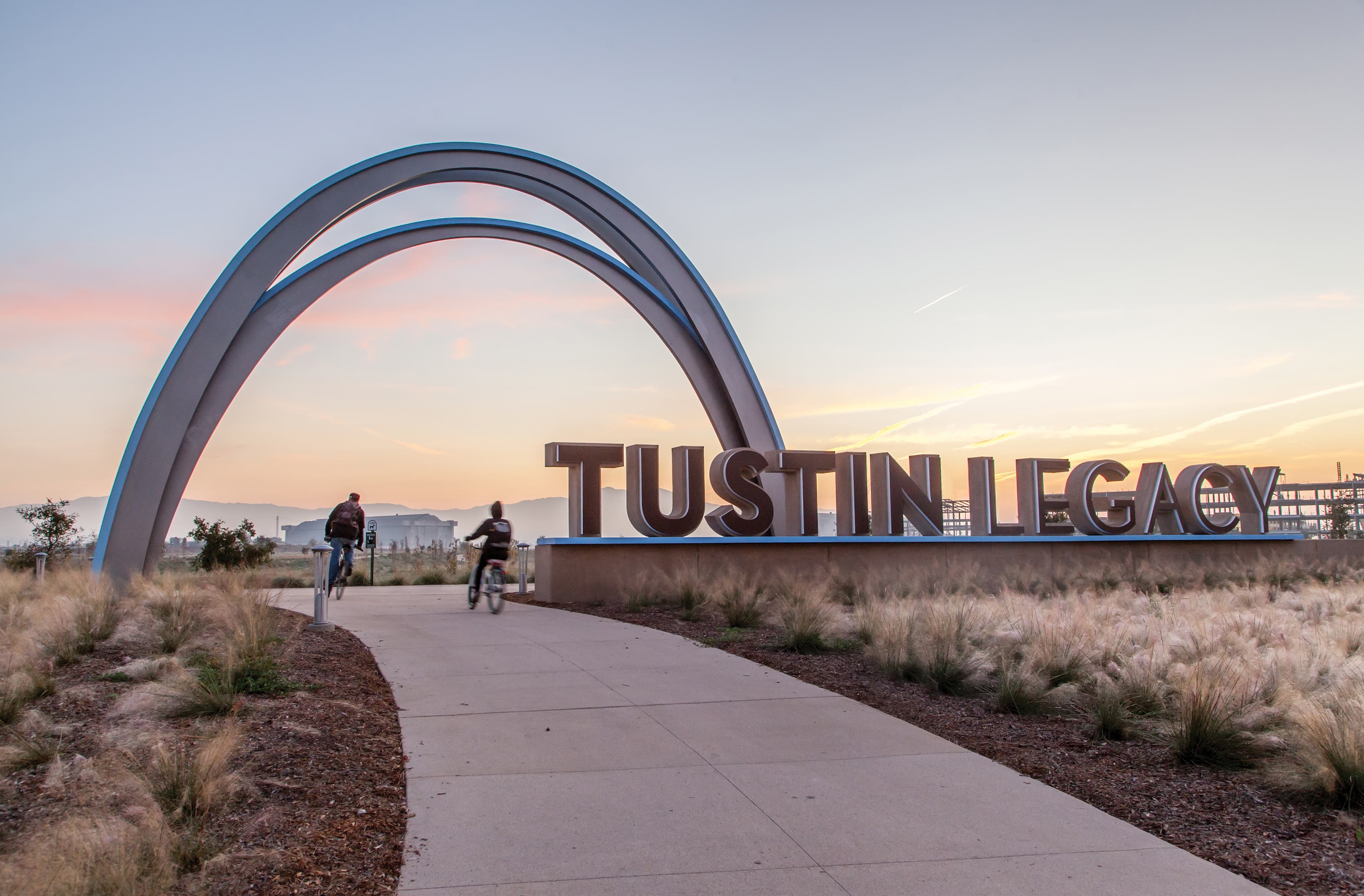
Knowing you’ve arrived at your destination is the first step in experiencing a space. This sense of arrival can be a huge, iconic gateway, such as the monument and arch at the Tustin Legacy, or a more subtle gesture such as different colored signage for every district in a master plan. Regardless of the scale, it should be clear to visitors that they have arrived where they meant to navigate to. This “a-ha!” moment is not only practical in the sense that it announces the beginning of a place, but it is an opportunity to mark the start of a brand experience that will be carried into and throughout the entire project.
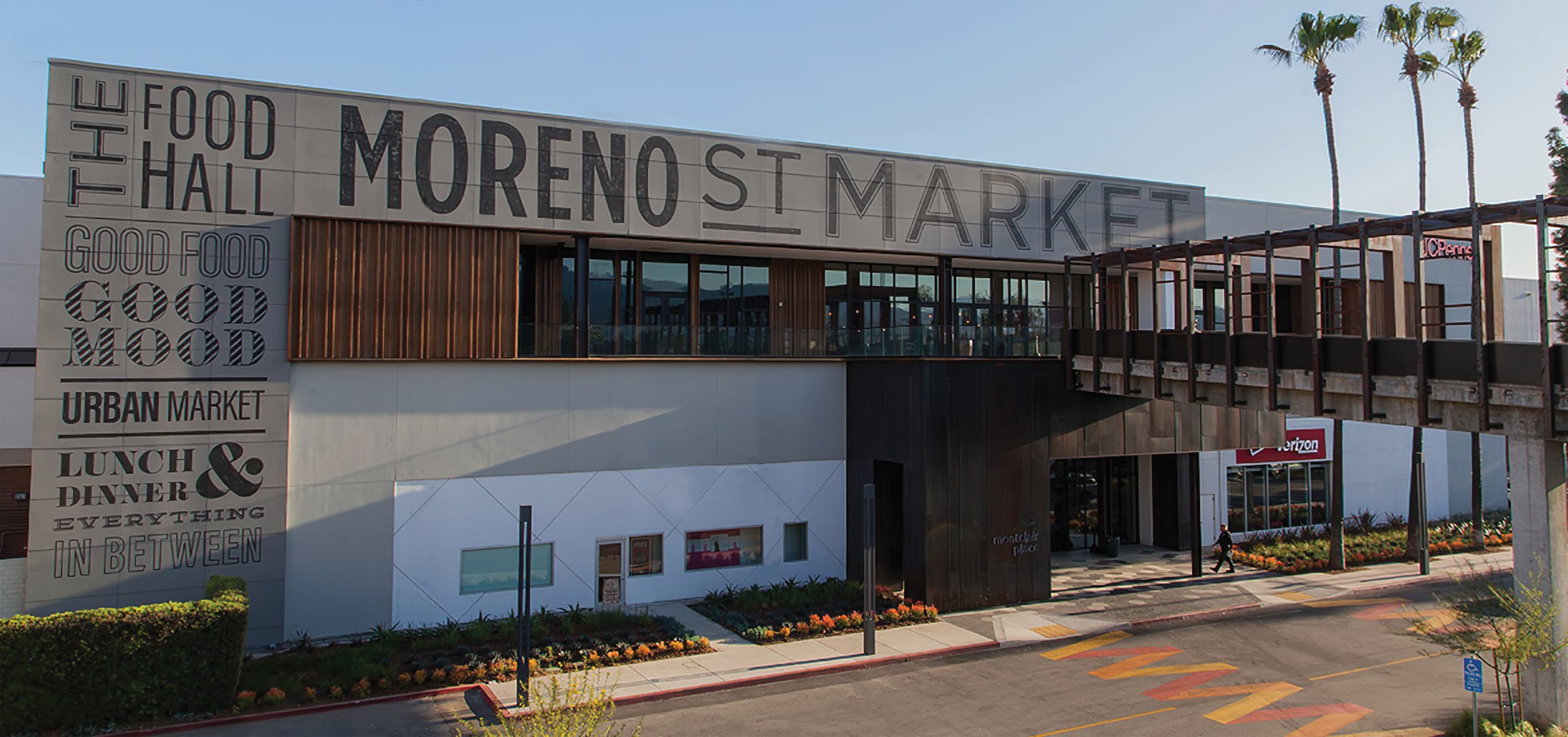
Walking into a big space can be intimidating. Without signage or landmarks to help guide you, it can be easy to feel lost and confused. Humanizing the spaces we work in by focusing on the micro-scale inside of the macro-space has a profound effect on not only logistical wayfinding but also in creating spaces that are engaging and fun. Visitors will be able to discover a new surprise every time they walk through. It also provides an opportunity to spice up even the dullest parts of a project, like lamp posts, back entrances, water fountains, parking garages, or restrooms.
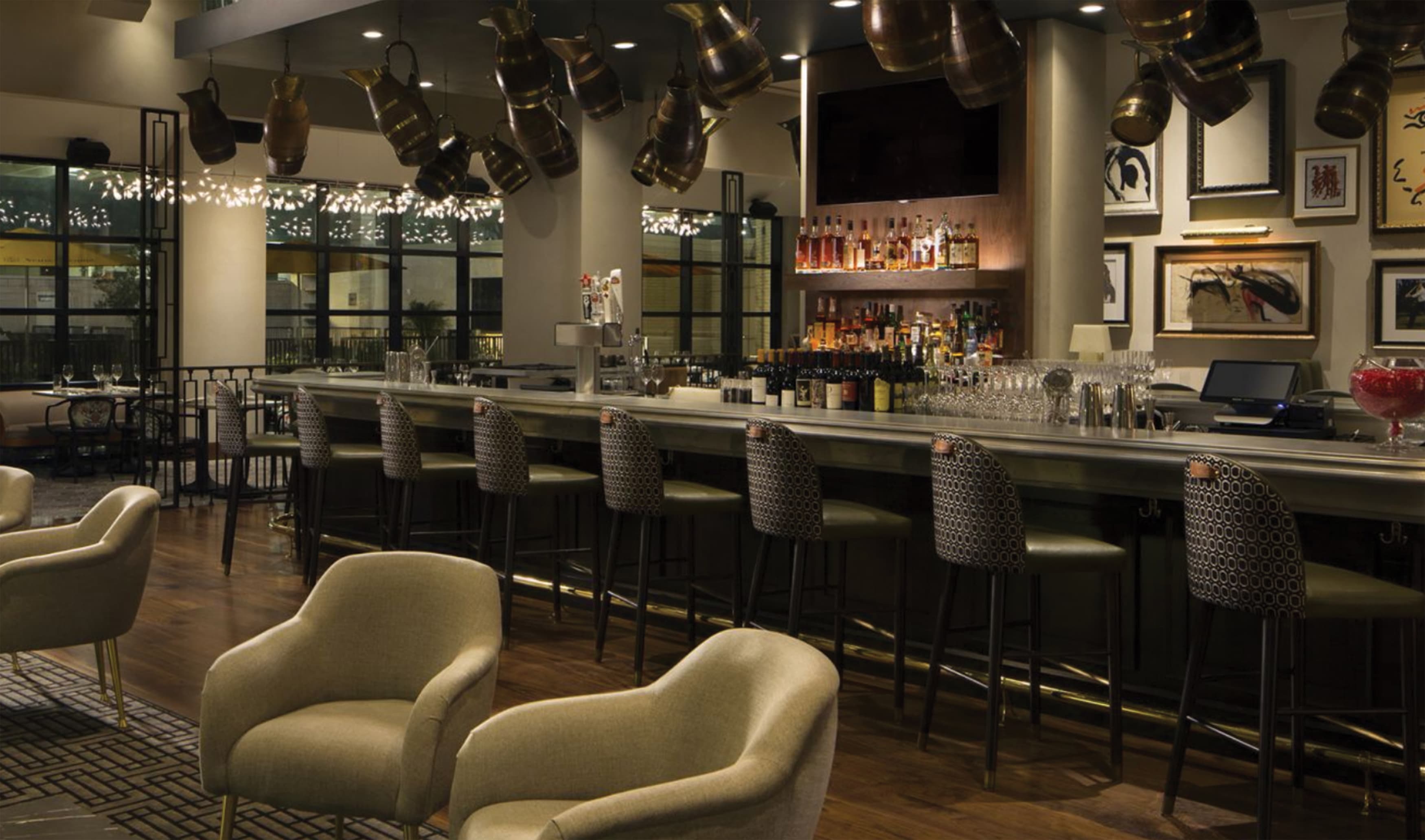
Engaging senses outside of sight can be a valuable asset to a project. It’s common knowledge these days that scent can play a big part in affecting our mood (see: the rise in popularity of essential oil diffusers) and some developers have begun to take that into consideration in the planning of their projects. RSM Design worked on the Hotel Zaza in Houston, Texas where the owner reached out to the luxury fragrance maker, La Labo, to engineer on of their scents, Santal 33, to be diffused throughout the hotel via the air vents. In this case, the scent was used to invoke a sense of luxe, but smell can also be used to relax, energize, or make us hungry (we’re looking at you, Cinnabon). Even utilizing plants like lavender in the landscape of outdoor spaces can help solidify the memory of a space in visitor’s minds.
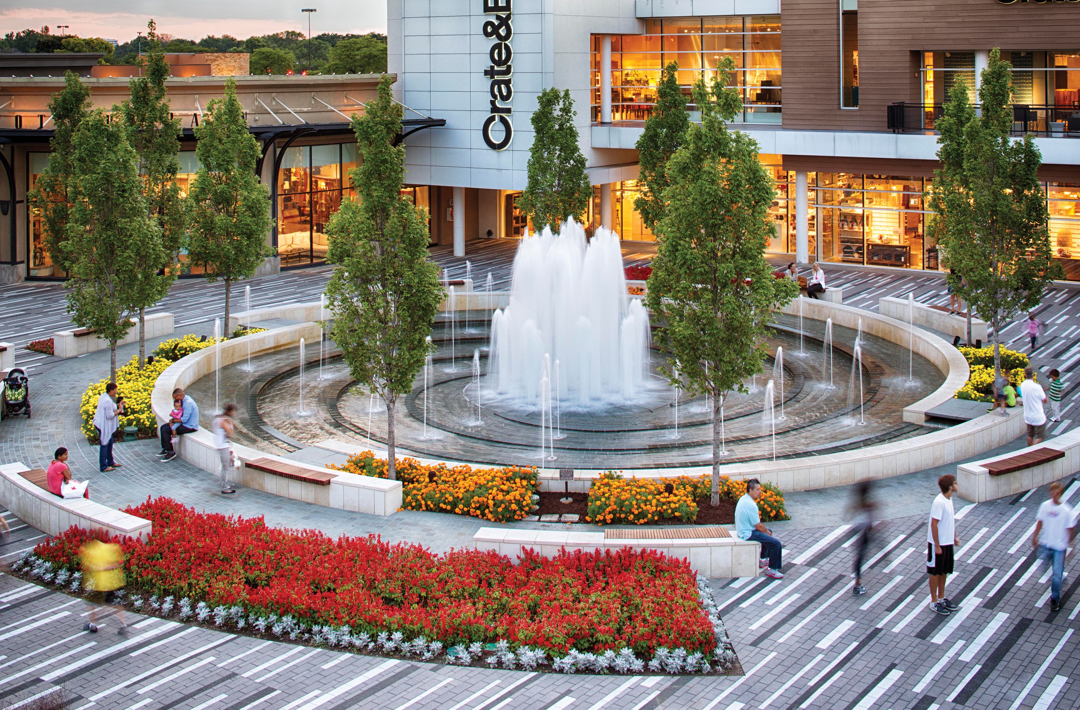
Music and sound plays such a vital role in our everyday life. Even used in a subtle way, the right music can drive shoppers to stay longer in a store or restaurant. There are even services, such as Noon Pacific, which have begun specially curating playlists for public spaces and businesses to help drive activity. Even the soothing sound of a fountain can transform a typical shopping experience into a relaxing afternoon. While music can be a driver to attract visitors to a space, it can also be used subtly to deter certain activities from taking place. The managers at a retail property RSM Design worked on in Irvine found that after working hours, the public spaces around the building were being used for illicit activity, creating an unsafe environment and causing damage to the property. They began playing classical music outside the building overnight, and the activity stopped. It’s just not “cool” to break the law to Mozart!
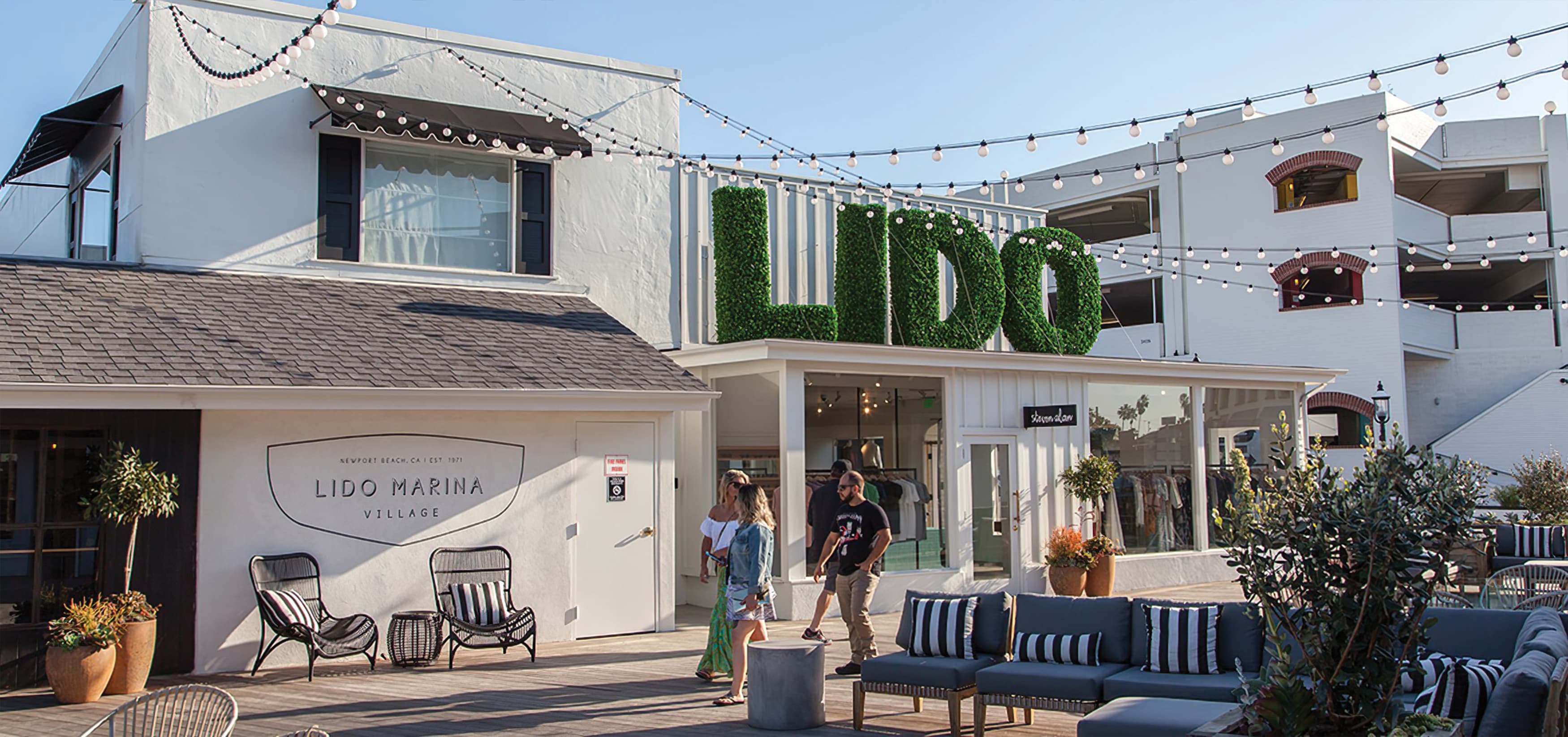
In many classical Costa Rican town centers, you can survey the area and see a plethora of different benches and seating options. While from a design perspective it may be more aesthetic to have a set of the same benches, from a wayfinding and placemaking perspective, RSM Design has found that a variety of benches makes it easier for people to identify their location and feel connected to a space. Finding “your bench,” or the one place you know you can always have a seat and know where you are.
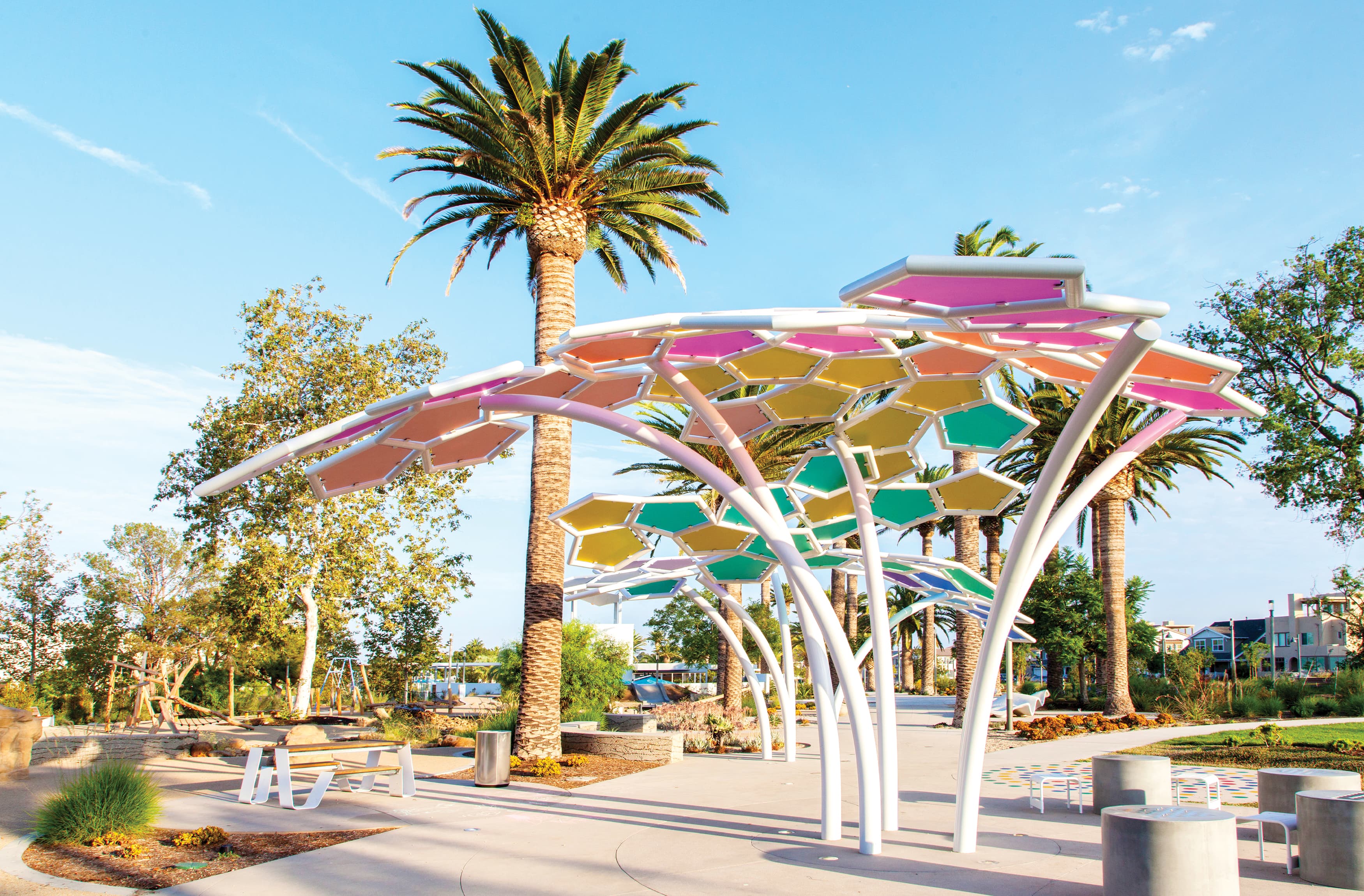
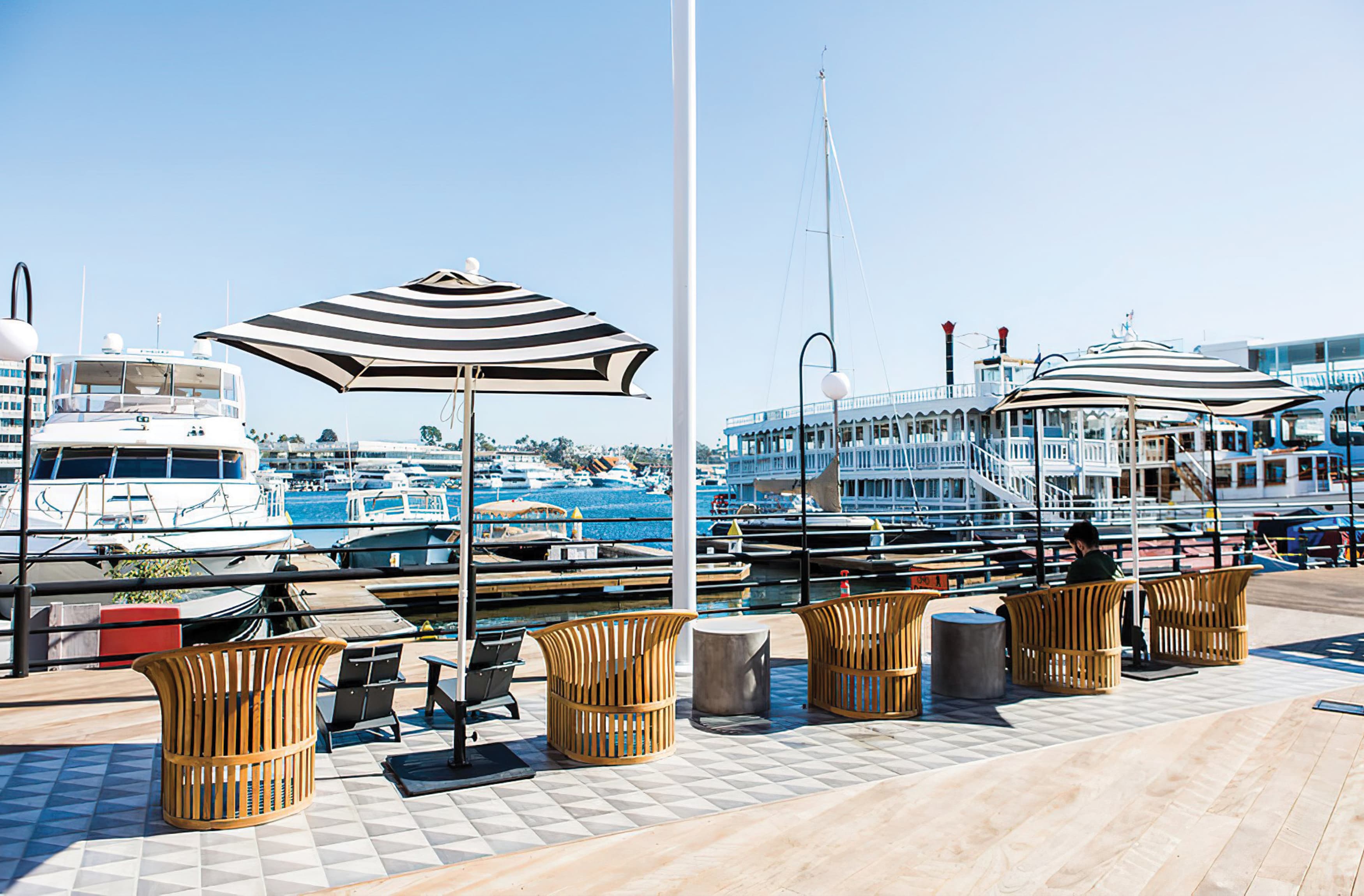
Shade can be easily planned into an outdoor space from just about any design discipline. From architectural awnings and canopies, to shade trees and umbrellas, there are so many ways to ensure that people are comfortable sitting and walking in the outdoors. RSM Design has worked on a number of projects where environmental graphics were directed to include shade. We have designed shaded wayfinding directories, patterns for glass awnings, and interventions such as playful canopies for parks, artful installations with shade, even bus stops that include overhead graphics.
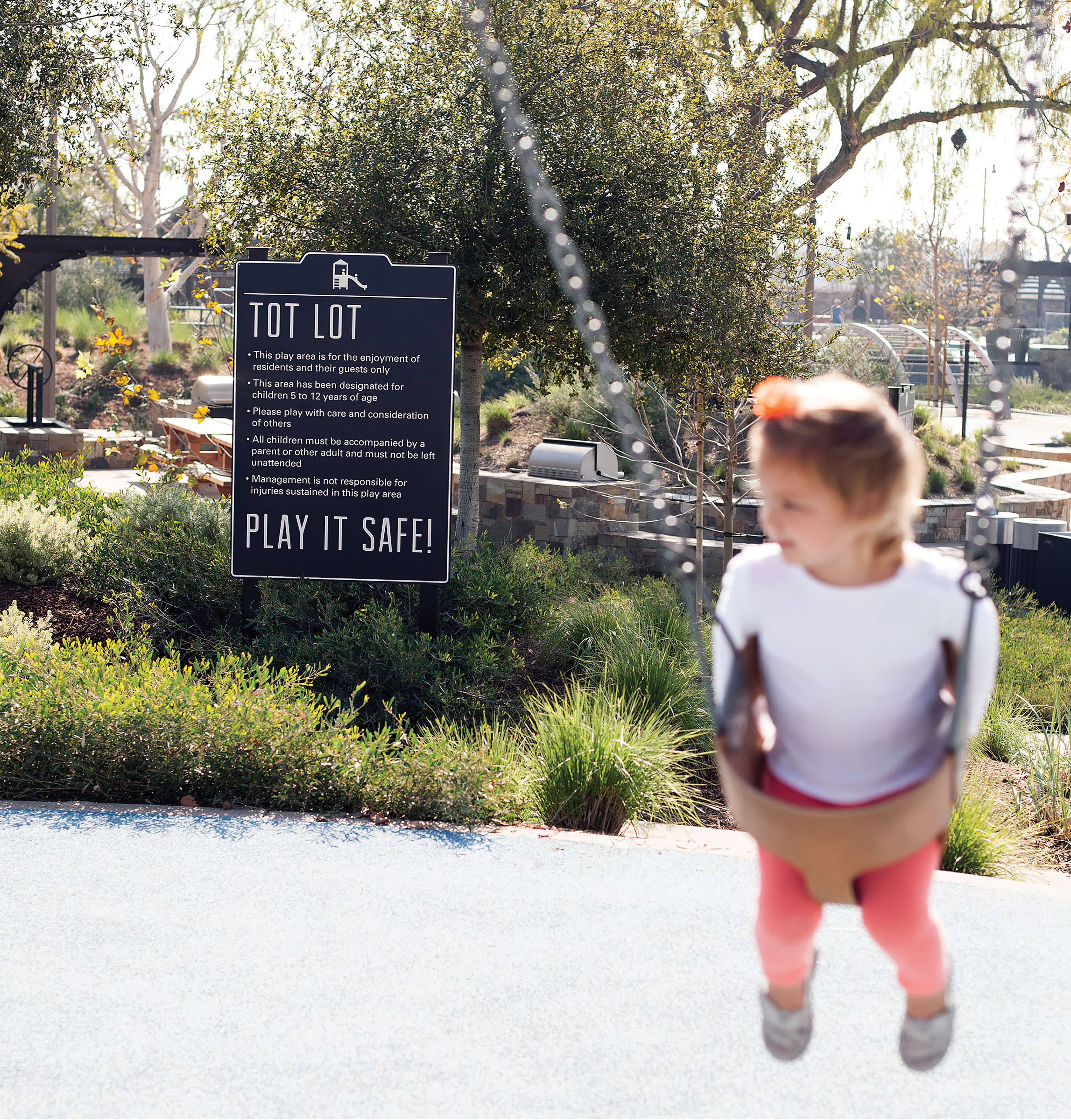
Accounting for security in a space can mean something different to everyone. For some, having good lighting at night means the difference between feeling able to walk home and deciding to call a ride. Walking to your car in the depths of an underground parking garage can be made to feel much more inviting if the walls are painted a light color. Having clear directions and a safe way to navigate a larger area can turn a confusing and stressful journey into an exciting adventure. Even touches as simple as clear and legible regulatory signage can help visitors feel safe in case of emergency.
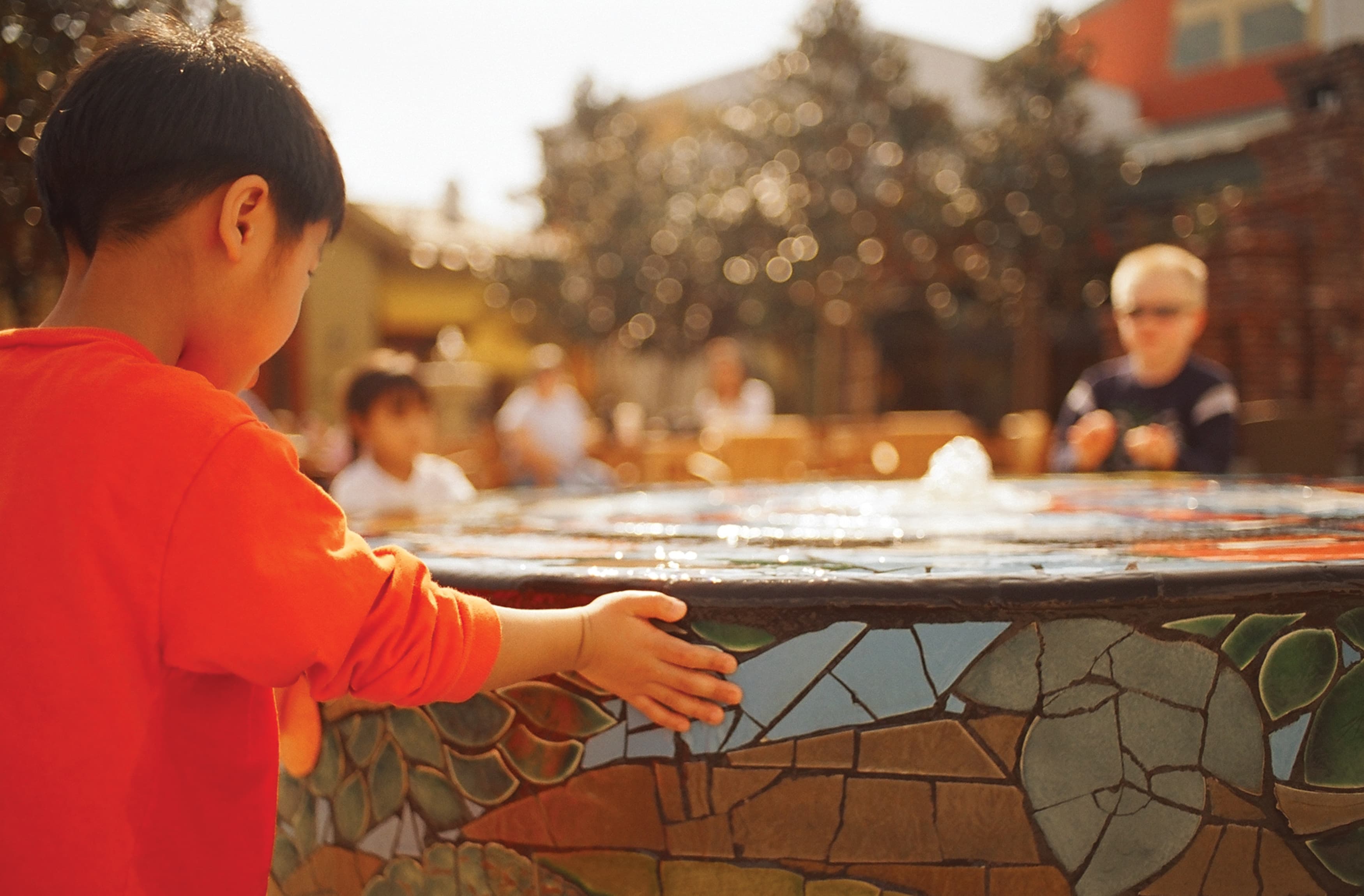
The hustle and bustle of a crowded public space can be draining for some people. Although it’s rare to plan a space dedicated to solitary activities, it’s important to set aside some areas where it’s easy to sit down, take a breath, and have a quiet moment to yourself. These interventions can be anything from seating with a nice view, or a pond with beautiful greenery around it. Landscaping, fluid forms, even comfortable seating or calming music can create a sense of serenity within the chaos of a crowded space.
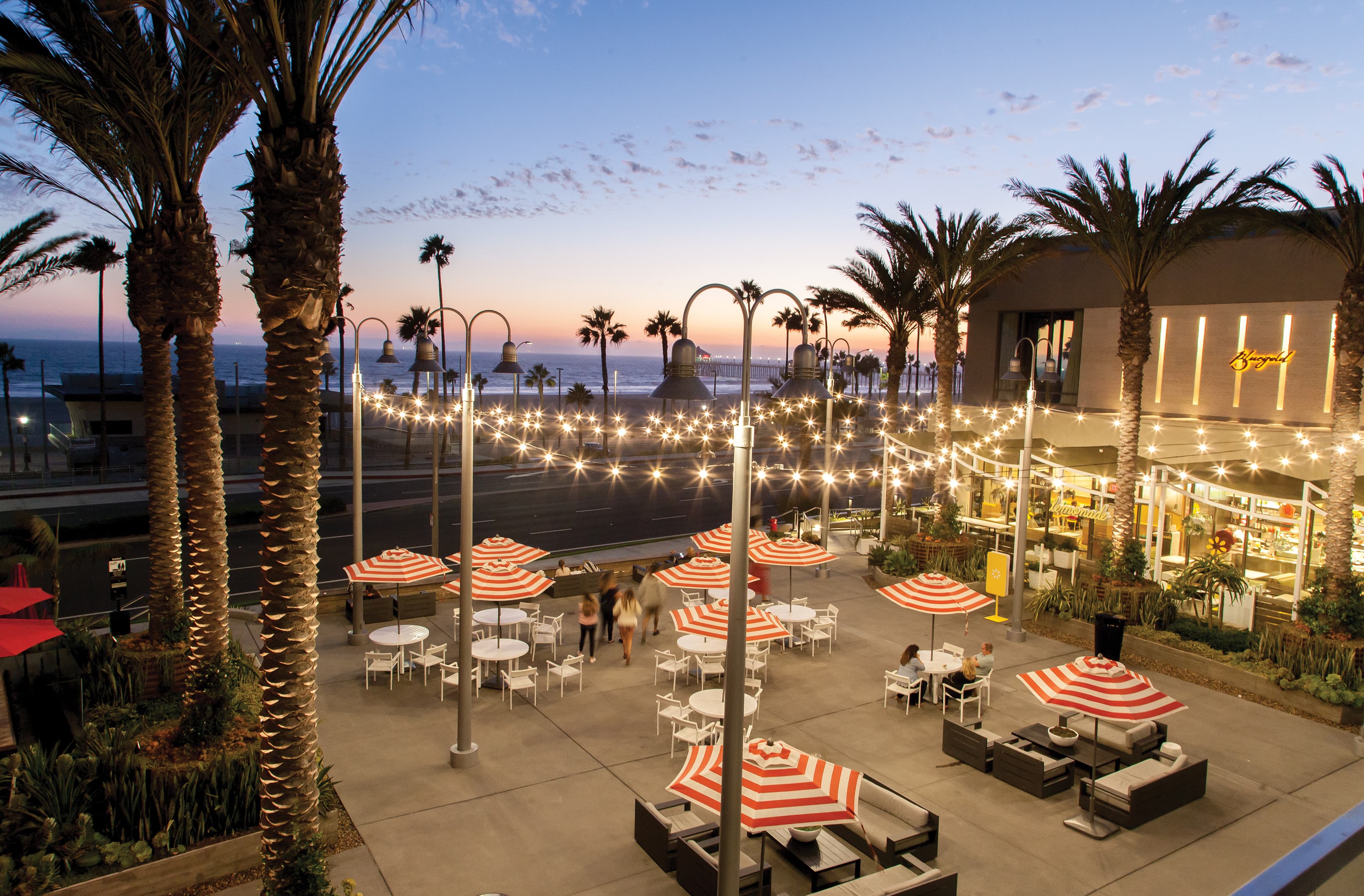
When we think about creating a “shared” space, we consider two main angles. The first is the physical space and how different people from many parties and places will be able to co-inhabit the space. Designing a space that help communities bond over a shared experience not only breeds relationships and a sense of closeness, but also leads to the second angle of sharing– social media. Creating spaces designed to be shared on social media is a new phenomenon with the advent of Instagram and other photo-based platforms. When visitors post images and videos of themselves enjoying a project, it in turn drives more people to come and experience the project for themselves.
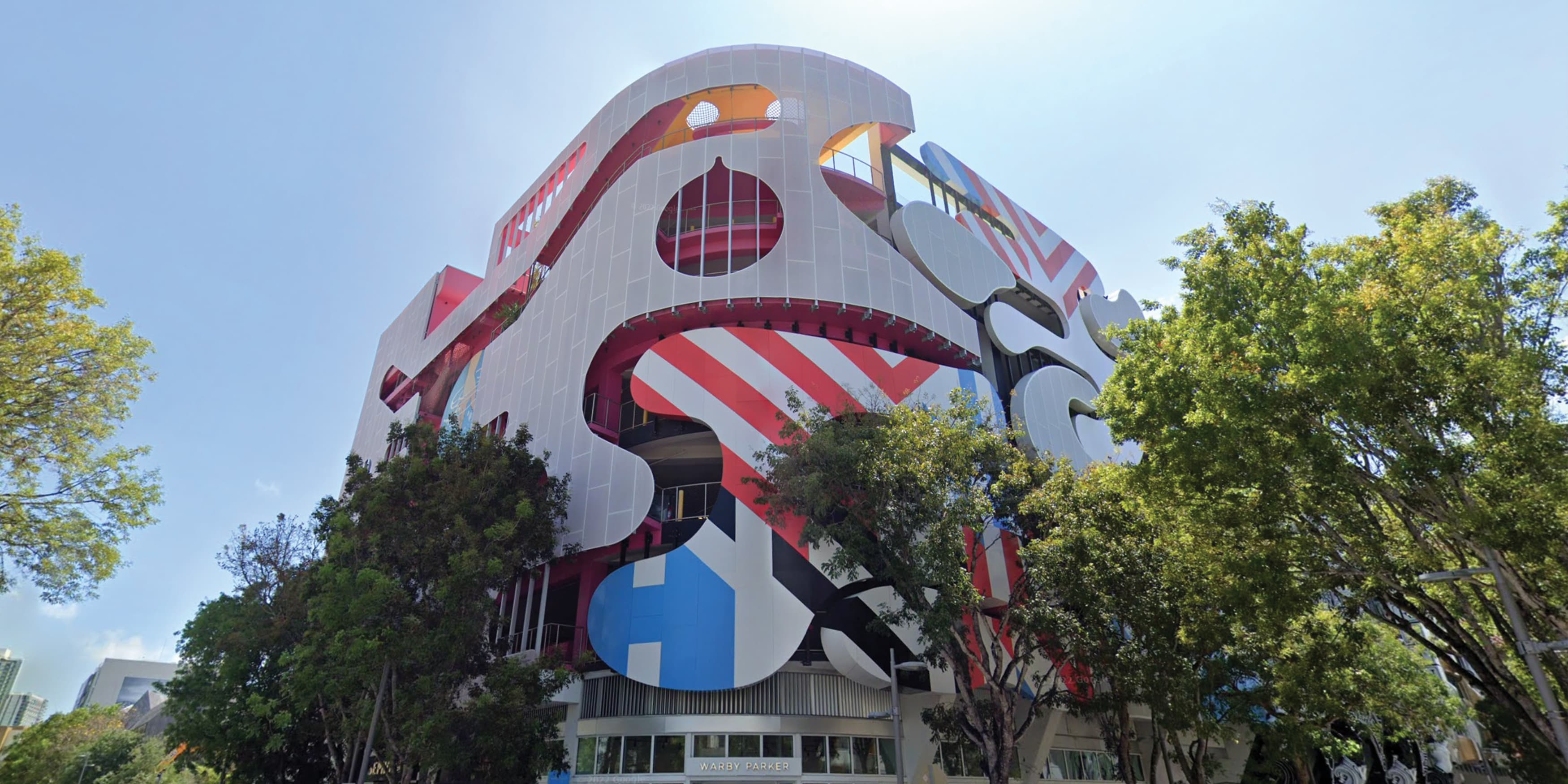
Probably the most exciting part of our job as environmental graphic designers is the opportunity to turn ordinary, every experiences into something extraordinary. These moments can be big or small; an empty plaza can be made exciting by putting a huge dancing fountain in the middle of it, or a water fountain can have a nautical-inspired pattern on the splash tile; transforming light poles into yarn-bombed works of art, or putting inspirational quotes and images on the wall of a parking garage. Anything from bike racks, garbage bins, building facades, and regulatory signage is fair game for a little bit of fun, and these moments of delight are what help create memorable and lasting moments for visitors.