September 03, 2024
A Story Needing to be Told: The BAR Center at the Beach
September 03, 2024
BY CODY CLARK, PRINCIPAL AND STUDIO DIRECTOR OF LOS ANGELES OFFICE
When asked about my most memorable wayfinding project, the BAR Center at the Beach instantly came to mind. A community center for the Jewish community of Los Angeles, the BAR Center is located on Ocean Front Walk just steps away from Venice Beach. We worked alongside the Jewish Federation of Los Angeles, collaborating with the BA Collective (formerly Belzberg Architects) and Mathews Development Group, Inc. (MDG).
The Jewish Federation wanted to position the BAR Center to better connect to its surroundings in the context of Los Angeles and the community it supports. The new building was to be welcoming and hospitable, but still vigilant and protective over the people it serves.
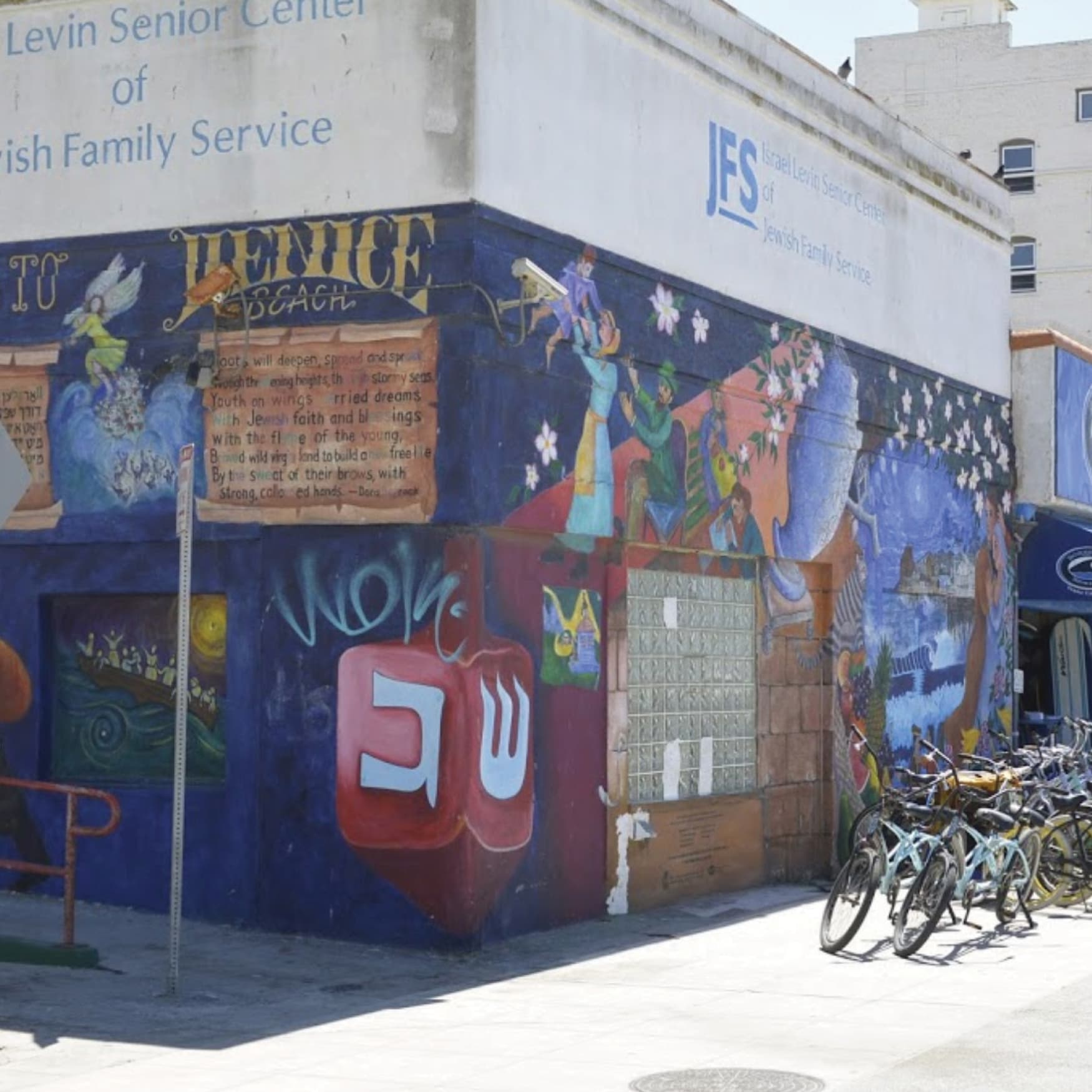
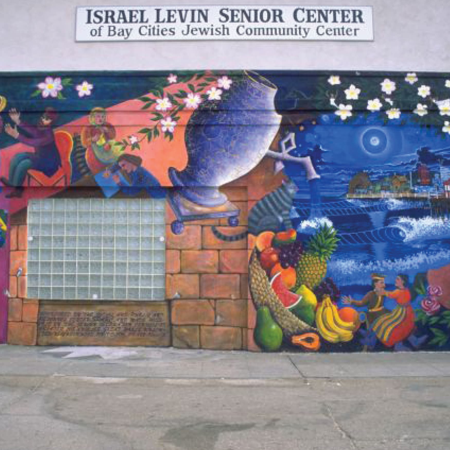
The original building had been there since the 1960s. Although inwardly focused, it made a statement along the beachfront with its celebratory and artful facade, which showcased cultural themes, icons, and visual narratives.
PARTNERSHIP WITH THE CLIENT TEAM
When RSM Design joined the team, the architecture was still in the concept stage. The RSM team was able to form a collaborative partnership with the BA Collective. Our teams had shared values, which made it easier to align in our approach to this project.
The architect team wanted to create something incredibly special and meaningful, and our team was able to echo that aspiration. The Jewish Federation of Los Angeles wanted this renovation to give back to their community. The challenging part was that the building had to downplay the community aspect and could not overtly show its Jewish identity on the outside of the building.
DESIGN THAT REFLECTS RESILIENCE
This limitation resulted in a one-of-a-kind outcome, born from collaboration, empathy, and asking good questions.
We quickly saw how design
can carry and positively reflect
thousands of years of adversity.
The beauty of it was the exploration of how to tell the story of the Jewish community. How do we celebrate this community in a way that is visibly invisible? This question began our exploration of how to portray strength, resilience, and community through materials and cultural icons. The challenge was finding a way to signify meaning without representing it overtly.
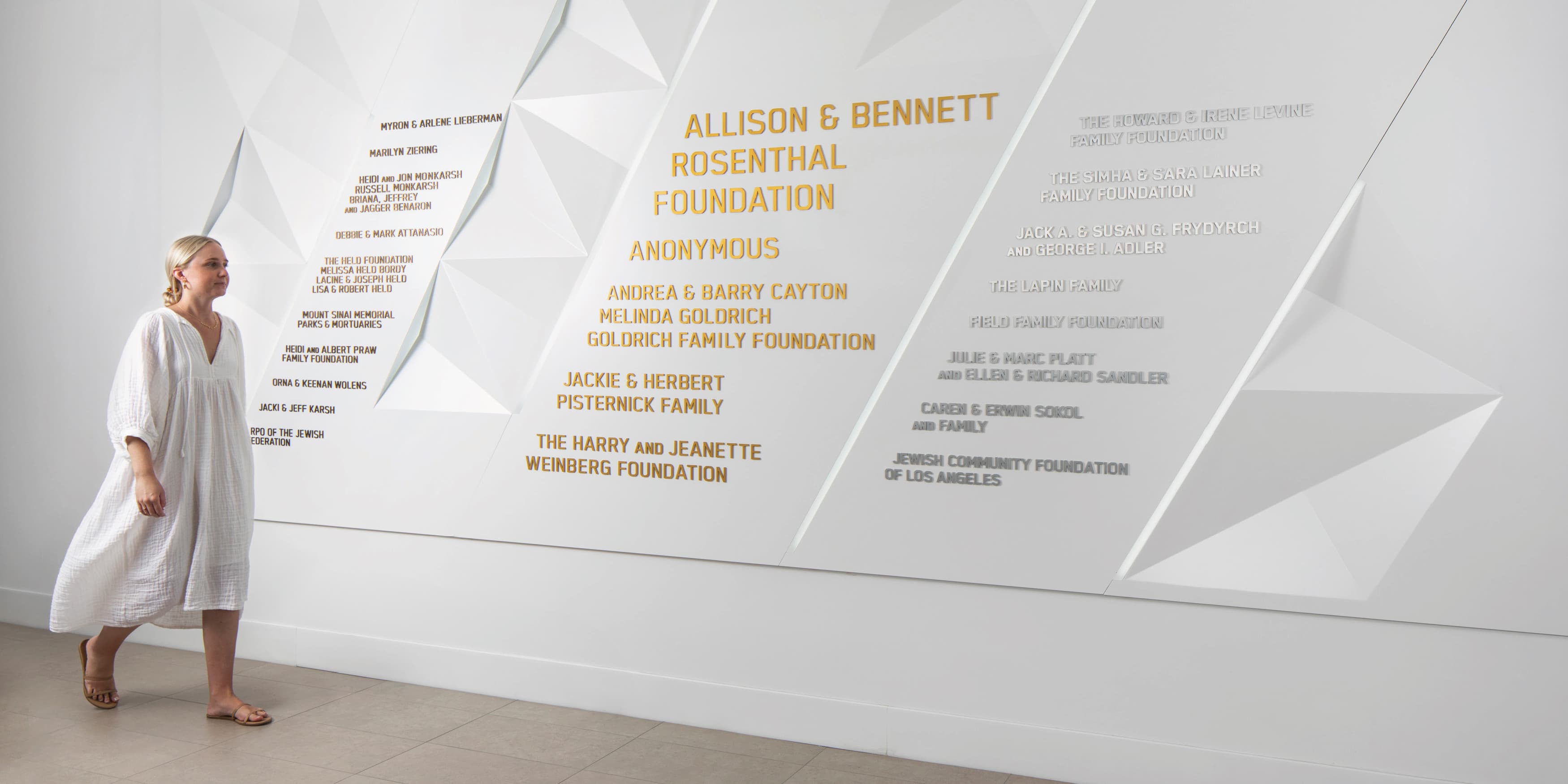
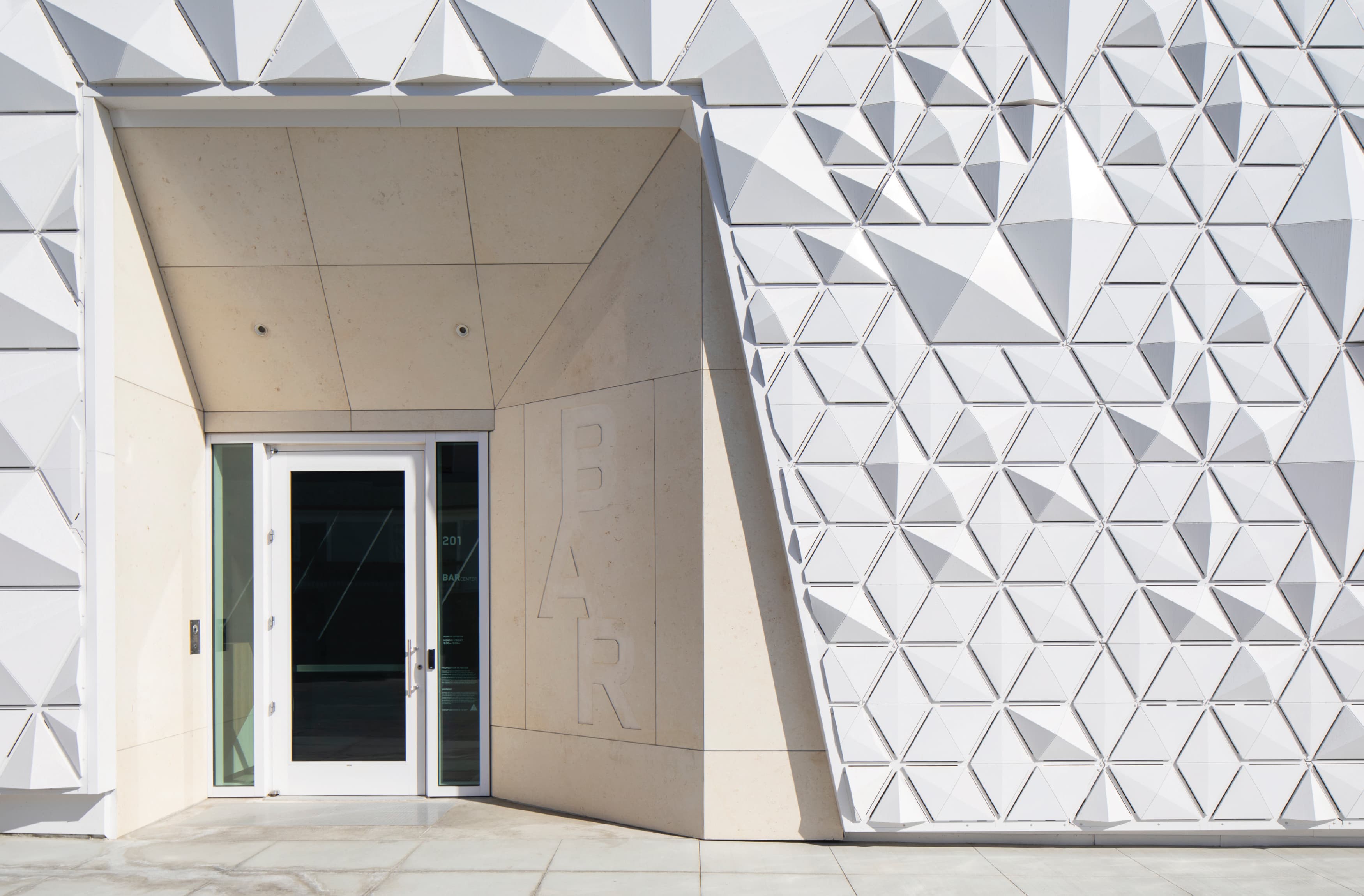
We started to connect the dots of this concept when working with the architect on the design of the facade, identity, and signage elements. If you look at the skin of the building, you can see the exterior ended up being wrapped with a tessellated surface. Taking on a geometric motif, the building is wrapped in an abstraction of the Star of David, counterbalancing the needs of symbolism and discretion.
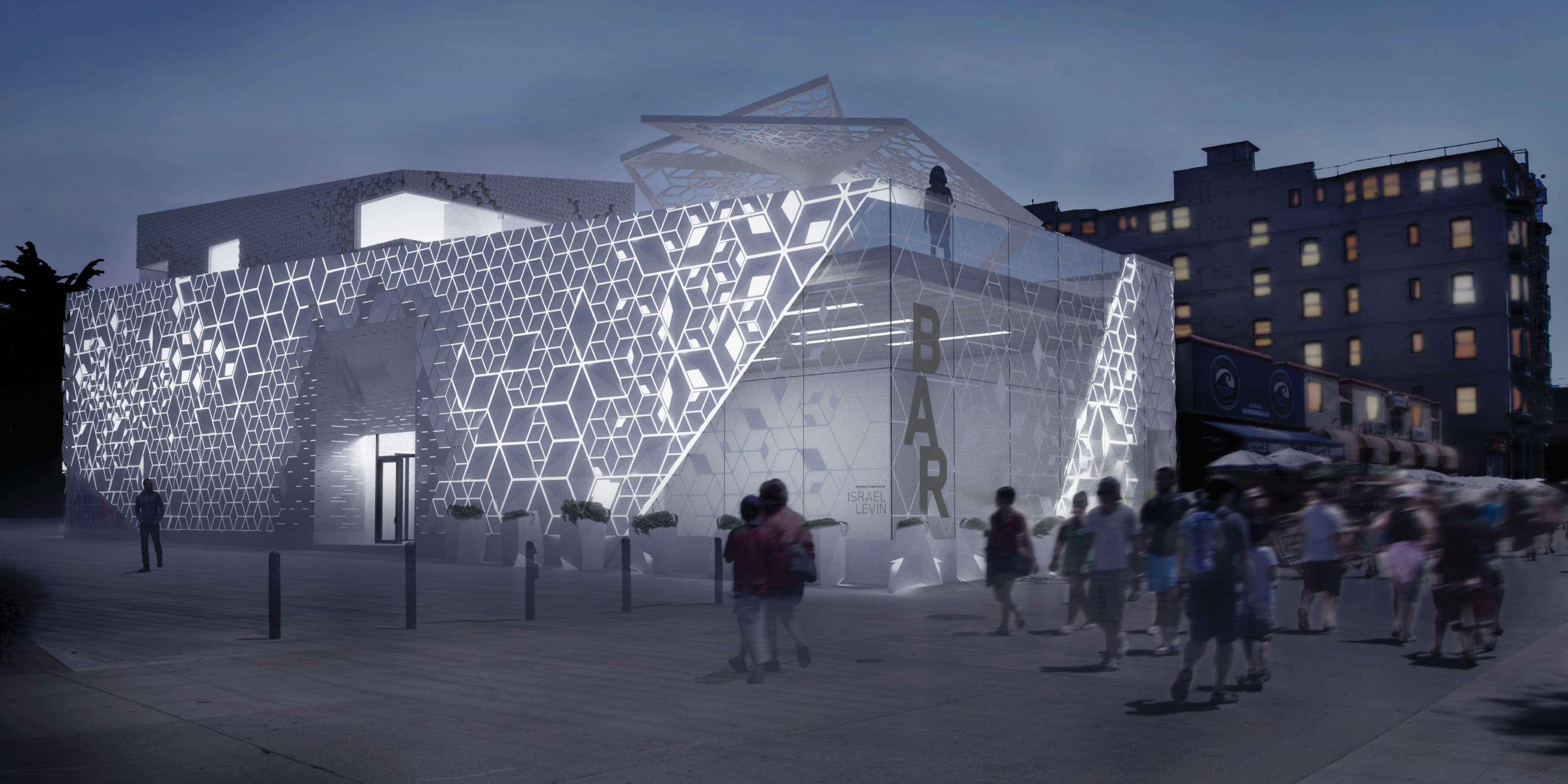
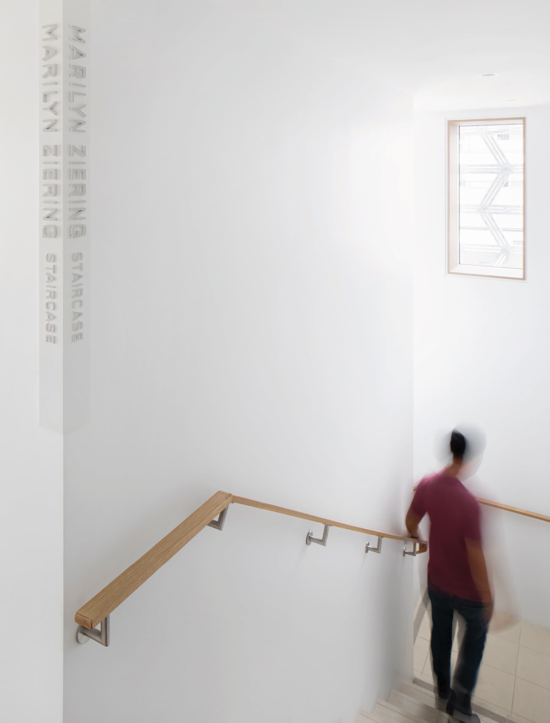
The wayfinding signage followed suit. Our signage was meant to be permanent, to emulate this feeling of thousands of years of strength. All of the signage from the outside of the building was engraved. We had the entrance identity chiseled out of a singular slab of Jerusalem limestone. The culmination of these design choices was permanence that honored the Jewish community.
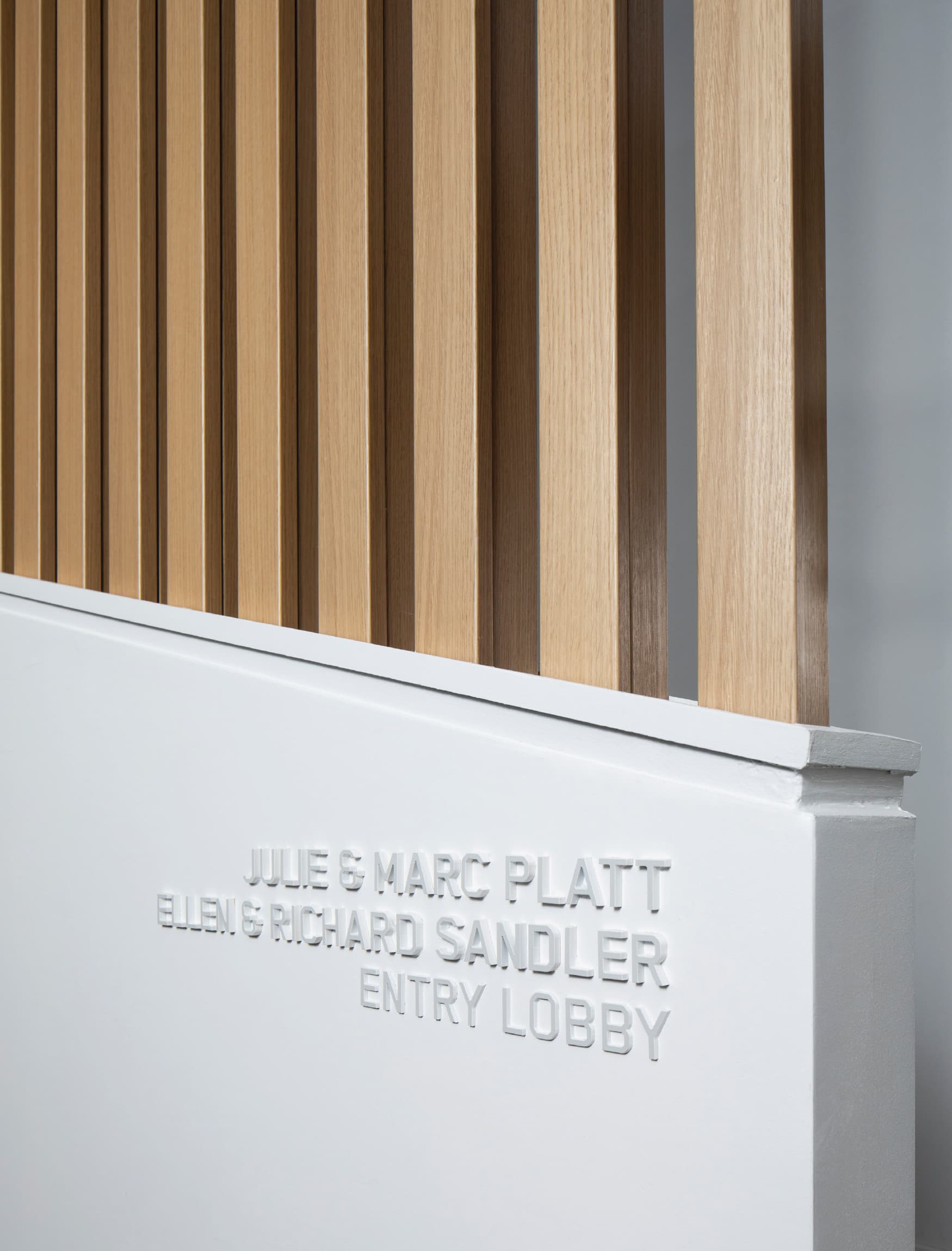
The only thing that makes the logo or the brand visible is light. That’s it. There’s nothing else. There’s no color, just the shade and the light. We continued this posture with our signage inside the building as well. The signage within the building is white on white, symbolizing purity and sacredness.
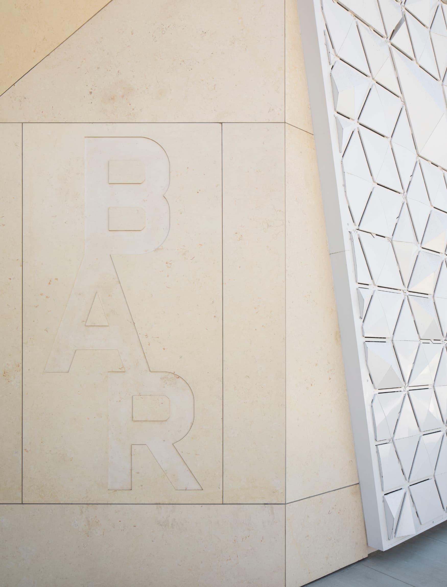
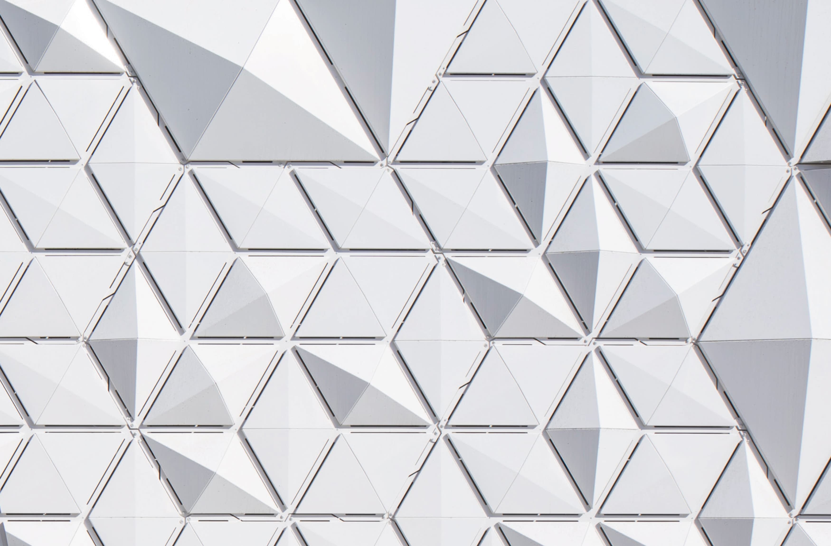
The structure and quality of the Star of David informed the design throughout the entire building. The idea is that until you see it, you don’t. It’s hidden in plain sight. Nobody knows it’s there, but the community sees it. Although the architecture looks quite modern, it’s also embodying the story of the community’s resilience—and every inch of the BAR Center plays a role.
To successfully work on the BAR Center at the Beach, our team did a lot of listening. One of our differentiators as a company is that we understand space. We understand architecture. We understand the fundamentals of planning—and landscape, quality and scale, and the composition of space. We’re not just a sign designer—a sign designer can be found anywhere, it’s a commodity. At RSM Design, it’s critically important that we understand where and for whom we are designing.
How are you informing your design if you don’t understand the quality of the space? What is its scale? Where are people walking, and what do they see? Is it an entrance? Is it a pass through? Is it a plaza where people are going to gather and spend time and share stories?
That’s why we always talk about context. You have to understand those qualities of space, otherwise you cannot design anything. Our coordination with the client team is critical because it allows us to design for the appropriate needs of the space, and then our team seamlessly puts it together.
The sign has to fit in the right spot, at the right paving, at the right module. How is it being supported, and can it support everything else? We’ve learned that we must ask questions, and, most importantly, we must listen. At RSM, this is our approach: We pose insightful questions, dive deep, and solve the puzzle.